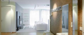
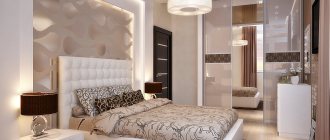
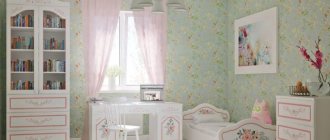
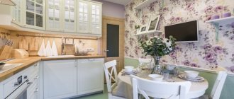
In the interior, the main role is played by wall decoration. Wallpaper in a modern style sets the mood and emphasizes the theme. They transport those present to the hot seashore and cold Scandinavia. Just open the catalog and you will be amazed by the energy of Chinese materials and the tenderness of Japanese ones. The rigor of minimalism and the gloss of techno. Vintage transforms strict classics into retro and rough industrial trends in room design.
Wallpaper in Provence style
Selecting wallpaper with a friend
Vadik decided to decorate the rooms in strict accordance with certain styles. He took a furniture catalog with him to show me what he had decided to buy. He asked me to help him choose wallpaper in Provence, marine, Chinese and retro styles. He was especially interested in loft-style wallpaper for modern interiors.
Wallpaper
I immediately warned him that design in various topics has a lot in common. The main thing in modern design is vintage - mixing different elements. Wallpaper in the Provence style can be attributed to many ethnic and natural styles. Floral trellises, these are interiors:
- classical;
- ethnic;
- baroque;
- Victorian;
- Oriental;
- neo-gothic;
- natural;
- country house;
- Japanese;
- eclecticism.
And many more less popular styles. After all, each people decorated their homes in their own way. The interior reflects the tastes of different eras. Only the wallpaper in the classic style and the floral pattern remain unchanged. All this has its own modern interpretation in the color and pattern of the wallpaper, and their combination. My friend looked at the catalog and realized that I was right. Floral wallpaper takes up the largest section.
Provence wallpaper in various rooms
If you decide to decorate your home in a rustic style, you should know which wallpaper will fit perfectly in which rooms. Based on the fact that a light color palette and discreet ornaments predominate, the canvases will be an excellent decoration for the walls of a bedroom, living room, kitchen and nursery. They will set you up for relaxation, create a cozy and relaxing atmosphere and transport you to a small village that has its own unique charm.
Provence wallpaper in the bedroom
The living room is a room intended not only for relaxation, but also for receiving guests, so it has a more elegant and elegant interior design. But no luxury or pomp is welcome in Provençal design; everything should be simple, airy, sophisticated and with a unique charm.
Wallpaper in the Provence style is suitable for the living room:
- monochrome with light relief;
- in pastel colors - olive, beige, white, lavender;
- with a floral pattern as an accent;
- imitating decorative plaster, stone, brick, boards, etc.
Plain wall decoration will not look boring and will forgive the interior, because the Provençal living room is famous for its abundance of decorative items - embroidered paintings, colorful rugs, light natural fabrics, sofa cushions, antique vases and a sea of fresh flowers.
In the living room, Provence is usually focused on furniture and other decorative elements, so the task of wallpaper is only to be the background for this union.
If you want to cover the living room with canvases with patterns, they must be quite faded, otherwise you risk finding that unacceptable diversity of the interior. It is worth giving preference to non-woven or vinyl wall coverings.
Wallpaper in Provence style in the nursery
The bedroom should have a calming and peaceful environment, since here a person rests, gains new strength and is filled with energy. In this room, not only plain wallpaper in delicate pastel shades, but also small flowers will look great. Paper or non-woven wall coverings are an excellent choice for the bedroom.
Wallpaper in Provence style for the bedroom:
- these are monotonous coverings in soft, delicate colors, creating a feeling of airiness in the space;
- these are canvases with small meadow flowers on a light background, emphasizing the depth of natural freshness;
- these are worn, aged surfaces that accentuate rustic motifs;
- These are vertical stripes, wide or narrow in pastel colors.
Vinyl coverings, which are highly practical and able to withstand mechanical stress, will help transform your kitchen in Provençal style.
Children's room in Provence style
The kitchen can be wallpapered in Provence style:
- with gastronomic ornaments - dishes, fruits and vegetables, various spices and food scenes, etc. Such a pattern will look harmonious in the kitchen and fully embody rural life;
- with a checkered pattern in warm colors;
- with a floral pattern - bouquets of flowers, vines and a lot of greenery will bring a magical Provençal corner into your home.
A rustic-style hallway can be decorated according to the principle - the smaller the furniture, the brighter the walls and vice versa.
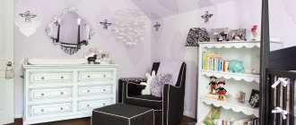
For a Provencal children's room, of course, wallpaper with a floral pattern is used. You can also use retro scenes - a child riding a vintage bicycle, retro cars, etc.
Popular wallpaper collections in Provence style: York Roses (USA), Little England Aura Series (Canada), Abby Rose Aura (Canada), York Wawerly Series – Cottage, Classics (USA), Chealsea Décor Theater (England), York Casabella 2 ( USA), Living Style Simple House (USA), Coswig Lady Mary (Germany) and many others.
Provence is a style that personifies rustic modesty and elegance, the charm of good old times and simple luxury; it is literally permeated with light, fresh air, romance and tranquility. It is associated with the spaciousness and comfort of a country house, preserving the unity of man with nature, so it is ideal for dreamers, romantics and those who are tired of the city routine.
Provence frozen in time - the spirit of France of the last century
Wallpaper in the bedroom
Provence is a region in the south of France. It is famous for the sea, vineyards, farms and ancient houses. It was as if time had stopped upon reaching this wondrous corner. Therefore, wallpaper in the Provence style corresponds to:
- retro;
- marine theme;
- ethnic style;
- natural.
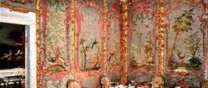
On a blue or sand-colored background, the pattern is mainly floral and striped. The colors are soft, as if faded in the bright sun. The texture is rough, the surface is matte. Sand, waves, fields. Paper wallpaper in Provence style matches the theme of the interior. This is a reflection of the life of ordinary people in the province. The walls of the palaces at this time were decorated with expensive fabric tapestries with complex designs in gilding and silver.
Provence style in the interior consists of vintage antique walls, light foam-like white curtains and retro-style furniture. Primary colors:
- blue;
- wet and golden sand;
- light gray;
- lactic;
- olive;
- beige;
- pink.
The theme of the drawing is plant-based, floral, plain and striped. The surface of the walls is matte.
Wallpaper in Provence style: secrets of ornament
If plain walls don't inspire you and seem boring, don't worry! And in Provence there are wall coverings with colorful patterns.
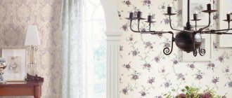
In order not to disturb the rustic idyll and to arrange the interior in this style as correctly as possible, you need to use wallpaper with a small, unobtrusive pattern on a light background. The most popular and sought-after ornament in this direction is a small flower. Chic peonies, graceful lilies, neat lavender flowers, delicate buds of unblown roses, elegant sunflowers, small leaves and twigs decorate the wallpaper and bring warmth, comfort, freshness and romance to the interior. The floral design should be of moderate brightness, not flashy shades, relaxing, calming and setting the mood for rest.
Provence style ornament
In Provence, there are also wall coverings with vertical stripes or checkered patterns in soft pastel colors. In wall decoration they can be used either independently or as a companion to floral paintings. Such prints indicate the modesty and unpretentiousness of a rural lifestyle.
Provence is partial to natural materials, so wallpaper imitating brickwork, wood, natural stone, planed boards, decorative plaster, and rough linen fabric are ideal for wall decoration. Such decoration in the interior will look original and impressive, and most importantly, holistically in accordance with the provincial flavor.
Sometimes in a rustic style, canvases with a specific zhuy pattern are used - monochrome depictions of idyllic pastorals, episodes of game hunting, walks in a secluded corner of the garden and many similar scenes - a godsend for those who appreciate light ease and grace with a French touch.
Provence style
The marine theme is as varied as the underwater world
Bedroom in Provence style
Wallpapers in a marine style are divided into several groups. The background is mostly blue or white. It may have blue and red stripes of varying widths. They are bright, like the sun setting over the horizon and water in the depths.
The drawing may depict:
- ships of different types;
- their elements - steering wheels, anchors, ropes;
- islands;
- the underwater world with its inhabitants and plants.
Combined wallpapers are selected for the walls. Striped trellises attract attention and emphasize style. They are glued in fragments. In a narrow room, horizontally wide stripes on the end wall. Low ceilings lift visually vertical stripes. Wallpaper in a marine style with thematic designs is placed in the relaxation and work areas.
The catalog can offer various themes for the walls of a marine interior. Against the background of wet sand, beach paraphernalia, silhouettes of vacationing people. On a turquoise background there are chests of gold, sailboats and even fairy-tale mermaids. The vintage look with sides corroded by salt looks harmonious with the other elements. Curtains are light, like sails fluttering in the wind, and will emphasize the nautical theme in the interior.
The cold nature of Scandinavia is warmed by the Gulf Stream
Interior of a house in Provence style
Wallpaper in Scandinavian style is bright with a simple pattern. This is a decoration for one wall on a white background. The wind carries cold from the Arctic, covering everything with white snow. Warm air currents from the Gulf Stream regularly burst into the kingdom of winter. The ground is covered with grass and flowers. Strange tunnels form in the icy rocks. Fog and sun fight for dominance in the sky. There are rocks and small lakes around.
Scandinavian-style wallpaper reflects all this. They are bright like spring flowers and simple. The drawing is simple, as if drawn by a child’s hand:
- leaves;
- flowers;
- geometric figures.
In the interior, with the help of wallpaper, attention is focused on one wall. Everyone else is usually white. The room is spacious and bright.
The catalog also offers vintage designs for rough stone and brick masonry. Such wallpaper is pasted on walls with stairs or doors. A brutal old wall among snowy whiteness in a harsh Scandinavian interior.
Provence wallpaper for other rooms
In the hallway, the choice of wallpaper is also simple - the less furniture, the brighter the wallpaper, and vice versa.
Article on the topic: Aluminum skirting board for the floor: anodized and cable channel
Since the hallway is the first thing a guest sees when entering the house, you should immediately set the mood of the whole house in it.
If warm Provence is closer to you, and it is in the other rooms, then do not interrupt the overall style by choosing “cold” wallpaper for the hallway
Children's wallpaper and wallpaper for a children's room mainly use the same floral pattern. And if you think that there is already a lot of it in other rooms, you can turn to a plot drawing, a little with a retro touch. For example, a boy and a girl from the beginning of the last century on a retro bicycle. Or a girl with a birdcage, etc.
The diversity of the East is reflected in the large number of types of designs and choice of colors
Wallpaper in the bedroom
The catalog, which contains wallpaper in oriental style, has several sections. They reflect the different cultures of this exotic part of the world and the styles in which the wallpapers are made:
- Chinese;
- Japanese;
- Moroccan;
- Indian;
- Arabic
Wallpaper in Japanese and Chinese styles is distinguished by its tenderness and sophistication. Other eastern cultures prefer bright colors and complex designs.
The Koran prohibits the depiction of all living things. Therefore, the designs are geometric, intertwined with unreal vines. Even a fantastic flower is rare.
In India, they prefer to create wallpaper in oriental style with patterns decorated with golden paint. Favorite wall color:
- bright red;
- turquoise;
- orange;
- green.
The interior strives to create a look of luxury. The finish shines with gold and silver. The walls are often draped with fabrics. In a modern oriental style interior, it is preferable to use fabric wallpaper. They convey the mood more accurately.
When studying the catalog, consider the size of the room. Oriental style looks good in spacious rooms. It visually reduces the room with its diversity.
What should be the wallpaper for a classic kitchen?
For large kitchens, design in a classic style is most suitable (after all, Provence originated in small country houses, so small, cozy spaces are key in this style). A kitchen combined with a living room will also look good in a classic style.
Wallpaper with a golden hue will fit perfectly into a kitchen made in a classic style.
It is worth remembering that classic is an expensive style: there is no place for flashy colors, artificial materials and imitation. The design should be discreet.
However, wallpaper for a classic kitchen doesn't have to be boring. In the design of a classic interior, the use of canvases with floral prints and patterns is allowed. Drawings can be made in golden or silver tones. An interesting option would be canvases of gray or gray-lavender color with white or silver patterns. Golden ornaments on a red background look rich: this canvas can be used to decorate part of the wall in the eating area. At the same time, the working area must be neutral.
Related article: DIY folding wooden chair: materials, assembly technology
The color scheme of wallpaper in a classic style depends on the overall design idea, furniture, and decorative elements.
Japanese and Chinese culture do not like clutter and cheap decor
Japanese style wallpaper mostly has a floral pattern. They are located separately in the catalog. Soft background of pink, peach, yellow tones. There is a drawing on it. Delicate cherry blossoms, colorful birds, landscapes with curved bridges and buildings with curved roofs.
Like painting, Japanese-style wallpaper is distinguished by its precise rendering of small details. Even fantasy and cartoon drawings have clear lines. There are no flashy colors or clutter of furniture in the interior. Japanese and Chinese styles are similar to minimalist. Only functional items. The decor is represented by expensive pieces of art. They are few. The main decoration of the interior are the walls.
In a Chinese house, partitions and screens are covered with wallpaper. Preference is given to paper trellises with flowers, cork, and bamboo. The material for wall decoration is only natural. Vintage can be used to decorate a modern apartment.
Separately in the catalog there are wallpapers in Chinese and Japanese lettering styles. Individual hieroglyphs and phrases are located on a white background.
In the modern design of the loft theme, vintage plays a leading role
Wallpaper in a house in Provence style
Wallpaper in the loft style looks brutal. Vintage is used to create the image of an attic or abandoned workshop. The design is rough and geometric. Shades of gray, brown and brown.
At first, the attics were inhabited by poor students and artists. They rejoiced at the spacious rooms in which they could live and gather in large groups. The walls were simply washed and hung with posters. Loft-style wallpaper conveys the mood of the 1930s. Chipped bricks, iron beams, rough walls.
Over time, home decoration based on the theme of abandoned houses has become fashionable. Against the brutal background created by wallpaper in the loft and vintage styles, expensive furniture looks more luxurious. Chipped stone and rusty iron rivets highlight the luster of the decor.
Provence style in the interior: fashion trends
Before choosing wallpaper, see if the Provencal style aesthetics really reigns in your home or, if you have just started transforming your house, whether you are moving in the right direction.
Provencal style is:
- Background bed colors;
- Gravitation towards floral print;
- Many decorative trinkets made of porcelain and textiles;
- Light curtains;
- Abundance of sunlight;
- Simple in design, but very decorated furniture.
If you start transforming your home into Provencal style by finishing the walls, 50% of the work will already be done
Provence style is sometimes confused with country style. And, of course, it is possible to confuse them - these styles are consonant, because they have one principle - the worship of a calm, measured, rural way of life. Considering that the lifestyle of a Western village is the standard, it is assumed that the house is not the smallest, and the family can afford such an abundance of decor and stylistic unity.
Related article: Warm water floor: what is needed for the device, work procedure
Interior in Provence style: master class on design (video)
Classic interior is always in fashion
The opposite of the brutal loft in its background and design is wallpaper in the Art Nouveau style. They are light, with a delicate pattern of natural lines. Home decoration was invented by artists around the same time as the development of attics. Only the direction is different. Refusal of everything rough and straightforward in favor of the natural.
The main thing in Art Nouveau is the smoothness of lines and the decoration of walls with paintings. The trellises serve as a background without drawing attention to themselves. The drawing is simple, not contrasting. Consists of bends and curls.
Wallpaper in a classic style is always in fashion. Floral and striped, with luxurious damask and geometric patterns. They are distinguished by softness and sophistication. The drawing is characterized by symmetry and highlighting of the central element. The interior uses a combination of patterned and plain or striped finishes. The catalog even offers pairs selected by designers.
Provence wallpaper for the kitchen: design tips
Provence is a style in which there is no place for polished surfaces and neon light. The rustic style welcomes only natural materials, muted, pastel colors, maximum natural lighting, and an abundance of decor. Wallpaper for decorating a room in Provencal style must also meet these requirements.
Wallpaper in Provence style often has a floral or other pattern.
Designers advise following these recommendations when decorating a kitchen in a Provencal style with wallpaper:
- It is better to place wallpaper in the upper part of the room, and leave the bottom of the walls for painting in neutral tones (white, milky). The border between the wallpaper and the wall can be decorated with the help of moldings: they are fully consistent with the ancient Provençal theme.
- To design an apron in the work area, it is better to use imitation natural stone, brick, ceramic tiles: such materials will be easy to clean and will last for years. The shades of the materials should be calm, and the surface should be porous, without excess shine.
- The dining area can be decorated with Provencal floral wallpaper, and the work area can be covered with plain wallpaper in the same tone. At the same time, the wallpaper for the dining area should be lighter and lighter. The working room can be decorated in more saturated colors.
- Wallpaper with a floral print can be combined with canvases with wide vertical stripes in a neutral color. At the same time, you should not place the canvases next to each other: it is better if they are separated by furniture or a window.
Article on the topic: Decorative street lamps: cozy lighting for the garden and cottage (35 photos)
Be inspired by various solutions in the design of Provencal interiors, improvise, follow the advice, and create your own, unique design.
Baroque - grace and luxury of the classics
We glue wallpaper in Provence style
Wallpaper in the Baroque style can be called a luxurious classic. Complex floral patterns are suitable for ceilings with stucco, columns and walls with curly moldings. They have geometric bases:
- rhombus;
- net;
- scales
Dark background and pattern in gold and silver. Many small elements, smooth lines, curls. The catalog cannot convey all the charm of the tapestries. You need to look at the sample.
In a modern interior, baroque wallpaper is glued to one or two walls. They create an accent, attracting attention to themselves. The walls can only be completely finished in a large hall with a high ceiling and intense natural light. Otherwise, the small room will seem cramped and gloomy.
A friend and I walked through a wallpaper store for several hours. As a result, he became entangled in all the trends in decoration fashion. He handed me a catalog with the marked furniture and suggested that I choose the design of the walls myself.
Type of wallpaper
When choosing wallpaper in the Provence style, you must take into account that currently there are many varieties that have their own characteristics.
So, the following types of rolled products are suitable for this design direction:
- Paper. The main advantages of such products are simplicity, low cost and environmental friendliness. This is what meets all the principles of the chosen style.
- Vinyl. They have a wide range of colors and imitation of natural materials. It is important to remember that the true Provence style gravitates towards wood and stones.
- Non-woven. The presence of a large number of textures, as well as the possibility of painting, will help give the room individuality.
- Textile. This is a real find for lovers of simple and natural design.
Naturally, a lot depends on financial capabilities. For example, the latest options are significantly more expensive than other varieties.
