The decor is like at an exhibition
Decor and accessories show the owner's personality. In pop art, details are repeated to create compositions. The more interesting, the better. Decorate the walls with posters, comics, characteristic color portraits and paintings, and seemingly simple mass market goods. For example, decorated Coca-Cola bottles in pop art become an independent installation. Pop art recognizes things made with one's own hands. Create something that is difficult to fit into everyday frameworks, go against the system, use simple little things for inspiration. Remember Warhol with his can of Cambells soup.
History of the pop art style
In the 50-60s of the 20th century, they began to paint pictures and create unusual sculptures in the pop style. What is interesting is that this unusual cultural movement originated not in the progressive United States, but on the shores of conservative Albion - in London. Initially, the goal of the style was to protest abstract expressionism. He made such a big splash in society that he immediately crossed ocean boundaries and filled America. Already in the vastness of the States, he crossed the line of fine art - apartments, houses and cafes began to be decorated in the pop style.
The very term “pop art” in interior design was first used by an extremely creative resident of the United States, Andy Warhol. He was an artist, filmmaker, writer and designer who changed the way Americans think. After his death, pop art has not lost its popularity; those who want to add a true sign of this style to their home furnishings are buying Andy Warhol's paintings for hundreds of millions of dollars at auctions. In the period from 1985 (2 years before the death of the pop genius) to today, the value of his paintings has increased by 3400%.
Other equally notable persons of the immortal era were Andy Warhol’s compatriots – Robert Rauschenberg, Jasper Johns. Robert Rauschenberg created compositions that were incomprehensible to most - “Monogram”, “Bed”, which were not used in home interiors and are still kept in museums. The author loved to create paintings from garbage, consider ordinary household objects as part of pop art, and in the last years of his life he created eccentric lithographs. Jasper Johns is a contemporary American artist, sculptor, who is considered the most expensive in the world. His sculptures, cast from bronze, do not represent something sublime, but everyday things - a toothbrush, a light bulb, beer cans.
Initially, the goal of the style was a protest against abstract expressionism
For the first time, the pop art style in design began to be used in the USA
Multi-colored decorative elements will create a positive atmosphere
Italian style
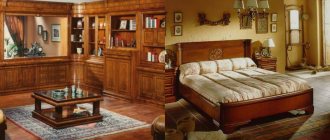
An interesting solution – Italian interior with a modern interpretation. The best features of Baroque, Rococo, and Empire, verified over centuries, were embodied in a separate style. Italian sophistication shook off the unnecessary pomp of Baroque and the infantilism of Rococo and proved that beauty can be consonant with functionality.
Italian style is a symbiosis of luxury, practicality and rustic simplicity.
- Columns, ornaments, and expensive materials coexist with antique scuffs and country-style ceiling beams.
- Methods of wall decoration: Venetian plaster, mosaic, wall painting, frescoes, “antique” tiles, tile panels, baguette in the interior.
- The ceiling is whitewashed or with dark beams. The floor is wooden or paved with tiles with decorative chips and abrasions.
- Doorways in doors, window partitions, and decorative niches have an arched shape.
- Aged furniture that preserves the history of generations, is solid and reliable is the best choice.
- The color scheme is represented by warm shades of beige, golden, yellow, and brown.
Signs of pop art style in the interior
To create a unique and at the same time very stylish pop art in the interior, it is not enough to simply “stuff” the room with objects of different styles, eras, and unusual products. You can determine that a room is part of shocking and cheerful art by the following signs.
- Bright, rich, acidic colors in the most daring combinations - purple with green, red with turquoise. Combinations of black and white in unusual textures are no strangers to pop-style interiors.
- An abundance of portrait images - posters, comics, newspaper clippings. They decorate not only walls in the form of paintings, but are used to decorate textiles and household items.
- The predominance of shiny parts - glossy surfaces of finishing materials and furniture. Textiles are also smooth - bedspreads, curtains made of silk and synthetic fabrics. The decor can sparkle thanks to a variety of rhinestones and stones.
- Illusionary space - created through many lighting points, neon lamps are used.
An interior in pop style is minimalism in terms of furniture - wardrobes should be built-in, beds should be pull-out, the rest of the furniture should be strictly “on point”. And, the main feature is the use of household items for other purposes. For example, a beer can can make a unique vase, or a beer barrel can make a toilet flush cistern.
Pop style uses minimal furniture
The pop style is characterized by a combination of bright colors
Decoration of walls, floors and ceilings
Multicolor and variety of shapes are best balanced with neutral white walls. In the traditional interpretation, pop art was used for spacious rooms and rooms with a large square area.
Today, you can also successfully recreate the concept of a style in a small area, and white walls in this case will be the best tool for visually expanding the space.
At the same time, the texture of the surface of the walls does not have to be uniform: for example, some walls can be simply painted with white paint, while others can be finished with large strokes using decorative plaster.
In addition to white, cool gray color is also allowed in the design of the walls. This color is reminiscent of the shade of chrome steel, the use of which became very popular in the middle of the last century.
Creating one accent wall also seems like an excellent solution. It can be covered with wallpaper with bright prints, posters, stickers, or hand-painted with creative graffiti.
You may be interested in: Design of a small studio apartment: forget about the boring interior
As a rule, bright accents are not provided on ceilings and floors. It is recommended to paint the ceilings in a tone or several shades darker than the walls, which gives the space a studio effect.
As for the floor, a laminate or carpet is ideal as a covering, but classic parquet boards should be abandoned.
A common household item is a carpet, usually of an unusual shape and pattern. For example, you can use zebra or tiger skin as a carpet, both natural and artificial.
Decor and textiles
In a pop art interior, decorative elements become real objects of art. Figurines, hangers, and wall decor can have a completely unexpected format, for example, a floor hanger in the shape of a horse.
The photo shows a living room with plenty of decorative details.
The textile part of the interior will become an interesting highlight; curtains of the brightest colors are successfully combined with classic white tulle. Clocks and mirrors can be decorated in a handmade style or decorated in bright colors.
Pillows can echo the curtains or become a rich accent in the design.
A carpet of unusual colors will look appropriate on a floor with a neutral surface, artificial skins, a carpet of several components will be the right choice.
Functionalism
In the modern pragmatic world, functionalism in the interior has found many adherents, and in a small room or kitchen this style is simply a godsend.
- Moderation and conciseness are the basis of the style, and functionalism considers decorativeness to be an excess. The aesthetic properties of interior items do not matter; their practical value determines everything.
Form is determined by function - the motto of functionalism.
- The living space is continuous, with one room flowing smoothly into the next.
- Particular attention is paid to lighting. Preference is given to large windows without decorations and lamps with adjustable modes.
- Built-in furniture and ergonomic transformers with rectangular contours.
- The ceiling and walls should be light colors. Ideally, a matte white ceiling.
- Light colors: white, green, brown, orange, gray, blue.
Rococo
If the Empire style in the interior is luxury with a military bearing, then Rococo is the embodiment of pampered wealth with a touch of unreality.
Differences of the Rococo style:
- The main storyline of the style is the sink. Its shapes, concave or convex, can be seen in all furnishings. Climbing vines and garlands of flowers complement the ornament.
- Decorative details of the Rococo style tend towards sophistication and comfort.
USEFUL INFORMATION: Design of a bathroom combined with a toilet (32 photos)
- The interior is replete with pastoral scenes, amorous stories, and mythical images.
- Decorative elements suddenly change in size, surfaces are replete with relief patterns, and instead of straight lines there are twisted curls.
- The shapes of the rooms are unusual - oval, round, polygonal.
- There are frescoes and stucco on the white and gilded ceiling.
- The color scheme of the interior is blue, pink, lilac, white and gold.
Moroccan style
Moroccan interior style is a bright ethnicity, an oriental fairy tale in a silky haze.
It is distinguished by:
- Motley ornaments, rich colors, high ceilings.
- Decoration is an important accent of the Moroccan style: mosaics on the walls and ceiling, frescoes, stonework on the floor.
- The characteristic color is turquoise. Yellow, white and brown, orange, and burgundy colors are often used in the interior.
- Arched niches in the walls are decorated with lamps, candelabra, figurines, and books.
- Door and window openings have a lancet or arched shape.
- Decorated accessories: forged lamps, painted trays, inlaid vases and boxes.
- In furniture, the main role is given to a wide four-poster bed. A special point is the chests, which serve as a wardrobe and decorative item.
When choosing an apartment interior style, it is important to remember: a creative impulse, like a kite, must be held back by a thread of common sense. The new interior should become “native”, fit into your life and become a part of it, and not remain a cold picture from a design magazine.
How to create a pop art style in the interior: 4 professional tips
Hanging posters of Marilyn Monroe or a copy of an Andy Warhol painting on the walls, putting flowers in a can and hanging silk curtains on the windows does not mean creating an interior in pop style, this is very little. Professional designers recommend using 4 tricks.
- Particular attention to the walls. The standard base is white paint, which must be decorated with decorative details. But a white base is a solution for only one wall; it is best if each wall is painted in a different color and has a different texture.
- Minimum furniture. In a room decorated in pop style, the space should not be cluttered with massive cabinets, cabinets and sofas; they should seem to blend in with the walls. An exception is upholstered furniture of an unusual shape in tandem with a glass or unusually shaped coffee table. The ideal furniture material is bright plastic and glass.
- Lighting – lamps, lamps and chandeliers of unusual shapes, with neon light.
- The floor can be monochromatic, or it can amaze with its unusualness. To do this, just lay a light laminate, and on top of it - a carpet with an animal or a bright abstract print.
There is no need to include decor in this list, since everyone who is planning to remodel a room in pop style knows all the details. For example, a true fan of pop art apartments does not need to be reminded that the style is characterized by absurd plastic figures, sparkling, and sometimes blinding details.
The floor in the room can be plain
A room decorated in pop style should have maximum free space.
To create a pop art design, follow the standard recommendations.
English style
Before you decide to implement the English style in the interior of your apartment with your own hands, you should weigh your financial strength: there is no place for cheapness and imitation.
USEFUL INFORMATION: What wallpaper will make the bedroom beautiful and cozy
Main features of the style:
- Aristocratic restraint, elegance and respectability.
- Expensive materials: mahogany, stone, bog oak, walnut, stone.
- Curtains in an English interior play a leading role. These are massive curtains with rich draperies, lambrequins and fringe.
- Color design in dark colors. Brown is the color of wealth and stability. It leads in the English interior, contrasting with white. There is also deep green.
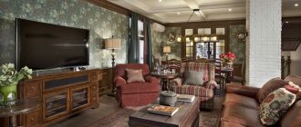
- Furniture made from expensive wood with flowing shapes is decorated with intricate fittings. The sofa has gracefully curled legs, spacious cabinets and deep shelves heavy with books, several coffee tables of various shapes and sizes, a choice of soft loungers and poufs.
- The English style widely uses frames in the interior: paintings, mirrors, tapestries are decorated with decorative frames.
Chalet
Like all areas of the rustic style, the chalet is in tune with nature, sometimes wild and “raw”, but always real. If you wish, you can create the interior of a “shepherd’s hut” with your own hands at home.
- The main principle of the chalet is environmental friendliness and simplicity. Coziness is created with the help of stone and wood. An interesting option is a wall covered horizontally with a board.
- A sure sign of the chalet style is panoramic windows.
- The colors are natural: all “wooden” shades, sand, gray. Accessories include a palette of orange, red, white, and green.
- The ceiling is decorated with dark-colored beams.
- Wooden and wicker furniture with natural upholstery is preferred. The chalet's textiles are rustic-quality, without embellishment.
- Animal skins instead of carpets and bedspreads.
