Lime kitchens
The lime shade in the kitchen interior today occupies a leading position among the general palette of colors and paints.
Green color looks good in any room: in the bedroom it will help calm the nervous system and relax, in the living room it will balance the image of the central room, and a kitchen in a green tone will always be fresh, summer, filled with air and light.
Lime is a very popular shade of green; today it is one of the leaders in kitchen interiors. Lime is a mixture of green and yellow, but it is brighter than the usual light green, much brighter than pistachio or olive.
Of course, doing the entire interior in this rich color would be a mistake - it is too bright, too active, if nothing is done to muffle it. And add orange to it, and the temperament of this kitchen will go off scale. The ideal option is a combination with pastel colors. This is light beige, oak, alder - these colors will calm the active lime, and at the same time not drown out its cheerfulness. Such a kitchen will be very summery, reminiscent of the atmosphere of picturesque islands with paradise nature.
Facades of rich lime color will perfectly match pastel colors in the interior
For a small kitchen, the design of which is decorated in light colors, the lime shade will be a kind of accent
To visually increase the kitchen area, the color scheme should be in white and honey tones, and lime will act as accents. There shouldn’t be a lot of it: literally several surfaces of the kitchen unit (cabinet doors, shelves). Accessories in the same color should also be in small quantities.
Shades of lilac
An ordinary person would call this tone light purple, but designers highlight many of its nuances:
- pale lilac;
- violet-lilac;
- lilac;
- lilac amethyst;
- dusty lilac;
- violet;
- lavender;
- blue-lilac.
The differences in nuances are explained by the difference in the ratio of blue and red in their composition, and the addition of other colors. So, the lightest, pale lilac tone is characterized by a large content of white, and the darkest is blue-lilac, it would be more correct to call it blue with a lilac tint.
The high content of pink in the composition is distinguished by a bright, fresh violet shade, and dusty lilac has a more muted tone, due to which it is universally used. Lavender is distinguished by a significant content of blue in its composition, so it belongs to the blue-violet range.
Lilac bed in the interior
Lilac color in the interior of the apartment
The combination of green and brown in the interior
Brown is the color of earth, a symbol of reliability, security, stability. It is believed that being in a room of this color can even dull the pain. The interior with the main color brown is quite conservative, it is a classic. But even in the most modern trends, it is rare that a design project can do without brown in its various variations.
Brown and green colors are a harmonious tandem. One suits the other, because in nature it is a combination of wood and leaves. There is nothing better than nature's ideas - its color combinations are the most correct, the most aesthetic.
Green and brown are natural colors, so any combination of them is harmonious
Brown has been a classic color in interiors for many years.
The combination of green and brown has a calming effect
For lovers of nature, naturalness in everything, this tandem is optimal. Green and brown also have other advantages:
- You can subtract one color, giving the opportunity to another to be dominant - the harmony will still remain;
- Apple green + dark brown - this duet can not be diluted with other colors at all;
- The next design idea is very subtle and interesting: all the main furniture can be brown, but accessories and textiles can be green and its shades;
- What an unexpected combination of dark brown and several shades of green at once - from very dark to the lightest.
The most stable color solution and the calmest in the combination of these two natural colors.
The combination of green and orange in the interior
This design is very reminiscent of an orange tree, and all the associations associated with it - summer, juiciness, sweetness, brightness. Often this symbiosis becomes the basis for the color scheme of a nursery. But it suits not only this room. The kitchen may well be made in this color, but it is better not to make the bedroom so bright.
Orange stimulates the appetite, while green has a calming effect. Both of these colors together affect the subconscious, encouraging a person to eat healthy food
By the way, regarding the kitchen: a lot of green in this room, combined with a juicy, bright color like orange, on a subconscious level attracts a person to eat green food (vegetables, salads, etc.).
The combination of purple and green in the interior
Unlike orange, purple has a slightly different function - it is a calmer natural combination, reminiscent of lavender fields somewhere in Provence. This is a flower bed and a bunch of lilacs, which means a feeling of freshness, air, and a warm evening.
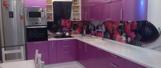
If you have an idea to design a kitchen in these colors: purple will not have a dominant role. But in this case there will be no calm green either here or there. The best solution is a milky overall tone (wallpaper), perhaps with a slightly pistachio tint, and furniture in a combination of light green and calm purple.
Dark purple has another function - it is already an accent color; one of the walls of the dining room or living room can be made in it.
A dark purple wall is a bright accent in a green kitchen
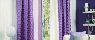
In an interior using a combination of green and lilac shades, the dominant colors should be pastel colors, for example, white, cream, beige or brown
An excellent design idea is the simple inclusions of purple in the green interior
General recommendations for combining purple with other colors
Once you figure out what colors purple goes with in the interior, you can independently choose the right design for any room in your home. Nature will tell you the ideal color combination.
The combination of purple and green is similar to how violets bloom against green leaves. Eggplant and dark green, lavender and lime color - look for winning combinations in plants, and you can’t go wrong.
Purple in tandem with gray is one of the best options for the interior. Gray as a base and bright purple details will be the perfect combination for a living room, bathroom or kitchen. Light lilac and lavender shades along with gray are suitable for any bedroom.
Combination of green and lilac colors in the interior
The duet of lilac and green is not so common in interiors. Perhaps they are afraid of it because of the richness of the colors. But the options for using this tandem are very attractive:
- The best duet is one rich color and the second muted (for example, very light pistachio and dark lilac;
- Lilac furniture + light green curtains and walls;
- Light lilac as a background + lime, apple, dark pistachio or olive (one of the shades) is a wonderful design for a girl’s room;
- Green + lilac, diluted with calm dark brown – a classic of the genre.
Whatever shade you choose, you should not forget the rule of combining calm and saturated. The only exception is the symbiosis of orange and green, and even then in rare cases, if you are willing to be in such an active room quite often.
Combination of lilac and green
The combination of lilac and green is a rare guest in our interiors; it is considered extravagant and unusual. It has been used in Western design for a very long time, although it has not become classic either.
Shades of purple and green can be combined in several ways. In the photo on the left you see the first method - when one of the colors is saturated and the other is light. With this method, a light tone of green or lilac is used for the background (walls, curtains), and a rich tone of the partner color is used for accessories or furniture.
______________________
If you make walls of any light green shade, then for furniture you can choose any tone of purple or lilac, as in the photo above. This will be a very fresh, original and juicy combination.
And if you choose a light lilac color for the walls, then for furniture or accessories it is good to use warm shades of green, as in the photo on the right and in the photo below. They will dilute the coolness of the lilac color and make the room more contrasting.
The combination of lilac with warm rich green shades (lime color, pistachio, olive, green apple color, etc.) is very good for a girl’s children’s room.
The combination of these shades of lilac and green is very tolerant of all kinds of bright inclusions - you can safely add yellow, orange, blue, and white colors here. The only color this combination is not friendly with is red.
This combination goes well with all beige, coffee, chocolate shades, as well as all light sweet colors - cream, milky white, vanilla, etc.
If you are using a cool shade of lilac, as in the photo on the left, then adding vanilla, sunny yellow, warm beige will be very useful.
The second way to combine lilac and green colors is to use equally light and delicate shades from the same palette (pastel or aquatic), as in the photo on the right. The softer, lighter and airier both colors are, the more beautiful the effect - the interior turns out to be light, spacious and a little sentimental.
This is a good solution for rooms facing southwest, where the sunset rays greatly distort the colors of the interior. Light lilac and light green resist this distortion well.
When choosing light shades of lilac and green, pay attention to the presence or absence of gray in their composition. In the photo on the left there is a very beautiful combination of light gray-green with light gray-lilac.
The combination of light lilac and light green shades (light green, mint color, willow leaf color, etc.) is very good for the bedroom - it is soothing and relaxing. If both colors have a gray or silver undertone, then the interior turns out to be very sophisticated, calm, and feminine.
True, this combination cannot be called warm and cozy - it suits southern rooms, where warm interior colors are less important.
The third way to combine purple and green colors is to use rich shades of these colors for background surfaces - walls, floors, curtains, and sometimes even the ceiling (if the volume of the room allows).
This method results in a very bright, active, modern and slightly “pop” interior. Bright shades of green (pistachio, lime, rich lime green, young foliage, apple green) go well with bright shades of lilac and purple, as in the photo on the right.
This is a very modern, active interior, it is suitable for young people and people who like to change their interior relatively often - because bright background surfaces get boring pretty quickly.
This combination can be complemented with white, bright yellow, bright orange. In such an interior, calm, muted colors should no longer appear - they will disappear and look like “blind spots”. If neutral colors are needed, then these should be white, rich gray, steel and “stone” colors - gray granite, tuff, etc.
The fourth way to combine purple and green colors is used much less frequently - when, as in the photo on the right, rich purple or lilac is used for walls and the same rich green is used for furniture.
This interior, as you can see for yourself, looks interesting, but a little heavy.
_________________________
If you reduce the saturation of lilac and green and darken the colors, the overall impression remains quite heavy.
But in general this combination is also interesting and original. It is suitable for bedrooms and living rooms, which are used in the evenings under electric light.
If you use dark shades of lilac and green, you will definitely need silver, white, and cream accessories - otherwise it will be a bit dark. Compare two pictures:
The deep emerald green and dark purple colors in the photo on the left create an incredibly beautiful, but still dark image. The presence of milky white and cream in the photo on the right makes this story much easier.
In general, I would like to note that in the combination of purple and lilac shades with green there is something subtly southern. It reminds me of Provence with its lavender.
I believe that in the interior it is better to use a combination of lilac with warm shades of green, close to the color of the grass in the photo on the left. This makes it less cold and more cheerful.
Herbal green, mint color, cucumber pulp color and other cool green shades in combination with lilac are best used in southern rooms.
Finally, the fifth way to use a combination of lilac and green in the interior is to use both colors for accessories, and choose a light neutral color for the background.
With this method, you can make one of the colors more saturated (like purple in the photo on the right), and the other paler (like the green tea-colored sofa in the same photo). The lighter and more neutral the background, the more noticeable and interesting both colors look.
The recipe for success is simple - a very light background (milky white, cream, light pink, light blue, vanilla) and bright accessories in rich purple or lilac and pistachio or lime colors. An excellent addition would be pink, yellow, orange colors.
______________________
I hope you found this article helpful - if so, click the “+1”, “like” button or your social network icon. Thank you!
Natalya Zakharova says: 08/27/2013 at 6:17 pm Dear Ticca, your publications and advice and recommendations are always so valuable. I really ask for help in one difficult issue: Bedroom - 14.5 sq m, on the wall where the headboard is, there is wallpaper with huge vertical saturated green leaves on a dark purple background (2 stripes along the edges of the bed). To go with them, we bought plain chocolate-colored wallpaper to match the veins on the leaf particles. But here’s the furniture - on the opposite side, the entire wall is occupied by beech-colored bookshelves (without visible pink and very light), but we don’t want to change the wardrobe, but we’re building it into a niche, only the mirrored facades in a dark brown frame will be visible. The floor is cork (it goes very well with beech). Do you think it’s possible to put it all together or should we abandon the dark Italian walnut cabinet? Here is the wallpaper: https://s019.radikal.ru/i642/1308/11/024271f64aa9.jpg https://s017.radikal.ru/i426/1308/59/1eb3743497d9.jpg And what color to choose the bed frame and nightstands (they wanted something very simple and maybe even a little rough, maybe buy a bamboo bed) and curtains (they wanted Roman curtains, since the window is three-leaf and large with narrow sashes at the edges). Which color is preferable in our case? I would be very grateful for recommendations on color and style.
Tatyana says: 03/22/2013 at 12:13 am Hello! Thank you very much for the site and your work. We are making renovations in a new apartment. Ceilings 2.5 m. The kitchen-dining room was designed in Provence style. Through the wall there is a living room-hall, but their doors are next to each other and are located at 90 degrees. The windows of both rooms face northeast. For the living room, from the existing property we want to take only a Czech crystal 2-tier chandelier of pale lilac color with a little gilding and tiny green flowers, a large library and a computer. We want to make the walls of a square living room of 18.5 m2 cream or pale green, and the floor – parquet. I can’t fully imagine the tone of his varnish yet. With the color of upholstered furniture and textile accessories, thanks to your site, everything also came together in my head to the end. But what color should the furniture and doors be? What's the best style for this room? What wall color should you focus on in the narrow 1.7m long 5m corridor where the doors of these rooms go. Are the doors probably suitable in bleached oak color or not? For now we assume that the doors will be made of natural wood. Thank you in advance
Daisy says: 19/03/2013 at 6:32 pm Hello! Help! The wallpaper is light green with an embossed stripe, a very delicate color, one might say light green. The wall behind the sofa is highlighted, the wallpaper is the same color, but with “vegetation”, and the sofa is striped, stripes of different sizes and colors (fuchsia, pistachio, lavender, purple and beige). The furniture body is “cherry” color, the facades are light (milky), the floor is similar to the cabinets. There are beige curtains and milky tulle. I really want to add lilac accents! And the striped sofa against the background of green vegetation is confusing! Thank you
Irina says: 05/03/2013 at 10:41 am Thank you, interesting article.
Natalia says: 06/02/2013 at 3:44 am Almost the same color https://www.google.ru/imgres?imgurl=https://img-fotki.yandex.ru/get/5815/88647786.2/0_59f08_db077111_XXL&imgrefurl= https://hands-creative.com/portfolio/3d/eskizik-olivkovoj-kuhni&h=704&w=1024&sz=122&tbnid=Y-kmnkWYcKJxTM:&tbnh=90&tbnw=131&prev=/search%3Fq%3D%25D0%25BE%25D0%25BB %25D0%25B8%25D0%25B2%25D0%25BA%25D0%25BE%25D0%25B2%25D0%25B0%25D1%258F%2B%25D0%25BA%25D1%2583%25D1%2585%25D0%25BD%25D1%258F %26tbm%3Disch%26tbo%3Du&zoom=1&q=%D0%BE%D0%BB%D0%B8%D0%B2%D0%BA%D0%BE%D0%B2%D0%B0%D1%8F+%D0% BA%D1%83%D1%85%D0%BD%D1%8F&usg=__qr0YLuoi1eIGFnHbolRBIfEP8bU=&docid=QeIZQ5LqipRB3M&hl=ru&sa=X&ei=apgRUZrtMqaC4gSanYBo&sqi=2&ved=0CDEQ9QEwAQ&dur=234
Natalia says: 06/02/2013 at 3:38 am Good afternoon! Please tell me, I ordered an olive-colored kitchen, glossy, white countertop and apron - stone. I really like the combination with purple (lavender). Corner kitchen, metallic + black appliances. The side is not sunny. Help me choose wallpaper, curtains, maybe some other accents. The color of the nuhna is rich.
ticca says: 06/02/2013 at 4:17 am Choose curtains with a lavender pattern on a white background (no plain lavender - there will be no game), for example, large stylized flowers or wide stripes, or soft geometry (no sharp corners, aggressive zigzags, etc.). I would choose either white wallpaper to compensate for the rich color of the kitchen, or, in extreme cases, vanilla (this will also add “sunshine” to the kitchen), but not darker than vanilla, otherwise in daylight the kitchen will look dark! Wallpaper is better in plain colors. And hang on the wall opposite the set (above the dining table, apparently) a picture that contains lavender and olive (you will probably find what you need among the images of blooming lavender, there are a lot of them). And the accessories that will be located on the set itself (some salt shakers, bowls, small things, in general), as well as kitchen towels and oven mitts, choose a lavender color, preferably as close as possible to the shade used in the curtains.
Dina says: 16/08/2012 at 7:46 am Hello! I really need advice from someone who understands


