What wall color should I choose for gray furniture? Some apartment owners believe that gray furniture will bring boredom and despondency into the interior. Professional stylists are convinced that this opinion is erroneous. With the right choice of wall color, gray furniture will become an excellent decorative and multifunctional element of the created image.
COMBINATION OF GRAY COLOR IN THE INTERIOR OF LIVING PREMISES
Among the secrets that allow gray furniture to look harmonious in the bedroom and living room, masters note the use of bright accents.
Advice! High-quality textiles in a contrasting color and small decorative elements will help “dilute” the grayness of the furniture.
It is the gray color in the home interior that can be made a certain indicator of the wealth, success, and stability of its owner.
Professional designers obtain a gray shade by merging rich black and white colors. It is this shade that professional designers are increasingly choosing in their works. Gray-blue, brown-gray, gray-violet shades guarantee a visual expansion of space in a living space. This combination does not introduce boredom into the interior; on the contrary, it gives the created image discreet elegance.
Attention! A neutral gray shade is a full partner for other colors.
Gray monochrome design, which is diluted with yellow, creamy, red, blue shades, is appropriate in the interior of living rooms and kitchens. If you think through the combination of shades correctly, you can use such shades even when decorating your sleeping space.
Stylists recommend choosing neutral shades to match the color of furniture and gray walls. For example, a combination of beige walls with a gray upholstered furniture set gives an original look.
Experts note purple tones as the favorite shade of gray. It is this that allows gray furniture facades to be presented in the most favorable light.
If the room has gray walls, what color furniture is best to buy? This issue worries many property owners, so it deserves detailed consideration.
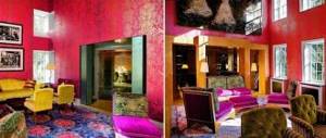
An excellent result is obtained by combining gray furniture and purple walls. Psychologists believe that this combination promotes relaxation and is suitable for creative and emotional people.
The combination of gray furniture with raw brick walls has an unusual look.
The violet shade tones up, gives new strength for work and creativity, and the gray shade has a calming effect.
Advice! Professionals advise choosing different shades of purple, as they all harmoniously complement gray tones.
Silver fabrics and metal fittings will add softness and tenderness to the interior. If a gray-pink combination is a good solution for bedrooms and children's rooms, then such colors are inappropriate in a study.
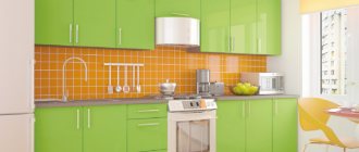
Gray color in the kitchen: pros and cons
When choosing colors for decorating a kitchen space, many owners of apartments and cottages prefer to avoid white and gray shades. However, designers, on the contrary, really love these tones. When used correctly, they perfectly emphasize the beauty of the textures and shapes of all pieces of furniture available in the kitchen interior.
Opponents of gray claim that it:
- boring and smacks of officialdom;
- makes a small kitchen visually even smaller;
- capable of plunging into depression with its gloom;
- when in excess, it creates an atmosphere of sadness and despondency in the room.
Vintage kitchen in gray
Wine cabinet
Kitchen-dining room in gray color
Kitchen with gray facades
Project by Yulia Chernova
But among the arguments for gray kitchen design are:
- compatibility of the color in question with any other colors and almost all styles;
- the versatility of gray as a basis for decor;
- practicality of the interior (drops of grease and other dirt typical of the kitchen are almost invisible on the finish in question);
- variety of gray and white palettes;
- lack of predisposition to fading.
Gray color belongs to neutral colors. It is not very warm and not very cold, does not irritate and does not become boring. Ideal for the basic background and facades of kitchen units.
Project by Marina Nellina
Modern style kitchen
Gray facades look noble and elegant
The combination of stone and glass makes the kitchen incredibly stylish
Bar counter made of stone
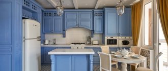
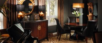
GRAY FURNITURE IN A MODERN INTERIOR
Designers often choose the color “asphalt” or concrete, creating a variety of Scandinavian and urban compositions in a loft style.
Pearl, dark slate color, regardless of the combination, looks advantageous even in a small room.
Gray and white furniture in the home interior plays a restraining role. For example, soft gray furniture in the interior plays a restraining role. If the walls are decorated in neutral shades, the interior will look subdued and restrained.
Advice! This combination is appropriate for fans of classicism and baroque.
The stability and impartiality of the gray shade has a beneficial effect on performance, which is why stylists select furniture in many offices in the “wet asphalt” color.
It is perceived as a strictly and brutal interior shade, diluted with a hint of ripe cherry or avocado.
KITCHEN
Any housewife dreams of creating a unique image in her kitchen, filling the room with an atmosphere of comfort and coziness. To do this, there is no need to follow fashionable interior trends, you just need to have your own taste and listen to your own wishes.
Professionals have some tricks to help them work with gray shades. Dark tones can hide any imperfections; they visually make the living space smaller.
Light shades have the opposite effect, so they are ideal for small bedrooms and living rooms.
To achieve a harmonious image, it is important to choose one specific color, and you can add shades to it. The furniture should be a couple of shades lighter or darker than the walls of the living space.
Attention! Professional stylists do not advise choosing the same color for the flooring and ceiling.
Instead of harmony, such a kitchen will be uncomfortable and uncomfortable.
COMBINATION OF BASIC COLORS
Black is considered a universal color; it can be chosen for other tones. Allies of the black background will be red, white, orange, and green.
Red textiles on gray furniture have an exciting and activating effect; it is suitable for fans of modern interior trends.
The yellow background helps strengthen and tonify the nervous system; it is complemented by blue, lilac, and cyan shades.
Green walls give the owner of the room inspiration, bring freshness to the kitchen, they are ideal for a gray kitchen set.
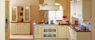
Gray and white kitchen
For those who prefer calm tones and are not ready to experiment, it is best to choose a white and silver interior. One of the most important points is the choice of color for furniture. A white kitchen set will create a feeling of cleanliness, light and coolness.
If furniture is purchased for a room that has already been renovated, take into account the color of the walls. Gray-white will look good against a background of light green, light lilac, light blue, turquoise or beige trim.
White creates the impression of purity
The combination of white and gray with splashes of blue creates a spring mood. It takes us to the forest after winter - gray branches, remnants of snow and blue sky.
The picture will be complemented by small details of green shades, which will resemble the first sprouts and snowdrops peeking through the snow.
Those who like bolder designs can use bolder combinations. A white and silver kitchen will look great on a dark purple, pistachio, rich turquoise or orange background.
Conservatives will prefer to use only two basic colors in the design of walls and furniture. However, designers advise making an accent in the form of an additional color - bright tiles, curtains or a vase.
A bold decision - bright fronts of several cabinets
The best choice would be gray furniture with white facades . The “reverse” kitchen will also be interesting - a white countertop with gray facades. At the same time, smoky can be diluted with marbled stains, specks or other combinations.
Most often, people buy kitchens made of chipboard. Artificial or natural stone looks good on the countertop.
The best choice is a gray kitchen with white facades
Upper cabinets are often complemented by a mensol, a decorative detail that serves to unite the top of the kitchen into a single whole. For this type of room it can be white or gray.
Facades made of chipboard and MDF can be made in the following options:
- white upper, gray lower cabinets;
- gray upper, white lower cabinets;
- some white, some gray upper and lower facades.
When gray is not the main one, but an additional one
The most common and classic option listed is the first.
When considering shades, it is important to think about the impact of color saturation on vision. The stronger the contrast, the faster your eyes will get tired. It is especially worth paying attention to the part in which the “cook” spends the most time (for example, the food preparation area).
We install bright objects that attract attention
OPTIONS FOR ADJUSTING LIVING SPACE USING WALL COLOR
Interior professionals know the secrets of choosing the right shade for walls, thanks to which you can visually adjust the architecture of a living space: lower or raise the ceiling, narrow or expand the size of the room, highlight functional areas.
When choosing a wall color, it is important to first rationally arrange the furniture in the room.
In addition to the color of the furniture, it is important to consider the texture of the furniture facades. For example, for a smooth texture, stylists use light finishing materials. Rough surfaces are complemented with dark colors.
Advice! Polished furniture facades can be highlighted with cool shades, and warm wallpapers are selected for matte furniture.
An interesting solution would be to use contrasting shades in one living space, for which gray furniture is chosen.
For example, one wall is painted white, and the second wall is decorated in black. In this case, upholstered furniture in asphalt color will be an ideal option for creating a functional office or living room.
INTERESTING IDEAS
Stylists offer different options for decorating residential premises, leaving the choice to the owner. White color is considered universal; it creates a feeling of spaciousness. It goes harmoniously with any shades, including gray furniture. Its main advantage is the ability to use gray furniture in the interior.
With skillful use of a pink shade, it will give gray sets a new breath and help simulate the unusual architecture of a living space. For example, a fashion trend has become the division of a pink wall into two functional zones. This allows you to give the room an elongated shape, making it more spacious and comfortable.
The best combinations in the interior
Gray furniture can be combined with various shades in the design of bedrooms, living rooms, kitchen areas, children's rooms and bathrooms, as well as corridors and hallways. There is a basic rule: upholstered furniture better reveals the depth of gray with soft tones, and cabinet furniture - with muted shades.
Soft classics and a new look at comfort
For bedroom and kitchen interiors in the Provence style, as well as children's rooms and hallways in a classic style, it is important to remember the following design law - the background should be white, light beige, dark cream or pearl. A similar rule applies to eclectic trends in the interior of the living room and bathroom.
For a classic apartment design with gray furniture, all pastel colors work well. Shades of natural wood look especially impressive. We are not talking about a standard dark brown base, but about lighter, softer shades that perfectly highlight the texture of cabinet furniture.
Modern interior styles
In order to decorate a hall, hallway, bathroom or kitchen area in art deco, high-tech or modern style, gray furniture is combined with bright and rich colors that can dominate the interior. For a bedroom, children's room and conservative living room, it is better to look for a calmer design, where the “bright spots” are just miniature accessories.
It is recommended to combine gray cabinet and upholstered furniture with calm attributes of lavender, sand, banana and terracotta shades. This “calm” combination looks great in the design of cozy kitchens, spacious Mediterranean-style bathrooms and respectable bedrooms.
Bright combinations with red, sky blue, dark blue and light pink are also welcome. They are more organic in hallways, living rooms, and sometimes in children's rooms.