King of the color palette
If your walls and furniture are decorated in gold, your entire home will magically be filled with an atmosphere of luxury and wealth. The golden color of the walls will fill your room with comfort and warmth.
It’s not for nothing that this shade was used when decorating palaces and manor houses; modern houses lack this coziness. The main thing is not to get carried away with this color when designing your interior.
After all, if there is an excess of gold, it will feel like you are showing off and instead of a warm atmosphere you will get an aura of boasting.
Most often this shade is used in the following styles:
- Baroque.
- High tech.
- Rococo.
- Classicism.
Combinations of gold with other colors in the wedding palette
A gold wedding palette can be combined with many other colors. After all, the golden color is quite self-sufficient. Golden shades are very bright in themselves, so it is important to choose a harmonious combination of this thoroughbred color:
Combination of gold and white
The combination of gold and white in the wedding palette is an airy tandem of brilliance and neutrality in the decor of the celebration. This combination of gold and snow-white is ideal for winter and autumn weddings.
Classic combination of gold and white at a wedding
Combination of gold and turquoise
The combination of gold and turquoise in the wedding palette is a guarantee of the exquisite style of your wedding. Cool shades of turquoise in wedding decor will perfectly complement the warm gold color.
Fashionable combination of gold and menthol at a wedding
Combination of gold and pink
The combination of gold and pink in the wedding palette is perhaps the most delicate and romantic color scheme. Gold and pink are perfect for a magical fairy tale wedding!
A positive combination of pink and gold at a wedding
Combination of gold and beige
The combination of gold and beige in the wedding palette is the softest and warmest combination. Beige and gold – these two colors together will create a comfortable, cozy atmosphere at your wedding.
Delicate combination of gold and beige in the wedding palette
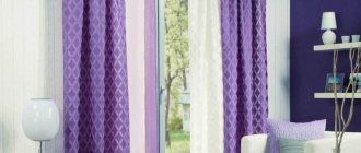
Combination of gold and purple
The combination of gold and purple in the wedding palette is a challenge of contrast and richness of colors in the decor! Aristocratic purple color is one of the most popular in wedding decor.
A bright combination of gold and purple in wedding decor
Combination of gold and black
The combination of gold and black in the wedding palette is an incredibly expressive game of contrasts! The sunny and sparkling gold color is advantageously emphasized by noble black. This is one of the classic color schemes for the wedding palette.
Strict black and gold in the wedding palette
Gold and black would be perfect for a sophisticated 1920s or Gatsby themed wedding.
The right combination of golden and other shades in the interior
When decorating a room in gold, stick to the ratio of 1:3. It is very difficult to find a “comrade” for this shade. It looks most successful together with warm and pastel colors.
Another good option is gold with grey, snow-white or peach. This way you will create an atmosphere of lightness. The combination of gold and chocolate gives a special chic.
If you prefer a chic style, then use gold with black. The main thing here is to place accents perfectly. Adding any other shades is not recommended.
Black is chosen as the background color, and golden is used to decorate accessories, furniture and walls.
Look also here:
Fashionable wallpaper: TOP-120 photos of ideas and new products from the 2020 catalog
- Units of measurement and its prefixes
Pink walls - 59 photos of interesting design options
What combinations are the most winning?
So, based on the principle of the color wheel, the main shades were chosen that perfectly emphasize the dominant shade. These include purple, white and black.
Lilac
Lilac has many shades, tones and halftones. It's like notes in music, some are bright and rich, others are soft and calm.
If you are planning to decorate the interior in a combination of gold and purple, then you should first decide on the purpose of the space - living room, bedroom or office.
Purple and gold in the living room
For the recreation area, light shades will create the necessary relaxing atmosphere. Even a children's bedroom can be decorated in a similar direction.
While for the office, dark shades of lilac with bright golden splashes are most appropriate. Business conversations and work issues will be resolved much faster and more productively.
White
Airy, light, gorgeous, very feminine combination. The room becomes ringing! If elves lived in reality, then most likely their home would be like this.
Golden decorative elements look very elegant - screens, table or floor lamps, candlesticks, frames for mirrors and paintings on a general neutral light background.
To make the interior truly unusual, you can add a drop of bright color, for example, red, blue or green. A blooming purple orchid goes well with the overall theme.
Black
If white and gold are associated with women, then the combination of gold and black can be considered absolutely masculine colors. The atmosphere created becomes incredibly stylish and characteristic. She talks about her owner as a person who is extremely confident in himself.
Combinations of gold and black colors are still recommended to be slightly diluted with beige or gray. Otherwise, you risk getting a difficult atmosphere to perceive.
For example, the interior of an office can be done as follows. White color – walls, floor and ceiling. Black – fluffy carpet, bookcase, chair and table. Gold – lamp on the table, picture frames on the walls.
Gold is a noble and extremely demanding color. As a result of an illiterate combination in a golden interior, you risk getting a tasteless room that you won’t want to return to. And only in the skillful hands of an experienced designer will gold shine.
We select curtains to match the golden walls
The golden color of the walls in the interior is a very specific design solution. Curtains for such a room need to be selected especially carefully.
It is better to give preference to warm, creamy shades. The ideal option is beige curtains.
Most people associate the color gold with wealth and prosperity, but they forget that it can also create a cozy atmosphere in the home. Look at the photo of golden walls in the interior, and you will understand that if you use this shade in moderation, your home will be filled with warmth and joy.
How to use gold according to the rules
- Moderation is one of the main conditions for using gold. There should not be a lot of it - gold blinds and tires.
- The gold color has many shades, but in order for the interior to be harmonious, you should choose only one.
- When using gold color, it is better to stick to one initially chosen interior style. Eclecticism in this case is inappropriate.
- Golden is very picky about all interior details. They must match this rich color, be immaculate and expensive.
On the picture:
a combination of gold and brown colors in the classic-style rooms at the Blues Hotel in Moscow. The ORTGRAF company provided EGE curtains and carpeting. The interior, composed in golden brown tones, looks solid, restrained and rich.
- The most suitable interior styles for gold: classic, art deco, Victorian, empire, baroque, Provence. Gold would be appropriate as accents even in a modern loft style.
- Best colors to pair with gold:
- blue,
- blue,
- green,
- black,
- red,
- burgundy,
- grey,
- white,
- turquoise,
- purple,
- pink,
- brown.
At the same time, warm tones of gold are more in harmony with bright and light shades, while cold tones look better with dark and dull shades.
Let's show options for a harmonious combination of colors in the interior according to Itten's circle using the example of the popular golden olive color, which, according to Panton, became the best color of autumn 2020.
The luxurious golden olive color will suit public and home interiors. It will be successfully complemented by white color, gold and cream accents. In the living room or bedroom, this color can become the base color, and in the bathroom or kitchen it is better to use its accents. No other color can compare with gold in its ability to create aristocratic and noble interiors.