History of the kitchen
In ancient Rus' there were no kitchens as separate rooms, and food was prepared in the oven, which stood in the center of the hut. Much later, a separate room was allocated for preparing and eating food. This period can be considered the birth of the dining room. The dining rooms featured light colors and spacious windows that let in plenty of light.
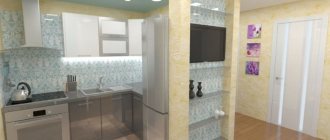
The kitchen has always been considered the most important place in any home and has been given a special role in any home. With the beginning of mass construction of multi-storey buildings, the kitchen area is gradually being reduced in order to save space.
In many apartments, the kitchen welcomes guests and hosts intimate gatherings over a cup of tea. Modern technology does not take up much space and there is no need to allocate large rooms for this purpose. Fortunately for many housewives, the modern range of kitchen colors has no boundaries. You can choose a style and color to suit every taste and age.
Designers strive to please everyone, without the slightest exception. The most popular according to the latest fashion trends is the kitchen in burgundy color.
Combinations with burgundy color in the design of the headset and work area
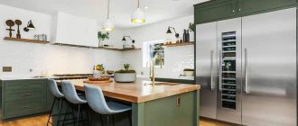
Harmonious combinations include burgundy with white and black, with gray, milky and beige; with chocolate and wenge colors, as well as other wood shades. Any of the duets can be used in each of the existing styles with the appropriate surroundings.
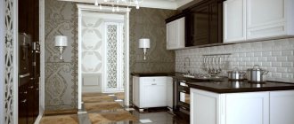
- The burgundy set looks luxurious in combination with milky, beige and chocolate shades. The tabletop and apron, furniture parts, frames for facades, fittings, and doors of household appliances can be made in these colors. Various materials are used, including wenge wood, the color of which also harmonizes with burgundy. It is wenge that can make such a kitchen not just aristocratic, but also exclusive due to the unique pattern of this wood, in the texture of which golden notes are also visible, which can be seen in the photo below.
In the photo - wenge+bordeaux+vanilla kitchen set - The design of a burgundy kitchen in combination with black and dark gray looks stylish and solid. Matte dark tones make the interior of the room strict and rational. Even in a classic style, a gray apron or simply a painted work wall in this color will highlight the depth of burgundy. The set can be finished with patina, various moldings, overhead columns, friezes and capitals, which will emphasize the style and nobility of the interior.
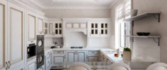
- In modern rooms, glossy burgundy-colored surfaces harmonize with both soft milky and beige tones, as well as white tones. In a classic kitchen it will look amazing if you use mother-of-pearl in the decoration of the facades, and in a simple and technologically advanced work area it can be frosted glass in the upper facades, a sparkling clean white apron made of ceramic tiles, and a snow-white countertop. But, interestingly, white cannot be dominant in the interior, as it makes the room unpleasantly sterile. The next photo shows that then the wallpaper or any other wall decoration is done in softer colors, which will smooth out the radicalness of the color of ideal purity.
In the photo, metal and mirror surfaces dilute the expressive design - Interesting, but less used combinations are burgundy with orange and light turquoise shades. Orange color is used in imitation brickwork, of course, in limited quantities. This could be the apron of the work area or the corners of the room next to the set. In a loft style, such a brick can acquire notes of gray ─ as if a coating from technological processes taking place in a once abandoned workshop. In this case, the mother-of-pearl and patina on the masonry look unusual.
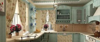
- The light turquoise tone acts as a pastel background for the burgundy set. The kitchen interior is most often done in the Provence or country style of other countries. Then burgundy is used mainly in the lower facades of furniture and only in muted colors.
The magic of burgundy color
Burgundy color is always more advantageous compared to others. It attracts with its luxury and aristocracy and has penetrated our lives so much that it has created its own direction. It is very multifaceted, magically reflecting a lot of shades, from ripe cherries to tart wine.
It has been proven that dark red shades have a positive effect on a person’s mental and emotional state, they increase appetite and improve digestion.
Also, some associate this color with stability and conservatism. After all, it magically calms the nerves and gives a feeling of complete security and self-confidence.
There is a feeling that it will never lose its relevance in the interior. However, it is worth remembering that you should not overuse these shades; they can produce a nauseating effect. In the right doses and in the right combinations, it is suitable for decorating any room. Designers insist on combining burgundy with calmer and lighter shades.
Burgundy kitchen set - playing with styles
Another amazing feature of burgundy color is that kitchen sets of this shade can harmoniously fit into almost any style. However, the safest option is to give preference to a kitchen set in a modern style. There are much more modern kitchens in burgundy tones in the arsenal of the largest Russian, Italian, German and Belarusian manufacturers than the classics.
Photos of burgundy kitchens from different manufacturers
A kitchen with noble matte burgundy facades, made of natural wood or MDF, will look very impressive in an interior design that follows the best classical traditions. Very unusual for a classic, but certainly bright and intriguing.
Glass fronts of wall cabinets and aluminum frame visually lighten the rich dark red fronts
A little golden patina, appropriate fittings, inlays, expensive finishing materials - and the elegant luxury of Art Deco will appear in the burgundy kitchen.
And if you prefer the restrained modesty of country style to flashy chic, then burgundy tones can come in handy here too. In this case, simple, perhaps even somewhat primitive furniture with an aging effect should be correctly complemented with accessories: ceramic tiles or mosaics, dishes, textiles, and other small items.
We replace matte burgundy facades with glossy acrylic, add the shine of glass, stainless steel, chrome parts, built-in household appliances in metallic shades and, depending on the accents placed, we get a kitchen in the style of minimalism, modern or ultra-modern high-tech. Note that the facades of such kitchen sets are usually made of plastic, MDF or chipboard. Enamel with glossy or matte varnish, often with a metallic effect, is often used as decoration.
Burgundy furniture will decorate any kitchen, becoming its “highlight”. However, when choosing a kitchen set of this color, you should keep in mind: it will especially benefit from its proximity to contrasting, primarily light shades, light natural wood and stone, glass and chrome surfaces.
Burgundy kitchen
People who decorate their apartments or houses with taste often resort to a burgundy kitchen. It belongs to dark color shades, which means that it visually brings objects closer.
We can conclude that a small kitchen should not be decorated in this color scheme, but you can use decorative elements in burgundy color. As for large spacious rooms, burgundy furniture and kitchen facades will be the best design solution.
This shade shows little dirt, and this is a big plus, as it increases the functionality of the space. This color is usually chosen by powerful and confident people who love luxury and wealth.
But if you add light colors to the interior, the burgundy color will look more rich and rich. The optimal design is considered to be a combination of beige and burgundy colors. They harmonize perfectly with each other, creating contrast, making the interior sophisticated and more refined, and revealing all the wine-colored colors.
It is worth using burgundy color either in interior decorative elements or in kitchen facades. Otherwise, it darkens the room, giving it mourning and melancholy.
Despite the popularity of wall decoration in wine colors, preference is most often given to furniture of this color range. The top and bottom of the cabinets are made in burgundy color, this is an excellent option for a light tabletop and walls; a dark red tablecloth and chairs would also be appropriate here.
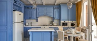
A bold decision would be to combine burgundy with bright colors. Like blue. The main thing is not to overdo it, otherwise your kitchen will look stupid, lose its elegance and will not be pleasing to the eye. A unique solution for a non-standard interior would be a combination of burgundy and gold shades.
Acrylic kitchens: pros, cons, stylish solutions and features of the best design options (90 photos)Decorating the walls in the kitchen: design options and possible tips for choosing decorations (85 photos)
- Skirting boards for the kitchen - the best designs and materials. Tips on how to choose a plinth (75 photos)
Kitchen interior with different stylistic directions
Classic style. Matte burgundy-colored facades on cabinets and hanging shelves will be unusual and bright accents for this style.
For high-tech, modern, and minimalism, acrylic kitchens with facades that have a glossy and bright surface are suitable. Chromed metal fittings and glass elements will highlight your chosen style.
An antique wooden set will go perfectly with country style. And as an addition, use ceramic dishes, mosaic tiles, homespun textiles, etc.
For art decor, a burgundy set with gold fittings and expensive finishing materials is well suited.
The best options for kitchen corner sets for a small kitchen (100 photos)How to choose the right floor tiles for the kitchen: types and selection tips
Kitchen design ideas in gray tones (100 photos)
“Ripe cherry” in the interior
Any color in the kitchen can either dominate or perform an additional or accentuating function, favorably emphasizing individual elements. Its overall perception always depends on the presence of contrasting tones and their total number. For example, if the kitchen design involves finishing the walls, ceiling and floor in light shades, then dark cherry furniture in the interior will look harmonious. But if you decide to paint the walls in a dark color, then it is recommended to choose a kitchen set in sandy shades, and the flooring in light colors.
It is important to remember that dark cherry walls are only permissible if the kitchen has good natural light and its layout is oriented towards the sunny side.
Cherry blossom goes harmoniously with:
- white;
- beige or pale yellow;
- soft orange, peach or sandy;
- light gray.
Such combinations are considered when thinking about kitchen design in different styles. Such combinations are especially appropriate for African and Asian trends, romantic and modern interior solutions. Pale shades mute the active cherry tones, soften the overall atmosphere and create a cozy atmosphere.
Combination with other colors
The most popular shade of cherry color in the interior is “ripe cherry”. It is used for furniture facades, floors, walls and decorative elements. But there are also other options - “pale cherry” and “rotten cherry”. In the first case, the cherry color turns out to be pastel, and in the second, it combines “brick” and burgundy.
- The combination of white and cherry color is a classic. Their contrast successfully emphasizes the dazzling snow-whiteness against the background of juicy cherries.
- The combination of beige or pastel shades with cherry color makes the atmosphere in the kitchen warmer and more tender.
- Gray in a cherry interior looks aristocratic and elegant. And silver is amazingly harmonious.
- The union of cherries and greenery is profound, thanks to the variety of shades of light green (from pale pastel to olive).
- Combinations of cherry and blue should be treated with caution. In particular, azure and turquoise in large quantities will give the kitchen coldness and formality, depriving it of the comfort and warmth of a home environment. But small elements or small curtains will make the interior fresh and airy.
- The tandem of black and cherry in the kitchen does not always turn out to be coordinated, although this option is close to the classics. In fact, there may be notes of inhospitability in the interior of the kitchen. But if you add white to these two colors and reduce black to a minimum, the results will be fantastic.
- Adding orange and coral to cherry shades can ruin even the best design solution or, conversely, turn a simple interior into something stunning.