Features of Tiffany interiors
Tiffany, like other shades of turquoise, is created by mixing green and blue. It is very beautiful, mint, associated with luxury, grace, and sophistication. The color gained particular popularity after the release of the film “Breakfast at Tiffany’s” with Audrey Hepburn. The main character dreams of a beautiful life and diamonds from the Tiffany & Co jewelry store - a kind of symbol of wealth, chic, and splendor. It was the founder of this store who was the author of a special stained glass technique and introduced into fashionable use the color named after him.
The distinctive features of styles using Tiffany shade are as follows:
- a combination of simplicity and elegance;
- lots of open spaces, no clutter;
- respectability, apparent high cost;
- comfort, high functionality;
- lack of excess and abundance of decor;
- inclusion of advances in new technologies;
- use of applied arts;
- a combination of pastel colors and bright accents.
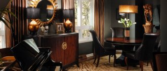
Tiffany styles include unusual furniture, interior doors, interesting palettes of colors in wallpaper, various stained glass windows with landscapes and natural motifs, paintings, floor lamps, and chandeliers. Modern materials in these types of designs can be combined with vintage accessories: watches, vases, forged items, decorative panels and mirrors. It is important to avoid corners and straight lines; only smooth curves are valued.
Tiffany style lamps are made of frosted or mosaic glass; they are bright, luxurious, and personify impeccable taste. It is best to use several light sources at once: this way the room will be sufficiently illuminated. Textiles for a Tiffany room include curtains, tulle, carpets with natural patterns, floral patterns, and ornate patterns. Intricate arches, openings, and asymmetrical elements are required. Popular materials include wood, fabric, and natural stone. Parquet, less often laminate, and stone tiles are usually laid on the floor.
The history of the Tiffany style
This amazing color is the hallmark of Tiffany & Co stores. The company was founded by three young men in 1837 with a $500 loan to sell fashionable, stylish items and jewelry. Its head was Charles Lewis Tiffany, who came up with all the brand attributes. Products from the store began to be packaged in delicate boxes with a white ribbon. This is how the mint-turquoise color acquired the name of the fashion house.
The choice of shade was a successful marketing move, because at that time it was already in fashion, but did not have such a bright name. The color symbolizes sea freshness, rain-washed foliage, representing a cross between mint, aquamarine, and Prussian blue. Now the name of the color is protected by copyright, it is popular with the most famous fashion houses.
How to apply tiffany color correctly
The use of shades of blue-green is allowed in the design of different interiors. Tiffany can be a background or an accent, in any case, it will perfectly refresh the atmosphere in the bedroom, living room, or kitchen. The furniture set and bed in Tiffany color look beautiful. Elements such as stairs, stucco molding, moldings, plaster figurines, and accessories will look original: they draw attention to themselves and give the interior a feeling of completeness.
You should not use too much tiffany in one room: this will make the design too cold. For example, in a turquoise kitchen you can decorate an apron or countertop in combination with the floor or dining area. In the living room, it is enough to use mint curtains and sofa pillows; for the bedroom, a bedspread and soft ottomans or capes on chairs are enough. In any room it is worth adding small accents to the picture in the form of photo frames, vases, and candlesticks.
Tiffany color can be combined with many other shades:
- Beige and light brown tones. Typically, turquoise helps to dilute a boring environment, giving it freshness and energy.
- White. This combination is considered ideal, harmonious and refreshing due to the contrast. Caution must be observed in rooms where there is little natural light - a cold color scheme can “cool” the environment even more, making it lifeless.
- Blue. Due to the similarity of tones, this combination is also considered successful. Tiffany, as a rule, acts as a background, and blue serves as a bright accent.
- Green. The combination of light Tiffany tones and bright green details makes the room lush and beautiful in spring.
- Pink and lilac. When comparing colors, you can get interesting options that are very popular in the West. Such duets are often used to decorate girls’ bedrooms.
- Yellow. A bright, unusual interior that is suitable for a boy is a combination of Tiffany and all shades of yellow and orange. In addition, this design is characteristic of a number of avant-garde styles.
- Red and brick color. In combination with Tiffany, it reflects a bold approach to decorating a room, which will appeal to creative individuals and people who value non-standard solutions.
Code and color model on the Pantone palette
According to the patent protecting the authorship of the color, Tiffany has a unique digital code - PMS 1837. It reflects the year the jewelry company was founded. The documents describe the color as "pale blue with a greenish tint." In the Pantone palette, the tiffany color also has its own designation - #OABAB5, it is formed by combining blue, green and a drop of red.
All about Tiffany color
Is Tiffany a hyped fashion trend and brand with exaggerated significance or a truly unique color palette? Some people go into “wild” delight just at the sight of everything that is made in this exquisite color shade. Others do not see anything special in this, believing that there are more pleasant palettes in the world that can create a much greater sensation in the minds of people.
It is this contradictory opinion that has been floating around in society for more than a hundred years. There are clear supporters of everything that is made exclusively using this range and palette and a group of people who do not see anything super strong and “cool” in this color scheme. They have every right to do this; human taste is a refined matter and requires a delicate attitude . Conflict of opinions is what makes each person individual.
What is this ambiguous color scheme? If you look from the outside, the Tiffany color has variations from soft blue to a rich, almost blue hue. The classic version has special designation codes: in hex: #81D8D0; RGB: (129, 216, 208); CYMK: (0.4028, 0.0000, 0.0370, 0.1529). It can be associated with the color of the sky and sea . Often designers use various variations and additions to the palette, because they want to bring something new to their decisions, to find a compromise between the tastes of the public. Although the peculiarity of the palette is also such that each person sees it in his own way . This adds zest and a touch of sophistication to it, making it especially pleasant and attractive.
that the color “Tiffany” originally appeared . It is not difficult to guess that it was first used and popularized by the jewelry company of the same name, trying to find a way to stand out from the mass of similar companies in the world , to become truly unique and inimitable. Which she did. In 1873, a name was introduced for the color shade and even copyright was issued. For this reason, if you choose to use a color shade presented in this article, use a different name to refer to it. For example, “pale blue with light shades of green.” This will allow us to delicately sidestep the issue of violation of the rights of the author of the Tiffany color.
Ingenuity and timely, subtle marketing moves made it possible to increase sales many times over, turning it from a modest small company into a world-famous brand.
Due to its special display and perception by people, “Tiffany” has found application in the design of weddings, the production of fashionable clothing, the production of colorful packaging, as well as in web design when creating various Internet projects . Printers do not stand on the sidelines and add color variations when designing business cards, booklets, brand books, marketing kits, souvenirs and other products.
You can find the use of “Tiffany” in the implementation of design projects for apartments, office and commercial buildings. Color shades and the ability to combine with other color solutions allow you to make the perception of children's rooms, bedrooms, halls, and bathrooms pleasant.
The color goes well with neutral tones (white, gray, silver), shades of brown and chocolate. Green, yellow and orange can enhance the effect of use. The combination with a red tint allows you to focus attention on any object. Want to add an air of mystery? Add purple or lilac notes to the duet.
Thus, by choosing “Tiffany” when designing any project, you can not only stand out from the masses and add a touch of sophistication , but also combine it with other shades and colors, which will make you unique . Don’t be afraid to experiment with color, bring in something new, change it to suit your sophisticated solutions. After all, following this path, the Tiffany campaign also achieved success, becoming a world-famous popular brand.
In what interiors is turquoise appropriate?
The tiffany shade can decorate any room: from the living room to the bathroom; it will be appropriate both in Khrushchev and in large, spacious houses.
Mediterranean style
Mediterranean style is simple lines, natural colors, including shades of the sea. Among the textures, the popular use of stone, decorative plaster, wood, fabric, mosaic and tiles. Tiffany color is ideal for this style; it will give a unique look to the living room, bedroom, and kitchen. It is recommended to combine this shade with sand, white, dark turquoise, and delicate terracotta.
Modern high-tech
For this style direction, the most modern materials and equipment are selected. Since the tiffany shade was originally intended to highlight metal and precious stones, it can be used to perfectly emphasize the nobility of chrome, glass, and metal parts. It is permissible to use Tiffany in decor, furniture, and other finishing elements.
Cultural characteristics
When decorating a room in different national styles, you can use a tiffany shade to complement the room decor with interesting traditional motifs. It is only important to combine it correctly with other tones so as not to deviate from the main idea. Most often, the fresh color of mint is used to draw Indian ornaments, Japanese painting, as well as in country and Provence styles.
A little crazy
The tiffany shade helps to come up with beautiful combinations that would look rough or too colorful with other colors. For example, they can beautifully paint walls and even ceilings, focus attention on fancy furniture, everything will be limited only by the designer’s imagination.
Home office design
The office workspace should be designed discreetly so that nothing distracts from productive work. But minimalism in an office setting does not at all contradict the possibility of using a blue-green shade. On the contrary, work productivity in a room that is too boring may decrease. You can add some bright accents to simple furniture (for example, the Shatura brand), which will add freshness, cheerfulness and improve your mood.
Vintage and retro
Tiffany goes well with a variety of vintage items and antiques. These include antique furniture or furnishings that have been intentionally aged. Typically, such techniques are used in shabby chic, Provence, retro, and vintage styles. It is even possible to use wallpaper such as an aged texture, which is produced by many well-known brands from Belgium, Germany, and Holland.
Use of color in the interior
Tiffany color will be appropriate in almost any room of the house or apartment, and not just where there is water. Its similarity to seascapes will give the room a clean, light and incredibly fresh look.
In the living room
The whole family traditionally gathers in this room and welcomes guests. When choosing shades for the hall, you should take into account the opinions of those living in the house, although Tiffany, as a rule, is liked by the majority. It is better to decorate the room with calm, neutral tones, making them the background. Using delicate blue-green tones, they create interesting accents that will radically transform the space. Such details include poufs, covers for sofas and armchairs, and curtains. If you get bored with such a range, it will not be difficult to change it.
In the kitchen
You can introduce Tiffany into the kitchen interior in different ways. It is allowed to paint the walls, lay out bright tiles on the kitchen apron, and decorate the facades of the furniture. In the latter case, mint-white sets look great, in which Tiffany is combined with white and looks elegant. For a calmer version of the headset, you can use a light gray shade instead of white.
Glossy finishes in the kitchen fit well into modern styles, such as high-tech. For country interiors, it is better to choose matte surfaces, wood, and externally aged materials. Household appliances in Tiffany color are an original choice, although they are not easy to find. Blue-green hues are believed to slightly reduce appetite, which will be beneficial for dieters.
In the bedroom and nursery
Tiffany in its delicate variations will give the bedroom a feeling of romanticism and charm. The turquoise palette is an excellent solution for a marital bedroom or a little princess’s boudoir. In a boy’s room, it is better to use darker shades of turquoise in combination with gray, coffee, orange, chocolate, and burgundy.
In the office
The invigorating notes of mint will not hurt in a room where a person will work regularly. But don’t be too zealous, otherwise the office will turn into a romantic place, which should not be allowed. Despite the use of such a rich color, strictness should be observed in shapes and lines. All accessories should be simple and prim. Figurines, vases, lamps, organizers, rugs - this is an acceptable list of details that will serve to accentuate different areas of the office.
In the bathroom
Tiffany color looks organic in the bathroom; it is suitable for decorating walls, floors, suspended or panel ceilings. There are brands that produce a whole line of tiles of similar shades (for example, Cersanit), from which it is possible to create original combinations. Tiffany is also suitable as a color for furniture, accessories, sinks, textiles, brush cups, and laundry baskets.
Valid palette
Tiffany belongs to the cold range, but reminds us of distant islands, relaxation, and the beach. Because of this, it is difficult to actually call him cold. You can combine it:
- with white;
- gray;
- creamy;
- brown;
- bronze;
- pale pink;
- beige and more.
It’s intuitively easy to determine what turquoise goes with, but you need to adhere to the style framework and focus on them.
Color combination with Tiffany touch
Pastel colors and rich shades may be present - bright turquoise. The muted range balances it out. Burgundy, mustard, gold, blue, green contrast with it and do not allow it to disappear or become faded.
For small and spacious kitchens
It is believed that in the kitchen the interior should be dominated by warm colors - orange, red, light green, and so on. If you add blue and purple to them, they will turn into a spectacular bouquet that will look great in the kitchen, with an interior design in the Tiffany style. Turquoise is appropriate to use.
Kitchen design in Tiffany colors
This style implies space, the absence of unnecessary furniture and objects. Stained glass is shards of glass from which the artist creates a canvas. They have chaos, but they are orderly. Much attention is paid to details, and yet the style tends towards minimalism.
A mess of bright elements is inappropriate in it; overload with them should be avoided. They must create an ensemble, a picture. Even an apple accidentally forgotten on the table will contrast with turquoise. It’s hard not to notice it, as well as the cup and candlestick. They will be a distraction. A Tiffany style kitchen should have a lot of shelves that organize all the details in a timely manner.
Spacious kitchen
The color of Tiffany in the interior of a kitchen that is spacious or, on the contrary, small, will cause inconvenience - it may seem so because of the important role played by order and disorder. In fact, it will give you a good mood and carefree. It will be easy to cook and put everything in its place.
Aesthetic pleasure will be provided by food beautifully placed on a plate, and beautifully arranged dishes and vases. This style is not as strict as baroque or romanticism, it implies play, and does not tolerate falsehood.
In the living room design
Is it possible to decorate all the rooms in a house or apartment in Tiffany style? Of course yes. Functional features are of great importance, which must be taken into account when choosing an option for implementing design ideas within a given style.
The living room can be the way its owner would like to see. Often they try to fill the living room with luxury, to create an atmosphere of prosperity and well-being. This is a tradition. People usually spend time here with friends and acquaintances. Making a good impression on them is, of course, important.
We must make sure that the conversation is relaxed, everyone is interested and having fun. It is rational to buy furniture painted turquoise. The living room will be transformed. You can buy a stylized floor lamp or chest of drawers. A turquoise carpet, a wall combined with elements of other colors, a chandelier made of glass mosaic, stained glass - a great idea. What do turquoise curtains go with? With tablecloth, pillow, flower pot.
The flight of fancy is not limited. Tiffany color in the living room interior; the first element added will awaken intuition and help unleash creativity. A win-win combination will be created. An alternative is to contact a specialist for help. He will draw a sketch.
For the bedroom
Visit a ski resort, go to the forest or go to distant tropical islands - which is preferable? Tiffany color in the bedroom interior invites you to dream. It's full of romance. This is what you need for interior design in the bedroom. The elements can hypnotize. Even if the day was busy, you will be able to get enough sleep. If the day has gone well, this color will give you additional energy - for a date, a conversation with a loved one, or watching an exciting program on TV.
Since zoning is sometimes carried out in the bedroom, not the entire area is allocated for relaxation, you can choose: decorate the area near the desktop or the part where the bed is with turquoise.
A bedroom with an interior design in the Tiffany style is luxury and harmony in the soul. Turquoise goes well with elements from other styles. Excessive pomp is sometimes unnecessary, as is restraint. It is important to repeat stylistic features, but they should not limit self-expression. Stained glass windows, associations with magnificent jewelry from the famous jewelry company Tiffany and Co. are what you need.
Is Tiffany suitable for a nursery?
Parents always wish their children happiness. They clearly understand that instilling good manners is important. This is a responsible task - raising children. It is appropriate to choose this style for the design of a children's room. Its creativity, brightness, clarity and conservatism will appeal to a child of any age.
Stained glass windows are, of course, not a toy. It is important to use less fragile, safe stained glass windows to decorate a child’s room. The topic may be close to the child’s dreams. One kid wants to become a president, work as a diplomat, the other wants to be a fashion model or a famous couturier. Perhaps the child will become a jeweler. This idea will appear and turn into a goal, because the parents once chose this style to decorate the children’s room.
The Tiffany color in the interior of a nursery is relevant, even if the style is different. It will add variety to the palette. This is a cheerful color that has an extremely positive effect on your mood, which is important for study, growth, and everyday activities.
Color in furniture, textiles and decor
Experienced designers note that bright colors should appear at least three times in the interior: this is the only way accents group elements into a single whole. For example, when buying curtains in a turquoise shade, you should complement them with a blanket, carpet or decorative pillows. A turquoise sofa can be combined with a small table of the same color, and a matching vase can be placed on the cabinet. Tiffany color can be used to decorate the space of any room; it gives enormous scope for imagination and allows you to make the interior fresh and unobtrusive.