How to use orange in the interior
Shades of orange are often called warm colors. They tend to be brighter and seem to bring a feeling of energy and warmth to a space.
To use orange, you don't have to spend a fortune or completely remodel your home to add orange. It pairs beautifully with a variety of shades and will always look at home with neutral tones such as taupes, beiges and grays.
If you are interested in how to use orange color in the interior, then pay attention to the following tips:
- An orange velvet sofa is a must-have piece of furniture for 2020. An armchair with orange upholstery will look no less stylish.
- One of the easiest ways to add a little orange to your decor is to add a little orange to your bedroom. Start with throw pillows and throws, or an orange ottoman. Decorating your bedroom in orange by adding these little details doesn't cost much. You can decorate your bedroom even on a budget.
- We recommend hanging wallpaper with orange elements on only one wall, for example, on the wall near the head of the bed. This will create an accent point for the room that you can work with to use more orange hues throughout the space.
- Bring some bright orange into the space by adding an area rug.
Orange-brown
It can be compared to fallen leaves that are about to be leveled with brown earth. Orange with a brown tint is the color range of maturity. She is a symbol of courage, adventurism and sincere serenity. Because it is a pure autumn shade, it is associated with rich harvests and fertile soil.
Orange-brown goes well with colors like purple and gold. These contrasts are used both in the interior and in clothing. In the first case, an excellent option is dark walls and decor in the form of a mirror in a gold frame or decorative forged shelves made in the classic Baroque style. In addition, a large bed filled with purple silk linens is suitable.
Orange-brown is a very stylish color. It is preferred by both office workers and partygoers. It predominates in outerwear; jackets and coats are most often made from fabric of this color.
What to combine orange with in the interior?
- Orange and green are both vibrant colors. They are almost opposite each other on the color wheel used by interior designers to create pleasing color combinations. You can transform a dull and dull room into a bright and stylish one with this color scheme. This color combination will fit into various interiors such as retro, scandi and modern.
- The walls set the tone for the entire room. The most traditional choice is to paint the walls white or cream. White walls provide a freshness that goes well with any style of furniture. For something more interesting, use subtle orange tones on the walls or add a pop of color to the wall in bright orange. If you're not afraid to make bold decisions, consider painting all four walls a deep shade of orange.
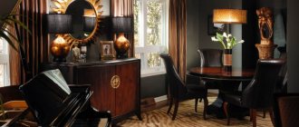
- Who would have thought that dark orange and brown tones could look cool together? The reason this color combination looks so good is because both shades are on the dark side of the spectrum. Together they are ideal for a sophisticated bedroom.
- The combination of gray and orange may give the appearance of traffic cones on the asphalt, but in fact this combination creates a surprisingly complex and interesting color scheme that will look especially stylish in modern interiors.
Don't forget that in any case, a color combination with orange will be extremely contrasting, which means it is best used in small quantities and when you want to draw attention to a certain design element or make an accent color. You could use shades of orange to make your room louder or add extra liveliness to your home office.
Orange color in the interior. Tips for choosing colors (1 video)
What colors does orange/orange go with?
If you analyze the color wheel, and also google on the Internet for the query “how to combine colors”, then you will see, firstly, a color wheel that shows how to combine colors, and secondly, if you superimpose all the combination schemes on one circle , then we can make a simple conclusion that any color goes well with any color. Well, I’ll show you just a few combinations to prove my statement.
Orange color in the interior: design options, photos
Designers create an interior in which a sunny mood always lives using orange. All its shades have the soft power of positive emotions, awaken energy and delight the eye.
Orange color in the interior
As a result of the combination of yellow and red colors, an orange heir, active by nature, warm in character, requiring a sensitive attitude, appeared.
Flesh tones
The combination of orange, pink and white gives flesh tones. In their palette they are very close to peach color. They exude freshness and exoticism. Very beautiful, delicate shades help you immerse yourself in a carefree, dreamy atmosphere. It is not surprising that romantic girls, who are determined to enjoy the here and now, without thinking about tomorrow, choose this range for their wardrobe.
Peachy shades of orange are symbols of Indian interior design. This is a “big family” design, which must have a large, bright living room, pillows, carpets and translucent curtains. In rooms where peach predominates, warmth and light are always preserved. Here you can warm up in the cold and cool down in the hot bliss.
Orange in the interior: color features
It is the orange color that is designed to relieve the blues and awaken sincere children's feelings of joy, surprise, and knowledge. The feeling of fullness of life, interesting discoveries, striving for novelty - all this is given by generous sunny orange. Its main advantages:
- color saturation without aggressiveness;
- harmonious with other shades;
- appropriateness in almost any interior;
- richness of halftones, range of shades;
- belonging to the “warm” color group.
The semantic fullness and energy of orange color can displace other colors and become the dominant theme in the design of a room. A juicy orange hue, a deep amber tone, and a cheerful carrot color cannot go unnoticed in the interior palette!
Designers recommend using orange to place the necessary accents and not overload the space with a rich background.
To unlock the full potential and benefits of orange tones in interior design, you should follow some rules...
Basic rules of orange interior
The rich range of shades of the primary color opens up a wide choice of halftones and room for creativity for interior designers:
- tangerine;
- coral;
- salmon;
- bronze;
- ocher;
- apricot;
- honey;
- terracotta;
- pumpkin;
- rusty;
- peach;
- copper.
An ascending diagram from muted and soft tones to intensely rich, saturated colors allows you to find a suitable color theme, taking into account the functional purpose of the room.
Rule 1 . Bright orange color is appropriate for rooms where activities take place: kitchen, dining room, study, office space, children's room, living room. The energy of light promotes activity and creative inspiration.
Where you need to relax and unwind, lose yourself in romantic impulses, or indulge in relaxation, a rich orange tone is inappropriate. Only soft cream shades and honey edges of color will create a harmony of peace and tranquility in bedrooms, bathrooms, and recreation areas.
Rule 2 . Orange will be a lifeline in dark and cool rooms with north-facing windows. With a warm tone, it compensates for the lack of natural light and relieves depression and despondency. Orange curtains will transform the room and create the effect of sun rays from the window. The lack of daylight is compensated for by interior details painted in orange, peach, and honey tones.
In bright and hot rooms, orange will seem redundant, will not create the desired impression, and will seem “stuffy.”
Rule 3 . A feature of bright colors is the visual enlargement of objects. Therefore, orange detailing will attract attention in spacious living rooms and open dining rooms. A coral sofa will gather more guests than a beige or gray one.
Rule 4 . A palette of orange shades is used to visually correct the space of the room. The walls of a long, narrow room should be painted apricot to make them appear closer and the room to look more spacious.
Combination of orange with other colors
There is no doubt that the color orange has a positive effect on the human psyche. It is no coincidence that associations arise with ripe fruits or sunny days. When orange is combined with other colors, it “pushes” its neighbors. This property must be taken into account when choosing a pair in interior design. The factor of the purpose of the room affects the palette in the design, duets with an orange tint. Pure color is rarely used. The main application is to place important accents.
One of the most common and popular combinations has become a pair of orange and brown colors, characteristic of Oriental and African design styles.
The mutual complementation of warm tones is appropriate in the design of a work area and office, living room, hallway. The gloominess of the dark color only emphasizes the beauty of the leading orange companion. This noble combination has a positive effect on the nervous system. The association with the color of chocolate and ripe fruit appeals to balanced and harmonious natures.
A pair of orange and white looks harmonious in the interior of the kitchen and bathroom. This combination is associated with a sunny day, lifts your spirits, and creates an atmosphere of cleanliness and freshness.
White acts as a background element, orange is represented by furniture and decorative items. This color scheme is ideal, for example, for a kitchen in a minimalist style.
In the kitchen, these shades increase appetite, as the theme of oranges, juicy persimmons, ripe pumpkin, carrots, bell peppers excites culinary fantasies and adds festiveness to every day.
Enlivening the room with a natural combination of orange and green is inspired by nature itself. The summer theme is reminiscent of a flowering lawn, the winter version is New Year's holidays with branches of pine needles and tangerines. The design of the dining room will be harmonious in this noble color pair, reflected in the design of curtains, furniture fronts, chair covers, and decorative items.
For a children's room, it is recommended to choose a pure grassy shade or green apple paints for furniture; complement with juicy fruit themes: peach, apricot, orange - textiles, carpet, curtains. The walls can be a neutral background, in beige or cream colors, so as not to awaken children's hyperactivity.
A rare and expressive combination of orange and black colors. This can be an individual solution for bold and daring natures. This combination resembles the fire of a fire at night and awakens strong feelings. Grayish surfaces of countertops, walls, and finishing elements can soften the contrast. Design in this combination of colors is typical for offices that reflect the individuality of the owner and the brutality of nature.
Orange and gray have become fashionable in interior design due to their versatility and self-sufficiency. The main thing in this color pair is to choose a rich sunny shade, and not to take rusty and “dirty” tones. You can add white touches to window frames and furniture elements. This will emphasize the union of a bright, life-affirming attitude and protective cement strength.
The rare and complex combination of orange and blue seems unfortunate. The secret of their combination is in the selection of warm natural shades, reminiscent of a sea evening or sunset. Interiors with an active color duo in a tropical style and ethnic themes are often found among the peoples of Asia. The famous Provence style includes blue and peach as dominant colors in interior decoration.
Light orange
The classic light orange shade is a lightened color scheme that combines white, red and yellow in equal proportions. This is a very natural shade that is associated with pristine beauty and purity. Since pure orange is the color of adventurism and dreaminess, white adds a little calmness to it and pacifies the hot character of the pure sun.
When combined with blue or cyan, it turns into a cool orange shade, and when combined with pink, it turns into a warm shade. These contrasts can easily be used in clothing design. Excellent combinations will emphasize style and ease. Light orange clothes can be worn every day, dresses can be chosen for special occasions and parties, and classic blouses will emphasize the rigor of an office look.
Light orange color is perfect as a base for painting walls. It adds warmth, but is pretty boring on its own. If you apply any stencil design, the room will be transformed and receive amazing energy. The color is preferred for children's rooms and bedrooms. It lifts your spirits, makes you fantasize, calms you down and makes you serious.
Orange color in the interior: tangerine mood every day
What color does everyone, young and old, like? What color improves your mood and energizes you? What color is synonymous with positivity, hot summer and fragrant orange sunshine? All this is a cheerful and lively orange color; it is rarely found in the interior of an apartment. Maybe it's time to fix this mistake?
The word “orange” hides all the different shades of this color. There are only warm shades here, ranging from light peach, apricot, amber and ending with terracotta, rust and mahogany. But there is also salmon, carrot, tangerine and many others.
This number of shades allows orange to easily fit into all interiors and combine with all styles. After all, light pastels (apricot) and dark muted shades (terracotta) are perfect as primary colors in classic styles, and bright colors (orange, tangerine, coral) are perfect as accents in minimalist and ethnic styles. Orange color can often be found in interiors in these styles: Japanese, Latin American, Mexican, Moroccan, Moorish, Mediterranean, Provence, Scandinavian, minimalism. One listing looks like a trip around the world. All countries want to use a piece of the Sun when decorating their home.
The orange color in the interior noticeably adds warmth. Therefore, this is an excellent choice for north-facing rooms. But for a room whose windows face south or east, it is better to limit yourself to a couple of accessories. Choose something from this list: translucent curtains, chandelier lampshade, rug, vases, bed linen, decorative pillows. Themes of citrus fruits and autumn leaves are appropriate for textiles; you can even make compositions-bouquets of dried orange leaves and flowers.
It is also necessary to remember that orange visually makes objects larger. That's why orange walls in a small room are not the best solution. For some reason, the kitchen and bathroom become especially cramped. Therefore, you should not paint all the walls orange, one is enough, and the rest can be made in a neutral color (white, beige, gray). Just in case, you need to warn that an orange ceiling visually in a room with low ceilings will further reduce the height of the walls.
Those who are on a diet are also not recommended to dream of an orange kitchen or dining room. This color awakens the appetite. But at the same time, it activates physical and mental activity, so the best place for orange is the office, playroom, living room. In the bedroom, only delicate apricot and peach tones would be appropriate. There are different opinions about orange children's. But here it is better to focus on the character of your baby: this color will suit a calm, quiet child, but not a hyperactive child. You can decorate your bathroom in apricot shades, this will give the skin a pleasant color.
Orange color goes well with all shades of wood, brickwork, and wicker furniture. With orange accessories you can quickly and inexpensively refresh the interior of a room, because they attract the eye and distract from shabby upholstered furniture or faded wallpaper. This color, like a small child, does not tolerate competitors, so do not use it as a background for your favorite collection of paintings or figurines.
In order for the orange color in the interior of the apartment to please and not irritate, you need to choose the right “companion” for it. You can either use warm shades of green and blue, or combine it with neutral colors (white, gray, beige). Orange and black are a rather explosive and provocative mixture in the style of hi-tech or futurism, which is best diluted with a neutral color.
You can decorate the room in monochrome colors. To do this, use several shades of orange, and add a little red, yellow and brown as an accent.
If you want to put an orange sofa in the living room, then white, gray, green or light blue walls will help to highlight it. The interior of a room with orange walls will need to be balanced with furniture in neutral shades.
If you think that the orange color in the interior looks too bright, then tone it down with burgundy or dark green.
Also keep in mind that this color distorts the shades adjacent to it. Be prepared for the fact that an absolutely white kitchen against the background of orange walls will appear warm and milky. This is all the magical effect of the eternally youthful, sunny and positive orange blossom.
Yellow-orange
Shades of yellow-orange are obtained by mixing red and yellow in at least a ratio of 1 to 2. To obtain lighter shades, white is added.
Despite the fact that the combination of orange with a predominance of yellow is quite bright, it symbolizes shyness and chastity. At the same time, it is a calm color that allows you to concentrate. That is why it was chosen for road markings and warning signs. This color is often used on posters; it allows you to highlight the main accents.
In clothing, these shades of orange suit people with red hair. This will highlight their features, originality and add brightness to the image. Most often, yellow-orange is found in fabrics for sweaters or T-shirts. Amber-colored jewelry will perfectly complement pale skin.