Read: 3,917
A kitchen in light colors always remains relevant and fits any style. At the same time, light shades can be easily combined with each other and such a kitchen will not be boring and monotonous. A bright room always looks elegant and practical at the same time. To create such a kitchen, it is important to decide not only on the color, but also on the materials for its finishing and furniture.
Kitchen design in light colors
Kitchen Design
Kitchen Design
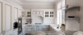
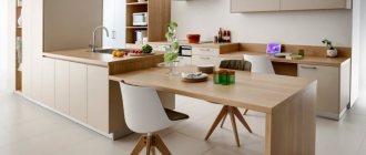
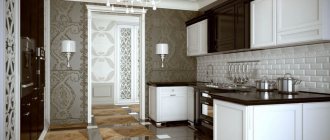
Kitchen in light colors design photo
Kitchen
Kitchen in bright
Kitchen Design
Features of kitchen design in a classic style
A classic interior is considered rich and elegant. With its help, it is possible to focus attention on the most inconspicuous areas in the room. The main condition is to use light colors for decoration. When organizing such a design, you should adhere to some rules:
- It is necessary to use only natural materials for interior decoration: stone, wood, marble, granite.
- For decoration and accessories, it is better to choose round ornaments, for example, additions to the set, curtains, overlays on the facade of furniture should have curved smooth lines or monograms.
- Curtains and other types of textiles must match the main shade of the interior. If some deviation is preferred, then it is allowed to use exclusively pastel colors.
- The room should have a sufficient amount of decor: themed refrigerator magnets, figurines, elegant wall sconces. Even table accessories, such as a salt shaker or napkin holder, are a must-buy. Moreover, they all must have an original structural form.
- Modern household appliances must be of appropriate design. Any manufacturer provides the opportunity to effectively design the appearance. If there is no similar option, it can be made to order.
- The design of the apron requires special attention. Here it is better to use materials such as glass, porcelain stoneware or tiles. It’s worth choosing something with an interesting designer print.
Design in beige Source formulamebeli.com
Beautiful corner set Source kuhny58.ru/
To prevent the appearance of the kitchen from seeming monotonous, it is better to dilute the overall shade with some contrast. For example, dark aprons under light-colored furniture will look great. The play of the coffee-colored floor with the beige facade of the set is relevant.
Classic kitchen interior in beige tones Source brigadir-info.ru
Reasons for using light shades in the kitchen interior
You can use light shades in almost any room. There are many reasons that encourage designers and ordinary citizens to choose these shades. Typically, a bright interior solves certain problems and masks the shortcomings of the room. It is recommended to use light colors in small, cramped and narrow rooms. They visually expand the space and make the room brighter, more spacious and freer.
Read: Countertops for the kitchen - 55 best photo ideas for decorating countertops in the kitchen
Kitchen – living room in classic style
The classic direction is considered quite popular and promising for use in kitchens and living rooms. Here, too, only natural materials and textures are used. Creating a combined interior involves the use of false walls or furniture partitions. Zoning one large room by differentiating the finishing materials used looks interesting.
The color scheme in combined rooms may have contrast. In this case, the participation of warm, soft, pastel colors is mandatory.
On a note! White color is an essential component of the interior, which is found in the design of walls, ceilings and other surfaces. Snow-white kitchen furniture is used less often. This is attributed to its impracticality.
Mosaic tiles on the work apron Source comfortoria.ru
Pink tones go well with coffee. Additionally, they create frames for door and window slopes made of natural wood. The decoration includes large openwork lamps and central ceiling chandeliers. The feature by which the “classic” style is recognized is the presence of candles in the interior. At the same time, they can be artificial, being a spectacular accessory.
Kitchen in a classic style with a window Source freedsgn.com
Shades
One of the most difficult stages in renovation is choosing shades. The choice must be carefully thought out and balanced. The most popular shade is white. This is not surprising, because white is like a blank canvas on which you can create anything. It can be either the main color or complement the interior. But the light shades don’t end there. In the interior of light kitchens, you can safely use the following colors: cappuccino, ivory, pearl and even light blue or soft green.
Read: Wallpaper for the kitchen - 115 photos of modern ideas in kitchen design
There is no need to stop at exclusively white color, because there are still a lot of interesting and not hackneyed shades. In addition, the design of a light kitchen allows for the use of more saturated colors for contrast. For example, all shades of beige go well with burgundy, turquoise and orange. Contrasting colors add a certain sophistication to the room.
Color solutions for the interior of a classic kitchen
The range of shades can be quite varied, although warm shades are welcome. They can be diluted and supplemented. However, the main ones are white, brown, cream and black. In design, they differ in some features.
Modern white kitchen Source kulikov-l.spb.ru/
White
Quite a harmonious and versatile shade. Classic design has been used in practice for many years. It can be found in various decorative elements. Most often it occupies large areas: walls, ceilings, and is used for door panels. The advantages of white color in a classic kitchen interior include:
- rich appearance;
- visual increase in space;
- good room lighting.
As for the disadvantages of this design, this color is considered impractical, as it quickly gets dirty with any careless movement.
Classic design in dark colors Source dizainvfoto.ru/
Brown
Fits very well into large rooms. Often this shade is concentrated in natural furniture and is present in the flooring. Some people use platbands to match the kitchen unit. The advantages of this color include:
- the ability to visually narrow the space in overly large rooms;
- variation of tones from dark brown to beige or coffee;
- contrast of shades of the same color: beige with rich chocolate and others.
Often when decorating a kitchen in this style, the problem of lighting arises. After all, the room turns out to be too dark and gloomy. In these cases, the problem is corrected by installing additional spotlights in the work area and kitchen ceiling.
Classic curtains Source www.everydayme.ru
Beige
Despite the fact that the beige tone is a type of brown, it is very comfortable and multifunctional. If most of the space is filled with such a shade, then a calm atmosphere will always reign in it. For cream or milky tones, an aging effect is acceptable. A similar texture can be found in furniture facades. The advantages of this color are:
- Can be used on any surface;
- moderate room brightness;
- variety of palette;
- use of interesting decor.
Again, cream or beige can be the most out of place stain in a modern kitchen. Therefore, if a color is in harmony with others, it is better not to remove it to the background.
Black
The black tone in nature is considered very saturated. If a kitchen in a classic style is created in this color, then only rough and matte surfaces in the proposed shade are used. Its advantages include:
- relative practicality;
- lack of visibility of fingerprints;
- contrast effect against the general background of the room.
It is known that alone this tone will only repel attention. That’s why they give it beige or milky in addition. Snow-white can only participate in the walls and some decorative elements.
On a note! As an option, this is a gray and smoky shade of a classic interior. For this purpose, it is not at all necessary to completely fill the space with the declared palette. It is enough to design the facade and textiles in ash and gray colors.
Beautiful crystal chandelier Source topstroyinfo.ru/
Built-in oven in a classic kitchen Source ogodom.ru
Apron in the interior with patina
The design of a light kitchen in a classic style is difficult to imagine without an apron. For finishing you can use various materials.
Ceramic tiles are especially popular among housewives. For a classic light kitchen, choose an option from pastel shades. A tile of a contrasting color will give an interesting effect.
The apron is quite often laid out with mosaics. The interior of the kitchen is in light colors and is unlikely to be decorated with a bright mosaic of rich colors. She will benefit from calm, natural shades.
Is it possible to use an apron with photo printing on glass in a classic kitchen? It is quite important to choose the right subject for the drawing. Still lifes, ornaments, city panoramas and black and white images are in demand.
An apron made of artificial stone is matched to the countertop. This duet allows you to achieve completeness of the interior.
Advice! If the funds do not allow you to decorate the entire apron with artificial stone, decorate a fragment in the sink area, and paint or cover the remaining part with wallpaper.
We select furniture according to the rules of style and design: the right countertop in the corner version of the room
Furniture for a classic kitchen in light colors should look rich, elegant and tasteful. Opt for models made of natural wood. For a wooden kitchen, choose linden, birch, pine or beech as the material. Furniture made from these types of wood will add special warmth and light to the interior. Elements with carvings, gilding, and intricate fittings are welcome.
If you are a follower of the classics, but you cannot afford furniture made of natural wood, pay attention to its substitutes - models made of MDF, fiberboard or veneer.
You can save money in other ways. If there is antique furniture in the attic that matches the style, feel free to take it out. A little imagination, time and effort will give new life to grandma’s old sideboard. Don't be shy to check out the flea market. Here you can find examples of classic-style furniture at an affordable price.
Bright kitchens in a classic style are equipped with countertops made of natural stone. A budget option for countertop material can be artificial stone.
It is acceptable to use models with ceramic tiles or porcelain stoneware. Economy versions of classic kitchens have countertops made of chipboard and covered with PVC film that imitates the texture of wood or stone.
The choice of sink and faucet has its own nuances. Stainless steel sinks look inorganic. It is better to choose models made of ceramics or stone. The color of the faucet should match the color of the handles on the furniture fronts. A combination of copper and silver colored elements is not allowed!
A beautiful kitchen in a classic style needs properly selected household appliances. Choose neutral models. Antique household appliances are not a cheap pleasure, but it’s worth it. In addition, you can order built-in household appliances and place them behind the cabinet fronts.
The interior of a kitchen in light colors is stylish when the achievements of science and technology are taken into account in its design. To keep up with progress, use modern ideas for classic cuisine:
- When ordering a classic set, make sure that the hooks on the lower modules extend completely. This is convenient in small kitchens.
- Glass inserts require additional funds. Limit yourself to open shelves or make blank facades.
- For a small kitchen, light-colored facades are the best solution. Do not overload the set with decorative elements.
- Hide the hood behind the front of the cabinet or look for a retro-styled one.
Materials for arranging a classic kitchen
For each design direction, they try to use a variety of types of construction raw materials for finishing. Classic cuisine is distinguished by the fact that it is acceptable to use only natural materials.
Stylistic design of the hood Source www.mebelitalii.ru
Floor finishing
The covering is predominantly natural wood in the form of wide boards or parquet. In reality, such a model is not always available. Therefore, you can create an imitation of wood using a high-quality laminate with a structure and a shade close to natural.
Many people prefer laying artificial stone or ceramic tiles. Such coatings look good in the classic style.
Spacious white kitchen Source my.rehabhelp.biz/
Wall decoration
This direction involves covering walls with wallpaper or textile material. Liquid or decorative plaster will fit very well into the overall interior. It is important to use natural tones when finishing.
Wallpaper is still considered an impractical surface, so owners give preference to super-washable models. When using decorative plaster, dilution with wooden panels is allowed.
You can complement an already finished wall in the work area with a glass or ceramic apron. For such decoration they also try to use thematic ornaments and patterns.
Ceiling decoration
The ceiling area in the classic style does not require any special decorations. The surface should look simple. It will look perfect even in light colors. Typically the main material is drywall. Multi-level ceilings in the same shade are constructed from it.
A good solution is to decorate the joints of the wall and ceiling with elegant figured baguettes. For such purposes, they try to use wide models of planks.
Black background for white headset Source www.chidaneh.com
Furniture
The furniture in a kitchen with a classic interior is distinguished by its naturalness. Wooden models of wall and floor cabinets are used. The dining table can be white or brown. A special feature of such items is their elegantly shaped legs.
Chrome and plastic parts should absolutely not be used. They will only disrupt the overall situation. As a result, the classic interior will turn out to be a failure. Upholstered furniture is characterized by the use of models with natural upholstery. Floral fabrics look good on wooden sofas in the dining area.
You should not refuse headset options that contain carvings and gilding. They perfectly emphasize the main idea of the interior of the room.
On a note! If household appliances do not correspond to the classic style, then it is better to use built-in models. They are easy to hide behind the wooden facade of furniture.
Option for arranging a kitchen with a window Source www.meb100.ru
A few words about lighting and decor
All light sources are chosen based on the free space of the kitchen. For example, if the room has a fairly large area, large chandeliers in the center of the ceiling are suitable. Experts advise using two-level models for such cases.
Candelabra with light bulbs imitating candles deserve special attention. Additional light can be provided using wall sconces in a similar style.
Such elements play not only a working function, but also a decorative one. As for other kitchen accessories, they include:
- long heavy curtains on spectacular wooden curtains;
- the presence of stylish figured flowerpots on the floor, on the surface of which there is a pattern;
- hood with additional wooden linings and shelves. The latter can be used to display figurines or amulets.
If the area of the room is large, then the use of a sufficient number of decorative elements is encouraged. The only disadvantage of such additions is that dust accumulates on them quite quickly. Therefore, from a practicality point of view, decorative items with small details and narrow shapes are best left for other occasions.
Stylish furniture Source imagesait.ru/
Dinner Zone
In a classic kitchen interior, a separate dining area is required. Therefore, its design must be approached responsibly. This object must have the following features:
- only reliable furniture. Even soft ones are welcome.
- the table must have the correct shape: round, square or rectangular.
- In addition to a spectacular sofa, you also need chairs in a circle (they are also suitable with armrests).
- the dining area can look like living rooms, but for this it must be consistent in style and color.
To complement the interior, a tablecloth is laid out on the dining table, small flowerpots with artificial flowers are placed, and textile napkins are placed for each place.
On a note! For additional effect, flexible transparent tablecloths framed in the form of pompoms or bells are used in the design of the dining area. This border is usually golden or silver in color.
Successful examples of kitchen interiors in a classic style
When decorating modern kitchens with a focus on classic interiors, some finishing materials can be combined. The main condition is their similarity to natural ones. There are some very chic ideas for decoration.
Kitchen with island Source inspirabuilding.com
They try to organize elegant furnishings for large kitchens using textured natural stone. For example, the countertops of the work area or bar counter are lined with marble or granite.
Ceramic tile apron in the kitchen Source s-bor.msk.ru
A large brown kitchen in a classic interior is distinguished by the presence of decor on the facade. It features golden-colored lines and interesting fittings design. The main feature of this design is the open niches for dishes. They can be built into walls.
Illumination of work areas Source www.cucine.ru
A classic kitchen in a milky color with decorative overlays looks good with lighting in the shelves and open cupboards. The disadvantage of such headsets is that dust quickly accumulates on the internal surfaces. The marble tiled floor emphasizes the overall ambiance. Dining area - round table with a snow-white tablecloth and chairs.
Kitchen-dining room Source gearbestblog.ru
A large kitchen area is almost always decorated with an additional work area. A dining area with a marble countertop and natural wood counters can have a similar appearance. To separate one space from another, designers advise practicing different shades. Most often it is a brown bottom and a beige top. These headset options are united by massive fittings.
Design solution for a small space Source nsrv.spb.ru/
A medium-sized kitchen looks good in cream color. It is not necessary that the wall decoration matches the façade of the set. It may have some contrast. As for the countertops, they cannot do without natural red stone. The mortise sink is also made from the same material.
Color palette
Obviously, bright colors will not suit a classic interior, so it is better to give preference to calm, natural and even slightly muted shades. The most popular and suitable options:
- shades of beige;
- shades of white;
- brown;
- grey;
- olive.
To these basic tones you can add several rich shades, for example:
- black;
- burgundy;
- dark green;
- Navy blue.
But they must be dosed carefully so as not to overuse the dark range. There are several color solutions for a kitchen in a classic style.
Bright hues
A bright kitchen in a classic style is the most popular design option for such an interior. Different shades of white and beige are used. They provide the pomp and solemnity of the room, which are so important in a classic interior.
In this case, the walls remain plain or with a dim pattern - wallpaper is most often used. It is acceptable to use other decorative elements:
- stucco moldings;
- decorative plaster;
- panels;
- moldings.
It is desirable to have wood on the floor, or at least an image of it, for example, on porcelain stoneware.
Bronze and gilding will serve as excellent companions to light tones. If gilding must be used carefully and in doses, then with bronze there are no restrictions. You can find her:
- on the mixer;
- chandelier;
- in the form of interesting patina options on facades;
- and even on equipment with a bronze coating.
A combination of light and dark colors looks very beautiful in a classic kitchen.
Dark colors
This design option is only suitable for a spacious room, since dark colors can visually reduce the space, which is not what you would want in a small kitchen or studio.
The use of dark and even black tones adds a touch of modernity to a classic kitchen. And gilded decorative elements will become even more luxurious. But you can’t use black alone, since the design will quickly turn from classic to gothic.
There are dark brown, dark gray and dark blue options. These tones always look noble and aristocratic, so they are perfect for a kitchen in a classic style. But it is the contrasting combination of tones that best emphasizes the depth of color, so two-tone kitchens in a classic style are not uncommon.
Green
You rarely see green in a classic kitchen: it’s difficult to find a noble shade. Most often it is emerald or malachite - these tones will look “appropriate” even on facades. In this case, the environment in the form of walls, curtains and a work panel is chosen to be more neutral, for example, beige.
A gold or silver patina looks very beautiful on a green surface. Brown also goes well with green, but it shades it and does not reveal all its beauty.
Blue
And blue can be found in classic-style kitchens, but most often it is used as accents. For example:
- headset on the handles;
- in the countertop;
- apron with a pattern;
- decoration of the bar counter;
- textiles;
- wall patterns.
Sometimes the blue color can be found in a set, but most often it is used only on the lower part, so as not to overload the interior and not lose its sophistication. Goes well with brown.
