Kitchen design
0
1 235
Share
The choice of kitchen wall color should be taken seriously. After all, this directly affects the well-being of the people in the room.
Color also affects appetite and performance, so choosing the right color for the walls in the kitchen is an important issue.
- Choosing an interior style
- Color selection
- Interesting ideas and useful tips
Basic rules for combining colors in the interior
The basic rules for combining colors in the interior are as simple as two: don’t try to embrace everything at once and don’t use all the colors you like at the same time!
It sounds simple, right?
But when it comes down to it, this is what begins: “Or maybe I should buy an apron for this red tabletop, in a lilac-coral tone? Or, in orange-red? Or, in terracotta brown? No? Too much? Then maybe we should buy purple chairs and curtains?”
As a result, we get what we said initially: an overload of bright elements that form a chaotic mess in which not a single object “plays.”
And no matter how difficult it may be, you need to highlight ONE thing that you would like to pay attention to first!
We will tell you exactly how to do this a little below, but now we will reassure those who want everything at once.
For such cases, there is a wonderful “Boho” style, which we will also talk about later, in the corresponding subsection. This is where excesses are welcomed and you don’t have to worry about overdoing it.
Color combination rules
Colorism divides the entire color palette into light - dark tones, warm - cold, pastel - saturated. Achromatic - white, black, other colors - chromatic.
Color circle
The designers came up with a color wheel, the center of which is a triangle (3 main colors - red, blue, yellow). The edges of the triangle are additional colors formed by combining the first three. Red plus blue will result in purple, blue with yellow will result in green, and yellow with red will result in orange. The primary colors make a perfect combination with each other.
Color wheel for choosing colors in the kitchen interior
Contrasting colors go well with each other and are opposite each other in a circle. Related-contrasting colors are those obtained by adding a third shade to two - orange, light green with the addition of yellow.
Organic combination of yellow, green and beige in the kitchen
Important! The most harmonious combinations of colors are 2 contrasting colors, 3 colors forming a triangle on a circle, 4 colors forming a square. These are the most complex color schemes.
Achromatic kitchen
A monochrome interior - white, white and black - can be made not boring at all. White color creates a feeling of spaciousness and adds light to a small kitchen. Snow-white is the color of harmony; it eliminates negativity. When choosing a white tone to decorate your kitchen space, pay attention to warm shades; they open up the walls and create a positive mood.
A white kitchen does not mean sterile, blinding monotony - the snowy facades of the kitchen unit can be complemented by marble stains on the countertop, light splashes on artificial stone. Matte or chrome roof rails will also harmoniously fit into the interior of a monochrome white kitchen.
Achromatic interiors include combinations of black and white, because both do not carry a color load. Popular combinations of black and white in the following styles:
- Minimalism;
- High tech;
- Scandinavian.
The design of the kitchen space can be complemented by household appliances in a metallic case (silver, black), moldings, and roof rails.
Lighting is of great importance in such a kitchen - cold snow-white will emphasize silver details, placing emphasis on them, white furniture can be illuminated with colored LED strip.
Colored kitchen
The influence of paints on the psyche and human behavior has already been discussed above. The right combination of colors in a kitchen design will become a means of creating a style; with the right selection of color variations, they will complement and enhance each other.
When combining colors, it is recommended to use the following techniques:
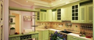
- Monochrome - the use of lighter or darker shades of the same color. For example, light green, spring greens, rich deep herbal or lime, olive plus moss color.
- Related colors are located on the color wheel in close proximity to each other.
- Contrasting - are at opposite ends of the color wheel: lime - purple, yellow - blue, pink - light green.
- Related-contrasting, when a third is added to two shades. Successful combinations are red with purple, pink or blue with lilac, violet.
When choosing combinations to create a kitchen design, consider the influence of colors on the human body and psyche:
- Red – causes excitement, increases blood pressure;
- Brown, wood - tends to melancholy, depression;
- Gray evokes despondency and melancholy;
- Blue – induces sleep.
Important! Light, pastel colors cause a surge of energy, dark ones - black-violet, anthracite, dark blue, on the contrary, lead to a loss of strength and reduce vitality.
Rule 60/30/10
And here is another rule, more specific and most useful. Perhaps, besides this, an amateur should not worry about anything else, since it works 100% effectively.
Law 60/30/10 means that the interior should have no more than 3 color schemes, and their distribution is as follows:
60% - dominant color 30% - complementary color 10% - accent
Attention here!
The dominant color is not the one that is your favorite and that you want to use everywhere.
The dominant color is the background color against which other colors will be clearly visible: the additional and most important one on which you want to focus.
For example, if you really like the color red, then to ensure that it is noticeable, but at the same time unobtrusive, you only need 10%. And nothing more.
The meaning of this law is shown very well in the photo below. Unfortunately, this is not a kitchen interior, but the main thing here is to show you the rule with a live example:
As you can see, following this rule, we get an interesting effect.
The room is essentially beige and brown, but we see it as yellow!
And, if you overload the accent, the look will look something like this:
Looking at this photo I remember: “Horses and people mixed together…” ©.
And for some reason we are sure that the owner of the interior wanted to emphasize the red color, but simply went too far.
But in the end, against the background of this bright red spot, neither the kitchen furniture, nor the stylish hood, nor the beautiful tiles on the apron are visible at all.
Of course, there will be designers who will immediately say: this is not bad taste, it’s just a monochrome interior (that is, in which there is one color and all its shades).
But, you yourself understand that this is just a beautiful theory and words. But in reality, we just see a red spot that hurts our eyes.
So, you have to think carefully and decide what is really important to you.
And one more thing: the three-color rule does not mean that you need to choose only three colors.
It means that 3 color schemes are allowed.
That is, if you have a light beige wall as a background, then the floor can be made dark beige and the carpet almost white. But, all these shades need to be included in 60% of the original percentages.
The same goes for the second color and accent color. But, here too, without fanaticism. A spread of two or three tones will look organic, but a big contrast will look like two different color schemes.
Naturally, the room cannot do without a fourth or fifth color. No other way. But their share should be very small.
We identify the most important subject on which we would like to focus
So where do we start? Of course, by choosing a detail or object that you consider the most important and beautiful of the entire environment.
It could be:
- Wall decoration
- Finishing the work apron
- Kitchen furniture
- Stylish accessories
- Latest household appliances
No matter how much you want, you need to choose one thing that you want to focus on. And it is this element that should include the main color that you focus on (in a ratio of 10% of the rest).
Let's say you have an incredibly beautiful work apron on the wall, red.
Then, you focus on it, and add a little more red in the form of splashes to the rest of the details: a small inclusion of red in the chandelier, paintings, decor.
Very small, please note! So that in total you get only 10% red.
But, let's look at each point in more detail.
We start from wall decoration
If you dream of an unusual and eye-catching wall decoration, then you will have to say goodbye to the thought of too bright furniture, flashy accessories and unusual floor coverings. Walls that are decorated pretentiously are very obliging.
And so that you can take a good look at them, you will have to give up other things and choose them as neutral in appearance and color as possible.
If you're willing to give it all up for colored walls, then go for it!
If you want to emphasize the intentional asceticism of the walls (for example, just white, without decorations or other embellishments), then you need to select contrasting accessories, against which the white wall will look very appropriate and elegant.
This refers to paintings, chandeliers, shelves, etc.
White walls
The combination of white in the kitchen interior is possible with almost any color in the spectrum.
But, if white is taken as the background, then the best second color is the color of light, natural wood. And already accented - whatever you like.
It’s simply impossible to come up with something better!
With this classic combination, almost any accent will be appropriate, except dark brown and black.
But if you make black the second color, and wood the accent, you get a very elegant look!
In a word, the combination: white wall + unpainted wood is a classic that is good in any interpretation.
Colored walls (photo wallpapers, ornaments, etc.)
If you have flashy walls, then the furniture should be as simple and unobtrusive as possible. Otherwise, these walls will simply mix with the cabinets and there can be no talk of any elegance.
The combination of colors in this case should be something like this: a colored wall and plain furniture, moreover, in a contrasting color, and not in the same color scheme.
The best option for the second tone in this case:
- White
- Grey
- Brown
- Black
If you find it difficult to choose a good contrast for the second tone, then you can use the color selection spectrum.
Moreover, it is better to do this online, on a special service: colorscheme.ru
There you can choose both contrasts and mono-color colors.
If you figure out how to use this site, then you will never again be faced with the question of how to correctly combine colors in your kitchen interior.
Stone walls
A stone wall is a very bright decorative element that doesn’t go well with anything other than white and light beige.
Any other color will simply “kill” the natural color of the stone, and it will not look expensive.
But if the stone itself is white, then it’s easier in terms of selecting a second color. But here you still need to take into account that not every furniture material or other decoration is compatible with stone.
There can no longer be any plastic, MDF, or metal here. Only natural materials and the simplest possible design.
Walls with stucco or plaster designs
If there is modeling on the wall, then it is best for the main background to be white. The stucco design can be absolutely any and it is better if its color is an accent color, that is, it makes up only 10%, which we talked about above.
Impact on perception
A competent combination of colors in the kitchen interior can arouse or dampen your appetite. The following have beneficial powers:
- green apple color;
- “raspberries with cream”;
- chocolate;
- lactic;
- yellow;
- red;
- pink;
- orange;
- caramel shade.
Advice. A subconscious influence on the process of assimilation of food will help women losing weight tame their appetite and normalize digestive processes. In families where the child does not eat well, make the eating area in an “appetizing” color scheme.
It is recommended to use visual stimulation of the appetite center in the subcortex of the brain. To do this, paste photo wallpapers with images of fruits, berries, citrus slices, favorite desserts or dishes, as in the photo.
Remember what suppresses appetite:
- blueberry color;
- blue;
- grey;
- lilac;
- lilac;
- violet;
- metallic shades.
When choosing a color scheme, you need to remember that the background will dominate the rest of the palette. The kitchen set will merge with the walls of the same color. A motley dark pattern of washable wallpaper or tiles will set off well a plain white or beige “kitchen” with a glossy facade. If the cabinet doors are decorated with a colored print, it is better to choose plain walls.
Important! It is advisable to first consult with each family member before renovating and choose an option that will suit everyone. If this is problematic, try to exclude from the undesirable list everything that causes categorical denial among the majority. Then it will be easier to navigate the remaining options.
Kitchen interior in a combination of different colors
Modern kitchen design in color combinations
Light colors in the kitchen interior
From a work apron
A bright work apron is such a detail on which a lot depends.
If you make colorful walls, then its beauty will fade. The same applies if the kitchen furniture is matched to the tone of the apron.
For example, now quite popular combinations are: a colored apron made of tempered glass and a bright kitchen to match.
This is ugly, to put it mildly. And too intrusive. This is what it looks like:
If you have a colored kitchen, then no colorful aprons! This is the law.
If the apron is colored, then no bright kitchens. It is important.
Here's what a colored apron looks like in combination with neutral furniture:
There is a difference, right?
Now, look at what the aprons look like in terms of color schemes. We have selected the most successful combinations and interiors with the right color.
Aprons in red tones
Red color does not tolerate the presence of many shades of its spectrum nearby. That is, pink, coral, burgundy, etc.
Only the right contrast or black, brown, gray and white colors go with red. The latter is a win-win choice.
Also, mirrors go wonderfully with a red glossy finish.
Aprons in blue and light blue tones
Blue really “loves” the white background color and natural, unpainted wood as an additional, second tone according to the three-color formula.
But blue, without any additives, is not the best option.
Blue is best used as a complementary color as it is too light for an accent color.
And so, it looks great paired with: light green, lilac, white and black.
Aprons in green tones
Green color goes well with yellow. If we are talking about shades of green, such as pistachio, olive and others, then yellow should be in their color scheme.
That is, sand and mustard would go well with olive, not pure yellow. Well, it also goes with white, just perfect.
Aprons in orange and yellow tones
Orange is “friends” with light green. Very good and fresh combination. Brown also goes well with orange. You definitely shouldn’t combine orange with yellow, blue, violet, or lilac.
Aprons made from natural materials
Here we can say the same as about finishing the walls with stone. If you have a marble backsplash, then select furniture or flooring that matches the color of its veins.
If it is made of granite, then you can make the same window sills in color. In general, duplicate the material somewhere again, not exceeding 10%.
Aprons with ornaments
If you have an apron with some kind of pattern, for example, oriental, then it would be good to duplicate it either in curtains, or in tiles on the floor or in a chandelier. You shouldn’t “push” it everywhere, otherwise the result will be excessive diversity.
Furniture and walls should all be neutral colors and textures.
Which solution to choose?
Each person has their own stylistic and color preferences, but the older generation is usually against a silver high-tech solution. Children do not like brown color combinations in the interior of a classic kitchen. And middle-aged parents will find green and gray tones boring.
Everyone will like a white and beige kitchen if the stylistic solution is chosen correctly and the decor and utensils are in harmony. But remember that there are no good and bad colors, there are wrong choices and wrong proportions. A thick, saturated tone weighs down, a blurry tone refreshes.
Kitchen design in a combination of different colors
Combination of light colors in the kitchen interior
Original combinations can be found in the “color wheel”, but do not overdo it with extravagance. If the experiment is unsuccessful, you can always fix something without costly repairs by changing the curtains, tablecloth and decoration above the work surface.
Advice. Add some contrasting elements or elegant lines to a faceless interior. If the selected palette turns out darker than expected, add LED local lighting for functional areas.
To avoid variegation bordering on bad taste, choose a light background and only one part of the spectrum for detailed design - “warm” or “cold shades.”
Warm colors warm and invigorate:
- red;
- yellow;
- orange;
- beige;
- cream;
- chocolate.
Cool color combinations for the kitchen calm and slow down reflexes:
- blue;
- blue;
- turquoise;
- green (menthol);
- lilac;
- crimson;
- violet;
- lilac.
To help a novice home designer - special visualization programs or a “designer” of color combinations in the kitchen interior.
Kitchen interior in a combination of different colors
Modern kitchen design in color combinations
Light colors in the kitchen interior
Based on the color of the tabletop
Choosing a countertop is an important thing during the planning stage. If you don’t want to be “attached” to it later, then don’t choose a flashy item. And if you have already chosen, be sure to take this into account when selecting the rest of the color scheme.
Natural stone countertop
Stone countertops are very beautiful. But you shouldn’t install only the countertop, without a duplicate of this stone in any other place in the kitchen, otherwise it will look like a foreign object.
You can decorate with stone: a window sill, a small part of a wall or a floor.
But, under no circumstances make the apron exactly to match the countertop! This is not a very good solution.
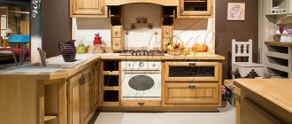
Wood table top
The wooden table top matches perfectly with the wooden dining table, chairs, wooden windows and shelves. But not with wooden furniture in kitchen cabinets.
Or rather, they can also be wooden, but painted, and not natural color. Otherwise, you will place a strong emphasis on unpainted wood, your kitchen will begin to resemble a sauna!
What about the color of the walls, the optimal one is white. But the second tone is olive, blue. These are the most win-win options, which are often used in Provence-type interiors.
From the color of the kitchen furniture
The combination of colors in the kitchen interior most often depends on what kind of furniture you have.
Of course, if you are making a design from scratch and haven’t bought anything yet, then it’s easier for you.
But if you already have furniture, then you only need to “dance” from it and there are no other options, since it occupies a large space and is a second, auxiliary color.
Unpainted wooden kitchen
The best background for such a kitchen is white walls.
And as accent colors - any colors except brown and dark orange. They will almost merge with natural wood.
Kitchen in white colors
White furniture looks great against contrasting colored walls. That is, if kitchen furniture is our 30%, then the background is 60%.
There is no point in listing what color white goes with, since it goes with absolutely any color!
Kitchen in red colors
A red kitchen goes very well with gray, stainless steel and mirror surfaces.
Also, it creates a good contrast with black, but it should be no more than 10%, otherwise it will be very dark and gloomy.
In addition, a red kitchen goes well with blue and white. This trio resembles sea colors and looks very fresh.
Here is a wonderful version of a white and red kitchen. Here, although the percentage balance of colors is not maintained, it still looks pretty nice.
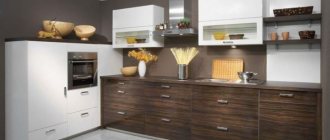
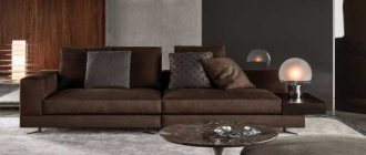
Kitchen in brown tones
Brown is a very capricious color and does not tolerate almost any neighbors except white and beige.
The remaining colors must be applied extremely carefully, otherwise all the beauty of the brown kitchen will fade against the bright background.
Also, remember this: if you have brown furniture, then the floor must certainly be light. Otherwise, the room looks dark and sometimes even sloppy.
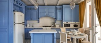
Kitchen in blue tones
A blue kitchen should not be combined with any colored walls. The maximum is a barely noticeable gray-blue tone of the wall. Or better yet, just white.
On other backgrounds, the blue simply doesn't look as bright as we'd like.
Kitchen in green tones
This is a very bright kitchen if the color is saturated. It is better, of course, to choose either olive or pistachio furniture colors.
But, if you already have a bright green kitchen, then the accent can be blue or lilac, and the background can be light yellow or white.
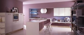
Kitchen in lilac tones
Lilac furniture goes well with light green, olive and khaki shades.
Also, lilac is combined with dark burgundy, white and black. Sometimes a pink accent looks good, but if there is an additional fourth color – black.
Kitchen in yellow tones
A sunny, yellow kitchen goes well with a light green accent, lilac, and red. And as a background, white is ideal. However, he is always perfect.
Choosing colors for the kitchen
When determining the color scheme for creating a kitchen interior, you need to proceed from your own preferences, taking into account the tips on color combinations outlined above. The correct ratio of background and accent colors will allow you to create not only a unique, but also a harmonious design of the room.
White
Choosing white to create a kitchen design in any style is simply ideal. It goes with all colors - both bright and pastel. Just avoid creating a “hospital” interior by painting the walls white and choosing the same furniture. If you want to get a completely bright space, there are many combinations of a white kitchen with other colors.
You can choose snow-white as the background, and a second, additional, light shade of natural wood. The accent can be anything. For example, a kitchen set, posters on the walls can be made from light beech, textiles can be chosen in a warm milk chocolate or cocoa color. An excellent combination for classic style, Provence, shabby chic.
A white kitchen set is a good addition to pastel-painted walls and a black countertop. Suitable design for minimalism and hi-tech styles. The versatility of white allows you to create both monochrome and multi-color interiors.
Red
Designers recommend handling the color red carefully - it increases activity, can cause aggression, and in children - anxiety.
Therefore, it is recommended not to use red paint as background paint. The photo shows how you can create a harmonious kitchen interior in red, combining it with other tones.
The best options are combining red with white, black, gray, brown. With blue and green it looks extravagant; for the kitchen this is too aggressive a combination. Choose scarlet as an additional shade in a beige, light gray kitchen (furniture facades) or use it as an accent (chairs in the dining area, a bright poster, a vase).
Yellow and orange
Bright yellow and orange are considered warming, friendly tones. They are associated with summer, sun, sunflowers, oranges. Well suited for the kitchen, they lift your spirits and awaken your appetite. An unpretentious orange tone can be used in the interior of a small kitchen with windows facing north - the room will be filled with sun and light.
Interesting results are obtained by combining bright colors with orange in the interior of a kitchen:
- Brown;
- Blue;
- Green;
- Purple.
It is important to choose the right options and place accents.
Blue
Most people associate this tone with the sea and sky, so it can be used for interiors in Mediterranean and Scandinavian styles. In other style designs it is better to use it carefully.
Blue tints can complement white, milky, gray. You should not choose dark shades as background colors; it is better to add blue notes in textiles and kitchen furniture.
Beige and brown
All shades of brown, soft, warm tones of beige symbolize unity with nature. Therefore, they are well suited for eco-style, rustic designs. When choosing which color to combine with beige, pay attention to the use of variations of green, orange, and yellow in the kitchen interior.
The warm shades of the beige set can be emphasized with wallpaper with a small floral design. The result is a small but cozy kitchen in a romantic Provence style.
Important! Fresh flowers in the interior of a beige kitchen are an excellent accent, emphasizing the unity of man with nature, creating home comfort.
Brown shades are most often represented in the kitchen interior using wooden parts - countertops, window sills, cabinet fronts, furniture for the dining area. Wood is an invariable material when creating classic, rustic styles.
If you want to live brightly, color your everyday life using a harmonious combination of colors in the kitchen interior. Place accents and you will realize that there are actually more color variations than a rainbow. Their correct use will allow you to expand the visible boundaries of not only the space limited by the kitchen walls, it will create your mood for every day.