03.07.2018 0
1361
Modern designers choose the most incredible combinations for interior design. There are many photographs in printed publications, as well as their online counterparts, that illustrate this. Not so new, but quite an original color for kitchen decoration has become pink. Most people choose it for a nursery or bedroom, but it also looks good in other rooms.
Advantages and disadvantages of color
Before updating your kitchen in the proposed color, consider a photo illustrating real rooms, and not ones that were just created in a computer program. Often the perceptions do not match. Or contact professional designers who can give useful advice.
In any case, using pink for the kitchen has a number of advantages:
- Delicate shades can visually enlarge the small size of the room and raise the ceiling.
- If the kitchen is located on the north side, then delicate and pastel colors will add light to the room.
- Color has a calming effect on the human psyche, which makes eating and communicating more pleasant.
In addition to the positive aspects, there are also several negative ones:
- An abundance of bright pink in the kitchen will make it look like a toy.
- The use of rich and flashy colors attracts attention to only one detail and all other elements become secondary, and sometimes completely invisible.
- Pink must be diluted with 2 or 3 calm colors.
Advice. If this is your first time doing such an experiment in the interior, seek advice from professionals.
Finishes and materials
When decorating a pink kitchen, it is important not to inadvertently turn it into a dollhouse. After all, this is, first of all, a workspace, so you need to choose the right practical and wear-resistant materials, and with them color combinations. It may seem that pink allows only classic combinations: with white, gray, black. But he is not afraid of more daring companions. A pink-green kitchen looks fresh and extravagant, a pink-blue kitchen looks gentle and soft, and a pink-brown kitchen looks cozy, warm and almost classic. In addition, pink color looks good both in modern materials like plastic and in luxurious classic ones like pink marble or velvet.
If you hang curtains from the ceiling, rather than from the top of the window, the room will instantly appear taller.
Floor
Two types of flooring fit well into the pink interior: wood and stone. Natural parquet is not the best choice for the kitchen, but durable and unpretentious laminate is no worse than conventional tiles. Natural marble or granite looks very stylish. They can be complemented with a tabletop, window sill or accessories. Modern imitations of natural rocks are not inferior to real ones, and acrylic stone is also lighter, more durable, and more resistant to wear. Shades can be any: from white to black. Pink goes well with natural textures.
Walls
Bright juicy pink is not the best option for completely painting walls. It will be too tiring and annoying. When choosing such shades, it is better to limit yourself to one accent wall. It is a convenient tool for zoning. For example, to highlight a working or dining area.
To make pink the main background, choose delicate shades that are comfortable for the eyes and perception. The best finishing materials for the kitchen are textured plasters, moisture-resistant paints and washable wallpaper. They are easy to care for, because cooking often causes kitchen surfaces to get dirty.
Ceiling
A bright glossy pink ceiling is a very unusual solution. But it is only suitable for large and spacious rooms, otherwise such a coating will be visually oppressive. If the room is small, classic light ceilings or decoration in the color of soft pink walls will be an excellent finish. Even classic whitewashed plaster is used. It's simple, cheap and practical. Suspended ceilings for the kitchen are good because lamps can be built into them and communications can be hidden.
White and pink
A kitchen in such colors looks light and almost floating, while the space visually increases. This option is perfect for very small spaces. But be careful, when combining white and pink, the first color is the main one. Pink will be optional.
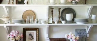
If you are decorating a kitchen in a vintage style, then use light pink shades for decorative elements. By the way, these details should be simple and look like things that came from the last century from grandparents.
This tone is used for several details:
- a couple of kitchen facades;
- textiles on windows;
- decorative elements on the walls (wallpaper with a pink pattern);
- tablecloth or upholstery.
But don’t be overzealous – choose a small number of pink details in the kitchen. This combination looks great in the Provence style, especially if you add a light brown or lilac shade.
Attention! For a kitchen in the Provence style, it is better to plaster the walls and paint them in a gentle tone, and choose furniture made of wood or a very good imitation.
Variety when choosing a pink kitchen
Pink kitchen sets can be designed in different styles. There are practically no restrictions when choosing a furniture style when creating the ideal interior in this color scheme, but the most popular can be considered:
- Modern;
- High tech;
- Classics.
It is these types of headsets that are most often decorated in pink, which can also have different shades. Some people prefer bright doll colors, others choose a delicate shade, and for others, fuchsia color in furniture is ideal. Which option you choose depends only on personal preferences. However, when creating a kitchen interior in such bright colors, you should take into account the opinion of all household members, since the pink color can safely be called ambiguous, and not everyone may like it.
Beige
This is a classic combination in both clothing and interior design. In this case, as in the previous one, the main color in the kitchen is beige. Pale pink or salmon are chosen as accents.
As an example, the room can be decorated as follows:
- Light, natural-colored flooring (boards, laminate or ceramic tiles are used as materials).
- Light cappuccino colored walls.
- Light pink curtains - if the room is on the north side, or thick curtains for a southern kitchen.
- Kitchen set with bright pink facades, you can use a glossy finish.
- The apron near the work area is made light, but with ornaments in the tone of a flamingo.
Pink color in the interior of the kitchen in different styles
- A kitchen set in shades of pink is an ideal solution for the Provence style. This delicate solution will emphasize the freshness and lightness of the design. Organically combines with pastel green and blue tones.
- Pink design is also harmonious in a retro-style kitchen. Ruffles and a lot of decor, flowers and antique interior items are used here, as can be seen in the photo. The atmosphere is romantic and especially cozy.
A set of this color is also friendly to the high-tech style. Glossy facades or metallic finishes, strict and regular lines are used here. Often, pink tones are also used in wall decoration: wallpaper with an abstract pattern or a photo, textured plaster or MDF panels.
- You can use peach tones in futuristic and minimalist style interiors. In these areas there is no unnecessary decor, and the bright and rich color decorates the room on its own.
Gray-pink kitchen
Noble gray color also goes well with pink shades. In order for everything to look harmonious, professionals completely exclude bright shades, such as fuchsia, and give preference to light or smoky tones.
A kitchen in gray and pink tones can be made in any style. A suitable combination for modern, classic or rustic design trends. The main thing that is required is to choose the right accessories and furniture.
For example, for a modern style in a pink kitchen you will need to install a kitchen set with glossy pink surfaces, make the countertop and splashback gray, and install household appliances in metallic color.
Extraordinary combinations
For those who like bright combinations, choosing green and pink is an excellent option. These colors are also found in nature. It is not at all necessary that these are very saturated and eye-catching shades. It is enough to combine pale tones, and the kitchen will become calm, but at the same time beautiful and bright.
If you want something completely unusual, then you can combine blue and even orange and pink. Don’t forget that the kitchen is the place where you want peace and relaxation, so you shouldn’t resort to extremes. A combination that is too colorful will cause discomfort rather than pleasant sensations.
