2019-07-07
Author: Belfan
From this article you will learn:
- Which tones are warm?
- What colors go well with basic warm tones?
- What principles of color scheme should be followed when decorating a kitchen?
- How to decorate a kitchen in warm colors?
- What is good about a kitchen interior in warm beige tones?
Most people prefer to decorate their kitchen spaces in warm colors. They do not create a tense atmosphere; on the contrary, they relax and give positivity. And calm, tranquility and comfort are exactly what you want to feel during pleasant family gatherings and meals. In this article we will tell you how to create the perfect kitchen interior in warm colors.
What tones are warm
The world around us consists of many shades. Everywhere you can see a huge number of color compositions and combinations. But this is only a small part of what is visible to birds and insects! Previously, artists used a system of decomposing white into seven tones. Today, designers use a more advanced structure - a diagram of warm and cold shades. This system of color separation allows you to more accurately convey warm or cold moods in art, including in interior design.
Human vision is capable of perceiving only 7 shades. Moreover, as experiments with color prove, all these tones can be obtained from three basic colors - yellow, red and blue, as well as an additional white color. With three basic shades you can achieve absolutely any color. If you need to make the composition warm or cold, you just need to add more yellow, red or blue.
To decorate the interior (including the kitchen), it is possible to use three color groups:
- Warm colors: yellow, red, orange.
- Cool shades: blue, cyan, purple.
- Green tones that can be either warm or cool. Designers tend to consider green a balanced, neutral color.
This division of colors into groups is quite arbitrary. It is much more important to choose the right color composition, in which the tones will be in harmony with each other. When choosing shades, you need to rely on our perception of specific combinations.
We perceive all colors only through the organ of vision. However, if we talk about warm and cold shades, the instinctive, receptor perception of cold and heat is connected here. This is why we can divide colors into two corresponding groups.
Recommended articles on this topic:
- Cupboard for kitchen utensils: decorating your interior
- Italian style chest of drawers: 6 types for your interior
- Solid wood kitchen (30+ photos): noble luxury and home comfort
Vertical and horizontal planes in warm shades
Strictly speaking, today's living room design styles are dominated by color contrasts. A combination of warm and cool shades is considered quite popular when choosing a color palette for wall decoration. For example, a cold shade is taken as the main color of the wall and diluted with a warm one, as individual elements located on the horizontal plane.
Using this method, designers try to achieve harmony of colors in the reception area, but it is not justified in all cases. A good example would be the traditional living room design in beige shades, which has not lost its popularity and is quite important today; a bright shade of beige is used as the main color in the room in combination with golden and chocolate components.
The floor and ceiling in the reception area are often decorated in warm colors. Moreover, this is actually distinctive for different style solutions of the interior, but very often if the floor and ceiling are decorated in warm shades, then the walls are in cool shades. There are exceptions to this instruction, but for the most part it is true. For example, in British-style living rooms you can often find a combination of a red ceiling, milky white walls and a chocolate floor.
Living room furniture
It is necessary to start with the fact that warm shades are completely natural for furniture, which is why a large number of classic styles love only furniture in warm shades. If you dare to create a guest room in warm colors, choose cabinet-type furniture in classic warm colors:
- woody,
- chocolate,
- beige.
The following colors are suitable for upholstered furniture: peach, apricot, tangerine, light green and others. Take a close look at the combination of warm shades; some of them combine well with any colors, while others do not combine well.
We advise you to take a good look at the design in the color of upholstered furniture. A great color option for her would be brown shades. Namely, a brown sofa, especially a corner one, looks solid and rich in the reception area, where beige, or more specifically its bright shades, is considered the dominant color. Upholstered furniture in warm colors is absolutely always much more comfortable than the same furniture in cool colors, because from the designer’s point of view it is more multifunctional and is suitable for a greater number of interior compositions.
Characteristics and successful combinations of primary warm colors
- Red.
- Yellow.
- Orange.
When choosing a kitchen interior in warm colors, pay attention to the red shades of furniture and decor. But you should understand that this color does not need to be used in large quantities: it will only irritate and tire the nervous system. But in the right quantities, red elements add warmth and coziness to the interior.
The brightness and sharpness of red is smoothed out by a neutral white shade. Combinations with soft green tones are also possible. Red harmonizes well with black and cool shades. You can complement the interior with tones similar in palette - yellow, orange, burgundy, brown.
This color is designed to lift your spirits and fill you with energy. Meals seem to taste better, and conversations and family gatherings take on a positive tone. However, you should be careful with yellow tones, as in excessive quantities they will irritate and tire. It is convenient to decorate kitchens in yellow that have little natural light.
Yellow harmonizes well with red, blue, light blue, lilac, purple, green, brown, gray, white, black shades.
Orange color will bring positivity and brightness to the room. This color can only fully reveal itself in well-chosen compositions. A kitchen interior in warm orange tones is always bright, stylish solutions, filled with light and warmth.
When creating a room design in these shades, consider the following nuance: there should not be a lot of bright, contrasting orange color. Only a limited amount of it is perceived favorably by us. The main advantage of this tone is that, unlike the red palette, orange does not evoke in us a subconscious feeling of anxiety and fear.
Also, the right solution would be to dilute orange with other shades. Possible combinations:
- Orange and white. Most often, designers use this particular combination. These two shades harmonize perfectly with each other, creating a stylish and beautiful design.
The optimal solution is a kitchen interior in a combination of warm orange tones with neutral white. The main furniture of the room is done in orange, and the walls are in white. Beige tones are suitable for the floor. An interesting solution is one orange wall combined with three completely white ones. The rest of the shades that you choose for the kitchen should also belong to the warm group.
- The composition of orange and black is consistent elegance and style. The combination will make the kitchen more interesting and sophisticated.
But you shouldn’t leave only these shades in your kitchen design. There should be other tones and combinations that go with black and orange. A neutral white color works well to cover the walls and ceiling. You can use black tiles for the floor, and a basic black-orange combination for the furniture.
- Orange and beige are a good solution for a kitchen interior in warm colors. These colors will fill the atmosphere with harmony and comfort.
The beige color will soften the main orange tone, and the room will be perceived better. Shades such as white, brown, and yellow are combined with the beige-orange color scheme.
- Combination of orange and gray. These colors are so harmonious that we perceive the combination as perfect, ideal. To complement the orange tone, the entire palette of gray shades is suitable. Most often, this range is found in modern high-tech design solutions.
- Warm brown.
Brown is a natural shade associated with earth and wood. We subconsciously associate it with security and calm. Designers use this color in textiles, floor coverings, and the design of furniture surfaces. But an excessive amount of brown tones can be oppressive and make the atmosphere heavier.
In the interior of a kitchen in warm colors, brown is combined with white, beige, and “close” light colors. Contrasting blue and cyan are also used.
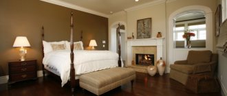
Bedroom interior in warm colors
So, to bring warm notes to a gloomy room, you cannot do without the warm sector of the color spectrum. These colors affect the subconscious, causing pleasant emotions. Help to make a room warmer:
Wall decoration and decoration.
Cold, bare walls will not add warmth and comfort to the bedroom, so it is better to tint the walls in
beige, soft peach, or light orange
colors. The place will have a wood-like finish, because living wood is warm. A good solution is to bring a little exoticism of hot countries into the room. Photo wallpapers depicting tropical species in red-orange tones will significantly raise the temperature. Another option is not to finish all the walls the same, but to go the route of creating a strong, warm accent. The photo below shows an example in which a wall with a window is painted bright yellow. The white colors of the remaining walls and ceiling neutralize the powerful effect of yellow, and the cold landscape outside the window does the same on the other side. Of course, this option is unlikely to be suitable for rooms facing the sunny side of the house and will not be appropriate in the homes of residents of warm climate zones.
In a white bedroom, one wall is painted bright yellow.
Set aside 0
Author
Lighting: even more warmth.
Properly designed lighting can completely transform a room and warm it up. When it comes to a bedroom (especially a classic one), small local lamps are simply necessary. A sconce next to a mirror, next to an armchair or a table lamp on a dressing table will create a romantic and peaceful atmosphere, enhancing the warmth of the interior.
The lights in the lamps and chandeliers in the bedroom should shine yellow, which least tires the eyes and is most reminiscent of the sun's rays. Be sure to place small lamps on the wall at the head of the bed or near it so that they are easy to turn on and off. And don't forget about the lampshades! Caps for floor lamps and table lamps in sunny, cheerful colors can completely transform a room, filling it with warmth and comfort. In the photo below, it is two lamps with beige lampshades that add warmth to the bedroom of a country house.
If you remove wall sconces, the interior will be less warm
Postpone 0
Author
Decor with “warm” objects: furniture and accessories.
When decorating a bedroom, it is better to refrain from intensive use of bright colors, otherwise you will quickly feel satiated. And to prevent the room from turning out faded and boring, use warm, rich colors only in decorative details - paintings, pillows, bedspreads. The most popular decorative items for “warming” the environment include:
- paintings with bright landscapes;
- bedspreads, blankets and other pastel accessories in warm colors;
- curtains;
- wooden furniture in light shades (more precisely, with the texture of natural wood).
In the photographs of the interiors of our collection you see examples of tactful inclusions of red and orange accents. Perhaps these are the most win-win options for a modern bedroom - a calm basic tone and explosions of riotous colors (pumpkin, orange and red).
An orange blanket on the bed completes the bedroom scheme
Postpone 0
Author
To summarize, let's say: even from the darkest and most inhospitable room you can make an oasis of comfort. Textiles and decor items will come to the rescue. Create!
The main principles of color scheme in the kitchen
The main color of the kitchen is the one in which large objects (kitchen furniture), as well as walls and floors are painted. For them, it is better to choose neutral, natural tones that are in harmony with each other. You can add contrasting and accent shades to the main shade - there should be two or three of them. It is advisable to use the main and secondary ones in proportions of 60:30:10. It is important to understand that using bright colors in large quantities will only spoil the impression of the interior, making it difficult to perceive. Contrasts should be no more than 10% of the entire composition.
When choosing primary and secondary colors in the interior, you can use the color wheel. This diagram represents a rainbow spectrum. Designers and artists actively use it when creating their works. Examples of combinations:
- Scheme 1. Monochromatic combination.
In this case, the kitchen interior in warm or cold colors is made with shades from only one segment.
The result is pleasant, relaxing compositions. But often such design solutions turn out to be too boring and monotonous. To prevent this effect, create contrasting combinations of dark and light shades.
- Scheme 2. Contrasting color schemes.
In this case, the colors located opposite in the pie chart are connected. These shades are also called complementary.
This solution allows you to achieve a bright, non-uniform design. But you should not use these combinations in their pure form - add neutral white, beige and other shades to the interior that will soften the atmosphere a little. Also, colors selected from the circle can be used, for example, in muted, whitened or deep variations. Otherwise, the interior will seem simple.
- Scheme 3. Harmonious combinations.
Here, adjacent colors located nearby on the circle are selected as the main ones. Such shades are also called analogous. The result is universal, harmonious combinations that perfectly complement any kitchen interior in warm colors. For greater brightness, you can add several contrasting shades.
For example, we are all familiar with the combination of yellow, green and orange. These colors are located close in a circle, so this combination looks as harmonious as possible.
- The colors you choose for the kitchen should resonate with the style direction.
Usually we perceive the main style of a room through the color scheme, and only then our gaze falls on the characteristic pieces of furniture. Let's look at which shades are suitable for different styles:
- For the classical direction, as well as for modern art deco, both warm and deeper tones are suitable. Painting is used to decorate the walls, this creates a feeling of naturalness. Classic does not allow the use of bright accent elements, but you can play with contrasting transitions.
- Shabby chic, Provence, as well as Gustavian and French styles are kitchen designs in warm colors (see photo below) without any contrasts or accents.
- Loft and industrial style are decorated in muted tones; warm color combinations are also allowed. The basis of the style is factory elements (brick, inserts made of wood, concrete, metal).
- Rustic, minimalistic, eco and country - these are mainly natural motifs (the color of sand, grass, clay, stones, wood).
- It is better to decorate the kitchen floor and work surfaces in light colors.
All housewives know that stains, crumbs, dust, animal hair, and dirt always stand out very clearly on dark surfaces of furniture and floors. However, to clean such surfaces to perfection, you will need to spend a lot of time and effort. That is why many deliberately choose a kitchen interior in warm colors, buying light-colored furniture, countertops, floors and splashbacks.
- When choosing and arranging lighting fixtures, it is worth considering the location of natural light.
If the windows in the kitchen are directed to the north, you can artificially recreate the feeling of light and warmth. Use a lot of white, as well as other warm shades - yellow, red, orange, pink.
Therefore, if there is little natural light in the room, it is better to postpone cool shades in the interior. This applies to boiling white, blue, light blue, and violet flowers. In the dim light they seem gloomy and uncomfortable. Pastel colors are also not suitable for such a kitchen. They look advantageous only in combination with natural light.
If the kitchen is flooded with sunlight every day, you can safely choose cool tones - they will bring a touch of freshness to the room. Soft pastel shades are also suitable. When there is a lot of light, it is better to avoid warm colors, as in the sun they become too bright and intrusive.
How to choose warm colors for your kitchen interior that will suit you best? Designers recommend the following method: take an A4 sheet, paint it in the chosen shade and hang it on the wall in the room. Throughout the day, you will be able to observe how this tone looks in daytime and evening light. A similar technique can be used when choosing floor coverings, the color of kitchen units and other items.
- For small kitchen spaces, it is better to choose light shades.
Light beige colors will help you visually expand the kitchen space. If most of the furniture, as well as the floor and walls, are decorated in a beige tone, the boundaries of the room seem to expand: it seems lighter and more spacious.
- Cool colors pacify the appetite, warm colors excite.
If you like to create culinary delights and then delight your family and friends with your dishes, light, warm kitchen tones will suit you. If you are a supporter of strict dietary rules, you can decorate the space in cooler shades.
- When choosing the color of the interior, you can proceed from the existing shades of furniture and decoration.
If you do not want to redo the finishing of the walls and floors, or change the main set, you should choose the missing interior elements to match the color of existing items.
- It is much more convenient to visit furniture stores with a ready-made color palette.
When choosing furniture and other furnishings, you need to keep in mind the selected palette of shades. To make your task easier, you can prepare a color palette or moodboard in advance, which will indicate the main colors of the future interior. You can use online resources (the Kuler program, for example) or create a palette yourself in a graphics editor. At the same time, it is very convenient to use examples of finished kitchen interiors in warm colors. Save the resulting image to your phone so you can refer to it every time you buy furniture.
Another method will help you in choosing a kitchen environment. You can cut out pictures depicting headset items and combine them into a collage (you will find pictures on the seller’s websites). This will help you visualize how furniture and other items will look in a single interior.
By the way!
About your design project
Designer discount for you!
It's profitable with us! The design project will be fully paid for due to designer discounts on goods. We have this discount in almost every store! We will share it with you!
Let's fit into the budget!
Even before we start selecting furniture and finishing materials, we will determine your budget. We will fit into this budget. Prohibitively expensive goods are excluded!
Layout without restrictions!
Redevelopment is the most important stage of a design project! We will work on it until you are satisfied with it. And it doesn’t matter how many options there are: 5, 10, 20... There are no restrictions!
Consultation is free!
Is this your first time renovating with a designer? We will tell you in detail how the design goes, share our experience, help you determine the budget, etc. And all this is completely free!
More than 10 years on the market!
This only means that we offer a quality product at the best price, we work honestly and you can rely on us!
1 year warranty!
We guarantee high-quality drawings!
If there is an error, we will fix it free of charge and promptly. The guarantee is valid for a year after delivery of the design project! Amazingly gentle bedroom. Striped pillows and bright rugs create the mood, and armchairs with a coffee table under the window create coziness and a feeling of comfort.
There are many successful solutions in this interior. This includes a range of colors, different wall textures, and wonderful lamps. We also combined the bedroom with the loggia and got a small cozy office.
What a sweet and gentle bedroom, right?
For dessert, another bedroom in light colors. This will suit all lovers of classics and sophisticated style.
Creating a kitchen in warm colors: decoration and furniture
As for decorating the kitchen interior in warm colors, it is better to give preference to light, soft colors. If you want to create contrast, it is better to do this with pieces of furniture or household appliances. Small dark inserts can be used to decorate the floor, textile materials, and some decorative elements. But the basis of a kitchen in warm colors still remains neutral shades.
- Floor.
A convenient and practical flooring option for a kitchen in warm colors is a coating made of porcelain stoneware, ceramic tiles or self-leveling. These materials are characterized by high strength, durability and wear resistance. The floor can be supplemented with a heating system, which will bring additional comfort to the room.
If the dining part of the kitchen is located at a sufficiently large distance from the work surfaces, decorate the floor under it with parquet, boards or laminate. Just in case, choose moisture-resistant coatings. As for color, it is better to give preference to light shades - beige, wood tones. The kitchen interior looks good in warm colors with a graphite floor.
- Walls and apron.
White furniture is perfect for decorating a kitchen. Delicate, warm pastel shades will look best as a background. But if you are planning to decorate a room in Provence style, you can use wallpaper with a decorative floral pattern. If you are planning a modern loft style, then factory motifs, for example, brickwork, will be an integral part of the composition.
Today it is popular to complement the kitchen with a bright apron made of tinted glass or plastic. This interior element can be made in a contrasting, eye-catching shade. It is also fashionable to use white brick-like tiles (“hog”) and simple plain tiles in warm shades as an apron. For a rustic style, matte ceramic tiles with a delicate lavender pattern are suitable. In Scandinavian design you can find an original patchwork pattern.
- Ceiling.
The kitchen ceiling in warm colors can be painted or finished with a material similar in color to the main shade of the interior. Open beams are welcome in loft and ethnic styles. If the footage allows, you can also hang decorative beam elements. You can smooth out surface unevenness using moisture-resistant plasterboard, fiberglass or special non-woven wallpaper.
- Kitchen furniture and appliances.
Dining room furniture, bar counter and other interior elements are also chosen in warm colors. If the kitchen is small, a single color style will make it visually more spacious. Also, light shades complement rustic and classic styles well with an abundance of original carved elements. If you prefer laconicism and minimalism in your interior, you can try combining furniture pieces of different colors and styles. However, even in such compositions some common feature should be visible, for example, material, texture, shape, size of the products.
Choosing the appropriate technique for the Provence or classic direction is also easy. Modern manufacturers offer us a huge range of models of stoves, hoods, and ovens in retro style. It is advisable to keep the rest of the equipment inside the headset so as not to violate the design concept.
A kitchen in a loft or modern style may contain such characteristic elements as a bright, old-style designer refrigerator, a vintage stove and a sink.
In terms of furniture fittings, faucets and pipes, silver or gold-plated metallic, steel, brass or pastel ceramics are suitable for a bright kitchen.
Furniture and bright accents for a bedroom with warm tones
There should not be a lot of furniture in the bedroom, especially unnecessary furniture. A bed, a mini-table, a small bedside table, a dressing table with a mirror - this is quite enough. It’s better to place the rest in the living room, where there will be more space.
In order to dilute the overall light tone of the bedroom, it is worth introducing a few bright ideas into the interior design. On the wall you should hang a picture with a gold frame, which will look good with light walls.
You can decorate the shelves with photographs, and place potted plants on the windowsill. Nowadays, decorating pots with your own hands is very popular. In this case, various available materials are used: flowers, rhinestones, shells, stickers, etc. Such an unusual pot, made at home, will add a touch of coziness to the bedroom and attract the attention of guests.
As a floor covering, you can use laminate or carpet in darker shades than the walls and ceiling. The interior will become cozy and homely.
Particular attention should be paid to furniture design. Since many elements of the bedroom are in warm colors, you should choose the right accessories that will help make the image of the room more harmonious.
Bed linen can be chosen in a light color with a bright pattern. This element will go well with curtains. In addition, you can choose one color, but in different shades. For example, lilac curtains and a lavender-colored pattern (it’s lighter) on the bed linen.
The bed can also be decorated with small decorative pillows. Bright materials in the interior are often used to decorate rooms. If the decor of the room is mostly neutral shades, then the easiest way to add brightness to its design is with the help of decorative pillows.
The advantage of this method is that you can just change the covers and the room takes on a completely new look. Currently, there are many ways to decorate. It is not necessary to buy ready-made pads in stores. You can do everything to your liking. It is important that they fit the overall image.
The above tips are just a small part of the ideas. A large number of solutions can be used to decorate a room. In the photo, the bedroom interior in warm colors is organically combined with the renovation and exterior decoration of the furniture. You can combine several different types of decoration at once. It is important here that all interior elements match each other and create a gentle and cozy atmosphere.
Currently, many styles of decorating bedrooms prevail. As you know, the general well-being of the residents, their mood, and the comfort of the room depend on the correctly selected shades and details of furniture.
The bedroom is a place of relaxation, where after a hard day at work you want to relax and immerse yourself in an atmosphere of silence and tranquility. Modern design projects make it possible to decorate a room, creating a cozy atmosphere in it.
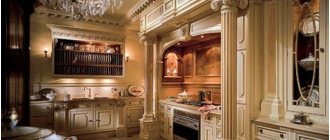
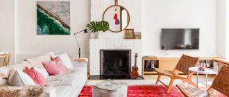
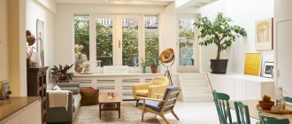
Successful kitchen interior in warm beige tones
Kitchen interior in warm beige tones is the most common solution in modern design. Beige is better than other shades in creating softness, comfort and at the same time severity in the environment. This palette has a huge variety of subtones, so you can easily choose a shade to suit your taste. Beige is often used as a background for original furniture and decor.
- Pros and cons of decorating a kitchen in beige.
The beige shade in the interior is considered one of the most popular. And that's why:
- First of all, this color belongs to the group of neutral tones, so it can easily harmonize with most other shades.
- The beige color makes the room more spacious and bright, which is so necessary in the interiors of small kitchens.
- Warm tones of beige are a huge variety of shades that can decorate any design.
- The beige shade creates a calm, relaxing atmosphere where it is pleasant to rest and recuperate.
Disadvantages of beige tones in the interior:
- The main disadvantage is that stains and any dirt are very clearly visible on a beige background, so such a kitchen will require frequent cleaning.
- The beige color is so popular that interiors may already seem boring and monotonous.
Bright accent colors will help avoid the same type of kitchen in warm colors. Photos of interesting options can be found in our article.
- Shades of beige.
Beige as the main shade in the interior is the choice of most people. The color is convenient to use, as it harmonizes perfectly with any other tones. This means that you have a huge variety of options for decorating and furnishing your kitchen. But many modern designers consider this shade uninteresting. Is it really?
Let's try to reveal its essence. Beige is a combination of two basic colors: white and brown. In addition to the main combination, beige tones can include yellow, golden, green, and pink undertones.
Popular shades from the beige palette:
- wheat;
- caramel;
- ivory;
- sand;
- opal;
- grayish beige.
When choosing interior colors, you should pay attention not only to the brightness, but also to the “temperature” of a particular option.
As we said above, if the room faces north, it is better to choose warm colors in the kitchen design - pinkish, peach, caramel (see photo above).
When arranging the kitchen interior, it is important to choose the right artificial light. Lamps that emit yellow light go well with a beige background. It is better not to use cool white or bluish lighting.
- Beige color combinations in the kitchen interior.
The palette of beige shades can be used to decorate the entire interior - from the kitchen unit to the finishing of walls and floors. To create brighter, stylish compositions, use contrasting beige tones - chocolate, coffee. Darker colors can be used to decorate window frames, dining furniture, and some furniture elements. Light ones are suitable for floors and walls.
If you have a small kitchen space, try not to use a lot of contrast. In more spacious dining rooms, you can safely create bright tints (for example, wenge in combination with a beige shade).
If you want to create a loft-style interior, you can use a color scheme of cream and gray or a combination of beige and metallic. This combination looks great in any kitchen, regardless of size. Thus, a kitchen interior in warm colors can be complemented with a gray floor.
If you like bright, unusual solutions, you can try decorating your kitchen with a color combination of cream and red. But, again, it is important not to overdo it with bright shades, so as not to spoil the appearance of the kitchen. Noble burgundy tones look great on curtains and wallpaper.
Beige colors can be safely combined with green and blue shades. Often these combinations become the basis of eco or high-tech styles. Ecological motives can be expressed in shades of green, while more modern ones can be expressed in shades of blue.
You can make a room stylish and unusual using purple tones in the interior. Delicate lavender will add tenderness to the interior. Brighter, juicier ones (blueberry, amethyst) can become color accents.
The kitchen interior in warm colors is often complemented by black elements. Popular colors are “wet asphalt” and slate gray. But with black shades you need to be careful. In too large quantities, this color can ruin the existing atmosphere of comfort. Use it sparingly.
The combination of beige and white always looks winning. The tabletop, curtains, and wallpaper can be decorated in a white tone. The beige and white combination is the optimal solution for small kitchen spaces that you want to visually expand.
- Beige in the kitchen in Provence style.
In a bright Provence setting, the beige color looks somewhat whitish. Therefore, we recommend choosing darker tones, such as wood tones. Natural wood is suitable for finishing furniture surfaces. Glass inserts in kitchen cabinets look good. You can see them in the picture below. Instead of glass elements, simple linen curtains are often used - they create the atmosphere of a cozy country house. Dishes can be placed in the foreground as an integral design element.
Photo of the kitchen interior in warm colors in Provence style:
Beige plaster, as well as light wallpaper with a small pattern, are suitable for the walls. The light beige tone harmonizes perfectly with terracotta and brick red colors.
The furniture of the dining area can either be in contrast with the main background (chocolate, coffee shades) or complement its light colors. A beige background can be combined with cream shades of furniture. It is desirable that the color of the dining part of the interior matches the color composition of the kitchen apron.
Curtains can be made in dark shades. But this is only if you have a large kitchen space. For small rooms, use light, weightless curtains. You can choose curtains with a pattern. Terracotta, red and even red colors are suitable for decoration. The most characteristic shade of French Provence is lavender. It can complement cream and beige motifs.
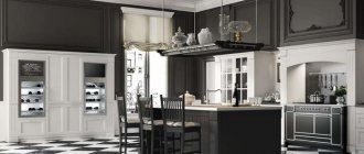
- Beige kitchen in a classic style.
The interior of the kitchen in classic warm colors is, first of all, an abundance of beige. Solid color schemes look good only in small spaces. Spacious kitchens work well with the addition of other colors. Classic allows the use of noble burgundy shades in furniture or textiles.
The classic style is more stately and powerful than the previously described Provence. Massive wooden furniture, curtains of noble shades, and exquisite finishing are used here. The walls are often decorated with wood panels. A popular decorative element is wood carving.
Wenge and other dark wood species harmonize well with the beige background. Dining furniture and tabletops are made in dark brown shades. You can also turn to the opposite option - decorate the tabletop and chair upholstery in a light tone, and the furniture legs in a dark tone.
- Beige in modern styles.
Most modern style trends are strikingly different from each other, embodying the most extraordinary design ideas. However, there is one common feature - the abundance of beige shades in the interior, which are also popular in kitchens in warm colors.
Characteristic features of modern styles are minimalism, functionality and maximum comfort. Here you will find a large number of glossy surfaces, geometric patterns and shapes, strict lines and outlines.
Finishing in the form of plaster and wallpaper is practically absent; painting is mainly used. With the help of walls, designers create accent spots: one wall is made in a bright color, the rest in a more neutral, lighter shade. The predominant tone can be combined with a kitchen apron or decor (textiles, vases, dishes, etc.). The accent can be both soft, pastel shades and sharper colors: red, turquoise, black, burgundy.
A kitchen apron can also serve as a contrast. Today the trend is to use glass finishes. It can be glossy, matte, colored, or with photo printing. An alternative could be mirror surfaces. However, such finishing requires daily careful maintenance.
In modern kitchen interiors in warm colors, roller blinds or blinds are often used instead of traditional curtains. These products are more compact and convenient.
Designers constantly generate many ideas related to interior design in beige tones. This color is the easiest to use, so even a beginner can create an interesting design.
Photo: Bedroom in warm colors
Carpeting (32)
Medium-tone parquet (27)
Dark parquet (21)
Light parquet ( 6 )
With different types of fireplace (43)
All Fireplace Surrounds (4)
- Popular today
- Recent Updates
- Popular all time
- New favorites
Olga Rykli Stylish design: a bedroom in a modern classic style with medium-tone parquet floors and brown floors is the latest trend
Karo In the photo: a bedroom in a modern style with
Andrey Belimov-Gushchin Fresh design idea: modern master bedroom with gray walls, mid-tone hardwood floors and brown floors - great interior photo
Photo of the bedroom AFTER the renovation Project implementation: January - June 2017 Photographer: Artem Meluzov In the photo: medium-sized bedrooms in the modern classic style with white walls, medium-tone parquet floors and brown floors
designer Victoria Smirnova, photographer Sergey Ananyev, stylist Daria Soboleva, florist Elizaveta Ambrasovskaya In the photo: a bedroom in the style of modern classics with beige walls and a beige floor without a fireplace with
Pictured: High budget large modern master bedrooms with brown walls, mid tone hardwood floors and brown floors
Photo - Ivan Sorokin Design idea: medium-sized master bedroom in a modern classic style with medium-tone parquet floors and multi-colored walls without a fireplace
Stepan Priporov Example of original design: a large guest bedroom in a modern classic style with red walls, light parquet floors and brown floors
Modern meets rustic master suite by McCroskey Interiors. Photo by Chad Jackson Photography An endless source of home inspiration: a large rustic master bedroom with beige walls and carpeting without a fireplace
This Palm Beach Gardens, FL home is a contemporary masterpiece. With a cream bedroom with dark accents, bold wall decor and built-ins, and a clean kitchen, this home has a clean sophisticated feel.
Master bedroom in a traditional 1950's ranch house. Photo by shoot2sell. An endless source of home inspiration: a medium-sized master bedroom in a modern classic style with brown walls and dark parquet floors without a fireplace
© Paul Finkel Photography Stylish design: large rustic master bedroom with beige walls, dark hardwood floors and brown floors without a fireplace is the latest trend
Design Idea: Contemporary Master Bedroom with Beige Walls and Carpeting without a Fireplace
Esther Van Geest, ETR Photography Pictured: A medium sized mezzanine bedroom in a modern style with multi-colored walls and a concrete floor without a fireplace with
Photo Credit: Chuck Espinoza A never-ending source of home inspiration: a classic bedroom with beige walls, dark hardwood floors and brown floors without a fireplace
Excerpted from Steven Gambrel: Time & Place (Abrams, 2012). Photography by Eric Piasecki. An inexhaustible source of inspiration for home comfort: a modern bedroom with pink walls
Design Idea: Contemporary bedroom with brown walls and wood fireplace surround
Design by MaRae Simone, Faux Finish by b. Taylored Designs Photography by Terrell Clark Fresh design idea: medium sized modern master bedroom with gray walls and concrete floor - great interior photography