Fashion for pastel pink
Pink palette: pastel, dusty and powdery shades are again in demand by leading designers when decorating interiors. Of particular interest are pale pink, white-pink, ash and dusty shades.
“Rose quartz” is the leading color of 2020 according to the international color institute Pantone, which sets global trends.
Powdery shades appeared in the living rooms and boudoirs of the Parisian nobility back in the first half of the 18th century and have since become a characteristic feature of the classic interior of small rooms. Pastel colors fell out of use with the outbreak of the World Wars and only returned in the 1950s. During this period, “pink design” experienced its peak of popularity.
The modern fashion for pink interiors is associated with the midcentury style and is driven by nostalgia for the golden middle of the last century.
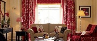
The combination of pink curtains with various colors and shades
Pink shades can convey a mood of tenderness and carelessness, freshness and lightness. Raspberry and sky pink are suitable for this.
Pink curtains in exquisite classic shades:
- ashy;
- beige;
- pearl pink;
- gray-pink.
Dark pink curtains go well with light and pastel colors, taken as the basis for the interior of the room.
The pink tint cannot be completely balanced by blue - a third color is needed, for example, white.
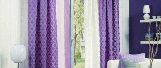
Mysterious, fabulous and one of the most beautiful combinations: lilac/purple/pink.
Satin coral curtains frame the white window frames wonderfully. On a sunny day, the entire room is illuminated with a gentle pink light. Purple silk curtains, as well as curtains made of tulle or organza, look elegant in pink tones.
Preference should be given to plain curtains. They should differ from the general color of the room by at least several tones.
Selection of beige curtains for different rooms
When decorating the interior of each room, you need to take an individual approach to choosing home textiles. Milk curtains in the interior should not only be beautiful, but also correspond to the purpose of a particular room. In this section you can learn how to choose curtains for each room of the house.
To the kitchen
Beige curtains for the kitchen are not only very beautiful, but also a very functional interior design option. Traditional white curtains in the kitchen are susceptible to various stains; over time, they can turn yellow from exposure to various fumes that appear during cooking. Although beige tulle in the kitchen also has to be washed often, various stains are less visible on it and it will not lose its color over time.
Cream-colored curtains in the kitchen make the interior lighter and lighter. Both short and long tulle options will look appropriate in the dining room. You can also choose roller blinds or spectacular Roman blinds in a powdery color for your kitchen - they are easier to care for and are more functional.
To the living room
It is worth choosing textiles for the room with special attention - after all, this decorative element can create a positive impression of the entire room. In the living room, cream-colored or powder-colored curtains look especially stylish and luxurious. Here you can choose tulle with various decorations - draperies, lace, appliqués.
Thick powder curtains for the hall also have a wide variety of decor. You can successfully focus on the texture of the fabric - velvet, satin or satin. Curtains for the living room can be decorated with patterns, rhinestones, and decorative draperies. When choosing such models, you should not overdo it with the decor - it is important that the lower and thick curtains are harmoniously combined and balance each other.
In the nursery
By decorating a children's room with cream curtains, you can make its interior lighter and more comfortable. Beige curtains go well with the bright colors in which parents often decorate the nursery. They will suit light green, blue and pink wallpaper.
Thanks to the neutral shade, such curtains will look appropriate in both a boy’s and a girl’s room. A good option for a child’s room would be a light, shortened powder-colored tulle - the children will not touch the curtains during games and the fabric will not lose its presentable appearance.
In the bedroom
Light curtains will also look great in a bedroom decorated in muted pastel colors. Do not forget that in this room it is important to ensure a balance of lighting in the morning and evening. During the day, you can use cream-colored and ivory tulle - it will let soft sunlight into the room. In the evening, the windows are closed with thick curtains to get rid of the light of street lamps and the glances of passers-by.
Roller blinds of the “day-night” model in beige tones will also be a functional option for the bedroom. They allow you to “customize” the lighting in a room through a combination of darkened and translucent stripes. Such models can also be combined with regular fabric curtains, since they are attached directly to the window frame.
Pink curtains in the interior of a nursery
Pink curtains in pastel shades are selected for a child's or girl's room. The combination of pink with two light shades of other colors, for example: white and pistachio, looks gentle and fresh. A classic, calm combination of light pink and milky blue is appropriate.
Roman curtains of rich pink color are appropriate for a children's room, which faces north and is poorly lit during the day. Fuchsia curtains will refresh a room with dark furniture. To create a fairy-tale atmosphere in a nursery, use curtains or drapes with floral patterns or images of magical creatures.
Blackout curtains for a girlish gray-pink shade with delicate monograms or floral patterns will create sound insulation and provide complete rest for the child.
Pink dreams
A bedroom in which the main color is pink is very bold and unusual, but in order for a man to live in one, several conditions must be met:
- Use pink-peach, any ash-pastel shades.
- Pair with dark chocolate. It is even possible to use pink wallpaper: furniture and decoration will give the room stability and some brutality.
- Maintain moderation in decorative elements.
With the help of pink it is possible to make the bedroom ideal, the way you personally see it. If you want an active morning, use white color with its tonic effect as a companion. Acceptable for pastoral and modern styles. The combination of powdery shades with delicate greenery and olive will add naturalness, freshness, and comfort. Adding blue and white shades at the same time will make the room look more spacious. This is relevant if the bedroom, in addition to a relaxation area, provides additional functionality, such as a work area. Light and space will be brought by accent colors of pillows, bedspreads, curtains:
- turquoise;
- light green;
- light emerald.
Each of us is well aware that the color scheme of the interior has a huge impact not only on the appearance of the room, but also on the atmosphere in it, and therefore on the mood of its residents.
Pink is rightfully considered the most romantic and sensual color. It lifts your spirits, fills you with a sense of peace, eliminates aggression, relaxes and can even drive away depression.
Pink is also the color of the feminine, the color of love. That is why many girls love this color very much.
It should be noted that in the decor of a room, shades of a pink palette are very appropriate. Moreover, this color can be chosen as either a primary or an additional color - with the help of pink accessories you can make stylish accents in the interior of the room in a very stylish and original way. In each case, using pink curtains would be an excellent option.
The curtains in the room can be either delicate pastel colors, for example, tea rose, or rich, flashy shades, such as fuchsia. The most important thing is that the chosen option fits harmoniously into the overall interior of the room.
Bedroom
Pearl gray neutral tones in the bedroom pair well with curtains in dark pink rich shades. A bedroom decorated in beige or light colors, along with gray-pink curtains, speaks of discreet elegance.
Choosing pink curtains for the bedroom means creating a romantic and feminine atmosphere. The contrast of pink powder with gray wallpaper will add sensuality to the interior.
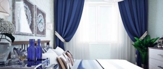
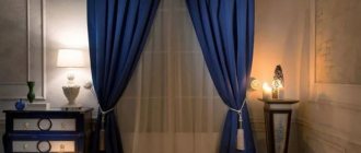
Milky pink curtains will help create a calm and relaxing atmosphere in the bedroom. They go exceptionally well with lavender and blue-gray, light green.
Complete darkening of the bedroom - blackout curtains. A thick curtain called “blackout” (complete blackout) falls in a uniform wave and is very good in powdery shades.
A white bedroom with pale pink curtains and cherry-colored natural wood furniture looks gentle and feminine.
Powdery color: what does it mean?
Powdery color is distinguished by a variety of beautiful and delicate tones. Surely those who do not understand all the fashionable nuances when they hear the word “powdery” imagine beige or pink shades. That's right - these tones are present in the natural nude palette, which includes the color with that name. But along with pink and beige, the powder spectrum also includes several others.
Reference. The variety of shades allows any girl to choose her own “powdery” look.
The main feature of the palette is the matteness of the tones. In addition to the shades in which face powder is traditionally produced - ivory, nude, beige, café au lait, etc. - the palette in question includes muted tones of lilac, blue, melon, ash gray and mint.
Curtains for the hall
Gray-pink curtains, light wallpaper and pastel-pistachio decoration of the halls and guest rooms are exquisitely combined. Pink curtains and copper or silver interior items are a rich combination. Curtains for the living room, combination with other shades:
- powdery/young greens and dogwood;
- beige-pink/hazelnut;
- cream pink/light turquoise;
- deep pink/golden.
The above combinations of shades were developed by the Color Institute. They echo the colors of living nature, inspire, but do not depress the nervous system. In the interior of the hall you can use curtains with a lambrequin in the proposed color combinations.
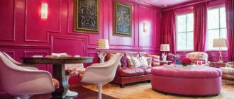
Pink curtains are combined with bulky mirrors, picture frames, and velvet upholstery.
In the living room, it is better to give preference to a pastel interior. It makes it easier to combine complex shades of details. The pink color of the curtains can be combined with pink furniture upholstery or other fabric elements (pillows, poufs, flooring).
Pink in combination with burgundy imparts masculinity and solidity to the atmosphere of the room.
Pink accessories
You need to carefully combine a pink accessory with other elements of women's clothing. Here, color decides everything - the brighter the shade, the less space it should take up in the outfit. A bright coral summer hat can match the color of the bracelet, but adding coral sandals here will be unnecessary. The cyclamen-colored belt is completely self-sufficient and does not need additional amplifiers of this color. Pink shoes are unique shoes, it is better not to distract the attention of the audience from her solo performance in the set.
If you want to keep a pink accessory in your wardrobe for a long time, choose time-tested colors: powdery, raspberry, light pink. These shades will never go beyond the focus of fashion designers.
Color - dusty rose. What is he like? What to combine the color of dusty rose with?
Dusty rose (sometimes called rose gray or pearl pink) was very popular in 2013. And for good reason. He is noble, not provocative, feminine, and sometimes strict.
It stands out from the line of flashy pinks and at the same time has a rich range of shades - from subtle, blurry to deep and rich. Sometimes it seems to fade into gray or purple.
The color is universal in its own way, one of the favorites of fashionable color schemes. Delicate, sensual, and at the same time discreet, it can perfectly harmonize with rich shades: black, anthracite or deep blue. Pairs well with white, slate grey, lilac and gold. In a summer wardrobe, a dusty rose will coexist with light yellow, mint or green - imagine a rose) - luxurious and elegant! And for the office, you can choose combinations with milky shades of coffee or cream.
For a dusty rose, sea wave and other shades of blue are suitable...
Mahogany goes well with it...
Chocolate colors are suitable - both chocolate itself and chocolate-plum...
Dark gray color, bronze...
Solutions made in this color in the interior and decor look luxurious and unusual. The color of dusty rose looks especially relevant in combination with copper and gold shades, neutral gray and beige.
Dusty pink color in the interior is becoming the choice of many, displacing blue and green shades. Whether large finishing details with a clear predominance or subtle touches, dusty pink color gives the room romance, tenderness, and femininity. This collection of ideas will show you how dusty pink looks in different interiors.
Walls painted in this shade look gorgeous. The soft color invites you to play with other colors and break away from patterns. Gray color is a good pair with dusty pink.
Curtains can easily transform a room. When your walls are white or cream, soft pink curtains are a great way to add color without making it too bright.
Curtains look even better if they are slightly long, as if flowing across the floor. French chic in a rustic style!
Pink is also good in the bedroom. Swap out your usual duvet for a solid dusty pink shade. This will add a soft feeling to the room. This color is neutral, so it can easily be combined with pillows of other colors.
And this idea is more likely for a country or country house. Surely you have furniture that is outdated but loved, like this linen closet. It is enough to paint it a soft pink color, and it will again take pride of place in the house.
It's quite difficult to change colors in the kitchen, but here's a simple solution. Buy a few dusty pink plates for everyday use. They look great among other colors on open shelving, and you will be surprised at how your kitchen decor has been transformed.
Are you still a little cautious with this shade? Try adding a painting or two where dusty pink is the dominant color. Let them be next to other paintings or fill an empty space. If you like the color, you can think about adding more pink to your interior.
When buying a new sofa, the choice often falls on neutral colors. But dusty pink sofa is the new neutral shade. Therefore, if you like this sofa, feel free to buy it! You can still use any color pillows you already have in your home.
Don't forget about the bathroom! Dusty pink goes well with marble. Add a few gray towels and some delicate flowers in a vase and you'll have a tranquil environment where you'll want to take a relaxing bath.
Some people may just stick with pink accents. A pink painting here, a pink chair there, a pink accent on a wall where you wouldn't expect it. Make this soft shade work for you.
Everyone knows that dusty shades go well together. Liven up your dusty pink accents with dusty, pale purple, blue and gray. Metal elements will add shine and chic!
Dusty pink building? Why not! If you can update the look of your home, consider using some of your favorite colors. Whether it's a whole building painted or a few dusty pink shutters, it will look great.
What color do you think is most popular this summer? That's right, many shades remain in favor, but the most stylish color in 2020 is the romantic color of dusty rose. This term applies to a whole range of soft tones: flesh, salmon, tea. It all depends on the intensity of pink in one form or another.
Woman in white against a background of roses - a beautiful vision
Let's figure out how this color is used in women's clothing and what other shades it combines with. Designers use this tone when creating wedding dresses, outfits for social events and trips to the theater or philharmonic.
Kitchen curtains
For the kitchen and dining room, all sorts of bright options for pink curtains are suitable as a color accent. The combination of a pastel background and pink kitchen curtains can be diluted with small pink splashes, presented in various details: upholstery, pillows, vases, paintings, lampshades.
Curtains in the kitchen can vividly contrast with the overall mood of the room. Interesting combinations include pink with gold or warm yellow.
For the interior of the dining room, a basic warm chocolate shade in an ensemble with pastel pink curtains is suitable. Gray-pink (dusty curtains) contrast well with eggplant-colored surfaces.
Bright pink (margenta) paired with black is a bold and expressive design for a room in the Art Nouveau style.
Pink curtains require inspiration and a skillful approach to combining pink shades with other colors. Atmospheric, delicate and feminine pink curtains should be made only from expensive fabric. Saving on curtain material will result in a loss of appearance of the entire room. In addition, cheap fabric quickly loses color saturation when exposed to sunlight.