Color Features
Pink tones are used infrequently in interior design compared to “classic” shades. Although the pink color looks very impressive, it is also capable of brightening the room and giving it spaciousness. An overabundance of shade can be a serious designer mistake: the room will tire a person. But when included moderately in the interior, this gentle tone can calm, help you relax, and relieve stress.
What does pink mean?
The colors are based on white and red - a neutral tone and a powerful, passionate shade. White softens the energy of red with its purity and innocence, turning it into a completely new color in meaning. Pink shades are natural, natural. They are visible in the first rays of the sun during the morning sunrise, coloring the skies and instilling hope. When a person sees a light pink object or situation, their irritability and aggressive mood go away.
In psychology, this color symbolizes femininity, as well as softness and the ability to smooth out “sharp corners.” Pink is the color of beauty, care, femininity - it instills positivity and friendliness. Thanks to such properties, the shade is widely used in color therapy, because its positive effect on the state of mind has long been proven. In addition, color has a very specific effect on the human body: if you look at a pale pink palette, fatigue and depressive mood go away, and blood pressure normalizes.
Shades of pink
The color range of pink tones is multifaceted, it includes different shades: from pastels to purple-pink and fuchsia. Designers and colorists look for different tones using tables, selecting the right combinations for a monochrome or contrasting interior.
The most famous shades of pink are:
- pale pink – a girlish color, suitable for dreamers and romantics;
- light pink is a very delicate shade, ideal for a newborn girl’s room;
- pale pink is a pastel tone that visually expands the boundaries of the room;
- powdery pink or dusty - a muted shade that includes cool notes;
- raspberry – a juicy, sensual tone, suitable for bright accents in the interior;
- dirty pink – the color of a wilted rose, giving the room an aristocratic feel;
- dark pink – a shade of purple wine, used in the interior only in doses;
- Ash pink is a warm shade containing weightless notes of gold.
Designers also use other light and dark tones of pink: flamingo, salmon pink, Hollywood light cherry, neon pink, lavender pink.
Basic shades of pink
The variety of halftones of this color allows absolutely everyone to wear it. Do not assume that it is obtained from a mixture of red and white. In fact, it may include yellow, purple, and orange tones. Depending on their saturation, pink is divided into 7 main tones, which designers use when developing new clothing models and ranking the most fashionable colors of the season:
- pale pink;
- lilac-pink;
- salmon;
- crimson;
- fuchsia;
- coral;
- magenta.
Cool shades of pink
In cold versions, blue, lilac, and violet colors are visible. Pink becomes warm due to the presence of yellow, peach, and orange notes in it.
Pale pink, or pearl, tea rose, camellia - all these names refer to that pastel, highly bleached shade in which a minimal amount of red color is seen. Such a soft, delicate color will be a good frame for a woman of any age. In its light powdery incarnation, it is especially recommended for ladies over 40 - both for business, office wear, and for festive occasions. Also, soft pink remains the favorite choice of brides (after white) for a wedding dress.
Mauve-pink is sometimes figuratively called the shade of “dusty rose” or “withered rose”. Due to the barely audible violet pianissimo, there is more coldness in this color. It is no longer as refreshing for older women as the previous color, but is still full of elegance and style.
Salmon is illuminated with an orange flare, and is therefore recommended for women of a warm color type. Its variety is shrimp and that fantastic natural color called “pink flamingo”.
Raspberry pink, sometimes called berry pink, is unusually harmonious, slightly cool and very appetizing, with rare exceptions, it suits almost everyone. A special coziness is felt in knitted clothes of this dark pink shade: a raspberry jumper or a sweater dress will be the ideal canvas for playing with accessories and bright details of the image.
In contrast to raspberry, rarely does anyone go for bright and explosive fuchsia - the most complex of pink tones. It needs to be muffled, dissolved and diluted so that the set does not look provocative and, frankly, arrogant. However, despite the audacity of this color, absolutely all women can wear it, with the exception of ladies who have crossed the 70-year mark, if you wear it at the bottom of the outfit - in the form of trousers or shoes.
Coral color is sometimes lumped into the same group as salmon, however, this is not the case. They have a common orange base, but the coral has more pink, so to speak, and the salmon has a slight hint of brown.
Magenta is a neon shade of pink that contains purple and blue notes. It’s cold and hurts the eye just by looking at it, so it’s only shown to equally bright and contrasting female representatives. It is this color, in its various variations, that is popularly called the “Barbie color.” Due to its richness, it is difficult to combine and is limited in use for women over 20 years of age.
Combination with other colors and shades
To make the room look harmonious, the color of rose should be used sparingly, correctly combined with other tones.
Pink with white
White perfectly complements pink in all its forms. Together they create an incredibly airy, gentle couple that makes the interior touching and exciting. An example of a successful design for a bedroom or children's room is pink wallpaper with a white ceiling and the same accessories.
Pink and cream
All shades of beige, cream, caramel, milk look no less advantageous against the background of pink than white. This color combination looks elegant and stylish. If you use “dusty” shades of pink, the interior will completely lose its sweetness and can be used in a living room with a strict style.
Pink with gray
This tandem is also very successful and pleasing to the eye. The design of a room in gray tones mixed with pink is considered elegant and noble. Textiles in pink and white colors made of velvet, silk, and sparkles will ideally complement the picture. Instead of gray, you can use silver and all metallic shades.
Pink and green
As another color of nature, green perfectly complements the shade of rose: together they give the room a cozy, warm atmosphere. Also, such a duet looks refreshing and uplifts the mood, which is why designers often use it to decorate the kitchen and dining room. Green of different shades can be used in accents: for example, as the color of curtains, covers for chairs, sofas or armchairs, and various accessories.
Pink with yellow
At first glance, the combination looks unusual, but due to its proximity to natural sunlight, it is widely recommended for the interiors of living rooms, bedrooms, and children's rooms. Yellow, the color of gold in its soft shades, goes well with dusty pink tones. For deep yellow, yellow-red or tan shades, it is better to choose a pastel pink palette and complement it with white, beige colors, otherwise the room will seem dark.
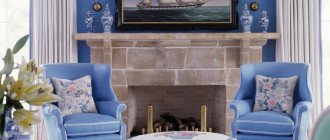
Pink and blue
Blue and turquoise can “get along” well with pink, despite the obvious differences in tonality. It is best to use shades of blue and rose in the bathroom and only in their light variations: together they will give the interior a feeling of airiness.
Pink and red
The most beneficial duo will be pastel pink combined with burgundy, which is often used in the classic style. With the correct dilution of a light shade with a dark one, an interesting and elegant interior is obtained, but if there is an oversaturation of red tones, the room will be gloomy and repulsive.
Pink with lilac
You need to be very careful when working with tones that are close to each other, such as lilac and rose. If the accents and proportions are chosen incorrectly, instead of mystery and romance, you will get a cloying picture that will quickly get boring. It is best to combine light tones of pink and richer lilac accents in the bedroom interior.
Pink and black
The combination of rose and a small amount of black accents is widely used when decorating living rooms and bedrooms in the French style. Also, in combination with other, richer colors, this tandem is inherent in oriental style.
Pink and brown
The shade of brick, as well as brown and woody notes, are no less often used by designers in conjunction with pink tones. This option is classic and can be introduced into the interior of a bedroom, living room, or children's room.
Materials
It is very important to choose the right not only the shade of the curtains, but also the material from which they are made.
Classic and win-win types of curtain materials are satin, jacquard, chiffon, organza and tulle.
Curtains made from chenille look creative and unusual. If you are choosing a set of combined curtains from several types of fabric for an apartment, then it is better to use different shades for each material - for light fabrics, choose lighter and more delicate colors, for heavy and massive materials you can choose slightly darker and more saturated colors.
Professional designers extremely rarely choose heavy and bulky materials in the shades described, since in this case the color loses its delicacy, lightness and sophistication.
Tucks in the shape of flowers, as well as potholders made of pebbles and beads, will look very beautiful as decoration for curtains.
One of the gendered clothing shades is definitely pink. This color is firmly tied to the female gender in the minds of most inhabitants of the globe. The separation begins literally from the threshold of the maternity hospital - with a ribbon on the blanket, everyone they meet is informed about what gender the child has been given to the parents. The girls are dressed up in pink dresses, ribbons of the same color are woven into their hair, and even the doll cars they play with are painted, as expected, pink.
Interesting fact: until the 40s of the twentieth century, blue was considered a “girlish” color, and boys were supposed to wear pink - as a softer version of the aggressively masculine red color. Pay attention to Cinderella's dress in the Disney cartoon - it is no coincidence that it is blue.
However, in the modern fashion world, pink has virtually no place in a man's wardrobe. Therefore, all the colors in this palette belong entirely to women, and especially to young girls. Pink has been associated with youth since the times of the ancient Roman Empire - this is exactly what young people are depicted wearing in ancient frescoes. But women of an elegant age also willingly use shades of pink in their wardrobe - with the right choice of tone, it is refreshing and youthful. You can't miss the opportunity to look younger just by wearing the right set of clothes.
Pink is also considered a very tasty, “edible” color - it is no coincidence that confectioners strive to add this color to their desserts: to enhance the attractiveness of the product and increase its sales.
Matching Styles
Compliance with style is no less important than choosing the right color combinations. Pink will fit into various interior styles: vintage, classic and others.
Modern style
The design of the rooms involves the use of a variety of natural and artificial materials. Furniture should not have pretentious shapes: only straight lines are allowed. On the walls, it is popular to use photo wallpapers or various geometric patterns. Usually pink in a modern style is used as the main color of the walls, but only in its soft versions.
Classic
The classic style is based on smooth transitions, standard forms, modesty and restraint. Therefore, among pink shades, dusty, ashen, and pastel tones are most often used. Wallpaper can be plain or with a dim pattern. Combinations of pink with gray, wood, and beige tones are welcome.
Shabby chic and vintage
In vintage style, bright or muted pink shades are used as accent colors, for example, as the color of curtains, chest of drawers, throws on a sofa or bed. This will give the room charm. The shabby chic style includes soft tones and cozy details; light pink in wall decoration here will be one of the most acceptable options.
Provence
The warm, romantic Provence style has a slight touch of antiquity, while it is airy and gentle. Interior colors in this style are usually pastel; other light pink tones are acceptable. Ash-pink walls will look beautiful combined with light furniture and greenish-colored details.
Scandinavian style
Typically, in this design direction, white color prevails: it is found both in the decoration of walls and ceilings, and in furniture. Materials must be natural, this applies to both floor coverings and textiles. Pink is used only accentually and in small quantities.
Using pink in different rooms
Pink can be used in almost any room. The main thing is to introduce it correctly into the interior. This tone does not like too bright chandeliers, so it is better to distribute lighting systems around the entire perimeter. Soft, diffused light will make the room cozy.
Bathroom
Pink is quite suitable for the bathroom, especially in combination with gray, peach, blue, and white. Mirrors in the bathroom will look great: the pink color is reflected especially beautifully in them, giving a delicate tonality. In a large bathroom, you can decorate two walls with a pinkish finish; in a small one, it is better to use this shade for accent decoration on a white background.
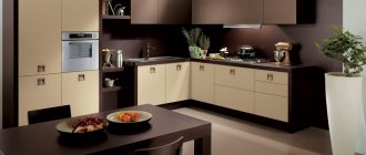
Kitchen
Pale pink in the kitchen is conducive to intimate gatherings and improves appetite. This can be a problem: against the background of such airy decor, the craving for sweets increases. But the overall atmosphere will be cheerful, especially when diluting the color of the rose with bright tones: green, blue, orange.
You can decorate only the dining area in pink, and decorate the working area with a different, more modest color, for example, wood, coffee, or beige. The wall covering does not have to be monochromatic: pink designs on the wallpaper, flowers and intricate ornaments are quite appropriate in the kitchen. Kitchen facades in pink tones rarely look good; it is better to use only a dark crimson palette for partial finishing of furniture. But the tiles of the kitchen apron may well have all shades of pink, with it the room will sparkle with new colors.
Bedroom
In this room, pink and its shades will be very appropriate. Even a man will love decorating the room in muted pink-beige, pink-peach tones, pastel and ash shades. A glossy white stretch ceiling is perfectly complemented by a composition of photo wallpaper on one wall and modest plain wallpaper on the other walls. If the ceilings are low, it is better to use light companion wallpaper to provide a zoning effect for the space.
In the bedroom, rose-colored accessories and textiles would be an interesting solution. For example, curtains or tulle can have an ornament of the same shade as photo frames, paintings, vases, candlesticks and candles, interior figurines and decorations. A salmon pink wardrobe or chest of drawers looks original in a bedroom decorated in vintage style.
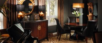
Living room
The optimal solution is to create a cool pinkish background in the living room, complementing it with furniture in wood, gray, white, and beige shades. If the walls are brighter, the rest of the furnishings should be contrasting and as light as possible. In Indian style, pink and orange colors are combined in the living room. To add aristocracy, the shade of rose is combined with lavender and mint tones.
Children's
Pink color is widely used when decorating girls' bedrooms. Of course, you can make the decoration or furniture bright, bringing the interior closer to the “Barbie doll style,” but more often than not, such an environment quickly gets boring. It is better not to introduce a lot of saturated tones, but to give preference to those that can soothe, evoke a feeling of magic and tenderness. The base color should be pastel or pale pink, and for rich shades, set aside a play corner or use them in accessories.
Hallway
Decorating a corridor with a shade of rose is not common. Although the palette of pink colors is rich, you can find a suitable one even for this room. It is better to choose calm tones: pastel, with a hint of peach, haze in combination with gray or steel colors. To illuminate the corridor, it is worth using LEDs and spotlights: soft light will make a windowless room very cozy.
Features of color selection for interior elements
Decor and various pink accessories are very popular: they allow you to change the look of a room without making drastic decisions or carrying out renovations.
Curtains
Textiles on the window can create a cozy, warm atmosphere in the house. Delicate rose tulle looks harmonious with curtains of a darker color or, on the contrary, with contrasting curtains. For the kitchen and balcony, blinds, curtains, and Roman blinds are often used: they give the room sophistication and bring it closer to a modern style.
Furniture
In the living room, the main object of attention can be a sofa complete with light pink armchairs. Such furniture looks especially impressive on a dark brown floor. In the neoclassical style, a popular solution is furniture made of velvet in a dusty pink shade; it is also suitable as an element of oriental design.
A bed with a pink leather headboard will add romance to the bedroom interior - the product is perfect for shabby chic, Provence, and romanticism styles. A cabinet of such an unusual color, especially a restored antique one, is an integral attribute of vintage and retro styles.
Textile
In addition to curtains and tulle, designers often recommend plain carpets with long pile from pink textiles: they fit perfectly into Provence, classic, shabby chic, and Scandinavian style. Covers for armchairs, sofas, chairs and stools can harmonize with the carpet, and the interior will look complete. In the kitchen, napkins, tablecloths and towels with potholders in shades of rose will add a touch of tenderness.
Decor and accessories
Various decorative elements are introduced into the interior at the last stage. Pink is a gentle, romantic color, but accessories can also have a strict shape, which will make the design more interesting. Candles, lamps, lanterns, plates and figurines that suit a specific style will refresh even the most modest-looking room. Accents can also have a brighter color: for example, a fuchsia shade, they will look great in a beige-pink interior.
The Story of the Dusty Rose
From early childhood we get used to gender differences in colors.
If a child was taken out of the maternity hospital in a blue envelope, then it is a boy, in a pink envelope, it is a girl.
Future ladies continue to be dressed in the same spirit. Interesting fact: until the 40s of the last century, it was the blue shade that was considered girly. You can see this by watching the Disney cartoon “Cinderella”. Several shades of pink in different things, and in addition - soft orange.
Who came up with this color?
It was first mentioned in
Colin McCullough's book The Thorn Birds
, where the main character wore a light pink dress. In 1983, a film with the same name was released on American screens, and in a short time it became popular all over the world. It was thanks to him that this color came into fashion and began to be used by leading designers around the world.
Room decoration
Pink color can be used in almost any type of decoration; the only important thing is its dosed and correct use.
Walls
To adjust the space of a room and choose a successful combination, they usually use two colors in the main wall decoration. The white and pink color scheme is considered classic; in minimalism and modern style it is worth using wallpaper and paint in pink and gray tones. Photo wallpapers with floral motifs, tiles or unusual pink bricks are also suitable for walls.
Floor
A rose-colored floor is a very non-standard solution, but a carpet of this shade can be relevant when arranging a room for a girl or a bedroom. Also, some interior styles use pink and white flooring with marble imitation. Dirty pink tiles combined with white walls and bright decor may be suitable for a bathroom.
Ceiling
Suspended, suspended, multi-tiered ceilings are an interesting option when decorating a living room or bedroom. Glossy coatings visually enlarge the space and harmonize perfectly with wallpaper with photo printing, especially when the pattern or shape of the ceiling echoes the decoration of the walls.
What shades suit each color type?
It’s not for nothing that stylists have lost their tongues, tired of answering the question: who will wear pink? Any color type has room to develop, and the most important thing in the color scheme of your personal set is that the pink color takes up as much space in it and exists in exactly the shade that corresponds to your age group.
Winter color type
Contrasting girls of this color type will suit bright, even flashy tones of pink. You should avoid calm, soothing shades that do not correspond to the “winter” expressiveness in terms of their impact on others. Cold and intense pink colors, even dazzling neon, will fit perfectly into the wardrobe of this color type. The only warm shade that they are allowed among the entire pink palette is intense coral.
Spring color type
Salmon, pale pink in various variations, coral, flamingo - all this is very suitable for a warm, golden spring. You should focus on the color of your natural blush - the skin itself will tell you what kind of pink color it needs. Cold magenta, dusty rose, clover variations with a lilac flavor extinguish the natural beauty of “spring” women. Perhaps they are the only ones who are contraindicated in fuchsia, except in very small “therapeutic” doses and at a great distance from the face.
Summer color type
Summer is always friendly with those shades of pink in which the influence of gray and blue is felt: “faded rose”, crimson, pearl, pink-lilac, dirty pink must be present in the arsenal of a “summer” beauty of any age. “Dusty rose” and dirty pink must be handled carefully - with a high degree of whiteness or, conversely, the presence of obvious gray in pink tones, skin prone to blueness or grayishness can take on an unhealthy, faded appearance. Therefore, it is better not to wear sets in which these colors predominate and, moreover, are concentrated in the upper part of the outfit.
Autumn color type
For some reason, in the fashion space, on the pages of blogs and websites about style, among readers and participants in discussions, there is a widespread opinion that red hair color, often inherent in this color type, and the pink color in clothes are written antagonists.
In fact, this is not true. Copper-red, brown, golden hair harmonizes perfectly with the right pink: lilac-pink, crimson, cyclamen. The subtlety is that the color has a clear structure - without halftones and without faded, indistinct shades. Autumn is contrasting and active - give it a worthy frame in the form of bright colors.