The turquoise color is not only incredibly beautiful, but it has its own meaning and positive power, which ancient people felt
Do you sincerely believe that like is drawn to like? Not necessary when it comes to the color scheme of the interior decoration . For several years now, turquoise has remained in the top five trending universal shades for home interiors . Another fashion whim or a truly worthwhile find that goes with everything? Let's try to figure it out together.
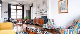
A wonderful combination of turquoise and terracotta colors in the living room interior
The color turquoise is directly related to emotions and feelings.
Turquoise color of different shades in the design of a cozy living room
The nature of turquoise and interiors
What color goes with turquoise is a question that worries many owners of houses and apartments who are planning to start renovations. Turquoise is the color of life, it is used in all areas, from clothing, jewelry to interior design. Photos of modern rooms this year are filled with turquoise, wallpaper, furniture, accent accessories - it takes on fancy shapes. However, this is an incredibly rich shade that can be “overbearing” psychologically, and therefore it needs to be “diluted” and wisely combined with other color solutions depending on the scope of its application. Which color is most harmonious when combined with turquoise? This question was long ago answered by experienced decorators who are ready to share simple but effective tips.
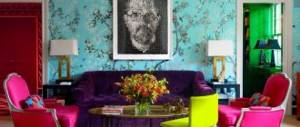
Interior decoration: skull inlaid with real turquoise stones
Beautiful kitchen in loft style
Turquoise color in the decoration of a stylish bathroom
Turquoise is a symbol of love of life and energy; it finds its niche in any style from classic to high-tech. Why does this color so easily find a common language with the world and design variations?
The versatility of turquoise is explained by the nature of its birth; it is not a pure color in itself; if you look at it in detail, it is a mixture of many parts of the color spectrum. The basis is blue and yellow, the fusion of which gives turquoise and the play of its shades; as soon as you add a little more of one or the other, turquoise reacts sensitively to changes. That's why we can often confuse it and call it sea green or even blue, but "some strange blue." Our eyes perceive the affinity of this color with green in different ways, sometimes calling it “almost emerald” or “bottle” if the shade is dark turquoise. This is a changeable color that can give incredible sensations if you find the right approach to it.
Today, turquoise color is very relevant in textiles.
Turquoise and gold wallpaper in the interior of the restroom
What turquoise can give in the interior
- Optical illusion of coolness and cleanliness.
- Psychologists claim that it has a positive effect on the psyche - it gives better concentration to achieve goals or promotes a better feeling of solitude. The main thing is to successfully play with the shades.
- It gives a feeling of the proximity of natural bodies of water, to which city dwellers are so often drawn, but due to the heavy workload they cannot go to them as much as they would like.
- The color fits organically into all types of rooms - neither a turquoise bedroom, nor a living room or children's room, nor a turquoise kitchen or bathroom is striking in beauty and does not irritate the eye.
Turquoise textiles are perfect for a white bedroom
A pouf will elevate the interior, diversify it and give the room elegance and comfort.
Beautiful living room interior in art deco style
Turquoise rooms best help their owners escape from the tenacious clutches of urbanization and feel themselves in quieter places, close to nature. Now let’s look at what colors go well with turquoise.
Color harmony in the interior
The right combination of colors allows you to fully reveal the beauty of turquoise in a design solution.
We also recommend reading:
Hot-rolled sheets: purpose and varieties Refractory boards: purpose, varieties, selection criteria Features of the technology of puttying walls for painting and wallpaper Protective treatment of planed timber
What shades does the turquoise tone go with?
- Gray is a universal option. The bright, sunny palette of turquoise goes well with calm and restrained tones. Soft gray is ideal for balancing the richness and color vibrancy of a design. You can avoid monotony in the interior by decorating. The shading combination of two primary colors creates an unusual and self-sufficient corner in which you can get a charge of positive emotions and peaceful peace.
- Red is a bold decision. Sea green wallpaper and bright red colors can look quite sharp and contrasting. To properly design such an interior, you cannot do without the hand of a specialist. A composition with muted red colors is a stylish, joyful and festive option. For harmony, you need to remember that 60% of the room should be the main color, and 30 - additional. Light pink and soft coral look good in the interior. Bright rich red can act as accents, for example, a hallway with red rugs, lamps or shelves in the closet.
- Yellow is the right approach. This is not to say that the yellow color does not combine with turquoise - the turquoise color has a variety of shades, which opens up great scope for choosing a yellow palette. Turquoise walls and yellow chairs, tablecloth or other decorative elements look good. For dark turquoise, designers choose sunny, lemon colors, and for pale turquoise - a delicate, not too saturated range. If the hallway or other rooms in the house look too flashy and bright, you can add additional color: gray, coffee or white.
- Orange – joy of life. Sea-green walls in the interior, together with small furniture and accessories in an orange hue, can create a cheerful atmosphere, lift your spirits, and charge you with positivity. Bright orange chairs in the kitchen or pillows in the bedroom should not be the dominant image in the design.
- Blue – uncertain option. A beautiful soft blue color combined with turquoise requires special attention. Designers believe that this unstable combination creates an unclear and vague image. The solution to the uncertainty of such colors in the interior is to add another basic tone to the composition: white, milky or cocoa. The room is also decorated using dark shades, for example, a picture with a black border looks good on turquoise walls.
With green, blue and cyan
There is a lot of debate about the compatibility of these colors, but no matter what anyone claims, we have one indisputable argument - our own eyes, which are able to see and let us understand that shades of the same range smoothly flowing into each other are an interesting find. The main thing is not to combine turquoise, green and blue of the same saturation level, but to give one of them a clear leading position.
The combination of turquoise and green looks very interesting
Play of shades in the interior of a modern living room
The symbiosis of these tones is suitable for:
- Bedrooms - a large and bright room looks advantageous if turquoise takes the role of the “queen”, and green and blue faithfully serve as her pages, highlighting her greatness. The main thing is that the ruling color in the bedroom should be soft and non-aggressive. We’ll leave special richness for the living room.
- Living room - here turquoise can either boldly become the “highlight of the program”, showing its nature in very bright forms, or serve as a moderate background for others and give the reins to blue and green. This is a matter of taste and interior design ideas, sometimes turquoise color serves best as an accent, if there is a large niche in the room, you can additionally decorate it with pieces of furniture or curtains, rugs and other small items of the same range. A large turquoise sofa looks especially beautiful as a focal point.
Rich shade, the depth of which is emphasized by light and shadow
Spectacular boho bedroom
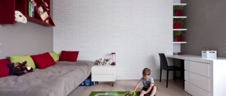
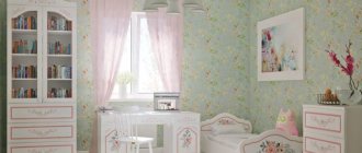
- Children's room - for our children this can be a godsend. Oddly enough, a turquoise room corrects your attitude towards life in a positive direction, giving an influx of energy, but at the same time promotes good sleep. Options can be different - from the domains of a merman to a fairy forest or a turquoise kingdom. If parents have doubts about painting the entire walls, you can focus on small details or interior items - wallpaper with turquoise stripes, put a turquoise chest of drawers, a table lamp, etc.
- The bathroom is a complete flight of fantasy, but with an emphasis on relaxation; after all, the bathroom is a place where we not only carry out hygiene procedures, but also relax after working days.
A ceramic bath against a background of turquoise tiles looks very impressive
Turquoise ceiling, furniture and decor in the nursery
Gradient of shades from teal to soft candy mint
Turquoise and cool sea or gentle mint tints will create the atmosphere of the real kingdom of Ondine. Their natural purity and freshness will make it easier for the hostess to create invaluable comfort.
Beautiful living room in a marine style
Black color
The same cannot be said about black. No doubt, the combination of turquoise and black is very impressive, but in large quantities it is too intense. Therefore, it is better to use black not as a second base color, but as an accent color, as in the photo on the right.
Every year, the turquoise background in the interior is rapidly gaining popularity, becoming a favorite in the color palette. Turquoise can harmonize perfectly with most shades of the spectrum, which opens up wide possibilities for design solutions and increases its demand for use.
Every year, the turquoise background in the interior is rapidly gaining popularity
Shades of turquoise can dramatically affect the design of the apartment and highlight modern decorative elements.
Features of turquoise in the interior:
- The turquoise color brings a certain coolness and cleanliness to the room. It has a positive effect on a person’s thinking, stimulating them to achieve their goals and take specific actions. Helps to activate perseverance and perseverance.
- Turquoise is a relative of the green color, obtained by mixing yellow and blue palettes. However, compared to green, turquoise has predominantly blue tones, so it is considered a cool shade.
- A room with a turquoise interior helps you to retire and concentrate on your work. This background is not suitable for noisy or public areas. One of the best options is to decorate an office or bedroom. Many people like the soft turquoise hallway.
- The abundance of gamut enhances the love of fame and pride, turning any person’s goal into an obsession. To prevent this, you need to correctly combine the tone with other colors. Then this will create a clean and bright atmosphere with positive thoughts, fresh feelings, feelings of fortitude and firmness in your plans.
- Turquoise is a unique color; it is used to decorate almost all rooms in the house. It looks great in the living room, is suitable for the kitchen and dining room, and will decorate the nursery. A dark turquoise element in the kitchen can even reduce your appetite.
- The color turquoise is associated with water, waves, and tropical vacations in the sea. Residents of large cities and megalopolises often choose it for their interior in order to escape from the bustle of the city, plunge into the world of relaxation and freedom, being closer to life-giving nature.
Shades of turquoise can radically influence the design of the apartment and highlight modern decorative elements.
What color does the turquoise shade go with? To emphasize the “marine” character of the room, turquoise is combined with a white palette. This range also helps to create a romantic atmosphere that will be fresh and clean. As a rule, designers prefer to make a white ceiling and turquoise walls. These two elements are a great solution for a girl’s room.
The right combination of turquoise color in the interior will allow you to plunge into a cool and vast world that brings freedom and open spaces of the sea.
With black and brown
Pairing black and dark brown with bright colors is design classic By combining turquoise with them, you can achieve a spectacular contrast. The elegance of the plexus will look stylish and laconic.
Turquoise color against black looks great
Such symbiosis is an indicator of aesthetics; it fills the room with tranquility and gives a feeling of majestic simplicity and comfort. This is the case when you need to emphasize expensive simplicity, like an elaborate luxury jewel on a simple plain dress, where rhinestones, peacock feathers or ruffles would not be appropriate. In the interior it will sound like charming severity and clean lines. If the interior seems too ascetic, you can add patterns, but they should not be flashy. That's why brown and black make the most successful company with turquoise in a classic interior. This is not always suitable for the kitchen or bathroom, and is somewhat more often a good idea for the bedroom or living room.
Bright chairs in the interior of a bright kitchen
Spacious bathroom with turquoise walls and ceiling
What to combine turquoise walls with?
A competent combination of turquoise wallpaper helps create a luxurious design. To do this, it is recommended to follow the advice of professional designers:
- discreet turquoise and soft beige add a bit of warmth to the finished interior;
- You can create a laconic design using rich brown and dark turquoise shades. This combination reflects all the nobility of the color palette. High-quality furniture and expensive accessories create a truly refined interior;
- monochrome colors of blue have a calming effect on the human subconscious. It's nice to be here after a hard day at work. Cozy textiles reflect peace of mind and tranquility;
- Rich turquoise wallpaper in the bedroom in combination with a chocolate shade is often used to create a stylish and harmonious living space. Such paints are preferred by creative people who keep up with the times;
- for more peaceful characters, it is best to choose delicate details in the space of the room.
When choosing a color palette, you need to familiarize yourself with the availability of additional lighting. A sunny room is perfect for bright colors in the interior. The lack of sunlight in a dark space adds a kind of discomfort. On a subconscious level, it becomes uncomfortable here.
With white
In combination with white, any color becomes softer, deeper and more noble. Turquoise is no exception: with the color of snow and clouds, it is faceted and looks delicate and rich.
The turquoise floor looks bright and very unusual
When to combine with white
- when creating a marine style, white perfectly emphasizes the marine motifs of turquoise;
- lively retro - it was once fashionable to have wooden furniture upholstered in turquoise fabric with white accents and painted walls;
- for a Provence style bedroom - a combination of turquoise curtains, bedspreads and parts of the walls with white furniture will create a beautiful girlish room.
Fresh aquatic colors in an eco-style interior
Turquoise color will dilute the white interior, adding bright notes to it.
Turquoise in stylish designs
Turquoise can become the basis for creating interiors of any style, as it not only easily combines with other colors, but also “gets along” well with metal and glass, ceramics and wood. Combine it with purple and brown and you will get a wonderful oriental style room. There is a place for turquoise color in a classic interior. Do you want to see palace luxury in your home? Decorate the walls in turquoise-beige or turquoise-gold shades. When looking at such a combination, an association with brocade and silks will certainly appear. Try a turquoise background in a rough and primitive African style and the room will instantly feel livable and inviting. Walls of this color will bring comfort to a cold and straightforward high-tech. Gilded turquoise perfectly conveys the pomp of the Empire style. It is able to convey the warmth of the Mediterranean style and will be an excellent choice when creating newfangled art deco, eclecticism, and avant-garde.
Bright living room in turquoise tones
Bold mix and warm tones
Do you want to break the interior template and experiment with the palette? A bouquet of the most colorful flowers, seasoned with dreamy azure, is a good start to change for the better.
Color mix in living room design
A great idea would be to combine heat and cold: red , yellow , orange on one side, and turquoise on the other. Colorful accents are sure to bring positive comfort.
Games of fire and flame have long attracted passionate people, but they should be implemented without going overboard, having clearly defined the inner mood and goals.
Turquoise plus orange . The basis should be turquoise, the orange notes here are intended to serve as holiday highlights to cultivate joy and a feeling of happiness. The embodiment of the idea should be reflected in the azure wallpaper and filling the room with splashes of red - a bedspread, a picture, pillows, a pattern in the curtains, etc.
Mixing turquoise with hot hues, typical of traditional South American and Mediterranean color schemes in the home
Turquoise and yellow. When heard, this combination always evokes skeptical exclamations, but if you approach the design wisely, you can get original solutions. The main thing here is that both tones should not be very saturated, almost pastel, and turquoise should predominate. Yellow can only serve as a splash.
Unusual yellow table against a turquoise wall
Turquoise and gold. These motifs have long been actively used in the creation of palace interiors; state and ballrooms often shone with turquoise and gold. Today they are replaced by living rooms and corridors, and this combination is often used for the bedroom. Golden patterns on turquoise canvas create the feeling of an expensive material, without weighing down the space or visually reducing the size of the rooms. This is a cheerful classic.
Gold and turquoise - a natural combination
Turquoise and red. This is the boundary of youth and growing up, or the same theme of water - after all, beautiful corals grow in the sea. The main thing is that there is a little red, and it is discreet even in accents - not a completely red pillow, but a turquoise pillowcase with burgundy flowers, not a scarlet lampshade, but a different shade of turquoise or green with red patterns, etc.
Turquoise color can carry not only the main color load, but also perfectly complement the interior
Natural turquoise and red, somewhat muted shade, plastic in furniture
Such combinations can be used in any room, even in the kitchen, skillfully complementing it with a glass apron and furniture with turquoise upholstery.