Gray color in interior design is always a good and practical choice. This color is neutral, calming and suitable for all rooms in your home. Plus, it goes well with almost all colors.
So, what curtains will go with gray wallpaper? The first step in choosing curtains for a room is to determine the overall tone of the interior. If you look closely at the color gray, you will notice that it can have a cold or warm tint.
A cool shade of gray has an undertone of blue or cyan. While warm - contains a red or yellow undertone.
Curtains in cool tones work well for cool-toned walls. If, on the contrary, your interior has a warm gray tone, then it is better to also use warm shades for window decoration.
White and cream
Although white is a versatile color, it will look best against walls in a cool gray tone. If the room is dominated by warm shades, then it is better to opt for cream curtains.
White curtains for the hall are an excellent choice. They give the room a fresh and elegant look.
Choosing curtains for rooms of different purposes
What curtains will go with gray wallpaper if they are pasted in the bedroom, living room or children's room? Depending on the type of room, curtains are also selected. When choosing, you should consider some nuances.
Additional bright accessories are often used in the living room: pillows for sofas, various decorative items and more. If the walls in the room are gray, then the fabric can be used in the same palette. And decorative elements will help you place the right accents. Thanks to them, you can create a special, sophisticated atmosphere in the living room.
A gray background in the kitchen creates a feeling of neatness, cleanliness, and neatness. This feeling can be enhanced by choosing curtains in a matching shade, such as cream or green.
An office in similar colors looks businesslike. And the curtains here can be rich, with notes of metal.
Designers rarely use gray color to decorate the interior of a children's room. It is not particularly appropriate in a room of this purpose. But it is quite possible to use it in a limited way, for example, when zoning a room. In this case, it is better to sew curtains from fabric in rich colors, such as orange or green.
You may also be interested in: Types of curtain tape for different drapery shapes
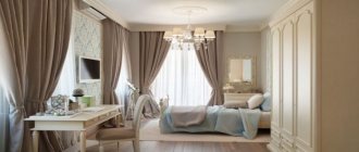
When choosing colors for a bedroom, it is necessary to use a palette that creates a peaceful environment. Everything in this room should be calming, conducive to rest and sleep.
Not only the color of the curtains matters for the interior in gray tones. Designers say that if you choose the right color combination, but the shape of the curtains does not match the style of the room, then it is unlikely that you will be able to complete the look.
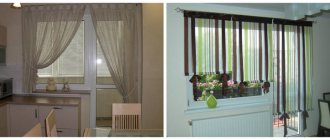
The configuration of the curtains can be different: very often the good old classics look great, in some cases you can choose French or Austrian curtains, and sometimes Roman curtains are the best option.
When choosing curtains to match a certain shade of the walls, it is important not to forget about other home textiles. You need to pay attention to bedspreads, covers for chairs and sofas, etc.
See the full collection of photos of curtains under gray wallpaper and walls in different rooms in our gallery.
Save
Save
Save
Save
Sand and beige
Sand and beige shades can have either a cold or warm undertone. Curtains the color of wet sand go well with cool gray. The golden-sand shade will harmonize with the warm tones of the interior.
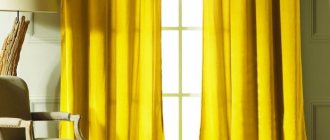
Yellow
Gray and yellow are a stunning combination of colors; together they create a very special atmosphere in the room. However, yellow is a very bright color and should only be used to create accents in the interior. This combination looks especially good in the living room and bedroom.
Green
Green color can be suitable for both warm and cold toned walls. For cool shades, neutral green, pastel light green, emerald, and aquamarine are suitable. Mustard, olive, and pistachio go well with warm shades of walls.
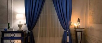
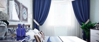
Blue and cyan
All shades of blue go well with cool gray: deep blue, sky blue, turquoise. Curtains with a pattern that combines several shades of blue at once look especially advantageous. This color combination is well suited for a living room, office or bedroom.
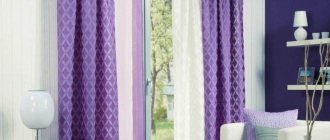
Violet
Purple looks harmonious in an interior with gray wallpaper. This color is suitable for many interior styles, the main thing is to choose the right shade: from pastel violet to intense dark lilac.
Gray color in the interior of apartments
Gray wallpaper is the ideal solution for stylish and ultra-modern designs. This tone gives designers a lot of creative options.
Dark and rich shades are rarely used in the decoration of living rooms. Practice shows that the most popular tones are light gray, gray-blue, green, purple;
These shades look attractive and combine with each other and with other contrasting tones. When choosing this universal color for interior decoration, take into account the following points:
- From a psychological point of view, soft gray shades are considered comfortable for a person. They are often used when decorating residential premises. Cold variations are appropriate in a work environment, which means they are suitable for an office, and the color of light steel is suitable for a kitchen.
- Dark colors, when used correctly, make a room more elegant. It is important not to overdo it, otherwise the room will turn out gloomy.
- Do not overuse slate shades. Their abundance provokes the development of depression. But a slate-colored pattern on curtains will come in handy.
- To create an elegant design, use contrasting curtains for a room with gray wallpaper.
- The boiling white on a gray background looks too formal and reminds of a hospital. It is better to use milky, yellowish and dirty shades of white.
Related article: Combining a balcony (loggia) with a kitchen or room
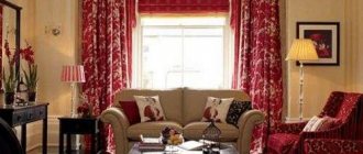
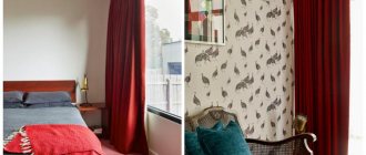
Red and pink
Despite the fact that red is considered a warm color, it can also be combined with the cool tone of gray walls. In this case, you need to choose curtains in shades such as carmine, bardot, raspberry, cherry. In the pink palette you can choose such cool shades as lavender pink, fuchsia, tea rose.
If the walls in the interior have a warm tone, then you should select textiles in scarlet, brick, carrot, terracotta, apricot, salmon, and coral shades.
A color scheme
Choosing curtains to match beige wallpaper is not very easy. This is a painstaking task, since you need to take into account not only the color, but also the texture of the textile. This is the only way to achieve the integrity of the interior.
To choose the color of curtains for beige wallpaper, you first need to understand what tones beige is compatible with. To decorate and design a room, experts use not only one shade of beige, but all its interpretations, of which there are a large number of types. Sometimes it can be difficult to fully understand them; here it is better to use ready-made color palettes.
The beige color in wall decoration is universal. You can choose bright, dark, or pastel drapes and curtains to go with it. Therefore, the determination of the color of the curtains should be based on the purpose of the room’s decor: if it is necessary to highlight a bright environment, then it is better to decorate the windows with beige, pinkish, cream, yellowish, and pale blue tones.
Selected colors such as crimson, purple, green and many other tones are suitable for accenting curtains.
There are cold tones of beige colors, such as light, gray-cream, green-beige. There are also warm shades: peach and brown, orange, wheat and yellow beige. Each paint step has its own color companions in order to create the perfect look. The basic rule for color combinations: for beige walls in warm tones, you should choose warm shades of curtains and tulle; in the case of cold ones, preference is given to the same tones of window textiles.
For example, light cream-colored wallpaper will harmonize perfectly with curtains of the same shade, only in darker colors.
You may also be interested in: Peach tulle design - recommendations and photos
Classic neutral beige goes well with dirty pink, red and olive, brown, blue-gray and gray-green, purple, yellow and gray. But just choose these colors wisely. An excellent option for such curtains is offered.
Beige tones combine perfectly with all shades of brown; they combine more advantageously with cappuccino, white, and golden colors. An interesting, but too contrasting combination will work with black. In this case, the latter can act as some small part of the ornament.
Beige also goes well with soft green shades.
But juicy purple must be combined with light brown in measured doses. Before adding scarlet or red to a beige interior, you need to think carefully, but if the beige is very light, then the combination will turn out funny. And such tones are reinforced with accessories of a similar color.
Black, lingonberry, turquoise, lemon, olive, purple must be combined with cream walls very carefully. These colors can only be used by experienced designers. But if you still decide, you can consider one of the options on the website.
Grey
An interesting effect can be achieved by combining gray curtains with walls of the same color. To prevent the interior from becoming boring, you need to select textiles several tones lighter or darker than the main color of the walls. A good solution would also be to use textiles with contrasting prints, which will highlight the window and add coziness to the interior.
As you can see, there are a lot of options for window decoration. Choose your favorite palette and create your own unique interior.
What is the power of beige color: studying character, psychology
When choosing a dominant color for a room, a person relies on the internal content of the color, on the strength of its psychological impact. It is very important that the color of the room is not an irritating factor and does not cause negative emotions. What colors can do this?
Beige color is “rich”, delicate and charming, elegant and “thoroughbred”, forcing you to respect everything that is done in its shades. The whole world has long stopped looking for something exclusive, extraordinary and surprising. Millions of people bet on beige color in the interior - and win.
Connoisseurs of classics choose beige color to decorate their home. Beige is a color with a million shades, each of which is individual and self-sufficient. The magic of color can pacify and relieve aggression. If there are beige tones around, relaxation “takes effect.” Relaxation is the main dominant function that beige possesses.
Psychologists affirm and confirm that people who strive to fill everything around with beige are sophisticated natures, with a great inner world, with an open soul. These practical people, not aggressors, maintain composure in any situation and take neutral positions on controversial issues.
This color is not characterized by bright emotions, so sometimes beige is classified as an amoebic color, which is characterized by the effect of stagnation. But at the same time, beige is a very warm color with calm energy.
Related article: Plastic panels for the kitchen: wall panel with a pattern, how to cover a kitchen, panel ceiling, finishing, photo
Due to its nature, beige color is not used independently. More often it is in the background. If it is chosen as a base, it must be combined with brighter colors.