| Maroon | |
| HEX | 800000 |
| RGB¹ (, , ) | (128, 0, 0) |
| CMYK (, , , ) | (29, 100, 100, 40) |
| HSV² (, , ) | (0°, 100%, 50%) |
| |
Dark burgundy
(English maroon, French marron, chestnut) is a shade of red, also called brown-raspberry.
Although the English and French names for the color come from the word “chestnut,” maroon and chestnut are completely different colors. It should also be taken into account that in many countries the synonym for the color “Maroon” is “Bordeaux”, while in Russia burgundy is usually associated with a lighter color.
The table shows synonyms, as well as colors with similar names in different languages.
| Color | Hex-RGB | Color name | A country | Link |
| 800000 | Maroon | Russia | ||
| Synonyms | ||||
| 800000 | Brown-raspberry | Russia | Brown-raspberry | |
| 800000 | Granate | Spain | es:Granate (color) | |
| 800000 | Maroon | USA | en:Maroon (color) | |
| 800000 | Bordeaux (Bordeaux) | France | fr:Bordeaux (couleur) | |
| 800000 | Kasztanowy/Wiśniowy (Chestnut/Cherry) | Poland | pl: Barwa kasztanowa | |
| Colors for comparison | ||||
| 800032 | Bordeauxrot (Bordeaux) | Germany | de:Bordeauxrot | |
| B00000 | Bordeaux | Russia | Bordeaux (color) | |
| 9B2D30 | Burgundy | Russia | Burgundy | |
| 954535 | Chestnut | USA | en:Chestnut (color) | |
| CD5C5C | Chestnut | Russia | Chestnut | |
| 964B00 | Marron (Chestnut) | France | fr:Marron (couleur) | |
| 8B6C42 | Châtain (Chestnut, brown-haired) | France | fr:Châtain | |
Color meaning for each style
A variety of shades are used in well-known, recognizable styles, time-tested, such as classics and art deco. The color of an exquisite burgundy will emphasize the good taste of the owners. The matte finish will make the interior deep. The combination of red and brown gives the desired shade, which is quite common in historical styles such as baroque and country.
Carpet in the living room with fireplace
Now some solutions are based on an individual approach. The burgundy color, which has some traditionality and stereotyping, emphasizes bold interiors, creating beautiful eclectic, non-standard solutions, fashionable fusion with notes of ethno-style. With the white paint of a modern style and the industrial brick of a loft, burgundy elements wonderfully exist, becoming expressive art objects:
- tapestries;
- country style textiles;
- silky carpets with recognizable oriental patterns;
- abstract painting.
Nuances and features of color
The burgundy color has always been a symbol of wealthy people. Bordeaux is an incredible combination of red and brown colors. Red carries life, fire, courage and love, knowledge and power. Youth is also a suitable note for this color. It is these qualities that help a person achieve a lot in life.
Brown color has a therapeutic effect - it calms. In addition, it symbolizes confidence and a certain traditionality.
In the short chapters that this article contains, we will reveal the main secrets, give advice and make a few comments about what burgundy color is combined with and how it looks in the interior.
Color proportionality
Depending on the functionality of the room, designers recommend the dosage of this color. After all, a comfortable pastime depends not only on personal preferences. Sometimes even your favorite shade of burgundy can cause discomfort and negative psychological pressure if there is excess.
The total area of the room is of great importance - Bordeaux does not like small rooms. It is able to reduce space visually. Therefore, light colors are chosen as companions, reducing the overall drama of the color.
Will delight you with ideal, verified duets, with no room for error, with the following tones:
- subtle shades of beige;
- pearl and smoky gray;
- pure white;
- creamy, milky, champagne, any alternative modifications of white.
Black and white interiors come to life thanks to bright berry and fruit shades. A distinct finish will add contrast to this trio of mostly achromatic colors. Even the calm, muted tones of a burgundy wall will not allow the hallway or kitchen area to look boring if there are black and white tiles on the floor. But a predominant amount of dark color, without a sufficient share of light, will make the room gloomy.
Not every room can withstand the abundance of deep shades of French wine in the interior. Sometimes it makes more sense to choose one thing for expressive color: furniture instead of walls, or only small decorative objects, as is the case with a nursery. A table of the predominant use of color in specific rooms from the point of view of psychological comfort, regardless of cubic capacity, will help.
| Accent surface area | Large elements | Small accents | Predominant color | |
| Hall | + | + | + | — |
| Living room | + | + | + | + |
| Bedroom | + | + | + | — |
| Kitchen | + | + | + | — |
| Children's | — | — | + | — |
| Cabinet | + | + | + | + |
| Bathroom | + | + | + | + |
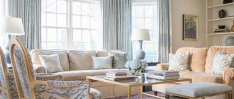
Luxury living room
Burgundy easily takes on a representative function in the interior, because it is associated with solemnity and well-being, which is so appropriate for the main room of the house.
The design of the living room will only benefit from a combination of deep burgundy shades with all the classic design techniques, styles with expressive decor:
- stucco, carving;
- patina, gilding in decoration, ornaments;
- furniture groups made of solid dark wood;
- mirrors, crystal, luxury glass;
- silky, fleecy fabrics for upholstery and drapery;
- textile wallpaper with noble patterns on a burgundy background.
Creating an environment of special scope in the art deco style, bohemian, spectacular is not a problem. But a living room with garnet and ruby walls, painted with matte paint or covered with wallpaper, may well look not like a formal hall, but a cozy and modern space.
A smooth white ceiling and bleached wood floor will perfectly balance the rich walls. Simple lines, geometric shapes of light furniture - for a comfortable, calm living room interior. Adding black in minimal quantities will add elegance.
Advice. High ceilings and sufficiently varied lighting are the key to the effective use of wine shades for walls.
Classic duet: combination of burgundy and black
The burgundy-black pair does not need any special introduction: it is a classic that will always be relevant.
We invite you to check out the duo of a burgundy blouse accompanied by ankle boots of the same color, black skinny trousers and an elegant bowler hat (by the way, very fashionable this season!).
It is impossible not to note another black and burgundy option: a dark translucent blouse, a fitted burgundy coat and high-heeled shoes. Fatal image!
The last combination that we simply couldn’t ignore was an ensemble in which a burgundy pencil skirt was “sung” with a black jumper decorated with a cowl collar. Soot-colored patent leather shoes and a wine-colored leather bag complete this look, which is perfect for autumn days.
Bedroom: delicate and different
Any bedroom will become absolutely luxurious if you add burgundy color to its interior. A particularly refined and attractive, sometimes somewhat romantic look is given by:
- Tandems with soft pink accents, pastel shades of background surfaces.
- Modern bed models are completely covered with textiles for special tenderness and softness of the main bed, and natural fabrics of the sleeping area will enhance the effect of warmth due to deep garnet and wine shades.
- The combination of details in the designer pieces of furniture is simply off the scale: painted wooden legs in dark burgundy, upholstery made of boudoir fabrics.
- Luxurious fabrics - velor, plush work well in burgundy, and beige, black, gold can serve as a contrasting edging and be used for ornaments and patterns.
- Lancet niches, majestic headboard, blue and burgundy - adapted oriental chic of the bedroom.
- A softer, dusty shade of burgundy is suitable for a vintage bedroom design.
The passion of the East and the tenderness of marshmallow are not suitable for everyone. Against the backdrop of a rich, solid wine-red wall, a gray bed of a laconic shape with the addition of black accents in the bedroom design will add brutality to the interior. Fashionable urban motifs can be easily supported with the help of burgundy color in the interior of the entire space of the apartment, which claims to be an original solution with pronounced energy.
Burgundy color in the interior: compositional combination
“ The parallel use of black and burgundy colors in the interior can greatly help in zoning space, but this pair cannot be used in all rooms.”
You don’t need to be a great esthete to guess that burgundy tones will go well with calm palettes of white, beige, cream, milky, light gray color.
The duet of burgundy and gold will make the interior pompous, bursting with luxury. This finishing option is appropriate in living rooms and large halls.
the burgundy and gold duet in the billiard room creates an atmosphere of luxury and rich decoration
The combination of burgundy and black will require some courage from the owners, because not everyone will risk experimenting with it. But if you get the proportions right, you will not be disappointed with the result, because you will be able to curb the riot of luxury, thereby emphasizing your good taste.
The parallel use of black and burgundy colors in the interior can greatly help in zoning the space, however, this pair cannot be used in all rooms . The bedroom and living room are not at all suitable for this, but in the kitchen-studio it will look very good.
burgundy pillows against a black accent wall
The gray-burgundy combination is universal and suitable for use in any interior. Fans of strict decors should pay special attention to this tandem. The presence of a light gray color will definitely provide it, but it will do it incredibly delicately. Your guests will not feel constrained at all in your home, but they will not be able to forget that they are only guests, since there will be just the right amount of severity.
The most popular decorative composition is burgundy and brown. True, there is practically no luxury in such an interior. It rather emphasizes a certain modesty of the owner and looks very good in the absence of such flashy elements as:
- Expensive furniture
- Fancy accessories.
- Antiques.
This decor can be used in any room, regardless of its size, which also adds points to the burgundy-brown combination.
combination of burgundy and brown in the living room interior
The result of combining burgundy color in the interior with dark green is certainly effective, but it gets boring too quickly and can be downright tiring, so this palette is used only in those rooms where household members are not expected to stay for a long time. This could be a bathroom, toilet or hallway.
The pink color introduced into the burgundy interior makes it unusually gentle and warm. This stunning shade knows how to tone down the richness of its companion. Pink and burgundy are a great combination for a bedroom, but provided that it is not a children's room. Psychologists recommend minimizing the presence of burgundy in children's rooms, so be careful.
Not every style is suitable for decor that uses an orange palette along with burgundy. It is better to leave such combinations for country and other eco-styles.
sand color in the interior of a burgundy kitchen makes the room brighter and more comfortable
Light burgundy, almost bordering on red, combined with a light palette, will give the interior of the room an atmosphere of passion and unearthly love.
The burgundy shade does not lose its qualities even in combination with white, and it does not matter to what extent the former is present: the walls are made in this color or just the lampshade of the floor lamp.
The use of burgundy in room decor helps create an unusually cozy atmosphere in the house. Let's see how this expressive color is perceived in the interior of various rooms.
Burgundy hallway
There is no need to guess which room greets us first. Naturally, this is the hallway. The atmosphere in it should be calm, welcoming, unobtrusive, so ideally burgundy color can be present in the decoration of a small ottoman or the color of a floor rug. Believe me, this is quite enough for your home to greet you optimistically.
burgundy color in the interior of a hallway decorated in Art Deco style
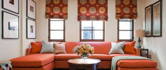
Burgundy living room
In a room for receiving guests and family gatherings, burgundy color can play a dominant role in the interior.
It is quite acceptable to use burgundy wallpaper in the living room, but not all walls need to be “dressed” in this color at once. One accent surface is enough. You can refine the rest of the space using any tones that match burgundy, which were discussed above. A good solution would be to fill the living room interior with burgundy textiles. This tone could be:
- Curtains.
- Furniture upholstery.
- Bedspreads.
- Lampshades.
- Carpet covering.
You won’t believe it, but even an ordinary shag carpet, sparkling with a triumphant burgundy color, can improve your mood and raise your self-esteem.
living room in burgundy tones
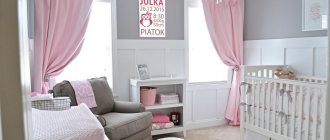
Burgundy children's
Burgundy color in a “children’s” interior is not a very desirable phenomenon, so in this case it makes sense to limit it to its presence in small details.
Oversaturation of the decor with burgundy tones can lead to suppression of the child’s psyche. Under no circumstances should you paint walls and other global surfaces in this palette; stick to a bright table lamp, a child’s chair, or some kind of toy. Against the main background of the interior, made in light milky beige tones, they will look simply wonderful
Castle for a princess
In the abode of the little princess, that shade of burgundy is used, which no longer resembles doll pink, but also does not look with pretensions to adulthood. It is slightly diffused and definitely matte, somewhat reminiscent of strawberry jelly. In such an interior there should be a lot of white color, symbolizing girlish purity. Marshmallow and light green accents will be pleasant.
burgundy color in the interior of a children's room
A little burgundy, fearlessly mixed with bright yellow, will be the perfect decor for an ambitious, success-seeking child. This combination is truly bold in leadership and will maintain the necessary spirit in the little nursery owner.
Both interior options will look stylish and will certainly appeal to their little residents.
Burgundy bedroom
Burgundy color in a bedroom interior has a special mission. It fills him with passion. However, this color should again be used sparingly. The presence of a bed with a headboard decorated in burgundy tones is quite enough. And how inviting the pillows and bedspreads with burgundy stains lying on it will look! And night lights with lampshades in this range will look wonderful against the backdrop of pastel walls.
burgundy accessories in the interior of a gray bedroom
If you try to combine this color with marble white, the bedroom will begin to resemble a luxurious orchid, symbolizing touching love.
In this case, you need to play on the contrast of burgundy and white colors in the interior . The decor of the room is divided into two parts. In this case, the lower one is decorated brightly, while the upper one remains light. Don’t worry, this technique will not reduce the space; moreover, it will raise the ceiling.
Burgundy heaven in the kitchen
To say that women spend a lot of time in the kitchen is an understatement. The majority of people simply live on them, mastering the intricacies of culinary art. “Dress” the kitchen in burgundy colors and it will become conducive to preparing dishes worthy of a king’s table and leisurely, intimate conversations over a glass of red wine. Here you can definitely buy a set of burgundy color, sparkling in the interior with a bright gloss! In the kitchen, such a quantity of rich and “tasty” colors will never be superfluous.
burgundy color in the interior of a light kitchen
Water kingdom in burgundy shades
“You can introduce burgundy into a watery interior with accessories like curtains, rugs, towels, flower pots and more.”
Burgundy finishes will be ideal for those bathrooms that owners see as a place for privacy and relaxation. In such decor, everything should breathe aesthetics. Plastic baskets are inappropriate here - they need to be replaced with wicker ones. Mirrors should be placed in beautiful frames, and only fluffy towels and rugs should be used, causing pleasant tactile sensations.
The bathroom looks very original, where burgundy is combined with light colors.
bathroom in burgundy and gray tones – restraint and austerity in the interior
Almost everything can be burgundy in the bathroom. Such luxurious tiles can be used to decorate the washbasin and toilet area, lay out the floor or wall ornament. You can introduce burgundy color into an aquatic interior with accessories such as curtains, rugs, towels, flower pots and more. But if in the bathroom interior you try to mix rich burgundy with milky, you can get a charming shade reminiscent of expensive lipstick. Bright and rich, in the morning such an interior will invigorate you just as much as a cup of coffee.
Brutal character
A room made in a “masculine” style cannot do without color accents when such modern materials and strong techniques are used:
- worn brickwork;
- raw concrete;
- rough skin;
- metal elements;
- technogenic lamps.
Burgundy, along with emerald green and dark blue, will support the idea, giving the room a calm, seasoned look, but with individual accents, looking especially impressive against the background of neutral colors. It is not necessary to design the entire living space in such a brutal, urban style.
The office is considered male territory: if the classic design does not seem relevant, then the latest trends will fully express the mood. The modern look suggests:
- monumental pieces of furniture - a sofa upholstered in burgundy leather;
- things with history, elements of industrial design;
- sharp corners, broken lines.
And of course, traditional shades are indispensable for the strict nature of the room, which serves as a library or study. A burgundy ceiling, perhaps a coffered ceiling, next to wooden panels, and noble striped wallpaper are even appropriate here. This will bring prosperity and increased comfort to the atmosphere.
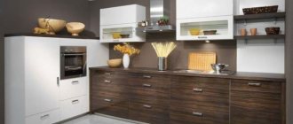
Kitchen – cozy and modern
The presence of burgundy is justified from the point of view of the positive color effect on the nervous system and appetite. But the small kitchen area will be a serious obstacle to implementation. A completely dark burgundy set, even against the background of light walls and ceiling, will make an overwhelming impression in a miniature kitchen space.
If you don’t want to limit yourself to curtains or a kitchen apron, an alternative division will help:
- the light top is not radically white, but its “gastronomic” variations: milk, vanilla, creamy.
- lower moderate wine-red tier on porcelain stoneware or light-colored wood floors.
- marble with cherry veining for finishing suitable surfaces.
- lack of decor on the facades, minimalism in details.
Advice. All glass elements and white splashback tiles will add lightness, regardless of style.
Kitchen sets are capable of independently expressing an idea. It is important how the burgundy color is applied - painted solid wood, matte or glossy MDF. The most popular modern solutions love bright, bold variations:
- A combination of burgundy facades and metal elements, frame models made of light aluminum, fittings and small household appliances for high-tech.
- Strict lines of minimalism and a bright shade (garnet) on a snow-white background.
- Glossy colored fronts with black elements of innovative household appliances - for a modern style that transforms the kitchen from a place of culinary accomplishments into a living space.
Spectacular bathroom
The logical combination of burgundy color in the interior of even a small bathroom with white sanitary ware is successfully played out; it can be quite bright and contrasting, which is conveyed even in the photo. The limited time spent in the “wet zone” allows you to create a catchy design that won’t get boring.
Colorful oriental or calm classic - the bathroom will definitely sparkle with new colors, because in addition to tiles, as the most common solution, the following will come to the rescue:
- wooden surfaces or tiles with imitation flooring;
- porcelain, enamel elements;
- a sufficient number of mirrors.
Adding blue pigments to burgundy allows the shade to become cooler. It works great in combination with silver, chromed metal, if you don’t like gold for functional bathroom decoration (soap dishes, towel holders) and plumbing components, it seems pretentious.
The main condition is a diverse lighting scenario. It will prevent you from looking gloomy in the morning, enhancing the notes of invigorating red in a complex color, and in the evening it will create a relaxing atmosphere with a touch of luxury in this area.
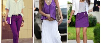
Monochrome look with burgundy clothes
In the new season, monochrome looks are at the peak of popularity. One set harmoniously combines burgundy-colored products and adjacent shades with red undertones.
The rules of monochrome allow you to combine burgundy with bright scarlet, red or pink in one ensemble. At the same time, light shades help add freshness to the image, while dark shades mute the natural characteristics.
The set should not use a large number of monochrome shades. To maintain harmony in one image, three colors are enough. The most successful combination would be a basic burgundy color and details in light and dark burgundy tones.
In monochrome looks, it is possible to add other colors from the palette. Products in black, white or gray colors are combined with burgundy sets. Bright accessories and jewelry made of gold or silver will fit into single-color ensembles.
The trend of the season is a combination of different fabric textures in a monochrome set. Burgundy color is ideal in this regard. Thick luxurious fabrics are combined with thin satin, silk or chiffon.
Alternative combinations
If in combinations with materials such as marble, wood, natural stone, metal, burgundy color manifests itself in all its glory, then not everything is so simple with contrasting colors. Only informed decisions and moderation will make it possible to make burgundy friends with other representatives of the color palette.
Designers do not use purple as a companion, and with caution, in doses:
- Herbal green. The best shade is natural greenery, and in its natural form: 2-3 beautiful plants, small decor.
- Olive. Moderate application will highlight and aesthetically calm the brightness of dark reds.
- Citric. Current shades of yellow will add positivity.
- Blue. Cool tones, with the addition of notes of gray and turquoise, will allow the fashionable color trend - Marsala - to appear in an advantageous light.
Even if burgundy colors are your favorite, using them only for decorative components of the design will remove the color load - paintings, posters, carpets, sofa cushions. Small accents will liven up a room, and using accessories that are easy to replace will help you safely use color, making your home look stylish without any doubt or hesitation.
Burgundy in the interior is a very purposeful color, combining the energy of red and the naturalness of brown. It will not allow the interior to look boring. And it will never be gloomy if you choose the right environment from spectacular materials and harmonious colors.