For those who want to create a cheerful, bright atmosphere in their home, you should pay attention to the light green color. This is the color of spring, nature awakening after a long winter sleep. Interiors made in soft green design have a positive effect on people, lift their spirits, and make them think about the good moments in life. The light green interior in the photo is a source of excellent mood and positive emotions.
The modern human world is oversaturated with bright advertising that is found everywhere. Such an abundance of contrasting colors quickly tires the eyes. That is why each of us needs a small corner in which we can relax from the busy city landscape. A home interior in light green color is a wonderful way to relieve stress and fatigue, and enjoy peace and harmony.
The soft green color in the design of the apartment fits perfectly into any style and is combined with wooden and textile surfaces. However, do not overdo it with this color. Its excess leads to the fact that the room will be devoid of comfort and will take on an official, slightly boring look. It makes more sense to combine colors to create an interesting palette.
Kitchen decoration in light green color
The kitchen interior in soft green design is suitable for purposeful, positive housewives. But to prevent the room from acquiring the features of a depressing and irritating space, you should consider using additional less flashy tones.
When planning the color design of the kitchen, you need to clearly imagine which elements will be in the green color scheme. There can be two options:
- Kitchen set in soft green design.
- Walls painted or wallpapered in the desired tone.
The color that will dilute the main color scheme is also selected in advance. As an additional color, you can choose:
- Bright yellow.
- Beige.
- Light brown.
Note that the quantity and saturation of each color is applied to the taste of the homeowners. It is not prohibited to use only light green color in the interior, especially if the room is decorated in eco-style, as in the photo. It is important that the space does not look monotonous.
Beige with wenge
Wenge is a noble and popular color, but quite “heavy” in itself. In combination with beige it is quite suitable even for a small room.
Key rules for creating an interior
The best style choice for decorating a kitchen in light green is the Art Nouveau or Provence direction. The modern design style is characterized by minimalism and the absence of unnecessary elements. In Art Nouveau rooms, much attention is paid to the correct placement of light sources. Spot lamps are usually used.
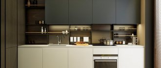
Light green kitchens in the interior in the photo can be emphasized by a kitchen furniture set in dark shades.
Provence style is an unobtrusive atmosphere in which plant and floral patterns predominate. Furniture made from light wood varieties looks excellent against the background of light green walls.
Based on the basic techniques used in the above styles, the premises are designed as follows:
- If the interior is light green, then the furniture is selected in light or dark shades of wood. At the same time, light surfaces will create the illusion of space and light, while dark surfaces will effectively emphasize the originality of the style.
- The light green color is practical, which allows you to select a kitchen set in this color scheme and not be afraid that accidental scratches will spoil the appearance of the bedside tables. On a light green tone, abrasions and scratches are almost invisible.
- Note that light green wallpaper in the kitchen interior looks great on both the south and north sides.
- The set in soft green color can be made in any configuration. This can be an island or corner kitchen.
- A luxurious combination in the interior of rooms is the light green and white combination. This palette will refresh the space and create a cheerful mood.
Using a light green palette in rooms
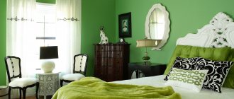
This color is universal. It fits perfectly into the interiors of living rooms, hallways, bathrooms, and children's rooms. For example, in the living room, you can cover the walls with wallpaper in a soft green color and choose bright orange sofa cushions as an accent. In the bedroom, light green can be used in several elements, as in the photo.
This could be: a lampshade on a floor lamp, a bedspread on a bed, a small bedside rug. For the bathroom, you can use an idea similar to the kitchen design - choose tiles in a soft green color, which will be emphasized by snow-white sanitary ware.
To summarize, we emphasize that light green color in the interior is an excellent solution, which on winter days will compensate for the acute lack of natural green color, and in summer it will harmoniously combine with the natural riot of color, without straining the eyesight and will create a pleasant, relaxing atmosphere.
Color plays a leading role in the interior of any space. The decor in a particular room will depend on the correctly selected design and color scheme. Color can both competently complement the space and, on the contrary, worsen the atmosphere, make the room not cozy and cold.
Recently, the first position of leadership has been occupied by light green color in the interior photo
. Light green is a wonderful color with a large number of shades that allow you to create the most vibrant, unusual and unique interiors. Like any other color, light green has a certain effect on the human subconscious. For example, a muted light green color will calm you down and create a feeling of relaxation and tranquility. Modern youth and simply active people in life choose a bright, rich shade of light green. A bright tone will push you to action, add dynamics and cheerfulness.
Experienced psychologists also speak about the charitable influence on the subconscious of a person of this color. In their opinion, any shade of green can restore strength, pacify and calm. Light green is a symbol of new life, beauty and youth. And having decorated it correctly, you will have a bright and rich interior.
Light green color is not used very often in decoration, as many consider it a complex color that is difficult to combine with any other. But, as practice shows and designers say, such a statement is not true. The combination of light green color in the interior is especially good
along with white and beige. In combination with these colors, light green can only be used in furniture upholstery and decor, but it can also be used as the main tone.
Decorated in light green color it looks elegant and unusual. In such a bedroom there will be a feeling of security and safety, which is very important for a room with such a purpose.
In addition, the light green color concentrates attention, so it is often used in arranging a work area. The main thing is that this color in the interior is not oversaturated. The combination of colors in the interior is light green
and dark wood - will give an unusual and very effective result. Such an interior will look bright even without additional decor.
In light green color it will bring a lot of pleasure to the baby. If you decide to go with this color, then it is better to choose furniture in light colors, decorating it with bright stickers with drawings of your favorite characters.
Light green color is perfect for decorating any interior, regardless of the design choice. It will perfectly complement a room designed in the Art Nouveau or even Art Deco style.
green color looks bright, beautiful and extraordinary
. In this room, color will be a wonderful addition and will highlight all the advantages of the kitchen space. In addition, the light green one is not very easily soiled, so caring for it will definitely not be difficult.
It is very successful to use light green color in the bedroom interior
. Regardless of its purpose, light green color is always an indicator of taste and style, effectiveness and originality. Don’t be afraid to choose to decorate your room; by choosing this color, you definitely won’t go wrong.
Don't you like green? Well, well, don't pretend. Perhaps you stubbornly ignore the green color in your own wardrobe, but it is simply impossible to remain indifferent to the transparent lace of the first spring foliage or the velvety greenery of a coniferous forest. And why? But because in the green color our eye, as they say, rests. Because green is the color of life. And that is why green color in the interior has long been and remains one of the most popular.
The interior of a living room in green was fashionable in the houses of the European aristocracy and Russian nobility, and even palaces always had green rooms. However, today an exclusively green interior will irritate rather than delight. Therefore, those who want to use this color in home decoration have to combine it with other colors and shades. And the ability to combine colors in any interior is a whole science, which involves the laws of psychology, the rules of interior design, and painting techniques. And how to achieve a harmonious combination of green color in the interior of the living room, bedroom, hallway or kitchen? Let's try to figure it out.
Cozy milky freshness in the interior
The milky color used in the interior is a special shade of white; it is softer than snow white, but in appearance it is much more expressive than ivory, that is, the tone of ivory. In any case, milky colors are complex and subtle shades. They contain a combination of yellow, blue and even muted red, but these differences are not always visible to a layman.
Advertising
Of course, the milky color owes its name to milk. Perhaps due to this, the use of any milky shades in the interior gives us a feeling of security and calm. A design that combines milky color with other tones in any proportion can be considered neutral. This interior is devoid of intrusiveness, it is always comfortable and cozy.
There are several shades with which the milky color goes perfectly. The combination of milky and straw colors always looks soft and natural. However, due to the golden shades of straw color, the interior may feel somewhat pompous. The combination of milk and denim color allows you to make the design contrasting, which is clearly visible even in the photo. What other shades can be used if milky color is used in the main interior? Green herbal shades, matte bronze, and soft chocolate will look optimal in combination with the color of milk.
Milky shades (in particular, the color of baked milk) create a cozy and homely atmosphere in the apartment. But everyone knows: in order not to spoil the first impression of the house, it is necessary to use only calm, “soulful” tones in the interior. The combination of milky and white in any interior visually expands the space, and therefore this design option is ideal for small rooms.
Milky color, along with classic white, black and gray, is included in the universal palette used in the interior of any room. Beautiful milky shades (this can be seen from the photo) are combined with delicate pastel colors, natural materials - cotton, linen, wild stone, wood.
The milky color gives some vintageness to the interior and at the same time does not deprive it of its nobility. It is difficult to imagine a modern high-tech style decorated in milky tones and, conversely, it is easy to imagine the color of milk in an interior that uses Empire, Rococo, Provence and even a combination of them.
A delicate, light milky shade is one of the most universal tones, highlighting bright and contrasting details in the interior. The color of milk in the morning will help you recharge with a positive attitude, and in the evening it will help you relax after a hard day.
Milky color is considered universal for any room, but it is best suited in an apartment for a kitchen decorated according to the canons of classicism. When choosing this design, a milky set, curtains or wallpaper of the same shade will look organic in the room.
The secret of the nobility and sophistication of the milk color shade lies in the difficulty of achieving it, so its production can hardly be considered cheap. A milky kitchen set used in a classicist style interior cannot be a budget option. If you completely follow the chosen style, then the furniture for such a kitchen should be massive, which implies its installation in a spacious room.
In such a kitchen, a work table with a bar counter on one of its halves looks optimal. The combination of a table with high chairs will allow you to decorate your kitchen in an American style. You can learn more about interior options in this direction by flipping through designer catalogs with vivid photos.
Bright lamps and small adjustable lamps look great above the table in the dairy kitchen. Accessories are also widely used in the interior - vases, statues in gold or bronze. The floor is best installed from boards with a clear structure. The sophistication of the milky set is emphasized by the wallpaper in straw shades. Painting the ceiling in this color will make the kitchen not only bright, but also as comfortable as possible for all household members. The same effect can be achieved if the curtains are chosen in warm shades of yellow, which blends perfectly with milky.
Green color for different rooms
Green is universal and suitable for decorating any room in the house. It has a beneficial effect on the human psyche and would be equally appropriate in the living room, in the kitchen, and even in the bathroom. But not all shades of green are equally suitable for different rooms in the house. After all, the color green can have light and dark shades, bright and muted, warm or cold. If we are to draw an analogy between the color green and its natural essence, then we will divide the entire palette of green shades according to the seasons.
- Living room, bedroom, hallway, office
To decorate the interior of the living room and bedroom, dark and rich shades of green and its autumn palette are suitable: dark green, olive, mustard, marsh, khaki. All these colors can be used both to decorate the walls and the overall tone of the entire room, as well as for individual accessories. In general, it is the autumn palette of green colors that sets the living room and office a respectable tone, and makes the hallway and bedroom cozy.
- Kitchen, children's room, bathroom
A summer green palette is appropriate here. These are bright, juicy and natural colors: pistachio, herbal, salad, green apple and young foliage. If such shades are used as the base color of the interior, then they must be diluted with bright contrasting accents.
If we talk about the winter palette (cool shades of green) and spring (fruit tones), then they are appropriate for decorating any room in the house. The winter palette consists of deep green shades, which in the spectrum gravitate towards blue and blue (emerald, turquoise). The spring palette is pastel colors: avocado, kiwi, lime, mint. In general, any green color has an extremely beneficial effect on the psyche and the atmosphere in the house. And it doesn’t matter whether you choose this color for the living room or the bathroom. The main thing is to correctly combine the green color in the interior.
Finishing features
In a dairy kitchen, natural materials will look most harmonious and will add comfort and coziness to the interior. Dark chairs and tables, shelves and other wooden accessories will organically complement a light kitchen set.
When finishing the main surfaces of the room, you should remember that the color scheme of the walls should be 2-3 shades lighter than the color scheme of the kitchen unit. The combination of pastel colors on the walls with a light floor looks original. Such a solution will increase the space of the room. For flooring, you can choose laminate or ceramic tiles that imitate wooden planks. Contrasting floors will add style to the design. Using light and dark coverings, you can divide the space of the room into a working and dining area.
Photo: light floors and milky walls will help you visually enlarge the kitchen
Photo: dark chairs and a bar counter will organically complement a light kitchen set
Basic green color combination
Let's try to decide on combinations of different shades of green. Naturally, the most popular of them are salad green (light green) and natural green (medium color). A harmonious combination would be to reproduce the natural combinations of this color.
- Green and blue are the colors of the sky and grass. This combination should be smooth, as these colors coexist not only in nature but also in the spectrum.
- Green and blue – greenery and water. A more contrasting combination, appropriate when decorating bright interiors.
- Green and brown - tree trunk and crown. This is how you need to combine these colors in the interior. Moreover, light shades of brown will lighten the green color, while dark shades will make it thicker and heavier.
- Green and black - wet earth and grass. A very contrasting, but also very positive combination. True, black should only be an accent, emphasizing the vitality of green.
- Green and red – flowers and greenery. A very good combination. Moreover, this refers not only to the color red, but also to its shades: pink, orange. In this case, the red color should be noticeable and bright, but only complement the basic green.
- Green and white are a sublime combination built on contrast. This combination is rarely used undiluted. Most often, a white-green interior is shaded with yellow, brown, blue and pink.
Additional combinations
Complementary combinations are combinations of additional shades of green. Here we have to focus not on naturalness, but on the laws of painting. It should be remembered that the darker the green, the closer it is to black, which can be combined with any bright or light shade. The classic combination of dark green shades - snow white, gold, bronze. This combination can be considered the most expensive and appropriate for traditional interior styles of a living room, bedroom or hallway.
Other popular combinations of different shades of green are as follows:
- Mint green (closer to gray) goes with all yellow-green tones and wine shades. Doesn't match with black.
- Olive (closer to yellow) is combined with white and soft shades of yellow, pastel purple.
- Gray-green (green gray) is considered a universal color for the background of any interior. Pairs with grey, white, beige, bright shades of turquoise and grass green, as well as dark red shades.
- Turquoise (blue-green) goes perfectly with all metallic colors: from silver-gray to bronze. Harmonizes with black, olive and rich gray.
- Jade (rich green) is combined with contrasting pink, beige, cocoa, gray, and light green. The combination with white is acceptable, but limited.
- Milky green (pastel) combines with white and blue, and is successfully diluted with turquoise, yellow and blue. Black is allowed only as non-aggressive accents.
- Verdun green (blue-green, bottled). It has the amazing property of turning green in cloudy light and turning yellow in the sun. Combines with white, grey, yellow and black. Dirty red color is used as a contrasting accent.
- Khaki (dark olive) goes well with ocher shades, gray, brown and white. Pink is suitable as a contrast color.
Dairy kitchen set in the interior
Color is one of the key characteristics of a future kitchen. Milky is a traditional color that is easy to imagine. But this color has its own palette, which is appropriate in modern and classic design options.
- Kitchen shade ivory
This color is suitable for neoclassical style. The main advantage is the natural and natural color. Unlike white, milk is softer. In an ivory kitchen, you can successfully combine pastel shades, coffee or beige colors. If you want to give your kitchen a luxurious look, reminiscent of the Baroque style, then matte ivory fronts, finished with a golden patina, with columns and pilasters from the Italian collection will be the right choice.
- Vanilla color
The shade is popular, rich, calm, fills with warmth. Everyone knows that bright kitchens are an excellent option for small spaces. For the kitchen-living room, you can choose vanilla-colored kitchens with glossy facades, which, thanks to their reflective effect, fill the kitchen with light and space.
As a background for vanilla kitchen furniture, you should choose neutral tones - brown, gray, white, beige, and for bright accents red or light green. Cases made of MDF or chipboard can be supplemented with fittings with a chrome surface and glass inserts into the facades.
Milky universal shade. A suitable option for combining with natural wood textures. Combines harmoniously with brown shades of wenge, oak, maple, walnut, cherry wood for finishing drawers, niches, shelves and kitchen countertops.
A milky-cream set in the Provence style can be made with niches for built-in household appliances and with a pencil case that will hide household utensils from the eyes of guests. Such functional kitchens in an authentic style with an island or breakfast bar will fit perfectly into a modern interior.
Base color and accessories
Interior design in green may vary. The main thing is to skillfully combine the base color and accessories. So, for example, for a green interior, only one shade of green is always used as the base one. Any harmonious combinations should only dilute the base shade. To decorate the interior of the living room, green wallpaper with gold embossing is suitable, and smooth green walls will harmonize perfectly with contrasting curtains or furniture in light green tones.
Combinations of different shades of green, complemented by accessories in contrasting colors, always look advantageous in the living room interior. Two-tone green panels will look great in the hallway, green walls and green carpet, brown laminate and brown furniture in the living room. At the same time, curtains and upholstered furniture can also be green, but of a different shade, or sand, beige, or white. Combinations of muted green tones and soft pastel colors are good for the bedroom, and rich or light green shades with bright orange or yellow accessories in the kitchen.
In general, decorating an interior in green or light green is quite easy if you know the correct combinations of different shades of green and the base green color with an additional one. After all, green is one of the most common and most natural colors on the planet. And in nature it combines with absolutely all colors of the spectrum. This is why this color remains so in demand in interior design. It gives a feeling of security, it calms and pacifies. Isn’t that the kind of feeling we all strive for in our own home?
