A beautiful and cozy kitchen is the pride of every housewife who spends a lot of time there. Therefore, it is important that the interior of this room is not only stylish and beautiful, but also replenishes the supply of vivacity and energy. Red kitchen design is a difficult but interesting solution that copes well with this task, if only you know how to correctly use its shades in interior design.
General recommendations for decorating a kitchen in red
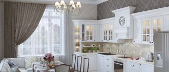
For some reason, many people do not dare to use red when decorating their kitchen; they prefer calmer and softer ones: brownish, beige or snow-white. And in vain: reddish tones in the interior look original, unusual and even festive.
They create a warm atmosphere in the room, improve mood and give vigor.
But you need to take into account that they are not suitable for everyone and that the red color in the interior has its disadvantages:
- Red shades in the kitchen should be used sparingly or completely abandoned if there are hypertensive or hyperactive children in the family.
- This design is not suitable for introverts and people who prefer a quiet, calm environment. They will feel uncomfortable in the red kitchen and will want to leave as quickly as possible.
- The color red greatly excites the psyche; it does not provide the opportunity to relax and relieve stress.
- The red color scheme for the kitchen interior is considered unsuitable for people engaged in strenuous work.
- Dark shades, such as cherry, are not suitable for decorating small kitchens, as they visually “steal” the space and make the room less bright.
And yet, red kitchens have more pros than cons:
- They attract attention and make even the simplest room design memorable.
- Red increases blood pressure and is therefore excellent for hypotensive people.
- This color improves brain activity and encourages a person to be active.
- Shades of red give confidence.
- Reddish tones go well with many other colors.
- Red brings a touch of luxury to the room: in the old days, it was considered the color of the aristocracy and ruling houses.
- Allows you to create interiors in a wide variety of styles: from Romanesque to high-tech and loft.
To make a red kitchen look interesting and attractive, you need to carefully think through its design down to the smallest detail.
IMPORTANT! It is not recommended to make monochrome interiors, since in large quantities this color increases aggression, causes a feeling of anxiety and a feeling of discomfort.
It should be used locally, for example, by making furniture facades or the ceiling, or walls, or floor red. But only separately, and not all at once.
If we are talking about a small kitchen, then red should be used as patterns in one of the shades of the mosaic or multi-colored tiles.
Design Features
Of course, there are certain arguments against using red in the interior, including the kitchen. However, it must be said that there are certain shades of this color, both light and vice versa, dark, which are quite pleasant to look at. In addition, we must not forget about the possibility of combining wallpaper in the kitchen.
It is the active use of various combinations on the walls that allows you to create a more individual and, at the same time, very attractive interior. At the same time, it is advisable to try to combine one or another shade of red with more neutral and rather pastel colors.
An example would be colors such as:
- Beige.
- Light green.
- Light grey.
In any case, do not forget that such colors should be combined not only with each other, but also with other shades presented in the interior. We are talking about such structural elements and parts of the interior as doors, window frames and window sills, kitchen furniture, home textiles and even household appliances. So, you need to be more careful when choosing a color.
Choosing a red set
In a red kitchen set, the red color should be combined with other shades. A combination of different materials will look advantageous. For example, plastic or wood with glass inserts.
Often red sets are made in the Art Nouveau or minimalist style. Their bright, rich color goes well with laconic forms and the absence of excessive decor or flashy fittings.
Spectral red is not used often; tones such as terracotta, cherry, coral or wine are more popular.
Wooden furniture in muted reddish shades is also suitable for country style. They will also be good when decorating an interior in a classic style, but they will need to be combined with softer and calmer shades, such as white, ecru, beige, and brown.
IMPORTANT! The red kitchen set can be either matte, suitable for classic styles, or glossy, ideally fitting even into ultra-modern styles.
Combination of red with black and gray
Such combinations look best and most advantageous in large rooms, so if you have a small space, then it is best not to choose this option. The finishing must be light, just like the curtains.
- Black color also goes well with red shades. They look a little dramatic, but at the same time they are still very stylish and beautiful.
- Gray color together with red is an excellent option, especially since it is gray that allows you to balance red. Your kitchen will be designed in high-tech style, then this combination was created especially for you.
At the same time, the rest of the equipment will be in perfect harmony with the entire design and style as a whole. It is best to decorate the lower facades, as well as countertops and aprons, in gray. Red curtains for the kitchen in this case will also be a great addition.
Choosing curtains for a red kitchen
To avoid rapid fading of textile shades, give preference to curtains made of high-quality dense natural fabrics in light colors. If the kitchen is located on the shady side, then it is better to use translucent thin fabrics in a reddish color scheme.
Curtains in rich darkish shades greatly weigh down the room and visually make it gloomy.
It is not necessary to use single-color curtains: patterned curtains often look more original and impressive.
IMPORTANT! If the walls in the kitchen are covered with wallpaper with a large, rich pattern, choose plain curtains in neutral tones that match the main color scheme.
For country-style kitchens, a good solution would be curtains in medium-sized white and red checks or vertical stripes, which will give the interior a touch of rusticity. In a classic interior, red curtains with golden patterns in Roman or Empire styles will look good.
Color scheme for a red kitchen
Red goes well with the following colors:
- black. This combination of wallpaper is rarely found in its pure form, often diluted with white, gray, pastel colors;
- white. A classic combination that does not require additional colors. To soften the contrast between red and white wallpaper, silver or grayish surfaces are sometimes used. The alternation of plain and patterned surfaces looks good in this design. Look at the photo;
- beige. Often used as a base, sand, straw, and earthen are added to it. It combines favorably with a red palette of varying intensities - from burgundy to pinkish-raspberry. An excellent background for red furniture will be white, milky, cream walls, wallpaper of ivory, cream, milk chocolate and baked milk. These shades neutralize the aggressiveness in the room and emphasize its advantages;
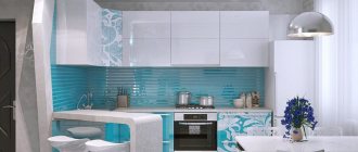
- blue. This combination determines the psychological temperature of the room. If red dominates, the space will seem warmer, and vice versa. Look at the photo.
- green. To make the combination natural, you should use a deep, dark emerald color along with calm red shades of wallpaper: burgundy, carmine, cherry;
- brown. This combination is used to decorate rooms in the English style; dark cherry and burgundy paints will add luxury to the kitchen;
- orange. A warm combination of wallpaper used for rooms with a northern orientation. It is not advisable to use this color palette when decorating southern and eastern rooms. In spacious kitchens with windows facing north, you can use wallpaper in pink, light terracotta or light crimson.
What wallpaper to use for a red kitchen, look at the photo.
Choosing wallpaper
The abundance of red and other bright colors has a negative effect on the psyche. When choosing wallpaper for a red kitchen, it is better to give preference to neutral tones, such as light gray, white, ecru, and beige. Light coffee wallpaper or natural wood shades are also suitable.
In large kitchens, you can create an accent wall and highlight it with wallpaper in a contrasting color.
IMPORTANT! A good solution would be photo wallpaper that can be placed in the dining area or in the living room combined with the kitchen.
If the kitchen set is light, the walls are decorated in red colors like this:
- A single color accent wall on a main patterned background. You can place hanging open shelves, photos or framed paintings on it.
- Patterned wallpaper, the pattern on which repeats the tone of the headset.
- Wallpaper with a large pattern, which repeats the same pattern as on the apron.
Wallpaper and furniture should be in the same style. A carved antique set will look bad against the backdrop of modern wallpaper with a bright abstract pattern, or furniture in the Art Nouveau or high-tech style if placed in a kitchen decorated with “baroque” wallpaper with monograms.
Regardless of its design, wallpaper in the kitchen should be waterproof, easy to clean, not fade in the sun, and withstand high temperatures well. You should not save on their purchase, since cheap wallpaper turns out to be fragile and soon begins to move away from the walls or swell with bubbles.
You should only purchase wallpaper for your kitchen from trusted manufacturers, and not those that are easier to find or cheaper to buy. Such dubious savings often cause the need for new repairs much faster than desired.
Design solutions
Too much red looks tasteless. Therefore, kitchens with walls, ceilings and floors decorated in red colors are found only in outright bad taste. The acceptable presence of red is a contrasting wall, or a wide kitchen set.
The color red stands out so much due to its rarity that a room can be called red even if there are several elements of this shade in it. Therefore, it is worth highlighting three main design solutions for the kitchen using red:
- with red furniture;
- with red accents;
- with red trim.
Design with red furniture
A set with facades in shades of red will fit into the kitchen. For this purpose, burgundy, burgundy, or lighter shades: cardinal, carmine and raspberry are suitable. You should not make the front of the set in a single-color background of caustic shades, such as scarlet, blood red and poppy - such shades do not increase appetite, because who would have it in a kitchen reminiscent of hell.
Adding red color to the kitchen interior using furniture
But other kitchen furniture, such as a dining table or chairs, can be decorated in bright colors. When choosing such furniture, you should avoid bright and non-standard colors of household appliances; the following are welcome:
- beige,
- classic black,
- white
- metallic shades.
The same applies to kitchen decoration. The color of wallpaper, tiles and other wall coverings, ceilings and floors should be pastel, desaturated colors. Suitable:
- beige,
- woody,
- other shades of brown.
At the same time, photo wallpaper on a contrasting wall and tiles with a pattern will fit into a kitchen with red furniture.
Design with red accents
Despite the originality of red, it can be used as an accent in any kitchen. If the room is made in popular wood and beige-brown tones, then they will be complemented by: burgundy or rotten cherry color, plain curtains. If eco style dominates the room, you can furnish it with decorative plants with scarlet flowers: for example, tea rose, and decorate the dining table with a dark cherry or pomegranate tablecloth.
The accent will also be a contrasting wall, the red wallpaper on which will highlight the main shades in which the rest of the room is made. This design will fit perfectly into the design of a high-tech kitchen.
Black kitchen design with bright red accents
Red trim design
It is best to use no more than three colors in designer decoration. This is logical, because not every modern equipment is produced in red or a color close to it. For a red finish, it is best to use wallpaper. The red background does not look nice in sharp transitions, which are inevitable when using tiles or lining. Wallpapers are available in a wide range of patterns that will provide a background with the desired combination of colors.
Red is combined with related shades, and with classic tones: white and black. Manufacturers of finishing materials also understand this, which is why there are many materials on the market based on white and black with a red background. So the black and red background of the wallpaper harmonizes with the white set and dining furniture. Kitchen utensils can be light shades of brown. Black and red are considered noble and will add sophistication to a designer kitchen, even if it uses simple and inexpensive materials. Likewise, the white and red background of the wallpaper is harmonious with furniture in a noble black tone, as well as in dark wood ones.
Important: In a kitchen with a predominance of red shades, it is not recommended to use mahogany-colored furniture, as it will blend into the general background.
Choosing an apron
A kitchen apron protects the walls from drops of water, grease and fumes getting on them and only then performs a decorative function. It should not only be beautiful, but also durable, heat and moisture resistant. It is important that water, drops of grease or other contaminants can be easily removed from the kitchen apron. That is why it is better to give preference to materials with smooth rather than embossed textures.
The kitchen apron can be decorated in red tones. The ideal material for it would be ceramic tiles or mosaics. These wall coverings are beautiful and durable; they will delight owners and their guests with their almost new appearance for many years and decades.
Such an apron can be made in the same shades as the set or be contrasting with it in color scheme.
You can also choose a kitchen apron made of impact-resistant glass. It can be transparent or decorated with photo printing, special interior stickers or hand-painted.
Glass aprons depicting fruits, flowers or abstract patterns, as well as forest, mountain landscapes or city panoramas fit best into kitchen interiors.
If you don’t like a red kitchen apron, then make it black, white, beige, grayish, silver or light brown.
IMPORTANT! From materials other than ceramic tiles and mosaics, you can choose natural or artificial stone, metal or brick for such an apron.
Advantages of the red and white combination
A stylish red kitchen combined with white is an original solution. This tandem is considered one of the best for a number of reasons.
- Versatility. This solution allows you to pacify the “ardor” of the red color. This tandem can be used by almost any person, even hypertensive patients.
- Can be used in a small room. Dynamic red color visually significantly reduces space. This makes it less versatile. Adding white saves the situation. This combination will allow you to visually increase the space and use your favorite red tones even in a small room.
- Originality. Despite the excellent combination of tones, not everyone decides to use them. In an ordinary city apartment, such a design is not often found. The kitchen will be able to attract the attention of guests and become the highlight of the apartment.
- Ease of execution. To decorate a room in this color scheme you do not need to have the skills of a professional designer. Everyone can do it stylishly and with high quality. Ideas for execution can be easily emphasized in photos from the Internet.
The combination of white and red in the kitchen interior will look original and stylish.
You can make a kitchen design in red yourself by looking for ideas on the Internet.
In a small room, a combination of red and white will visually enlarge the room
Photo gallery
Red and black kitchen
The combination of these colors is considered classic, but the red and black interior of the kitchen does not always work out well. An excess of black elements will make the room dark and gloomy. If red predominates, the kitchen will look too bright and provocative.
The most difficult thing when developing a design is to achieve the correct ratio of black and red colors. But if you manage to do this, then the room is literally transformed: it becomes more interesting and more attractive.
Most often, such designs are dominated by a black bottom and a red top. But if you want to experiment with this bold and beautiful combination, then try placing the headset sections and drawers in a checkerboard or random order.
This design solution will allow you to avoid monotony in the kitchen and make its interior more dynamic and original.
Red and white kitchen
The combination of red furniture and white walls results in a harmonious and bright interior design that visually enlarges the ceiling. In this case, it is considered acceptable to use bright spectral shades.
IMPORTANT! If the walls are red, it is better to give preference to muted tones, such as cherry or wine.
Red and gray kitchen
For red-gray interiors, it is preferable to use cool gray-violet and bright reddish-orange tones. To smooth out too sharp a contrast, they can be complemented with brownish or beige shades with a cool undertone.
A combination of these shades with steel elements will also look good, especially if the room is decorated in a modern style.
Black and white red kitchen
With this combination, the tonal and color contrast of red and black is somewhat smoothed out and the interior looks harmonious and original. Experienced designers recommend arranging these colors like this:
- The bottom set is black or black with small inserts of red elements.
- The top of the furniture is red.
- The apron and wallpaper are white, perhaps with a small, discreet pattern.
IMPORTANT! This color scheme fits perfectly into modern styles, but it also looks good in a classic design.
Red-beige kitchen
The red and beige interior looks stylish and elegant. It does not create too sharp contrasts, like a combination of red with black or white, but it creates an atmosphere of comfort, home warmth and family coziness in the kitchen.
In such a kitchen, furniture or parquet made of natural wood would be appropriate. It is also important to consider that beige goes best with bright and warm reddish-orange tones.
Red and green kitchen
The combination of red and green in the kitchen interior makes it original and at the same time brings it closer to nature. But it is necessary to remember that not all tones of red and greenish combine well with each other.
IMPORTANT! The optimal solution would be a combination of only warm or exclusively cold shades.
For example, red-orange with lime or cool raspberry red with emerald.
Dark red kitchen or burgundy
Dark reddish tones look noble and elegant. They fit well into most styles. Colors such as wine or burgundy do not irritate people's psyches and do not tire the eyes.
Burgundy and dark red shades look good in classic interiors, such as Empire or Victorian style.
But you need to remember that these tones visually make the room smaller and are not suitable for small kitchens.
Yellow and red kitchen
Such a room seems filled with warmth and comfort. But to make it less “hot”, it is recommended to alternate red and yellow design elements with more neutral colors. White, black, grayish, brown and beige or milky shades are suitable for this.
It is important to take into account that this color scheme is better suited for rooms facing the shady side.
IMPORTANT! If in winter you want to “let in” as much light and heat as possible into the room, then in summer it will not be very comfortable to be in a red-yellow kitchen due to the increased warmth of these colors.
Also pay attention to the fact that you will need to choose the main and additional shades: in equal proportions, red and yellow will “interrupt” each other with brightness and saturation, such an interior will look inharmonious and even flashy.
Common Design Options
It is no secret that today many wallpaper factories have in their assortment wallpaper that is either partially or completely painted red. However, if we talk about design options, we can note three of the most common ones. This applies not only to the wallpaper itself, but in general to the entire environment that is created in the interior.
Related article: Installation of plastic windows: rules, sequence
On a note! If you are interested in orange wallpaper for the kitchen, then you can read more about them in this article.
Red wallpaper
A few words about how red wallpaper can be used in the kitchen. You can see photos of ready-made examples in the gallery attached to this article. As for the possibility of creating organic combinations with various pieces of furniture, it can be noted that there are quite a lot of options for this. However, there are also limitations.
An example of such restrictions is the simultaneous use of red wallpaper and wooden interior items, as well as furniture made from natural wood or designed to look like wood. This is not at all difficult to explain, since red simply does not go well with wood trim, both in shade and texture.
Therefore, try to use pieces of furniture in other colors, especially such as:
- White.
- Cream.
- Beige.
We are talking about the kitchen set itself, as well as the stools. By the way, the red color itself should also not be a classic red: use either darker (closer to burgundy) or lighter (closer to pink) shades. Color combinations made using a similar range of shades are not irritating to the eyesight and psyche.
By the way, since we are already talking about kitchen wallpaper, I would like to make one small remark. Yes, of course, design is a very important component of the future kitchen interior, and a lot depends on it. However, you need to pay great attention to the materials from which the wall coverings are made. They should not only be beautiful, but also practical, able to withstand constant exposure to moisture, frequent temperature changes, and also be washable. So, vinyl and non-woven wallpaper may be the best choice. But it is best to refuse their paper counterparts.
Related article: Zebra roller blinds: tips for choosing and decorating the interior
Red furniture
Red furniture for the kitchen is chosen in cases where you initially want to make the room bright and “rich”. At the same time, it is advisable to select wallpaper for a red kitchen taking into account the fact that it should be neutral and quite simple. As a rule, we are talking about “representatives” of light colors. The use of such neutral tones can make the interior more “weighted”, somewhat neutralizing the influence of such a bright color as red.
Attention! In such an interior, household appliances of silver or metallic color will look very interesting. You can also use decorative metal elements to decorate the room itself.
And in general, the color gray, especially its light shades, will look quite advantageous in combination with a red kitchen. Wallpaper for red kitchen, photo:
Red wallpaper and furniture
And finally, let's take a closer look at this combination option, when both the furniture and the wallpaper in the kitchen interior are red. It is worth recognizing that this combination is quite rare. Realizing that this combination may be too bright and even, in some way, aggressive, it is worth thinking about how best to approach this problem.
Here are the basic tips:
| Peculiarity | Solution |
| Variety of shades | If both your walls and kitchen furniture are red, then at a minimum, you should think about buying furniture of a different color, preferably light and neutral. |
| Muted tones | The shades of red that you use in the interior should not be too bright. Use more muted tones. |
| Additional decor | You can use photographs, figurines and other decorative items. This will allow you to diversify the color palette of the kitchen. |
| Matte surface texture | Its use in the interior allows you to make the interior more neutral, “soft” and non-irritating. |
Article on the topic: How to make a blind area around the house with your own hands: installation of concrete, soft, video