Basic criteria for selecting curtains
Apartment owners often invite designers specializing in this topic to select textile window decoration. But if you take into account the basic rules for selecting curtains, then it is quite possible to achieve the perfect look of the room yourself.
The main thing is to determine the style of the room, the purpose of the room, whether the task is to adjust the space, and then the only thing left to do is to choose a neutral or contrasting color scheme.
Match the color of the walls or interior
This is one of the basic techniques for selecting curtain colors in any design project. The shade of the curtains lies in the same color palette as the main interior scheme. Often such monotonous spaces are called by the leading color - “gray room”, “green room”.
But it is necessary to observe an important nuance - the color match cannot be made 100%! The fabric is selected two or three shades lighter or darker.
It is necessary to correctly combine dark and light tones of the same color, shades, and halftones. Following this design law will help you understand how to choose the color of your curtains.
This method of choosing curtain colors is well suited for draping windows in small rooms. The method allows you to achieve the effect of merging the wall with the window, which helps get rid of visual boundaries and expand the space.
In addition, decorating a window to match the color of the walls is the safest - choosing the wrong shade of curtains is difficult. You don’t even have to take into account what color the furniture is in the room; the most important thing is that the walls and curtains are in harmony with each other. So, when choosing a beige color scheme for a room, the curtains can be milky or creamy.
You can even play a little with the proposed palette and choose light brown curtains for walls that have a brown finish. To add elegance and a little liveliness to the atmosphere in this case, you can hang textiles with prints and embroidery.
Color combination options
In living rooms, bedrooms and children's rooms, curtains are matched to wallpaper or furniture - the most significant parts of the room in terms of volume. But it should be taken into account that pieces of furniture are not changed as often as wallpaper. If after 3-4 years you want to change the decoration of the room, then it is easier to change the wallpaper and choose curtains to match it than to change the furniture. The most difficult task in this case is selecting curtains to match the wallpaper by color.
To simplify the selection process, it's good to follow some proven design techniques. For example, if the walls in the room are pasted in bright, catchy colors, you need to match the color of the curtains to the wallpaper to match the dominant color. Red, brown and chocolate curtains are ideal for burgundy wallpaper, but soft pastel colors look good in combination with wallpaper of calm, not saturated colors. Using this principle, curtains for red wallpaper are purchased.
Related article: Silicone flowers for interior
It should be taken into account that not all bright colors are combined only with paints of similar shades. The exception is orange; it harmonizes with almost all colors and their shades: green and yellow, red and brown, pink and beige. Also, curtains of almost all colors harmonize with walls covered with yellow wallpaper.
The blue and light blue color of the curtains will go well with yellow or sand wallpaper. This combination is often used in children's and teenage rooms for boys. In a yellow room, blue or light blue curtains with a yellow print, for example, in the shape of stars, look interesting. With this approach to window design, you should make sure that the shades of yellow on the walls and curtains are identical.
The blue color is used to create a Scandinavian style or a marine theme, and in designs with the presence of blue, preference is given to simple geometric patterns: wide stripes, zigzags, wavy lines.
If the room already has wallpaper with a pattern, it is better to buy plain curtains, and vice versa, for single-color wallpaper, curtains with an ornament that matches the style of the room are well suited. This rule is always effective when buying curtains in the color of the wallpaper.
The blue color is so extraordinary that bright upholstery and colorful curtains may look out of place next to blue walls. Therefore, you can't go wrong if you hang white or pale blue curtains under blue wallpaper. At the same time, it is not recommended to use faded, inexpressive tones in combination with blue. Against a background of pure, saturated color, dim details will look dull and unattractive, the window will be lost and will look like a dirty spot.
Curtains and interior textiles
Of no small importance is the observance of the law of color harmony in the interior, when the drapery of the window matches the rest of the textiles in the room - pillow covers, bedspreads, tablecloths, etc.
Sometimes designers resort to an interesting solution - sewing curtains and decorative textiles from the same fabric. It is worth considering that here it will be necessary to repeat the pattern on the fabric on all products.
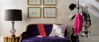
Curtain color and interior style
Of particular importance is the stylistic orientation in the design of the room. So, purple curtains with flowers will not suit a minimalist setting. And for eco-style, you shouldn’t take dark red shades, which are more suitable for a Victorian living room.
The best color combinations by style are as follows:
Curtains for the kitchen with a balcony door - 165 photos of beautiful and original ideas for choosing and using curtains
- Curtain design: 195 photos of the most stylish curtains and options for their use in the interior
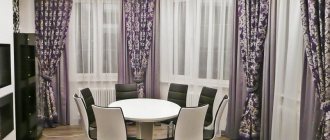
- Curtains for the living room - 170 photos of beautiful new products and the secrets of their use in a real interior
- in minimalism, black and white, milky and ashy, shades of gray prevail;
- in eco-style - green, sand, brown, blue, light blue, olive;
- in Scandinavian - pearl gray, delicate greens, blue shades, cream tones, white.
- in the classic - white, cream, beige, brown tones, a palette of green colors.
Selecting the color of the curtains
If everything is more or less clear with trends and combinations, then what about color combinations? And here there are some nuances that arise based on what color the wallpaper is.
Walls in white and beige tones are a universal option that allows for a lot of combinations. In this case, you can take almost any textile – light, dark, bright. For a calm interior, it is better to choose pastel colors - cream, sand, light blue, creamy, as in the photo:
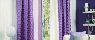
For an accent, you can take fabric of burgundy, raspberry, purple, lilac, etc.
Wallpaper in gray tones. In this case, you should not choose textiles of a similar shade; if the color is incorrect, you may end up with a dull, faceless interior. It is also not recommended to choose dark curtains under gray wallpaper; the room may turn out gloomy.
Pink, blue, green, yellow, purple, green, and white go well with gray.
In the case of yellow wallpaper, you can use two options: a calm combination with warm shades - beige, pink-cream, peach and others
or choose curtains in a contrasting color - turquoise, blue, red, green. This will give the interior a positive, joyful atmosphere:
You can also give preference to shades of a dark palette - gray, purple, brown.
Green wallpaper. In the interior, a combination with natural colors would be appropriate - brown, olive, pistachio, yellow, lilac, etc. In this case, you should pay attention to the tonality of the wallpaper.
In an interior with pink walls, curtains made of delicate, translucent fabrics in light shades - lilac, peach, gold, white, blue (photo) will look harmonious.
Curtains of various shades can be suitable for brown wallpaper, however, some combination can create a gloomy atmosphere in the interior and this should be taken into account when choosing textiles. In a cramped room, it is better to decorate the windows with white, yellow, turquoise curtains or other shades of a pastel palette. This combination will make the room brighter and more spacious:
Selecting curtains and wallpaper in the interior is not an easy task. But if you take the issue seriously, you can significantly improve the interior, making it more expressive and harmonious.
How to choose curtains for a finished interior:
Recommended Posts
Paper wallpaper in the interior for a nursery, kitchen
Turquoise wallpaper in the interior design of a living room, bedroom, children’s room…
Pink, orange, red wallpaper in the interior of a nursery, bedroom...
Wallpaper for a small kitchen in Khrushchev
Wallpaper in a marine style for children's rooms
What wallpaper to use in the kitchen
The relationship between shades and textures of textiles
The structure of fabric can change our perception of color. The denser the textile, the heavier and richer the curtain looks. Glossy textures, like satin, can also increase brightness and festiveness.
But when using these fabrics, you need to take into account that they are quite capricious and change their color depending on the angle of incidence of the light. But thin curtains made of light fabric make beautiful folds and give the space weightlessness and airiness.
Color palette
There are many different tools that allow you to intelligently combine tones and shades. For example, a color wheel.
The principle of the wheel helps you decide on a combination of colors: shades that lie opposite each other, as well as those adjacent to each other, will look good together.
For example:
- you can match the yellow wallpaper with light green or light orange curtains;
- yellow or red curtains go well with orange wallpaper;
- lilac curtains will go well with a purple wall;
- green wallpaper will be complemented by yellow and blue curtains, with which they will harmonize perfectly, and if you need to create an effective contrast, you can choose orange curtains.
The third color in any interior can be universal white and pastel colors.
Contrasts
Contrasts make the interior varied and add dynamism. But you cannot use them in equal proportions.
For example, orange walls and violet or magenta curtains are an ideal choice and will not cause eye strain or anxiety.
Contrast between walls and curtains is a common solution to avoid boredom in a room.
White and black
Black and white create an endless variety of right combinations. By adding white we lighten the colors (green, for example, becomes more pastel). Adding black deepens the colors, adds elegance, and makes the room optically somewhat smaller and darker.
Below are options on how to select and combine curtains and wallpaper using the principle of the color wheel.
Yellow wallpaper and curtains
Yellow is the easiest color to use in interior decoration. It is important to understand that yellow includes several shades. You can choose between warm yellow, hot, sunny and very elegant and one that gives the impression of cool or even cold. It can be a light, gentle tone or an intense, rich one.
Yellow has many benefits: it stimulates, brings good mood. It's a good idea to use yellow in a dimly lit room. But when there is too much of it, it can be tiring. Yellow goes perfectly with green. This duet can be compared to a spring meadow full of blooming dandelions, with a breath of freshness. A similar effect is achieved by combining yellow and beige.
The following curtains are suitable for yellow walls:
- white,
- red,
- green,
- gray.
Bright and rich curtains will go well with gray wallpaper.
Purple interior
The principle of personal preference is paramount. Want to create a bright purple wall? Choose purple wallpaper or paint and make your dream come true. But you need to correctly select the rest of the interior items to get a harmonious composition. Choose light purple shades for curtains and furniture, and maintain moderation.
Shades that harmonize with purple are presented in the palette below.
What does green go with?
According to the color wheel, shades of green and blue are in harmony, while green and red are in contrast. Harmonizing shades create an atmosphere of calm and relaxation. Green goes well with natural colors - gray, yellow, brown.
Other combinations
Pink, white, yellow and gray curtains will go well with pink wallpaper.
Golden curtains will go well with red wallpaper.
Orange perfectly complements brown, beige, and contrasts with green. Orange contrasts well with blue and violet.
Fashion trends can inspire us, but we shouldn't take them too literally. There is a high probability that this year's popular color will irritate you and pretty soon you will have to re-paste the wallpaper.
Purpose of the room
The psychology of color is the designer’s starting point when working on creating an interior; choosing a beautiful color for curtains sometimes becomes the main task at the final stage of arrangement.
So, the black and red palette of the newlyweds’ bedroom is not suitable for a child’s room, and gray curtains are also undesirable. Light pastel shades in the office can relax and break up the pace of work. Cheerful orange color will not allow you to properly relax in the sleeping area.
White curtains in the largest room, despite their solemnity, reduce the feeling of coziness, and beige curtains will be boring in a teenage room.
Meanwhile, there are also classic, recognized palettes for rooms with different purposes:
Children's
Children's room - curtains with a slight darkening effect are welcome to provide protection from the bright sun. A good option is thick curtains in combination with a light veil.
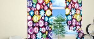
It is not recommended to use bright, intrusive colors, as this can irritate the child and will have a bad effect on rest. For children, blackout curtains with designs of cartoon characters are sometimes hung. The traditional solution is a pastel and yellow-blue palette.
Kitchen
Kitchen - usually the color of the curtains in this room is matched to the palette of the walls, apron or furniture fronts, or to match the tone of other textiles. White and green remain the most relevant and most versatile colors for the kitchen.
If there is not enough sun in the space where you cook and eat, you can brighten up the situation with the help of warm, life-affirming shades. This is one of the rooms into which printed textiles, for example, with floral patterns, will fit well.
Living room
Living room - the color of the curtains for the main room can be varied, the main thing is that the colors of the curtains and light tulle harmoniously match the overall color scheme of the room and take into account the nuances mentioned above. In general, this is just the right room where you can experiment with color.
Bedroom
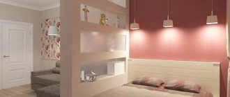
Bedroom - to decorate this room there is a whole palette of light, pastel shades, those that set the mood for rest and relaxation.
However, those who follow trends in interior design know that today the so-called intimateization of space is gaining popularity. This means that lovers of gloomy dark rooms can rejoice, because fashion is on their side - you can hang any dark shades in the bedroom, including graphite gray and even black.
Popular today are blackout curtains, which darken the room, even creating complete darkness during the daytime. They also have the effect of sound absorption and thermal insulation.
The textiles for such curtains consist of three layers. The middle one is black, visible only on the cut. The side facing the room comes in different colors. But the layer facing the window is light—usually white.
The classic color of a sleeping area is blue. Fans of delicate styles can hang curtains with flowers in the bedroom.
Cabinet
Office - universal colors for almost any workspace are all light shades that do not distract from work. By the way, scientists have long proven that the color white sets the mood for creativity.
If you want to enhance brain activity, then orange and yellow colors will help with this. But the whole palette of a conservative interior is traditional, which gives the work area laconicism and austerity; for example, you can choose green curtains.
Little tricks for color combinations
If the wallpaper has a large pattern that includes several colors, it would be wiser to choose plain curtains to match the upholstery. It is not necessary that the tones match one to one; even the presence of small differences in shades will look natural. Designers recommend buying more fabric for curtains than you need and using the leftover material to sew a bedspread for the sofa or pillowcases for the sofa cushions. This will free you from the need to tie the color of the curtains to the walls or upholstery.
Related article: Bedroom in the Gothic style: basic elements, design recommendations
When choosing curtains for wallpaper with large flowers, it is better to give preference to plain fabrics in calm tones. If they are in harmony with the background wallpaper, the window design will look like one with the walls. This technique works flawlessly in a small room in which, for some reason, wallpaper with a three-dimensional pattern is hung.
If, when choosing curtains, you can’t decide on a particular color, select the largest piece of furniture, for example, a sofa, and focus on the color of its upholstery.
WATCH VIDEO INSTRUCTIONS
Problem solving
Draping a window can visually change the dimensions of a space. Dark, saturated colors and cool shades can visually reduce and narrow a room, making it more intimate and cool, while light colors and warm shades can expand the room and fill it with air.
So, in order to achieve a visual change in a long narrow room and make it closer to a square one, you need to make a shorter wall with a window more expressive and attract attention.
You can take curtains in rich colors with an active print or horizontal lines. If you want to create the feeling of high ceilings, then vertical stripes work well. When placing a window on an elongated side, it is better to choose textiles in pastel shades so that the wall seems unobtrusive and seems to disappear into the overall environment.
In areas with low ceilings, it is preferable to use light, light textiles; in areas with high ceilings, it is preferable to use curtains in active colors. To make the room warmer and more welcoming, it is better to give preference to warm colors: beige, yellow, ocher, brown, gold, mustard, etc.
This will be especially an ideal solution for northern rooms, where almost no light from the street penetrates into the windows. Another advantage of warm colors is that they visually bring the window closer and make it larger.
How to choose the right color combination?
Properly selected window decorations have a significant impact on the internal individuality of the interior. Curtains, curtains, blinds - these elements can radically change the interior.
Well-chosen colors are the easiest way to create an interesting, inviting room that you'll want to stay in. Many people who are faced with the need to select shades are afraid that the selected options will not interact, resulting in a tedious and unpleasant cacophony. Therefore, many people settle on safe beige, gray and brown shades, which quickly get boring. Bright colors on walls or curtains are a great way to add energy.
Taking into account the lighting of the room
First you need to find out whether the room is bright, whether there is enough natural light. Dark shades are better represented on a wall opposite a window, and they look completely different in a dark corner or a long hallway. The shining rays of the sun have different shades at different times of the day.
- If the windows face north, it is better to choose light-colored wallpaper and curtains, otherwise you will get the effect of a gloomy room. For windows facing north, it is better to choose warm colors.
- South-facing windows allow for dark and rich colors. You can use different types and thicknesses of materials and different designs in such a room. You don’t have to be afraid of complex compositions that take in a lot of light.
- In the eastern room, all shades will seem lighter and warmer. Here you can choose cool tones.
- For windows facing west, it is better to choose neutral shades - the sun will fill the interior with warm orange light.
Harmony or contrast?
The next step in creating a suitable window decoration is to choose the appropriate shade of the individual elements. You can choose window decor, furniture and accessories tone on tone, harmonizing with each other, complementing or contrasting.
- Color combination of curtains and wallpaper “Tone on tone” - selection of curtains, wallpaper and accessories in shades of the same color.
- Harmony of colors - selection of curtains and wallpaper for furniture in colors that are next to each other in the palette, in any shades.
- Complementary colors are pleasing to the eye and have a slight contrast, this type of combination is used in deep, soothing tones.
- Contrasts. The most daring decision is to create compositions based on oppositions and contrasts. This combination will give the interior a bright, unique character. Try combining orange with turquoise, pink with green, graphite with purple.
Don’t be afraid of colors and bold combinations; using different interesting proposals, you will be able to make the interior unique and add expressiveness.
The influence of color on a person
The main role in the choice is played by personal preferences and personal taste. A trendy and timeless combination of white, black and gray can be used and complemented with any colorful accent. The point is that homeowners feel comfortable in the created interior.
Colors have a great influence on us. The effects of specific colors on mood have been scientifically proven.
For example:
- blue - calms, promotes mental activity, helps to relax;
- green - inspires;
- pastels - help you relax;
- red - gives energy, but in large quantities causes overexcitation and aggression;
- yellow, orange - evoke positive emotions.
Principle of proportions
There is no universal recipe, but there are some universal principles (for example, the principle of proportions) that can be a useful guide.
If inside prevails:
- warm light - choose neutral or cool shades of curtains and wallpaper;
- cold light – you should choose shades of neutral or warm tones;
- neutral light – you should choose neutral, warm or cool shades.
It is important to take care of the correct proportions. A safe color ratio for interiors is 70/20/10.
- 70% of the interior is decorated in neutral shades of the base color;
- 20% – complementary shade;
- 10% – accessories, additives for contrast.
Try not to combine more than a few shades. Two or three colors on a neutral background is a safe maximum. To combine more shades, you need to have good taste and a large selection of fabrics and furniture.
Color and layering
Often rooms are draped with complex multi-layered compositions. But even in this case, color laws will apply; you just need to successfully arrange several layers of canvas according to the shade and learn to correctly see the color combination of curtains.
For example, if the bedroom is made in light colors, then you should not weigh it down with dark fabrics. The ideal option is several airy layers of satin, organza and tulle in bed colors.
Multi-layer curtains are most often used in the living room and bedroom, where it is necessary to give the room solemnity and splendor. In this case, curtains are often chosen in two colors, preferably monochromatic, and the third layer is in a pattern. The most difficult thing when decorating a window with multilayer textiles is not to overload it with decorative elements and prints.
When choosing curtains for your home, of course, it is important to rely on the basic criteria for choosing the color of textiles, but no less important is the owner’s own attitude and taste. Sometimes the most attractive rooms contradict all the laws of design.
Choosing the style of the room
The style in the interior of the room is reflected in the way the curtains are cut, and the combination of colors in the curtains and walls obeys the general design rules. The basis for choosing curtains for wallpaper is the classic style. The basic principles of the classical direction in interior design were laid down in the 17th century and have not lost their relevance in our time. Classic fits any interior if the color palette is chosen correctly. In this style, curtains are used in the same color as the wallpaper - they are two or three shades darker if the walls of the room are made in light colors, or a couple of shades lighter if the walls of the room are decorated in dark colors.
If you need to match curtains to patterned wallpaper, follow one of two directions. The first is to buy curtains that are the same color as the pattern on the wallpaper, the second is to buy curtains that match the color of the background filling on the wallpaper. By choosing one of the options, you can create a harmonious, unified design.
In the Provence style, curtains and wallpaper with the same pattern are widely used. The color palette of walls and curtains can be completely identical or have slight differences. To prevent curtains and wallpaper from merging into a single whole, the window is complemented with transparent curtains with flounces, ruffles, and tiebacks in contrasting colors.
The easiest way is to choose curtains to match the wallpaper in an apartment whose interior is designed in a minimalist style. There are five rules here:
- The curtains are plain or have a minimum of geometry that does not attract attention;
- If possible, the curtain covers the entire wall, from floor to ceiling;
- There should be no dark, unlit places in the room, so a combination of two curtains is suitable - thick for the night and transparent for the day;
- No decorations in the form of lambrequins, frills, ruffles or ties are used, only uniform coattails;
- Minimum additional accessories.
Related article: Do-it-yourself manifold for water heated floors
Photos of curtains
Please repost