Deciding on a color: what are pastel shades?
Most often, the concept of pastel colors is associated with all shades of beige and gold. Refined and noble tones remain the most popular among designers:
- powdery;
- pearl;
- lactic;
- ivory;
- champagne;
- shade of coffee with milk;
- caramel, etc.
But any color can be turned into pastel. To obtain the required shade, white color is added to the base. Thanks to the depth of white, the resulting tone remains rich and full, without losing its complexity.
Pastel palettes cover all the colors of the rainbow. The spectrum of the shade, like the base color, can also be cold and warm. The first includes variations from purple to green, the second includes tints of mustard, golden, muted copper and powdery pink.
When choosing a color scheme for decorating the interior of an apartment or house, take into account the size and purpose of the room itself. For example, the design of a spacious living room welcomes cool pastel shades: lavender, dove-blue or soft olive. The first gentle tone is especially organically woven into the decoration of the hall, made based on Provençal country.
Method 6. Pastel shades of green
Pastel shades of green, especially mint and olive, have a special magic to transform a home. In the design of houses and apartments, it is recommended to combine them with white, beige and brown tones, and if you want to add brightness, with beautiful floral shades.
Living room in pastel colors
When decorating a room with windows facing north, you should take a closer look at the warm shades of pastel. Soft peach, cozy brown or sunny sand will gently fill the room with warmth, making up for the lack of light in the room. But such colors can visually reduce the space, so in a small room use warm tones with caution.
Mint with neon echoes, turquoise, noble gray, exquisite pearl or muted pastel ultramarine are suitable for spacious living rooms located on the south side of the building. Here, cool pastel shades will balance the abundance of light and fit harmoniously into the interior.
To reduce the dominance of pastel colors, dilute the interior with bright colorful highlights. Furniture and decorative items in rich tones will attract attention and become the center of the interior composition. You can diversify the living room design in a similar manner by using bright decorative pillows for the sofa, ceramic vases and flower pots, contrasting curtains, floor lamps or sconces.
Method 8. Pastel colors as decor
For a strictly and neutrally decorated interior, there is nothing better than pastel-colored decor. Cushions, paintings, flowers in vases and other pastel details can look surprisingly impressive against a calm background.
Bedroom and the charm of pastel colors
The calming effect of pastel colors is indispensable in the room in which a person spends most of his time. Evening rest and night's sleep largely depend on the environment, so the choice of colors for the bedroom should be given special attention.
Green color calms the nervous system, so its pastel shades are successfully used to create a small bedroom design. You can complement delicate olive with warm lemon. With moderate use of the latter, an interesting contrast of warm and cold spectra is achieved, which will not be flashy and depressing.
When choosing the color of the walls in a woman's bedroom, you should take a closer look at all the pastel tones of pink and the current powder color. This coloring is considered truly girlish and will evoke positive emotions among the fair sex.
The white and brown combination is suitable for couples' bedrooms. Bed linen in the appropriate color scheme will help complement the interior: choose sets with a pattern that will echo the print of the curtains or wallpaper.
Pastel colors for a children's room
Soft combinations of pastel shades are successfully used by designers when planning the decoration of a nursery.
This palette has a positive effect on active and excitable babies.
For boys, classic shades of blue, dove-gray, olive and an interesting combination of turquoise-brown details are suitable as the dominant tones in the room. To realize the last combination, just paint the walls turquoise and add natural wood furniture to the room. Bookshelves, a wardrobe and a bed in wenge color will organically highlight the soft but rich primary color of the interior.
Little princesses will love pink, peach, gold and lavender colors. You can decorate the interior of a child's room for a girl using a light canopy, cute lace decor on bed linen, and translucent airy tulle.
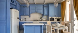
Kitchen and pastel palette of shades
The beige-brown palette is the optimal color solution for decorating the kitchen. The softness of beige is elegantly emphasized by the warmth of the chocolate tone. These colors are appropriate not only when choosing tiles or kitchen facades. A golden-beige refrigerator, a caramel-brown oven or a microwave oven will also harmoniously fit into the interior and serve as a “highlight” of the final decoration.
Light colors when planning a kitchen design visually enlarge a limited space. If your kitchen does not have a lot of square meters, play up the compact area with a dominant pastel tone:
- pearl;
- dairy;
- olive;
- violet.
The light color scheme is quite difficult to care for. But this drawback is fully compensated by the elegance that noble pastel colors bestow on the kitchen.
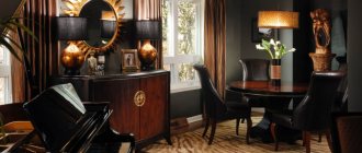
Method 10. Pastel colors and luxury effect
Pastel colors symbolize warmth, softness and comfort - qualities that are necessary for the luxurious design of luxury-style rooms. However, for the full effect they lack the shine that can be added with glossy surfaces, mirrors, shiny fabrics, metallic details and chic lamps.
Pastel shades for the bathroom
Light and delicate pastel shades fit harmoniously into the interior of the bathroom. The abundance of white items allows you to appropriately combine other colors, complemented by a white color scheme.
A bathroom in blue tones remains a classic example of the implementation of pastels in a design project. Textiles and lighting will help refresh the cold spectrum: you just need to choose towels and soft sets of carpets with long pile in a rich warm color, for example, peach. Soft green is also appropriate in the bathroom. Tile of two shades from the same palette is organically complemented by a floor in a neutral tone, for example, light gray. You can emphasize the special style of the room with the help of glossy stretch ceilings in the same bluish shade.
Turquoise and mint are another win-win color scheme for the bathroom. In addition to tiles, textiles and accessories can also be selected in this shade:
- toothbrush holders;
- towel holders;
- shower curtain.
A color scheme
Combination with neutral shades
To achieve the most light and delicate interior, the most successful combination would be with neutral shades such as white and light gray. Both colors combine harmoniously with almost the entire color palette, and when combined with pastel tones, they form a romantic and relaxing design.
Monochromatic
This is a combination of one color of different saturation, from white pastel to deep shade. In the interior, such a combination can be found in the decoration or filling of the room, for example, wallpaper with a smoothly flowing pattern or a sofa with brighter pillows and blankets.
The diagram shows an example of monochromatic combination.
The photo shows a stylish compact living room. The design uses a monochromatic combination of lavender shades.
Complementary
Opposite shades from the color wheel, such as soft pink and blue, are considered complementary. In apartment design, this combination looks brighter and more interesting. Despite the contrasting colors, the room will not be overloaded due to soft shades.
Similar
The shades adjacent in the circle will become a continuation of each other in the interior of the room. The shades are close to each other, but are not variations of the same color.
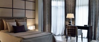
The photo shows a bedroom in mint-orange tones. The walls are decorated with wallpaper with a small floral pattern combined with paint of the same tone.
Bright accents and pastels
Accents are an important detail in decoration; every little detail can change the character of a home. Bright elements will decorate a modern style, delicate colors are suitable for a classic and softer direction.
The photo shows a bedroom with pastel floral wallpaper. The bright coral headboard serves as an accent.
Pastel colored furniture in the interior of the apartment
Furniture sets are a continuation of the design, and therefore must correspond to the style chosen for the room. Modern materials used for upholstery of upholstered furniture allow you to choose any exquisite color of the pastel palette and put a harmonious point in creating home decoration.
In spacious rooms with light walls, sofas and soft corners in mint, turquoise, muted ultramarine, lavender and violet shades are appropriate.
Furniture in peach, whitish coral and salmon tones harmonizes with wall decoration in both white and warm pastel shades. You can complement the set with decor and textiles, which can be made in contrasting colors.
Having implemented a new design through renovation, you don’t have to part with old furniture that no longer fits into the interior due to mismatched upholstery color. Sofas, armchairs, chair seats and banquettes can always be altered in a furniture studio, saving money on the purchase of a new set.
Harmonious and calm pastel colors easily transform the interior of even a compact one-room apartment. Wall decoration, furniture color, tulle and curtains, paintings and unusual decorative items in these shades help create a unique cozy environment, the serene aura of which will protect the peace of homeowners.
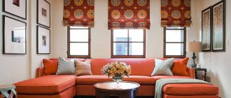
Method 1. Pastel sofa
Are you planning to reupholster your upholstered furniture? Or buy a new sofa? Then give preference to fabric in pastel colors - after all, this is one of the main trends of recent years and the easiest way to bring the tenderness of pastels into your home.
The following photos demonstrate how such a piece of furniture can look in a traditional and modern room design. A calm blue, pink or beige tone is ideal for this, because... will look neutral enough to please you for many years to come.