Finishing the kitchen and choosing the right color for the facades is an important and responsible matter, requiring a subtle approach. Time does not stand still and the development of technology, coupled with the uncontrollable imagination of designers, can shower you with a waterfall of ideas in this matter.
Of great importance is how cozy the kitchen is and what mood it creates and how it affects a person. Kitchen fronts with their rich palette of colors play an important role in creating the overall style of the room. These can be strict glass facades, playful and daring ones made of plastic, or luxurious ones made of wood.
Choosing the color of kitchen facades
The next step is choosing a color. Psychologists have long proven that colors can have a very strong effect on a person’s mood and behavior. Certain colors can evoke joy, give cheerfulness, and lift spirits, but they can also awaken aggression. In addition, with the correct color design of the facades, you can visually enlarge a small room and make it smaller, create the effect of greater illumination when there is a lack of natural light and make the room incredibly cozy, pleasant and functional.
Playing with color
Psychology is a subtle thing and it finds application in almost all areas of human life. Even when it comes to decorating the kitchen, we couldn’t do without it. When it comes time to choose the color design of kitchen facades, preference is often given to various shades of brown, as well as white, cream and beige. The option is undoubtedly a win-win, but it’s too hackneyed. But psychologists advise decorating depending on what psychological effect you want to recreate in the room. And this matter has its own subtleties.
First of all, you should decide whether you want to cheer up when you find yourself in the kitchen, or, on the contrary, calm down and relax.
A win-win combination
If you are not sure about your choice of color for the main surface, then decide in favor of a neutral shade. It can be white, light grey, cream or beige. These colors can be safely combined with variegated color accents. White facades gain expressiveness thanks to well-aimed color accents. Almost all color tones go with white.
Warm colors of facades
To feel a surge of vivacity and energy, you should turn to a palette of warm colors. These are:
- red;
- yellow;
- orange.
In this case, it is advisable to take into account the size of the room: in a too small room, the red color may look too aggressive and will cause irritation rather than a feeling of empowerment. In this situation, it will be more appropriate only as an addition, expressed in accessories of this color, for example, cabinet doors are white and handles are red. At the same time, it is important not to make a mistake in terms of compatibility of red with other colors, but more on that later.
But yellow and orange colors are softer and will not produce such an effect. They can put you in an optimistic mood and awaken a positive attitude in any problem that arises. In addition, yellow itself seems to radiate warmth and light, so it will be the ideal solution for a kitchen with a lack of natural light. Once in a room with such color design of the facades, you will feel as if the sun itself is wrapping you in a warm blanket of its gentle rays. But orange is more likely to resemble juicy splashes of orange. This color, like citrus itself, will give you a great mood and cheerfulness.
Facades in cool colors
Cool shades will have a different, but no less beneficial effect: they will help you calm down after a hard day and find inner harmony at the beginning of a new one. Cool colors include:
- blue;
- green;
- blue.
To find peace of mind, there is no better option than blue, which will look great in the design of work surfaces. This is especially good if you like to cook for a long time. You feel some peace when you look at the soft blue sky, through which fluffy clouds slowly float? So it is here: a table in a similar design will set you up for a calm and long cooking. This color will not tire you or your eyes.
But green color will help you make important decisions, organizing your thoughts and allowing you to focus on the main thing. Therefore, if the kitchen in your home is the most frequently used place for discussing some pressing issues, there is no better option than a color reminiscent of the foliage of a wise oak.
In turn, deep blue, like red, is best used with great caution: it is quite heavy and has the ability to create a oppressive and depressing atmosphere in the room. In order to minimize this effect, it is enough to dilute it with splashes of other cheerful colors, for example, orange.
Colors such as purple, pink or indigo are often offered to clients. They are, of course, very beautiful, but they are still not worth using in their “pure form”. Why? The answer lies in the same inextricable connection with nature: such colors cannot be found in such large quantities as, for example, blue or cyan, only in the form of small inclusions, for example, beautiful flower buds. Likewise, in the interior, the leading role should be given to some other color, and these colors should be used as a complement.
Hide cannot be emphasized
Colors in the architecture of a house play a much larger role than one might think. With the help of color schemes, they hide the flaws of a house or emphasize its advantages, visually change its shape, increase or decrease insolation. The latter is especially important for latitudes with climates warmer or colder than temperate. So, what surprises do colors hold?
The degree of heat absorption. According to the laws of physics, dark surfaces attract light more, therefore, in northern latitudes, dark shades are preferable for facades and roofs, and in southern latitudes, light shades are preferable.
Resistant to fading. According to the same laws, bright, saturated colors are most susceptible to fading. The leader in this marathon is black. The lighter the color, the less noticeable the sun's exposure to it. It would seem that white is ideal in this regard, but not everything is so simple - in the sun it tends to turn yellow over time. The most practical color, unfortunately, is also the most discreet: gray does not fade, does not turn yellow, and dust is not visible on it. Over the years, the gray color can only change its shade slightly, and even then only slightly.
Visual properties. Light colors visually enlarge the building, which is why white is the favorite color of classical architecture, striking in its grandeur. Cream and light beige shades also look noble. But the pastel colors themselves look faded. Objects with dark accents in decoration look much more interesting.
Dependence on form. Bright, saturated colors are justified only with simple house shapes and the absence of small architectural details. Otherwise, it is better to choose a light and calm color of the walls, which will smooth out the intricacy of the design.
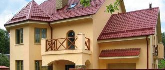
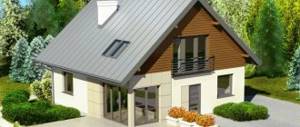
The yellow house looks very bright and sunny, which is especially noticeable against the background of the cold blue facade of its neighbor
The house in gray-green-brown shades fits well into the landscape
White and blue are an elegant tandem that also harmonizes with the shades of the sky and clouds
The white house, standing out brightly against the green background in summer, completely merges with its surroundings in winter
Color combination on facades
Well, it's time to talk about color combinations. Since decorating facades in one color is a boring and tasteless idea, it is necessary to skillfully play on the “friendship” of certain colors. And here it is important not to make a mistake with the compatibility of certain shades.
For example, you cannot combine colors that are clearly opposite to each other: blue and red, yellow and purple. This combination will, without a doubt, look very impressive and bright, but you will not be able to stay in such a room for a long time, as it will put pressure and create an unfavorable psychological atmosphere. But such colors can be used in accessories so that they make pieces of kitchen furniture “play” in a special way.
Fine line between shades
Shades play a big role: a little darker or a little lighter - and the effect of combining this color, for example, with wood, is completely different. Finding the perfect color combination is really difficult, but the modern industry provides an incredible variety of shapes, sizes and colors of kitchen utensils.
Purity of white
Recently, there has been a trend towards increasing the use of white in decoration. And this is not surprising - it is a noble color, giving a feeling of purity and freshness. However, it is not very wise to use exclusively white color; its excessive abundance can rather cause a feeling of coldness, some kind of emptiness and detachment.
To avoid this, it is enough to “dilute” white with other colors, but not aggressive, but just as calm: beige, gray, cream, etc.
It is especially worth thinking about this noble option for those whose kitchen space is small in size: light shades in the design of the facades will make the room visually larger.
Also, do not be afraid that white surfaces are too dirty: modern products can clean any surface to a shine.
Color solutions
At the moment, there are only 3 ways to change the color of a plastic window. Double-sided lamination - applying a special film inside and outside, while traces of white color will be visible on the frame fold, which will irritate when the windows are open. One-sided application is not practical, since the inside of the window remains white, but the outside is multi-colored, which does not look very attractive.
When laminating on both sides on a colored base, one of the sides will be brown, which means the film should be the same shade. As for the façade, it should be lighter to highlight the window frames and their originality. It is also necessary to remember that color and its visual perception are affected by lighting, which must be used wisely.
The color palette for laminating plastic windows is quite large. In the case of “mass” coloring, only a few shades are available - beige, dark and light wood, birch or cherry. Such color solutions will allow you to create a private house that will fit well into the landscape and become its highlight. In this case, the facade of a private house should have light or pastel colors to emphasize the originality of the window frames.
With additional financial costs, you can use a shade of golden oak or mahogany - these are expensive and noble colors that can completely change the visual appearance of a building, making it more luxurious and harmonious. The use of natural wood is also suggested, but the material is considered less practical, since it requires careful treatment with antiseptics and various antifungal solutions.
Materials
It is equally important to consider when choosing kitchen fronts the materials used to make the furniture. The most commonly used material is MDF. A special enamel is applied to the surface, thanks to which it is possible to recreate any color or effect. The new coating, called “chameleon,” looks very creative. And for good reason: when the lighting changes, the color of the coating also changes.
And in the end, I would like to say that the main thing that you should be guided by when choosing the color design of kitchen facades is your personal ideas about comfort. 90% intuition and 10% knowledge - this is the formula for success!