Advantages of green tone in the interior
Green color and all its shades are used to decorate various rooms. It is universal and can be combined with almost all colors, has a positive effect on the emotional state, calms the psyche, which is important for people whose work involves heavy mental work.
Advantages of the shade:
- in the kitchen, light green wallpaper looks appropriate in any interior;
- a greenish set, decorated in gloss, visually makes the kitchen more spacious and free, which is very important for “Khrushchev” apartments;
- green is an excellent base for creating a cozy and warm atmosphere;
- the shade stimulates mental activity and inspires new ideas.
The green palette in the interior instills positivity and tranquility. But to achieve a harmonious combination, the color must be combined correctly.
Which shade should I choose?
The appearance and perception of the kitchen space depends on the basic tone. Light green and marsh tones look different. Designers advise choosing colors based on which side the room is on. If the kitchen faces north, it is better to choose a background with yellow shades. For rooms with windows on the south side, it is allowed to use a dark palette.
Green does not have to be combined with other colors. You can achieve an interesting effect by combining different shades. For example, you can paint the walls light green and install an emerald set.
On a note! When deciding on a color scheme, it’s worth remembering one more rule: light green goes better with light colors, and dark green goes better with muted shades.
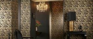
Green wallpaper in the interior: from fresh mint to deep malachite
Green color in the interior is considered the optimal solution if the owners of the room cannot make a choice in favor of a particular color. It is the shades of this color in their diversity that can make any room an example of style and sophistication. Regardless of the chosen shade: be it cool olive or juicy lime, the color will always calm and pacify.
A dark shade of green on glossy wallpaper in a modern style bedroom. An abundance of printed textiles dilutes the severity of the interior
Healthy! Wallpaper for the bathroom - 44 photos, weighing the advantages and disadvantages, considering options, choosing a style
Psychotherapists call this color the most calm and conducive to harmony, and the thoughtful design of rooms with green wallpaper is a guarantee of an excellent mood for all inhabitants of the apartment. In the modern world, with its eternal bustle and frantic pace of life, which not everyone can keep up with, there is no room for peace in a person’s life.
Calm, fresh interior of a children's room for two girls. The main color of the bedroom is green. White and pink are complementary colors
This is why designers recommend using green in the interior of apartments and houses: it is not at all necessary to make this color the dominant one; a few details or the partial presence of this life-giving shade is enough to normalize a person’s psycho-emotional state.
An eclectic bathroom with a green pineapple print and a bamboo mirror frame highlight the tropical theme of the interior design.
Some explain this effect by a person’s instinctive desire to get closer to nature, others – by pure psychology and the effect of color on a person’s mood.
Children's room with floral print wallpaper, bright Roman shades on the windows and lots of cute decorative touches
Green apron
If you want to decorate a room in green tones, then the color can be used not only for walls or furniture, but also for an apron. In this case, it acts as an accent. An apron looks stylish if you add other decorative items of the same color to the kitchen.
The following materials are preferred for the shield in the work area: ceramic tiles, mosaic. Another ultra-modern option is to install glass panels onto an image with photo printing. The advantage of this option is that the apron can be with any image presented in the catalog.
On a note! The tandem of an apron and a headset in the same colors looks very interesting and unusual.
Green kitchen decoration: what furniture should be like
A cozy green interior is sometimes created before the set is chosen, and then another question arises for the owners: what color should the furniture be chosen to make the decor harmonious?
- The white set looks clean and elegant against the backdrop of both bright and muted green walls. In such a duet, not a single detail will be lost, especially if you make an apron in the work area with lemon or even malachite.
- A light beige, cream set looks neutral and light. Furniture with natural wooden facades in a light color will be organic.
- Bright yellow and orange harmonize with muted shades of grass, with pistachio and olive wall decoration.
- A dark brown or black kitchen set will look stylish against a green background. And for the working wall, you can choose a fairly bright, flashy color. Of course, if the furniture is made in a classic style from dark wood, it is better to give preference to soft tones.
- Sometimes pink shades are combined with emerald walls. This is acceptable both in a classic interior and in a rustic style. But in such a duet you cannot use too rich notes; it is optimal to choose one deeper shade and the other lighter, perhaps even bleached, which is appropriate in the stylization of antique design.
Selecting curtains
When choosing such an interior, you need to not only know what wallpaper is suitable for a kitchen with a light green set, but also what curtains will look most appropriate . Green is a natural shade, so it is desirable that the curtains are made from natural fabrics. There are no restrictions on color choice.
The gamma is selected depending on which tones predominate in the design. A win-win option is to decorate the window with translucent tulle and light curtains in white, cream, and ivory shades. You can also hang pearl or silver curtains. They go well with the chrome plate.
Choosing curtains
Curtains in a bright room become especially expressive, so they are chosen very carefully. Some useful tips from experienced designers will help you in this matter.
- Light, light curtains made of transparent fabrics go well with white wallpaper.
- A win-win combination is light walls and curtains in sand, coral, coffee or beige.
- When choosing bright colors, add “companions” to the curtains - sofa cushions, carpet, lampshade of the same shade. Red or blue curtains look very impressive in combination with white walls.
- Olive and green colors should have a slight tint of yellow, otherwise such curtains will discolor the room and give an unpleasant pale green reflection on the wallpaper.
- Curtains in cheerful colors are suitable for the kitchen and children's room: bright orange, blue, turquoise, lilac.
Advice
Curtains of cool colors - purple, blue, light blue - are best hung in rooms with windows facing south.
When decorating formal rooms, the combination of white walls and black and white curtains is effective. To refresh the impression and get rid of monotony, you can use light curtains with large colored patterns.
Combination with other colors
It is not difficult to choose wallpaper for a green kitchen; you can use different colors. The interior can be monochromatic or multi-colored. If you want the room to be bright and rich, it is recommended to combine contrasting shades.
Designers advise choosing the following tones for a green set:
- White. This color combination is universal and suitable for all style trends. When arranging a white and green kitchen, it is recommended to add colored accents, which can be curtains, a bright apron, or decorative items. The only exception is minimalism, which allows the use of only two shades.
- Coffee, sand, brown. This classic combination allows you to get closer to nature. Furniture made of natural wood, imitation brickwork, and still lifes in beautiful wooden frames fit perfectly into such an interior.
- Black. The shade is recommended to be used for flooring or as the main color of decorative items. A green kitchen looks stylish in combination with black decorative dishes and other accessories. But to prevent the interior from looking gloomy, preference should be given to light green rather than dark green.
- Yellow and orange. With this combination, the room becomes bright and rich.
- Violet. The combination of green and purple is complex and demanding. When choosing such combinations, you should seek help from specialists.
Wallpaper with a pattern in a green kitchen
Kitchen design most often involves the use of functional decor, and patterns on the walls are less appropriate here than in the living room or bedroom. But it is quite possible to use wallpaper with a pattern, especially if the room is large and requires visual zoning. And quite often there is some kind of pattern on the apron of the work area.
In a modern interior, an apron with a photo (skinali) can be used, the color and plot of which can be repeated in the rest of the decoration of the room. For example, an image of an orange can be used in a work wall screen and in a still life on the wall. But the rest of the finish will be monochromatic.
The design of a spacious classic kitchen is often diluted with wallpaper with large floral patterns or stripes. One or two walls are covered with this material.
For a country-style room, you can choose wallpaper with a small, unobtrusive pattern.
In any case, it is advisable to make the main background monochromatic so that the interior does not turn out to be too colorful. And the choice of color depends, as already mentioned, on the main shade of the furniture and the style of the decor.
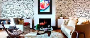
White living room
White wallpaper in the living room interior simply calls for elegance. They will be a good complement to the stately white leather sofa, softened by a carpet and a sand-colored blanket.
When choosing a cabinet, take into account that closed options are best done in light colors, which will blend in with the wallpaper as much as possible. But the open shelving may well be in contrasting shades - for example, black and white.
To achieve an extraordinary impression, bright furniture is placed in the living room, but it should be one large thing and two or three smaller ones. For example, a red sofa and two red vases. Or a sofa combined with a carpet. In spacious rooms you can combine a sofa and two armchairs in a catchy color.
When decorating a bright living room, it is better to avoid bright and heavy curtains. If possible, limit yourself to white tulle. Do not forget that the center of the composition invariably remains the sofa, and too bright window decoration introduces dissonance into the room. In addition, heavy curtains reduce the flow of light.
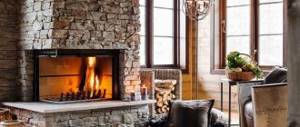
Green and its shades
Let's figure out why green wallpaper is interesting in the interior compared to other colors.
The color under discussion can both “heat” and “cool” the room
Today, there are 20 generally accepted names of flowers related to the species in question:
- Classic green;
- Forest green;
- Malachite;
- Ultra green;
- Citrus;
- Green meadow;
- Bright lime;
- Graney Apple;
- Mint;
- Spring;
- Khaki;
- Sea green;
- Shamrock;
- Asparagus;
- Nephritis;
- Chartreuse;
- Mustard;
- Olive;
- Viridan;
- Camouflage.
Accordingly, each of them is able to bring their own special mood to the decorated room. And the choice will depend not only on the design ideas and the existing furnishings in the house or apartment, but also on the personal perceptions of the color being discussed and its shades by all residents.
Colorists add their names to explain the suggested shade
Types of wallpaper for gluing and combining in the living room
There is probably no more affordable option on the finishing materials market than wallpaper. This is really good material that appeared in China a long time ago and has not lost its popularity to this day.
The first and perhaps the most important advantage of wallpaper is its wide variety. Let's look at the most common types.
Paper
The oldest variety is precisely paper wallpaper, which still has not lost its popularity and has been able to prove itself from the best side. The main advantage, which is often considered decisive, is the cost, since everyone can afford to purchase this material. If you correctly combine two types of paper wallpaper with different designs, you can transform your room beyond recognition.
Non-woven
A fairly practical and reliable option for decorating a room is to cover it with non-woven wallpaper. Despite the fairly high cost, they are considered a very common option with the best technical qualities and features of use. Among the main advantages are environmental friendliness, quality production, durability and long service life. Pasting a room with two or more types of such wallpaper, preferably selected from the same collection, will make the room bright and stylish.
Textile
This type of wallpaper is quite expensive, but at the same time, its appearance can perfectly transform any living room, regardless of its design style and main features. The effect of luxury, coziness, comfort and unsurpassed appearance is the most important thing that is achieved in the process of decorating the walls of a room with the presented finishing material.
Among the advantages are naturalness, luxurious appearance, long service life, and the use of only high-quality constituent materials. Textile options for covering the entire hall are used extremely rarely. Designers recommend combining them with other types of wallpaper. This approach will make the room incredibly beautiful and rich.
Vinyl
Vinyl wallpaper options are extremely popular on the finishing materials market. With their help, it is possible to hide all sorts of defects and errors on the surface, and a wide range of designs and textures will not leave anyone indifferent. An important advantage of vinyl wallpaper is the ease of gluing it, since this does not require the use of any special techniques and techniques, which saves your time.
Bamboo
Bamboo wallpaper is a relatively new material for interior design, as it requires specialized skills and abilities to achieve the desired result at the appropriate level. They really look great in the interior, but they collect dust and quickly lose color and attractiveness when exposed to direct sunlight. That is why it is recommended to use such options for pasting a small space of a wall or for a separate section of it, thereby creating original accents in the external design.