Paintings can decorate any room. But it is worth keeping in mind that the decorative element is part of the interior, and it must correspond to the overall style. The house begins with an entrance hall, the appearance of which creates a general impression of the home and the taste preferences of its owners. In addition to wall decoration, the furniture of the corridor, as well as its decoration, is also important. But often it is only decorated with a mirror.
One of the best options for decorating a hallway is art paintings. When choosing a canvas, it is worth considering that each of them carries a special information message. Some feature happy scenes and add a positive vibe to your living environment. Others immortalize gloomy scenarios that reek of sadness or a sense of impending disaster. In each case, the paintings will share energy with the material world, and the overall atmosphere of the hallway will depend on it.
Paintings for hallways in different styles
The entrance area should adequately welcome both residents and guests of the house. It’s good if it’s spacious and bright, but this is not the deciding factor. Even a small room with a lack of light can be transformed using paintings. The optimal images for the corridor are:
- Abstractions;
- Natural landscapes;
- Avant-garde images;
- Photographic images.
The abstract genre implies a rejection of easily recognizable forms. Such paintings will decorate a hallway furnished according to the laws of minimalism, loft or high-tech. Creations in this style are usually placed on walls without frames. But you can use narrow metal or plastic frames.
Minimalism involves having only the necessary amount of furniture. You can decorate the corridor with paintings in a similar color scheme.
Avant-garde is a set of experimental, modernist, emphatically original forms. This interior style replaced the boring classics at the beginning of the 20th century. The new movement proposes to abandon stereotypical thinking and instead embrace bold and expressive ideas. Conceptualism in painting implies an intellectual game between the viewer and the author. Some works are deliberately banal, others cause slight bewilderment among viewers.
Paintings for the wall in the hallway: style direction
Very popular as paintings for the hallway (and not only) are images of flowers or entire landscapes. Chic canvases that add zest to the room, perfectly complement the image of the room and attract attention.
Paintings should be selected so that they harmoniously complement the interior, decorating the corridor
Don't limit your imagination to just one picture. Fashionable manifestations in design are modular paintings.
They represent one image divided into several sections. Essentially, these are separate paintings, but with a single image. They need to be hung only together, otherwise it will not be clear what is depicted on the canvas. A vertical or horizontal modular painting will decorate the interior and emphasize the refined taste of its owners.
Paintings are not only suitable for certain styles. They can be used in any design, be it minimalism or techno. Naturally, the image in the painting will have to be selected according to the direction. For example, for a room in the minimalist style, canvases with drawn geometric lines or individual small details are perfect.
For a modern apartment of young people, posters with their favorite musical performers or actors are suitable.
The role of photography in the interior of the hallway
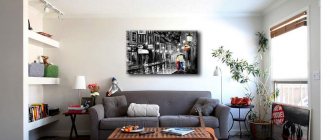
Since the advent of digital technology on the market, a tendency has arisen to decorate every free corner of the apartment not with hand-made works of artists, but with photo wallpapers or posters. Photo images are relevant for hallways with a simple design. Modern technologies make it possible to print high quality pictures. With their help, for little money you can give your front room a memorable look.
Remember that the scenes themselves depicted in the paintings will not significantly change the appearance of the hallway. They can be changed periodically.
Selection of paintings for different interior designs
Increasingly, apartments are decorated not with “live” works by artists, but with printed images, which are popularly called posters. To say that such a solution is unsuccessful would be a mistake, because even printed pictures can look quite decent. In addition, they can be decorated not only in the form of a painting, but as panels, which have gained particular popularity today, even in the highest circles.
Their advantages include:
- Relatively low price;
- The ability to “draw” a project individually;
- A wide range of.
This solution is especially good for those who have not yet decided whether they need paintings on the wall or not. By spending very little money, you can get a decent example, which will help put all the dots in place.
Hanging a picture does not mean radically changing the appearance of the hallway. This piece of furniture can easily be removed or replaced with something else. Don't take the issue too seriously. The choice must be made immediately! Based on this, a decision is made: to hang the picture or not.
The front door is considered the calling card of the house. Behind it there is an entrance hall, which is designed to form the visitor’s first impression of the home and the tastes of its inhabitants.
Therefore, not only the decoration and furnishing of the front room furniture is of such great importance, but also all decorative items, for example, paintings in the hallway, selected according to several criteria: size, color, style, subject, type of frame.
Works of art are a source of positive energy generated by the master in the process of creative work.
Color spectrum
The main aspect when choosing a painting for a corridor or hall is its color. The color scheme of the work of art should be pleasing to the eye and harmonize well with the overall color scheme of the hallway. The photo below shows a harmonious hallway with a smooth transition from the palette of the painting to the palette of the room.
Dirty, gloomy tones in paintings are unacceptable in the entrance area, where it is necessary to show the hospitality of the owners, create a good mood for those entering, and make a pleasant impression.
The choice of the subject of the picture also matters. Scenes of violence, images of disasters, and broken objects are not recommended. Such masterpieces of world art are best enjoyed in a museum setting. A good choice: still lifes, landscapes, images of people. A great option is to place photos in the hallway, for example, family photos.
The style of the painting should not fall out of the overall concept of the hallway. Flirty pictures look cute, ideal for the entrance area.
You shouldn’t get carried away with masterpieces of abstract art, but they will be appropriate for decorating a home decorated in the minimalist style. Creations in a modern style are hung on the wall in the hallway without frames or with narrow simple frames made of metal or plastic.
The classic hallway will be decorated with works of impressionists, artists working in the best traditions of romanticism, baroque and realism. Such paintings require beautiful wooden or gilded frames.
An English interior would be incomplete without images of horses or dogs.
Even a rustic hallway has space for paintings. These can be panels framed with a wooden frame, which clearly shows the structure of the wood.
Paintings do not necessarily represent independent hanging elements. Furniture or functional elements, such as a key holder, clock or lamp, can be decorated with an interesting image.
Pictures can hang not only on the walls, but also on hanger hooks, or stand on a shelf or console table.
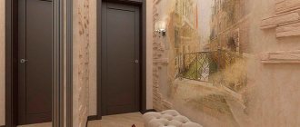
The frescoes on the walls of the hallway deserve special mention. This move often helps to significantly expand the space of a room due to the perspective in the drawing. This is an unusually attractive solution, but you should be very careful when choosing a plot. Because you won’t be able to quickly change the decor of the hall if you get tired of the fresco or just want a change.
Placement nuances
The simplest placement option: one painting on one wall. In this case, you should adhere to the rule: the image should occupy no more than one third of the width and height of the free space.
- The photo below is an example where the passport takes up a large area, but the size of the painting itself corresponds to the frame dictated by the “one third” rule.
Free walls can have different character and area. If we are talking about decorating a long wall of a narrow corridor, then it is most appropriate to place posters of the same size in a horizontal row.
This will make the wall visually less long and boring. And the shine of the glass will create the illusion of space. The photo below shows options for corridors without furniture with posters hanging horizontally in a row.
When you have to hang several paintings of different sizes in a row, they are aligned along the central axis. But the implementation of such design ideas requires the designer to have impeccable taste and sense of style. The photo shows how interesting such solutions look in the hallway.
We invite you to read: Dreamed of a little girl having a baby
Modular paintings deserve special mention. Their elements can be of different sizes and proportions. All together, the parts of such decor sometimes form a complex configuration. Most often, you need enough space to see what the artist depicts.
By the way, there are artistic techniques thanks to which a work of art can be viewed at an angle, from different points of view. These are the options that are most suitable for use in a front room.
Along the stairs, which are found in two-story mansions, paintings are arranged in steps, for example, as in the photo below.
Above the entrance to the living room is a good place for desudeporte (a picturesque panel can be placed above the door). Thus, the height of the doorway increases, creating a solemn atmosphere in the room.
Often there is a need to fill an empty section of the wall above a cabinet, pouf or sofa. A shelf or any protruding decorative elements will interfere with the use of the seating area, but a flat picture is what you need. There are several options here too:
- one large piece;
- several small ones horizontally in a row. Moreover, the paintings can be either with or without frames. In this case, family photographs look good;
- vertically in a row. The photo shows paintings with hieroglyphs for a Japanese-style hallway.
Eastern teaching, which studies “subtle matters,” attaches great importance to interior paintings. Works of art not only decorate the room, but also create a special atmosphere and influence the residents.
Feng Shui experts believe that a painting with a certain plot, hanging in a specified place, can serve as a sailboat, carrying along the waves of life to the crest of success. Or it can create complete calm or a stagnant swamp in the house.
Magnetic flows invisible to the human eye sometimes destroy peace and serve as a generator of family quarrels or eternal anxiety.
The hallway gives a huge scope of imagination for choosing paintings. Unlike the bedroom, where it is not recommended to place autumn and winter landscapes, dynamic scenes, or too bright paintings, the decor of the hall does not impose such restrictions. You can even hang “late autumn” or sunset on the western wall of the house, and “sunrise” or a floral still life on the eastern wall.
An empty wall in the corridor is perceived as an obstacle by the energy of well-being penetrating through the front door. The best way not to push luck away is to “hook” it with an attractive image.
Flowers in a vase are an excellent plot, bringing beauty and prosperity, peace, tranquility and life. Depending on the location of the hallway, according to the Bagua grid, you can activate the energy here: money, career growth, love, knowledge and fame.
In addition, the painting is capable of absorbing possible negative energy emitted by envious people or ill-wishers entering the house.
- Pay attention to the proportionality of the decorative element and the dimensions of the room. A small room will not allow you to see what is depicted in a huge painting, and a miniature picture will get lost in a large area.
- Select works by the same artist, of the same style, made using common technical techniques.
- It is worth preferring the originals of a good master (even if little known). If originals are beyond your means, you need to order high-quality copies of your favorite works.
- Practice moderation and do not turn your home into an art gallery.
- The best location for a painting on the hallway wall is when the center of the painting is at eye level of a standing person.
- Do not expose artwork to direct sunlight.
- Proper lighting on the walls or ceiling will make the paintings more attractive.
When choosing a work of art, you should first of all be guided by your own taste, and not by fashion trends.
First of all, you should like the decorative element on the wall.
The choice of a painting is a manifestation of the spirituality and taste of its owner. A magical set of stroke lines is a powerful source of energy for the viewer, “food” for the intellect and soul.
- Watch a video on how you can place pictures on the wall without damaging the surface.
Color scheme in the interior
You can create an original atmosphere in your home without special education. To get a unique design, it is advisable to follow simple rules:
- Colors should be selected based on the principle of opposites (yellow with blue, red with white) or mixing related shades (brown with orange).
- In dark rooms, it is recommended to use light and bright colors that compensate for the lack of natural light.
- A win-win option for a hallway will always be gray. In this case, a painting made in any, even very original, style is suitable.
Bright, beautiful paintings in the hallway will contribute to a harmonious combination of elements that at first glance are incompatible.
Paintings by contemporary artists are very diverse, and their range is huge. Therefore, you should not worry that there is no suitable option. A work of art that is correctly selected in terms of plot and color scheme will harmoniously fit into the existing decor of the room.
Photographs, scenic or modular paintings are perceived differently, even if they depict an identical subject.
Image selection
It is not recommended to hang pictures in the hallway that depict disasters and things that have expired. Images made against the backdrop of nature will look good. A photo from a family album will also fit well into any hallway design.
USEFUL INFORMATION: Modular paintings for a children's room: for girls and boys
Different interior styles also have their own decor requirements.
- In a narrow room designed in a minimalist style, canvases without edging with abstract images will look good. If you want to give the painting a finished look, you can place it in a narrow frame.
- The hallway, made in a classical style, will be perfectly complemented by reproductions of paintings from the Renaissance. However, you need to take into account that such paintings require space, so they will look out of place in a narrow, small corridor.
- Modular paintings depicting horses and dogs will look great in a hallway with a predominant English style.
- But for rooms in country or Provence style, you can take reproductions of any animals. A photograph taken in color and a monotonous photograph will look equally good.
When making a selection of paintings, it is necessary to take into account that all images must be designed in the same style as the hallway and they must have a common storyline.
The nuances of placing paintings in the hallway
When choosing images for the corridor, it is worth considering the pattern on the wallpaper (or lack thereof). Walls with an ornate pattern will not harmonize with the artwork. And on a plain surface, paintings will take on one of the main roles in the interior.
Vertical modular paintings for the hallway in an apartment - images consisting of several segments:
- Diptych (2 parts) - not in great demand;
- Triptych (3 parts) - this option is often purchased for decorating various rooms;
- Pentaptych (5 parts) is the most popular way to decorate walls.
The purpose of the fragmented canvas is to unobtrusively fit into the interior and create an unusual atmosphere in it.
When decorating a corridor, it is advisable to give preference to peaceful subjects: architectural landscapes or decorative paintings, illustrations of plants or animals, macro photography or minimalism - all this will be the optimal solution for the hallway.
If there is no desire or opportunity to buy paintings, then you can decorate the corridor with framed family photographs. They will remind you of happy events that happened in life for a long time.
In the hallway it is necessary to maintain a proportional relationship between its size and the size of the picture. Massive canvases will not look good in a cramped room; they are only suitable for spacious corridors. And in free space, miniature pictures will be inappropriate. You shouldn’t turn the hallway into a museum: it’s better to use no more than 5 canvases for decoration.
The picture should please all family members living in the apartment. It should be placed at the eye level of a person of average height or slightly higher. If, according to the plan, it is necessary to place several images of different sizes on the hallway wall, then for better perception it is advisable to align them along the edge (top or bottom, left or right).
You don't have to practice perfectionism. Originality is always welcome; it turns a standard vertical corridor into an unusual one. But it is not advisable to hang images on canvas next to photographs (combine abstraction with a lyrical landscape, etc.).
The elegance of the picture will be emphasized by lighting. Ceiling chandeliers and built-in lamps, wall sconces, etc. will cope with this task.
In multi-storey buildings, hallways in apartments are deprived of natural light. However, this is not a drawback: the bright colors on canvas will never fade.
A long corridor decorated with posters will look no worse than a hallway hung with handwritten canvases. Bright posters, in turn, meet modern criteria: it is not recommended to use massive outdated frames for interior decoration.
The corridor is a place where the level of pollution is very high. You should not hang a picture without protective glass, otherwise it will very soon lose its attractiveness
Designer tips for decorating the hallway interior with paintings
Vertical or horizontal, small or large... The paintings are radically different from each other, so choosing the best one is a very difficult task.
It’s quite possible to cope with it on your own! Moreover, decoration is not a sentence at all. If desired, it can be replaced or removed altogether. Therefore, you need to approach the solution of the issue very calmly! One of the main criteria for choosing a painting is the color scheme. What we first see when entering a house is read on a subconscious level. The same applies to guests. Entering our apartment and seeing, for example, skulls on the wall, they will already have a little doubt about hospitality. Of course, everyone can use whatever they see fit in the design of their apartment.
https://www.youtube.com/watch?v=45qeSpAlegE
For a hallway in a classic style, choose creations in the traditions of romanticism, baroque and realism. Such canvases should not stand out from the overall color scheme of the interior. Don't limit yourself to paintings to add personality to your entryway. Compact and no less stylish elements can be key holders, hanging hangers or even a doormat.
A hallway in the Provence style is perfect for canvases made with slight carelessness. Mesmerizing views of Paris, beautiful flowers or tranquil landscapes are what is needed to maintain this style.
The interior of the hallway in the art deco style is quite complex. It combines elements of neoclassicism, ethnic motifs and cubism. On the one hand, the picture can reflect one of these styles, and will already look harmonious. But in order to achieve a truly accurate hit, it is worth trying to take into account all these directions that art deco includes. Base your choice of painting on the following points:
- don’t be afraid to combine unusual elements, smooth lines and abstract shapes;
- try to combine opposites: fashionable and ancient, simple and unusual;
- choose a monochromatic color palette with accents on individual bright details.
Country style is simple and “natural”. It mainly uses wood products, wicker baskets and various natural materials. And since the general atmosphere suggests everything natural, the paintings should be chosen very simple. Black and white are best. Decorating with such paintings will slightly dilute the colors of natural materials and the hallway will look more stylish.
Art Nouveau is increasingly being used to decorate hallways. The picture here can be with any subject, because the color component is much more important. It should be close to natural shades.
The restrained English style of the hallway suggests a slightly conservative approach. Everything should be in moderation. Bright furniture is not welcome. But a little color can just add to the picture. Choose light floral motifs or, for example, a pleasant mountain landscape.
The chalet style is the choice of those who want to furnish the hallway with completely environmentally friendly materials. In such an interior you can even use stones, for example, as flooring. Paintings with an aging effect will fit into such an interior. They will look especially atmospheric if you add lamps that will highlight the paintings and add mood to them.
These are just some of the styles in which you can design your hallway. But no matter what interior design you prefer, you can select a painting that perfectly harmonizes with the interior from our catalog. And if you want to completely customize your hallway, we will be happy to print a picture from your photo.
There are many nuances to choosing a painting for a corridor or hallway. Let's start with the color scheme. The dominant tones and plot of the canvas as a whole should be in harmony with the interior of the room and be visually pleasing. Designers recommend avoiding the use of gloomy and dark colors in the entrance area; pastel shades will help achieve a cozy atmosphere.
A win-win option when the color scheme of the painting and the hallway are on the same plane, but differ slightly in shades. If the ultimate goal is to create psychological comfort in the interior, calm tones are a priority. Dynamic people and creative people prefer contrasting combinations.
Wallpaper with a large pattern and a bright design are unlikely to find harmony with each other. The canvas looks much more impressive against the background of plain walls. A bright image will successfully cope with the function of an accent element of the interior.
The design of the hallway also influences the choice of design. There are several main solutions:
- Traditional oil painting is suitable for Art Nouveau, Shabi Chic and all areas of classicism.
- Modern modular paintings are universal, it all depends on the subject. Scandinavian, eco-style, Mediterranean and Japanese, art deco - there is a suitable option for any hallway interior.
- Photo images are relevant for high-tech, minimalism and other solutions for laconic hallway design.
Less often, handmade work in the form of beadwork or cross stitch finds a place in the corridor. If you want to demonstrate your own skills, you can hang a unique collage made from scrap materials. Hand-made art is organic in the interior, where national or rustic notes dominate: country, Provence, Chalet.
Another point worthy of attention is the presence or absence of framing. Frameless panels quickly gained popularity and are not losing ground.
In order for the interior of the corridor to benefit from the presence of paintings in it, it is worth listening to the recommendations of the designers:
- The size of the hallway is of great importance. It is important to find the optimal proportion between the dimensions of the room and the outlines of the picture. Bulky canvases are inappropriate for a small corridor, and the interior of a spacious hallway will absorb miniature pictures.
- Use moderation when choosing the number of images. Naturally, you shouldn’t break up the composition of a modular painting, but in other cases one canvas is quite enough for the interior of a corridor. After all, this is a functional room, not an art gallery.
- The optimal location is at eye level. If there are several images of different sizes on the hallway wall, according to design canons they are aligned along the bottom edge. But perfectionism in the interior is not necessary, so experiments are not forbidden.
- When more than one painting decorates the hallway walls, compatibility is important. There are several ways to achieve harmonious perception: the artist’s special technique, a single plot and texture of the canvas. You should not place photos, images on glass or canvas next to each other. Mix abstraction with a peaceful landscape, etc.
- Special lighting will help enhance the effect of the picture. Spot ceiling lights, adjustable horns on the wall or LED strip - there are many ways to make the design of the corridor original and attractive.
We invite you to read what Gray hair dreams about. Seeing gray hair in a dream
Location from a feng shui point of view
Paintings in the hallway, hung according to the principles of Feng Shui, can direct energy flows in a positive direction. They will help household members maintain harmony in the family. Eastern teaching is based on the fact that many people create life problems and other negative situations for themselves, including financial ones. Often this happens unconsciously. You can get rid of almost any difficulties or take control of them. This will be facilitated by the interior of the apartment, decorated according to the principles of Feng Shui philosophy. Basics of attracting positive energy:
- The entrance area must always be clean.
- Warm lighting.
- No dark tones.
- When decorating a corridor, you need to add a water motif to the interior: it could be a small stream in a painting, a photograph with a waterfall or a mountain river. A yacht with sails, rushing into the distance along the sea surface, or a beautiful shell on the sand would also be suitable. But you should avoid negativity (storm, tornado, shipwreck).
According to Feng Shui, a sprig of orchid will give its owner peace and tranquility. Stones will attract useful energy into the house.
How to decorate the walls in the hallway?
When choosing, you need to not only rely on taste preferences and ideas of beauty, but also take into account the characteristics of the material.
Stone
Artificial stone or stone imitation is very durable and environmentally friendly. With their help, you can decorate all the walls in the hallway or apply only partial decoration, for example, play with the space around the front door, and thereby create a rather unusual design in the hallway.
Mirror wall
Allows you to transform the space, visually expand it and create an original play of light. An exquisite mirror surface increases the lighting of the room, giving the interior volume, airiness and a certain coolness.
Tile
Porcelain tiles have anti-vandal properties and have a long service life. This type of finishing or tiles are considered a very practical decor for the corridor, as they are easily washed from any type of dirt.
Brick
Brick walls are quite a bold and bright interior solution. Products imitating small bricks bring a special charm to the interior. Quite often, white finishing is used for the corridor; it makes the room more expressive and unusual.
The photo shows a small hallway with a wall decorated with brickwork.
Painted walls
The simplest and most cost-effective way to design. Since the walls in the hallway should be easy to clean from dirt, it is better to use moisture-resistant types of paint, such as enamel.
They allow you to make the design of the corridor truly interesting. Washable vinyl, non-woven or photo wallpaper will not only create a unique interior, but will also last quite a long time.
The photo shows a spacious hallway and walls decorated with wallpaper with drawings of birds.
tree
A universal type of finish that is durable and long lasting. Wooden products have a very beautiful texture and bring a feeling of comfort, warmth and peace of mind to the atmosphere of the corridor.
- Lining. A natural, aesthetically attractive and practical design option. The lining retains its original appearance for a long time; such wall covering is unpretentious in maintenance and installation.
- MDF wall panels. These composite models can have different colors and textures. MDF boards or panels in the interior of the corridor will look very beautiful and will add a special atmosphere to it.
Decorative plaster (textured)
Using the textural, imitation and color properties that decorative plaster has, you can achieve amazing effects. The relief surface with various patterns is perfect for decorating any style.
Feng Shui painting in the hallway
Feng Shui experts say that the painting should predominantly feature flowers or trees. Dandelion will attract joy and happiness, and peony or deciduous tree will provide financial stability. Regardless of the chosen topic, the main condition for attracting positive energy is the absence of negativity, even hidden ones. Positive motives in interior design will have a beneficial effect on the atmosphere in the house.
When deciding to decorate the area near the entrance with paintings, you should be guided by fundamental design criteria: take into account the style of the room and surrounding areas, as well as the proportions and design of the walls. But first of all, of course, you need to rely on your own feelings. No amount of design advice will help if a painting that is “suitable” in all respects does not evoke a sincere response.
wall decor in corridors and large halls:
Is there a long boring corridor? Create a vernissage in it, fill the entire space of the walls with paintings, turning the corridor into a real theater foyer. Or, select only one area for decoration, a niche or wall at the end of the corridor.
If you prefer brevity and have chosen black and white photographs or graphics, complement them with black little things: rugs, vases, shelves.
Decorating a spacious hallway with lots of empty walls? There are only two tips here: (1) do not forget about symmetry when it comes to classics and (2) do not try to fill all the walls with decor, because the balance of free and decorated surfaces is one of the indicators of good taste.
__________________________
Decorative plaster - original design of corridor walls and more
Decorative plaster is an environmentally friendly material that allows you to quickly create an original design for vertical surfaces. The range of color solutions and possibilities for creating imitation structures of this finishing material are truly limitless. Such coatings allow your walls to “breathe”, but at the same time create a fairly durable and reliable coating of vertical surfaces.
Depending on the grain size of the plaster you use and what tool you use to apply the mixture, you will create one or another appearance of the finished surface. And, of course, a lot depends on the chosen color palette.
