Most homeowners are faced with the need to carry out repairs and update their design. The reasons may be different: wear and tear of finishing materials, change of monotonous interior, improvement of living conditions. In the process of decorating different rooms, special attention is paid to the combination of colors, especially in the kitchen. Here you can use any shades that are unacceptable in a nursery or living room. For example, a black and white kitchen will look very interesting.
The combination of two opposite tones depersonalizes the space and brings to the fore the texture and shape of the surrounding objects. A black and white background blurs boundaries and allows you to visually enlarge the room. At the same time, simplifying the picture has a beneficial effect on the person himself, making it possible to relax and restore strength.
Peculiarities
It is very convenient to use a contrasting color combination when decorating a room. The right combination of white and black will transform your kitchen and highlight any style, be it classic, retro, modern or minimalist. You can arrange the space yourself or use the services of designers. The main thing is to take into account the features of such an interior, which are as follows:
- The room should not resemble a chessboard; some tone must prevail. Design experts recommend using the following proportions: 3:1, 2:1, 6:3:1. In the first two cases, primary colors are used in one or another ratio to each other. In the third option, inclusions of other shades are allowed, for example, rich red, blue, green. Such additions can include furniture elements, chair upholstery, curtains, tablecloths, and other items.
- The use of two-color contrast characterizes the owner of the home, testifies to his punctuality, rational thinking, attitude to excessive luxury, and romantic nature.
- Patterns and ornaments will look harmonious only on the monochrome surface of facing materials or installed elements.
- Furniture and wall decoration should be contrasting. A dark wooden table, stove, or refrigerator look better on a light background and vice versa.
When designing in black and white, it is worth considering the fact that a dark shade visually reduces the space, while a light shade increases it. Accordingly, the predominance of one or another background depends on the area of the kitchen room.
Advantages and disadvantages
Many owners of apartments and private houses opt for monochrome colors. This is due to various factors, from personal positive perception of such a background, to the very qualities of these neutral colors, which are easily combined with other shades. If the interior gets boring, it can easily be diluted with various objects, furniture, and textiles of a different color. In addition, this design has a number of significant advantages:
- In the interior, the colors look great on any finishing material, be it wood, tiles, plastic or wallpaper.
- Playing with shades allows you to zone the space.
- This combination allows you to adjust the shape of the room and disguise some of its defects. Using one color or another, you can visually change the look of the room, make it wider or narrower, higher or lower.
- This range will highlight the chic, elegant look of the kitchen.
Of course, although this is a universal color, it is not without some drawbacks:
- Various contaminants (stains, dust, carbon deposits, grease) are visible on the surface of objects, so the frequency of cleaning will increase.
- Too much black can lead to worsening mood and cause depression.
- This design is combined only with expensive furniture and finishing materials.
- The perception of the interior largely depends on the lighting, which requires detailed planning and appropriate placement of electrical points and lighting elements.
Psychology and perception of black and white colors
The choice of color indicates a person’s preferences, his internal state, and perception of reality. Different shades evoke certain emotions and sensations. Only taking these circumstances into account can you correctly draw up a project and distribute tones accordingly. The slightest inaccuracy can nullify all the work, and the kitchen room will irritate, cause a feeling of fatigue, anxiety, danger, and worsen your mood.
The black hue is often associated with grief and sadness. However, he is also the embodiment of strength, confidence, luxury, wealth, mystery, and tranquility. Using it as the main background allows you to add expressiveness to white objects, as well as elements of other colors. Suitable for serious and self-confident individuals. However, we should not forget that it visually reduces space, so it is recommended to use it as the main background only in large rooms.
White color is compared with purity, faith, inspiration, freedom. It is a symbol of goodness, honesty, perfection, honor. Combines with many colors and gives the room an airy, spacious, elegant look. Allows you to visually expand the space. With the right combination with black, acting dominant, it will have a positive impact on household members, improve mood, and indicate the impeccable taste of the owners of the house.
Color proportion distribution
Creating a black and white room design will require design skills or a good artistic understanding. The choice of a dominant background should be approached taking into account the following points:
- room size;
- the presence of natural light coming through the window;
- location and number of artificial lighting devices;
- psychological perception inherent in consciousness;
- wishes of all household members, for example, if dark colors are suitable for secluded living, then in a large family light, cheerful colors often predominate.
When combining two contrasting colors, you can use different proportions. A 90% white background interspersed with 10% black will look good. In lighted rooms, 70% of the living space can be allocated to a cold shade, diluting it with 30% of a warm one. The universal formula 60:30:10 allows you to give the room a complete harmonious look. Here, 10% of the total area is allocated for an accent addition. To add it, you can use vases, lamps, teapots, and other elements.
Stylistic directions for black and white kitchens
The color combination will be an excellent design for both classic and modern interiors and will allow you to uniquely organize the space. Let's consider several popular styles and their characteristic features:
- Classical. The room is decorated gracefully and elegantly. Do not use complex shapes. The furniture chosen is comfortable and practical, devoid of unnecessary pretentiousness. Natural materials are used in decoration. Along with pastels, two-tone colors are also great. When choosing black as the main background in a small room, it is recommended to make one of the surfaces exclusively white, for example, the floor or ceiling. An excellent addition would be chandeliers and vases with gold trim.
- High tech. Characterized by ergonomic, simple shapes. Glossy items look good, for example, a patterned light apron and a dark hob. Even small details play a big role: a chandelier, a chrome handle on furniture, LED lighting, and other decorative elements.
- Modern. It is distinguished by comfort, simplicity, and smooth texture of objects. A light design looks good with a small addition of dark colors in the form of a countertop, oven, refrigerator, or completely black kitchen furniture or other items against a background of white walls.
- Loft. An ideal option for a studio apartment, a kitchen combined with a living room separated by a bar counter, as well as small spaces. The finish can be complemented with steel and glass surfaces. The walls can be tiled with tiles that imitate white brick, and blinds can be installed on the windows. In spacious rooms, it is good to separate colors, decorate the bottom dark and the top light and vice versa.
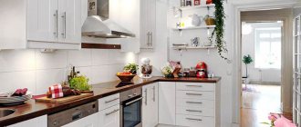
- Scandinavian. The absolute predominance of white color, which can be diluted with an accent black wall, or by installing a dark granite countertop. The cool shade is used here solely as a complement, emphasizing the snow-white design.
Scandinavian style
It uses light, airy colors and predominantly natural materials. And if everything is clear with white, then it is unclear what black has to do with it.
Yes, the latter really should be less in ratio. For example, a black countertop made of granite or its imitation on a white wooden set. Try to choose smooth, natural textures. There is no need for experiments - even in this design the kitchen will look elegant.
Add accents with decor: here it’s a dark rug with bright stripes.
A corner black and white kitchen will look good if you slightly dilute the mono-interior with wooden laminate aprons. Yes, it is a little out of our color scheme. But, as mentioned above, 1-2 bright elements are quite permissible.
For a kitchen combined with a living room, the Scandinavian style is also suitable. Largely due to its simplicity, the kitchen space will not distract attention from the recreation area. Try to somehow complement the clarity of the lines of the furniture - with an original chandelier and lighting under the cabinets. This way the impression will be more harmonious.
Work with textures: matte white facades and the same brick-like apron, glossy black countertops and household appliances. Here black acts rather as an addition, which emphasizes the snow-whiteness of the remaining elements.
Let's summarize. Black and white kitchens look great if you can take into account all the details and carefully consider the interior. Most likely, the repair will cost you a considerable amount - the simpler everything looks, the more carefully you need to select materials. However, if this does not scare you, the result will exceed expectations - the combination of black and white will be spectacular and beautiful in almost any style.
Selection of finishing materials
When planning the interior of a black and white kitchen, you need to pay attention to the materials used for flooring, wall and ceiling decoration. They must match the main colors and give the room an original, not boring look. The cladding should not contradict the chosen style, the installed furniture, be practical, and meet the requirements for the kitchen space. Let's take a closer look at each surface.
Floor
The choice of flooring for the kitchen is limited by its functional features, and a room decorated in black and white requires a separate approach to materials. Among the most popular are:
- Ceramic tile. It can be laid in one color, in a checkerboard pattern, or made into a decorative pattern. It would also look good to imitate natural stone, for example, skarn, hornfel – dark in color, quartzite, marble – light in color.
- Self-leveling polymer floor. One of the best coatings with a long service life. A monochromatic design with abstract patterns will perfectly highlight the chosen direction.
- Laminate. Externally, it can imitate a wooden or stone texture. Only the highest quality material should be used, then it will last a long time and become an integral part of the design.
Walls
For wall decoration, it is better to use a light shade; such a background will emphasize the appearance of the installed furniture, electrical appliances, and other interior items. Different materials are suitable for cladding:
- Decorative plaster. They make it in one tone. To add shine and contrast, fillers and special additives are added to the composition.
- Tile. Classic raw materials include tiles and porcelain stoneware.
- Painting. Waterproof paint options are used.
- Wallpaper. They must be durable, resistant to moisture, and also match the color scheme.
Ceiling
It is not advisable to decorate the ceiling covering in black, especially in rooms where its height is less than 3 m, but as an accent surface, such coloring can give the kitchen a non-trivial look. The following raw materials are used as coating:
- Coloring. This finish is similar in appearance to whitewash, but it is more practical and wear-resistant.
- Drywall. With its help, multi-level designs are made, which allows you to effectively combine different shades.
- Plaster. The material creates a textured surface, which is very good with a monochrome color combination.
- Stretch ceiling. In small rooms it is better to give preference to matte or satin options; gloss will visually reduce the space.
- Wallpaper. Along with painting, they are a budget option, and they can also be combined with the same wall design.
Apron
The choice of material for cladding the vertical surface from the countertop to the wall cabinets must be taken very seriously. The apron is most susceptible to contamination, is constantly in sight, must be impervious to moisture, and have an attractive appearance. The main raw materials can be used:
- Ceramic tiles. Standard, traditional product with a long service life. It can have a glossy or matte, smooth or textured finish.
- Mosaic. There are glass, smalt, ceramic, porcelain stoneware models. With its help you can create interesting patterns.
- Mirror glass. The coating is easy to clean, resistant to mechanical damage, withstands open fire, and neutral to moisture. Gives the interior a luxurious look.
- Stainless steel. Requires constant care. Characterized by strength and moisture resistance.
What style is suitable for a kitchen in black and white?
Pros and cons of black and white kitchens
This design solution has both positive and negative sides.
Decorating the kitchen space in black and white guarantees a minimum of design errors, since such a color combination is universal. Black absorbs light, while white, on the contrary, reflects it, so it costs you nothing to create an atmosphere of light and spaciousness through the use of light surfaces.
White color is a light source in space
The negative qualities of such an interior can be considered the excessive soiling of the space. Every speck will be visible on white, and every stain will be visible on black. In addition, black color has the ability to compress space and psychologically oppress the people staying in it - not at all what is needed on dull winter days.
ADVICE:
the predominance of black color in the interior is recommended only for large rooms. A small black and white kitchen should have a color ratio of at least 50x50.
Credit: @
Dilute the black color with wood texture or greenery
Both of these colors are initially quite distinctive. So what's the best way to decorate a kitchen in black and white?
You might be interested in a blue kitchen - more details here.
Kitchen styling options
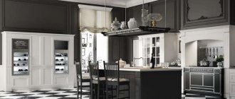
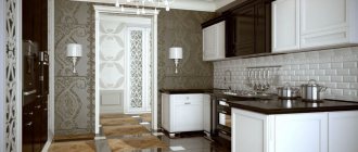
Immortal classic
Kitchens in a classic style, made in black and white, will look no worse than pastel colors. Excessive complexity of shapes and lines is not encouraged. Patina on the facade and vintage accessories complete the picture.
Credit: @
Photo of a black and white kitchen in a classic style
Modern
This style, containing smooth lines and smooth textures, is suitable for rooms of any size. Experimenting with color accents will come in handy - they will enliven the austerity of a kitchen in black and white. The most suitable material for modernism is tempered glass: simple and stylish.
Photo of a kitchen in black and white in modern style
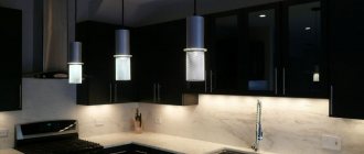
Hi-Tech
Metal and gloss in a black and white kitchen are faithful companions of this style. Futurism in this case plays into the hands of the interior. An unusual chandelier or kitchen island with LED lighting from below will create the necessary atmosphere.
High-tech kitchen
Note! Black and white color in the interior - design and different interiors of rooms
Loft
Brickwork is a classic element of a loft space - cover the apron or the entire wall with it. Choose curtains for a black and white kitchen - vertical textile blinds or Roman blinds are suitable for a loft. Divide the space with clear geometric lines. A corner kitchen in black and white style is an ideal solution for spacious rooms, and 1-2 bright color accents will make the space more interesting.
Brick walls will create a loft atmosphere in the room
Art Deco
Maximum sophistication and smoothness of form. This style focuses all attention on the details that create a solemn atmosphere in the interior - it is very easy to overdo it with the decor, ruining everything in the bud. A black and white kitchen-living room in Art Deco style is a space for imagination and implementation. Consult a specialist and transform your home into an elegant palace.
Credit: @
The photo shows a corner kitchen in art deco style
Color combination options for headset and dining room furniture
Having made a firm decision to make a monochrome kitchen design, you need to figure out what will be white and what will be black. What should be the color of the set, the color of the finishing material, and other decorative elements. There are several ways to achieve the required combination:
- White top and black bottom. A good solution for any kitchen size. This method allows for a clear delineation of space. Large household appliances merge with drawers and bedside tables, becoming more mundane, while at the same time the upper part looks airy.
- Black top and white bottom. Dark wall tables, tabletops, ceilings look good in combination with a white refrigerator, chair upholstery, and cabinets. This design is suitable for more spacious rooms with high ceilings. It is recommended that the flooring be done in light colors, but not white, so that the space has a more expressive appearance and does not merge into a single spot.
- White kitchen and black countertop. The best option for small spaces in Scandinavian style. The black color of the work surface with a glossy finish will only emphasize the light, warm design.
- White kitchen and black apron. Along with the tabletop it has an impressive appearance. It highlights the severity of the finish and is a good backdrop for furniture located above and below this area.
- White kitchen and black table. A separate element of kitchen furniture will go well among light colors. Can act as an accent or support other elements. An excellent option for interior decoration in Provence or classic style.
- Black and white floor. As a floor covering, you can use square or rectangular tiles, laying them in a checkerboard pattern, and diagonal placement will visually increase the space.
Materials for making kitchens
Manufacturers offer a wide range of kitchens that differ in their performance characteristics. The quality of a particular product will depend entirely on its price. For the manufacture of facades and bodies of cabinets and bedside tables, the following is used:
- Chipboard. The most common material for creating budget products. It has a loose structure.
- MDF. They are characterized by durability, water resistance, and environmental safety.
- Solid wood. The most expensive raw materials. Natural wood will become indispensable when decorating a classic interior with its expensive decoration.
To give the façade a finished look, the surface of the base is covered with different materials:
- enamel;
- veneer;
- polyvinyl chloride film, as well as melamine;
- acrylic plastic.
In the production of countertops, the same raw materials can be used as in the manufacture of facades, as well as tempered glass, metal, and stone of natural and artificial origin.
Which layout to choose
Kitchen layout is a very important stage in its arrangement. A lot depends on the correct arrangement of furniture, appliances, sockets. For example, these actions will allow you to place all the necessary tools in a small room, and in larger rooms you will be able to move around comfortably.
The first thing to consider is the working triangle rule. The storage, washing, and preparation areas are the main objects from which you need to start when planning. According to approved standards, the distance between the central components should be within 1.2 m - 2.7 m. But everyone has the right to choose a distance that is convenient for themselves. In total, 6 main placements of objects can be distinguished: single-row, double-row, corner, U-shaped, island, peninsula.
Selection and installation of built-in equipment
When choosing built-in equipment, you should take into account the need to smooth out the contrast between opposite colors. This will allow you to achieve harmony when decorating the space. Built-in household appliances, painted black, in combination with a dark countertop made of natural or artificial stone, standing out against a white background, will emphasize styles such as loft, minimalism, and Scandinavian.
When decorating the lower part of the room in light colors, the appliances should have the same shade. Black color will look good in combination with a checkerboard floor, or together with a black bottom. It is advisable to combine the tone of the equipment with the furniture in which it will be built.
Harmonious kitchen: several nuances of a black and white duet
The black countertop visually divides the space into two parts: top and bottom. She draws a clear line. Various ideas for designing and organizing space will help to smooth out the contrast or make it more harmonious:
- In any style, the use of a black and white duet is applicable not only in furniture, but also in floor finishing : tiles in such a palette, laid in a checkerboard pattern, look interesting.
The photo shows the interior of a white and black kitchen with a similar floor finish.
- Traditionally, the countertop is made of imitation stone. It is advisable to use textured solutions in a monochrome interior so that the black shade of this coating is not too deep. When the countertop is made of natural or artificial stone, its pattern plays and shimmers in different lighting conditions, which conceals the excessive contrast of the main shades.
The photo shows the beautiful natural texture of the stone countertop.
- If the entire kitchen is made in white, and you plan to make the countertop and apron black , then in this case it is better to choose relief or textured coatings. In a classic style, the apron can be made from brick-look tiles, plain mosaics, or relief tiles.
The photo shows a black apron and countertop in a classic kitchen.
- A glossy countertop will look harmonious against the background of similar facades , and a matte one will look harmonious in combination with wooden painted doors without gloss or shine.
In the photo there is a dark tabletop against a background of white wooden furniture.
A similar dining table would be an organic complement to the black countertop. Don’t forget about other details that will support the composition and make the interior harmonious and comfortable.
Third color: which one to choose and whether to add it
Two solid colors are universal and self-sufficient, but over time this color can get boring. In this case, the background is diluted with a third shade, which will enliven the composition. But you should not overdo it with the companion color; its share should not exceed 10% of the total area of the room. The main colors that go best with a black and white kitchen include:
- Red. A bright background will bring freshness to the space. Chandeliers, curtains, chairs, kitchen appliances will add dynamism to the interior. You can use any shade, and thanks to its powerful energy it attracts attention.
- Grey. Allows you to reduce contrast, add restraint and brevity to the room.
- Green. Can improve mood due to its relaxing properties. It also helps improve appetite.
- Yellow. Stimulates activity, positive mood, creates a feeling of warmth.
- Violet. Helps balance strict shapes. Excessive supplementation can have a depressive effect on a person.
What material is used?
First of all, it is important to understand that there are no exclusively good or bad materials; every solution has its own disadvantages. The basic selection rule: kitchen surfaces must be hygienic - that is, easy to clean and resistant to the absorption of fats.
Interesting article: Elegant color combinations of countertops and aprons for the kitchen
Ceramics
Ceramic tiles are a fairly common solution for the backsplash area in the kitchen.
Advantages of ceramics:
- affordable price;
- aesthetics;
- large selection of shapes and sizes;
- hygiene of glossy and semi-matte decors.
Disadvantages of ceramics:
- applied only to prepared surfaces;
- difficult to use at the final stage of repair;
- grout joints “collect” dirt;
- Professional assistance is required for installation.
Tabletops lined with ceramics are more often found in ready-made proposals for dining groups. Only an experienced specialist can finish a kitchen countertop with ceramic tiles.
Stone
Not all stones are equally useful - if it is appropriate to choose natural granite for a kitchen countertop (marble and onyx are too soft materials), then the backsplash area with tiles made of black or dark granite will become a headache for the housewife.
The fact is that natural stones have pores, so the surfaces are polished with special compounds, which are washed out over time during wet cleaning. Therefore, a countertop made of natural granite will have to be waxed regularly . And if it is enough to simply treat a horizontal surface once a month, then on vertically laid apron tiles it will be difficult to avoid streaks without touching the kitchen body, for which waxing is contraindicated.
An equally popular proposal is cast or acrylic stones. Since all stone countertops are very heavy, they are transported in several segments, which are connected at the time of installation of the set. When using dark and black monochrome decors, it is impossible to make the joints completely invisible.
Advantages of black countertops made of artificial stone:
- unlimited design possibilities;
- maintainability and lack of edge materials;
- the ability to make an end with a “zero” chamfer.
Flaws:
- increase in project cost;
- if there are joints, it is necessary to choose decors with the effect of sand or crumbs;
- When using high polishing it is impossible to avoid scratches.
Advantages of an apron made of dark artificial stone:
- the ability to eliminate the water trap due to “seamless” docking;
- maintainability and absence of connecting strips and obvious seams.
Disadvantages of artificial stone aprons:
- high price;
- frequent “burns” of the surface.
Artificial stone can be used on a backsplash only in cases where the depth of the countertop is increased to avoid overheating of the surface in the area of the stove or hob.
Glass
Perhaps the only brand of glass that is appropriate to use for kitchen countertops is Lacobel lacquered glass. And even this material is more suitable for bar counters than for work surfaces, since any mechanical impact on polished glass will cause scratches.
Lacobel is more common for equipping aprons, although it will not be possible to simply drill a hole for a socket; only the laser burning method is acceptable to prevent cracks during operation.
Interesting article: Beige and white aprons for the kitchen: brick and gloss in design
Important! The glass must be mounted on a rigid substrate made of laminated chipboard or MDF to relieve stress on the part.
In addition to Lacobel, you can consider glass options with photo printing.
Advantages of photo printing for dark aprons:
- creating optical illusions through panoramic images;
- the possibility of tempering the glass before applying a film with a pattern on it.
Disadvantages of photo printing on a kitchen apron:
- complexity of color rendering, frequent tint of greenery;
- the need to increase the depth of the tabletop and use a substrate.
Plastic
As a rule, black and white kitchens have strict shapes, so straight ends of facades and countertops are preferable. Whereas postforming is carried out with the plastic being folded from the plane to the end, and therefore the edge of the tabletops will look rounded.
Advantages of postforming:
- affordable price;
- the ability to complete the apron to match;
- availability of glossy and matte decors;
- high hygiene.
Disadvantages of postforming:
- edging materials at the ends of the slabs;
- complete with connecting strips;
- limited design possibilities when creating patterns;
- If the plastic is damaged, the entire part must be replaced.
In addition to postforming, you can consider plastic tabletops with ends under the edge of ABS - unlike PVC, ABS allows you to avoid the “frame” effect, the surface looks like a single whole with an edged end.
Important! The absence of a frame effect is achieved on robotic lines; manual edging of a plastic countertop can ruin the appearance of the kitchen set.
Disadvantages: a high-quality product with an ABS edge will be comparable in cost to an artificial stone countertop.
Porcelain tiles
Due to the desire to create the perfect glossy black splashback with a minimum of grout joints, more and more attention is being paid to porcelain tiles. This is the biggest mistake you can make when choosing a kitchen. Glossy porcelain tiles should absolutely not be used on the apron area. The resulting greasy stains cannot be removed from this material. If there is no alternative, and you definitely want porcelain stoneware, then you should choose tiles with a lapped surface.
Features in lighting
In this design, like in no other, lighting plays an important role. This is due to the properties of black, which not only visually reduces space, but can also have a negative impact on the psyche. The room should not be dark; it must be well lit artificially and naturally. When planning a black and white design, you need to consider the following points:
- If the interior uses a lot of dark shades, additional ceiling lamps should be provided along with the main chandelier.
- It is necessary to choose furniture, household appliances, and finishes with a glossy surface that will serve as a light reflector.
- It is necessary to provide for additional lamps installed under wall cabinets.
- The best option would be to use multi-level lighting installed around the entire perimeter of the room, not only on the ceiling, but also on the walls, and also use floor lamps.
- Additionally, you can use decorative ceiling lighting and install LED strips under free-standing objects.
Black and white kitchen in the interior: photos of finishing options
The primary issue that needs to be resolved is the dominant tone in the kitchen interior in black and white. The abundance of white will make the room larger and more spacious, while black will bring some mystery to the room and emphasize the expressiveness of the lines in the design. Colors in the interior can be distributed in different ways; there are a huge number of options. If the role of the main color is given to white, then a white top, black bottom kitchen would be appropriate. A white kitchen with a black countertop will look just as neat and minimalist. If the dominant color is black, then only individual elements will be in white tones, cabinet doors, handles and again the tabletops of the dining and work tables. An original solution would be a combination of black and white surfaces in a chaotic manner. Another great solution would be a black and white glossy kitchen. Alternating matte and glossy surfaces in the design of a black and white kitchen will be an appropriate and successful accent.
Textiles and decoration
Curtains, tablecloths, towels, and other textile elements must fit into the overall background of the room and not contradict it. Most often, calm, monochromatic tones are chosen. Light white curtains paired with black drapes look good. The main thing when choosing is not to overdo it with the tone.
Textiles should be selected based on the overall style. But its color does not have to be in unison with the main background. It may be colored with additional accompanying colors, emphasizing a certain focus.
For a small room with insufficient lighting, it would be inappropriate to use black curtains. In combination with dark furniture, you can hang exclusively white curtains. In a room with high ceilings, short curtains made of various fabrics look harmonious.
Design Tips
Recommendations:
- The correct shade ratio is maintained.
- Select a good material for the kitchen countertop. Artificial and natural stone with a good pattern, streaks and inclusions. The natural pattern easily masks dirt.
- A suitable combination with an apron. The colors of the coatings must match completely.
- Moderate use of bright decorations against a white background.
- Patina with silver or another shade in a classic kitchen dilutes the contrast.
Color balance is maintained with a dark rug on the floor.
Matte finishes hold more dirt due to the rough surface. They are more difficult to wash. Scratches are not as noticeable on a matte surface. Lighting is distributed easily because there are no glares on the surface.
A black work surface and a brown apron looks impressive
Other examples:
- Brown should be supported by other decorations.
- A bright interior is diluted with blue or yellow
- A black table perfectly complements a dark work area.
Important! An optical illusion occurs when a kitchen with a black countertop and walls are painted white.
The walls are finished with plaster, paint or wallpaper. Protection from water, dirt, and temperatures is created near the working surface.
To the point! What paint to choose for kitchen walls, as well as what its advantages and disadvantages were written about here
An apron can combine shades of all furniture elements.