It's no secret that bright details in the interior help to enliven the picture, adding dynamics and richness to it. Large objects, furniture, and unusual decorations can act as accents that dilute the monotony of the room, but color accents can be classified as a separate category. Most often, a bright, rich shade serves as a color accent. This is the currently fashionable color of ripe lingonberries or lingonberry color.
Choosing the color of the doors
In order for the door to each room of your house to have a presentable appearance, you need to correctly select the shade in which it will be decorated. Stores offer customers a huge number of color and print options. It’s easy to get lost in this rich palette, so you need to familiarize yourself with all the variety of interior and entrance designs in advance.
Variety of color palette
In order to understand the color palette of doors, it is not enough to know all the names of the colors. It is important to remember such components as texture. Each texture has its own unique shades.
For doors made of solid wood, chipboard and plastic, the following colors are selected:
Brown
- American Walnut is a rich brown shade that comes in a variety of interpretations. It is typical for a classic interior and is suitable for decorating both entrance and interior structures.
- The deep brown shade is inherent in wenge wood. This color is similar to the color of rich dark chocolate. It eliminates the mixture of shades and in most cases has a matte texture.
- Italian walnut has a brighter tone, falling on the border between brown and red. This color is used for the Orchid design, which is a popular type of interior doors.
- Mahogany has a rich burgundy color, which does not have a “flashy” tint and looks very noble.
- The most neutral shade of brown is teak wood. It does not contain additional tones and is often used to create entire sets.
- For both wooden and plastic doors, a popular coating color is mocha. Like the drink of the same name, it is a noble brown shade with slight tints of texture.
- For lovers of light brown tones, a Scandinavian walnut color design is suitable. Both the panels and the solid mass will look good and combine with almost any interior. The doors of the Sonata model are often embodied in a similar shade of walnut.
Gray
Ash and asphalt shades are increasingly popular in various interior styles.
To decorate the door, colors from the following palette are suitable:
- Dark ash anchor has an unobtrusive light gray color that will not attract undue attention to the door structure.
- Ashy cappuccino, located on the border of beige and gray colors, looks very elegant and unusual.
- Paloma is a shade of gray, dotted with light stripes, making the surface look more prominent.
- Ash wenge is perfect for lovers of solid shades. It is a rich tone with a discreet dark relief.
- For MDF material, light gray metallic is used, often used in modern interior styles.
White
White colors always look catchy and sophisticated.
They come in a variety of shades that will make your room door truly impressive:
- Milky oak is a very pleasant color. Despite the light shade, it has a pronounced texture that looks great over the entire surface of the product or in combination with contrasting dark materials.
- Ash is often used as a light-colored door covering. Varieties such as Sonoma ash and Shimo ash give doors a delicate, but at the same time noble appearance. Shimo has a cooler shade of light, while Sonoma is closer to beige in color.
- Ivory color is used for designs made of various materials. It is often found in paneled products, popular in antique and classical styles. Ivory can often be seen on vintage designs, sanded down for added effect.
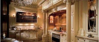
Coffee shades of doors
Interior doors in a brown palette occupy first place in the ranking of demand. The color of coffee with milk has many shades. The most popular ones will be discussed further.
Cappuccino door in the apartment
This color is well suited for doors to the bathroom, kitchen or hallway. For the bathroom, you should choose models treated with a special moisture-resistant coating to prevent mold from appearing on the surface. The main advantages of walnut canvases:
- the door looks impressive;
- any decor is suitable, including stained glass inserts;
- goes well with both light and dark colors;
- Comes in different shades, so each product is unique.
Looks best in a classic style. Brown would be an ideal option if you choose antique or modern antique-style furniture for your apartment.
Cappuccino door in the bedroom
Wenge
It will fit perfectly into the room if the surroundings are decorated in light brown or light gray colors. Main advantages:
- original texture;
- doors made of wenge are practically not affected by fungus and parasites;
- goes well with classic dark brown skirting boards, which are found in most apartments;
- goes well with synthetic materials (for example, plastic).
Cappuccino swing door
Very often accordion doors are made from wenge. They usually have a matte surface, but some manufacturers make it glossy or decorate it in the form of photo printing.
Cappuccino door in the hallway
Red tree
It fits well into an interior that actively uses black. The advantages of this shade are its noble appearance and dark matte surface, on which no dirt is visible. However, there is also a significant drawback - the abundance of mahogany sometimes gives the apartment a gloomy look. To solve this problem, you can liven things up with a light-colored rug.
Art Nouveau cappuccino door
Looks impressive. Doors of this color are best suited for decorating the entrance to a living room or bedroom. The advantages are as follows:
- the possibility of creating a relief or, conversely, convex decor imitating carving;
- beautiful natural wood color;
- It is convenient to apply photo printing and decor from self-adhesive film on teak doors.
Among the disadvantages, the high price should be noted.
Sliding door cappuccino
Who is suitable for Mocha hair dye?
Since the tone is natural and natural, ladies of any age can use it. There are rules that allow you to choose the tone that will decorate you.
Dark mocha
Warm, even rich, colors of this color are suitable for girls of the autumn color type.
- If you have dark brown, amber or blue eyes, peach, beige or dark skin, then choose this hair dye;
- Dark mocha hair dye is suitable for those with blue eyes;
Suitable for skin prone to pigmentation. It helps to visually hide spots and distract attention. Whereas light shades emphasize.
Light mocha
If your skin is delicate, fair or has a pinkish undertone, choose a light, honey or caramel tone.
- Give preference to cold ones;
- Dark and light colors are suitable for dark-skinned women. But if your skin tone is cold, then the paint should be appropriate. Conversely, if you have a warm skin tone, choose warm colors. It is worth abandoning “chocolate” shades;
This paint looks like light highlighting. Balayage or Venetian highlighting in several tones is a fashion trend this year. These tones are combined with each other, therefore they allow you to get a natural and harmonious effect of burnt strands.
Cappuccino color door materials
The choice of interior paintings is made based on a number of conditions: the attractiveness of the appearance and the style of the room. An equally important role is played by the building materials used in the manufacture of doors.
MDF cappuccino door
Tree
Cappuccino doors in apartment interiors, made of wood, are strong and reliable. Spruce and oak are traditionally considered the most durable species (Karelian birch was very popular in the 19th century). A light brown wooden interior door will suit any setting (with the exception of modern urban styles). Here are the main advantages of wood:
- the ability to create original carved and stained glass decor;
- reliability and long service life;
- beauty and originality of natural wood texture.
Cappuccino front door
Among the disadvantages, the rather high cost should be noted. Also, if there is high humidity in the apartment, the wood may become affected by fungus.
Typically, wooden door panels are installed in rooms (living room, bedroom, children's room). It is better to choose a different material for the kitchen or bathroom. A door made of coffee-colored wood, separated by elegant carved decor or glass inserts, will go well with a Provence-style interior.
A dark brown door with glass inserts will create a cozy atmosphere in your hallway or study
Cappuccino-colored doors in the interior
Coffee-colored doors made from various materials are very popular in modern interiors because:
- look great;
- they are easy to care for, and no dirt is visible on the surface;
- easy to choose wallpaper, tiles, linoleum;
- are in demand in most styles used in the design of apartments (for example, classic, Provence, industrial and urban).
Cappuccino door in modern style
Before ordering a cappuccino-colored product, you need to have a clear idea of how it will look in a particular room.
Inserts in the form of horizontal stripes visually increase the height of the ceiling
Coffee-colored doors are well suited for an office, city apartment or country house. The main thing is to ensure that this color does not exist on its own, but echoes the tones of other pieces of furniture and interior design.
Wooden cappuccino door
Lingonberry color in clothes
This color will make you look slimmer, emphasize elegance and brighten your complexion.
Lingonberry is more suitable for such color types as “Summer” and “Winter”, since it is more of a cool shade of pink than a shade of red.
Lingonberry-colored clothes are worn mainly in winter; in summer, lighter shades are preferred. Also, this color is more office-business than festive, but it is quite suitable for winter holidays (for example, New Year).
In clothes of this color you are seen as a strong-willed person, however, without any arrogance. They may seek your protection or turn to you for help.
Fabrics of this color are preferably warm: wool, viscose, mohair, angora, corduroy, satin.
Lingonberry color will make any interior sublime, but in this combination simplicity will be appropriate: not carved furniture covered with silk, but simple, with straight lines, but this does not mean cheap. The atmosphere should feel good and solid.
It is better to choose upholstered furniture upholstered with fabric. Cover the floor with neutral-colored carpet.
It is worth compensating for the lack of light (after all, the dark lingonberry color) by using lamps with lampshades (table or floor lamps).
In such an environment, a massive desk and an extensive bookcase, preferably made of mahogany, will look good.
VIEW COMBINATIONS WITH SIMILAR SHADES (click on color)
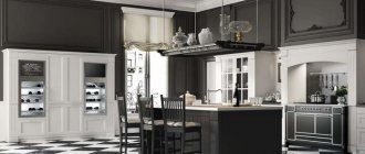
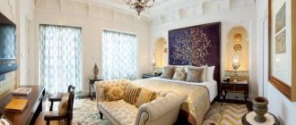
Mocha color in the interior of the apartment
Mocha in the interior: beautiful combinations and design examples
The noble soft brown shade looks expensive and aristocratic in the living space. Depending on the saturation, it can be lighter or darker, varies from the tone of coffee with milk, milk chocolate to a muted coffee color. It is universally suitable for the role of a base or accent color – the atmosphere is very calm, cozy, and induces relaxation.
Ready-made design project in mocha shades
An elegant combination of dark brown tones and a light shade of ivory was chosen to decorate the living room, hall and hallway of the apartment. The contrast they create makes it easy to highlight the desired details, but at the same time it is not as harsh as black and white.
In the wall decoration, wide cream-colored wall panels alternate with narrow mirror inserts framed by laconic wooden baguettes. The facades of the built-in cabinets repeat the design of the wall panels and form an integral composition with them. High skirting boards around the entire perimeter look like a natural continuation of the wooden floor and optically increase the height of the room.
Berry colors in the interior, the taste of berries in your home
A cocktail of floral and berry shades can be “preserved” in the interior - and there will be a summer mood all year round. This design option would be appropriate both in a country house and in an apartment.
In order to enliven a monotonous room, you need to choose one large item - for example, furniture, a carpet or a panel and several small details - all of this should be in one favorite bright shade.
The use of rich berry tones in the interior is a fashion trend that has replaced the conservative approach. One of these “branded” shades is raspberry. Wall decoration based on the predominance of raspberry colors does not look as aggressive and defiant as red, but at the same time it is not cloyingly sweet like pink. Meanwhile, regarding this color there are a lot of prejudices and warnings related to the fact that an interior designer should not choose crimson as a base color.
How rational they are and how to work correctly with the crimson color; a bright and rich crimson color is associated with joy, summer and activity. This color is preferred by purposeful and easy-going people who are accustomed to looking at the world with optimism. In England, for example, for many years crimson-colored fabrics were used to sew military uniforms, and in Rus', the shade of ripe berries adorned the costumes of kings and nobles. Undoubtedly, using this shade in the interior, to one degree or another, its qualitative features will affect our well-being and attitude.
But, since the interior cannot contain only one color, giving preference to this shade, it is very important to choose the right combination. The combination of crimson color in the interior is very interesting and varied. On the one hand, I want to “mute” this bright and active color a little with the help of pastel shades, but on the other hand, it is in complete harmony with other bright tones.
So, according to designers, the combination of crimson and white looks most ideal.
Moreover, the crimson shade in this tandem can either dominate or complement the white color. For example, crimson curtains in the interior against the background of white or pastel walls, decorated with paintings in crimson frames or other accessories of this shade, will look very advantageous and bright.
crimson color tends to visually narrow the space, so in small rooms it is recommended to use it in very small quantities. However, it is precisely thanks to this feature that overly large and high rooms acquire a warm atmosphere of home comfort.
In addition, do not forget that this color represents activity, so a bedroom in crimson tones is not the best place to relax. In the sleeping room, the crimson shade should be presented as an addition. For example, if the room is decorated in light colors, crimson textiles will look very beautiful against its background - tablecloths, bedspreads, rugs, curtains, pillows, etc.
It has long been known that all shades of red in interior design give the room a special nobility and respectability. It is not without reason that all noble people at all times preferred to decorate their chambers in red colors.
Nowadays, preferring crimson color in the interior, you can interestingly decorate any living space, be it a living room, kitchen, bedroom or bathroom.
The crimson color is most suitable for Baroque, Renaissance and Empire styles. But it is also preferable for the interiors of the oriental style that is fashionable today.
Plum color
Not often used in interiors due to its depth and coldness. But at the same time, this shade is very elegant and goes well with absolutely all cool shades - gray, blue and many others. The color of plum in the interior gives a special atmosphere, mysticism, mystery. It is considered one of the noble shades that tunes a person to intense emotions and passion (unlike the lilac shade of lavender, which tunes to romance and tenderness). Too much plum interior is dangerous; it is better to use plum color in the interior as separate elements, diluted with other colors. The color of plum is most often combined with white and gray.
The rather bright shade of ripe plums cannot but attract the attention of others.
The color is soft and delicate, juicy and ripe, warm and “tasty”. Plum color - neither burgundy nor violet. If I may say so: it is something in between. But with all this, plum color is independent and self-sufficient.
Since this color was first identified in England, for some reason it is considered to be a purely English variant. However, many designers managed to prove the opposite and present the world with modern, unconventional solutions.
The main advantage of plum color is its functional versatility. This color behaves best in a formal and formal setting. But the serious interior of the living room can only be slightly diluted with plum elements (pillows, vase).
Magnificent plum color can make any interior spectacular. Even a small accessory of this color will definitely attract attention and add a touch of luxury and exclusivity. If the walls are painted plum, then the room immediately turns into a real theatrical stage, illuminated by the light of the spotlights.
Creative people with a developed imagination and rich imagination prefer to be in such an interior. As a rule, this color scheme is chosen for a theater dressing room, an artist’s studio or a musician’s bedroom. Plum also attracts designers, photographers and creative people in general
Cherry color
Many designers use the rich color of ripe cherry, the so-called Hollywood cherry, in interior design. He is also loved by many celebrities. This shade is not as bright and aggressive as red, but darker and more saturated. The interior in cherry tones looks much nobler, more solid and solemn.
Red color, as you know, symbolizes energy, passion, activity. Although cherry is red’s “brother,” it is more restrained, sensual, and romantic, so it is very often used to decorate the bedroom. It can be used in larger quantities, but remember that it darkens the room and visually makes it smaller.
Cherry color can be dominant in the interior or act as significant accents (pillows, textiles, dishes, accessories). It adds warmth and coziness to the interior. The richness of shades is a fine line of perception.
This color is distinguished by a wealth of shades - wine, ruby, garnet, dark cherry and others. The fine line between them lies in the mystery of human perception of the nuances of color rendering. By combining these sophisticated tones with each other and with other colors, you can create a stylish and sophisticated interior for different rooms.
A bedroom in cherry tones will look romantic and sensual. Shades of red in different cultures symbolize love, passion, even depravity. But cherry blossom softens these strong emotions. It will warm up feelings, increase attraction, but not cause aggressiveness and outbursts of emotions, like bright red. Even individual cherry-colored details can completely change an ordinary bedroom and the atmosphere in it. These could be lamp shades, a bedspread, blinds or roller blinds, bed linen, pillows, an armchair.
Lingonberry color
The color of lingonberry is a noble shade, but at the same time it is considered quite complex and sometimes even pompous. One of the designers’ discoveries was a lingonberry-colored kitchen, which is the key accent of the entire home. The first question that is asked when using the shade of this berry indoors is furniture. Everything is simple here: choose kitchen cabinets, tables and chairs, as well as household appliances of simple, even ascetic shapes. In addition, the color of lingonberries in the kitchen interior is an opportunity to play with color combinations. Dilute the royal shade with white, flesh, pistachio, gray, beige tones, and you will see that the kitchen will be transformed. However, take another advice from designers: the colors chosen for combination with lingonberry, like it itself, should not be glossy - this way the entire effect of luxury is lost. As for the flooring, the lingonberry kitchen will accept light laminate or floor tiles - sand, cream or milk. Avoid using dark colors or other shades for the flooring as they will weigh down the room and make it appear smaller.
Lingonberry color in kitchen design is another way to play with textures. For economical options for this room, use MDF facades covered with plastic, and if you have sufficient funds, choose wood. Aluminum or chrome frames will go well with the color of your kitchen cabinets. As you can see, lingonberry color is worthy of choosing for interior design. Use this shade and it will highlight any style - from modern to baroque.
Burgundy, purple and violet are the most mysterious and mysterious shades of the spectrum. These colors give interiors a special flair. Plum and wine shades are suitable for living rooms, bedrooms, home offices and libraries. Moreover, in these rooms these tones can predominate; in the kitchen or nursery it is worth limiting yourself to only the details. Avoid overdose - dark colors can spoil the interior with excessive gloom and depression, but the right combinations and design techniques will create an amazing effect.
Purple shades perfectly dilute monochrome interiors. Add to a neutral base - walls, floor and ceiling - a couple of large pieces of furniture in one of the tones, or several accessories that support each other: photo frames, small boxes or vases. The main thing is that the shade of such decor matches not approximately, but completely.
In addition to white, a light version of green is considered a good companion for the purple range. At times turning yellow, the shade of juicy or, on the contrary, slightly withered grass will dilute the gloom of plum and refresh burgundy. This season, the latest in interior fashion is purple with barely noticeable splashes of brown - like a grainy coating.
Related articles:
- Saffron color is what photo
Saffron color in clothes Saffron color is a slightly darkened shade of yellow. Rich, but not... - Fashionable colors in the interior Fashionable colors in interior design 2020 - stylish trends Every year fashion trends in design...
- Green color in the interior Colors affect not only our well-being, but also our health. By choosing the right shades, you can...
- Wood color Wood colors Any wood changes color after treatment with protective compounds. Some breeds change color slightly...
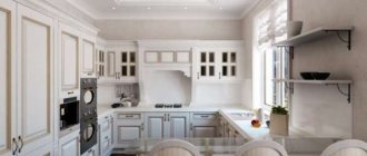
Features of interior decoration in mocha color
Mocha color – what shade is it? It is a dark brown color with a soft and deep tone. Some people think that brown room design is quite boring. But mocha has tangible benefits. This color helps a person calm down and relax. Some people tend to dwell on their problems, although silently grinding the problems in their brain will not solve them. For such women and men, it is recommended to use brown colors in the interior of the kitchen, bedroom and living room.
Mocha color in the living room
Why is lingonberry color popular?
Lingonberry color has become one of the most popular and requested colors for interior decoration in 2020. This demand is quite understandable. Berry colors have always attracted attention with their richness and richness. Adding them to a regular interior helps create a spectacular and unique design.
Lingonberry color does not lag behind other berry shades; it is distinguished by its nobility and mystery. It displays some hints of the Victorian era, adding even more luxury. In the new year, this color received incredible publicity and began to appear more and more often in the design solutions of many masters.
Advantages of decorating an apartment
Decorating an apartment in mocha color has the following advantages:
- The shade looks good both on individual objects - accessories in design, and in the tone of the set or as the main color of the walls and floors. With the right combination of cool and warm tones, you can create a rich and stylish room.
- The mocha color in the interior helps a person to calm down and relax. For excitable and nervous people, this color in the apartment is recommended by experts.
Comfortable studio apartment design
- Mocha works great in combination with other tones. When using bright accessories, this shade “quenches” the excessive brightness of objects.
- Using an interior in mocha tones, you can create a design of various styles. This includes eco-style, Provence, retro, chalet, loft and other options.
Modern interior style
- The texture of mocha-colored furniture can be very different - matte and glossy, carved and smooth, aged and ordinary. The shade goes well with other materials - wood, glass, stone, metal.
Designers nowadays do not shy away from new ideas. The most daring solutions in the interior of apartment rooms are offered to the demanding customer. You just have to remember that rich brown color optically reduces space. In small rooms it should be used in shades of accessories. You can recreate a bedroom with brown furniture. It is better to decorate wallpaper, doors, windows in cold or warm light colors. You can experiment with large rooms by making the panels on the walls dark brown. At the same time, it is worth decorating the floors with light colors and buying furniture combined with milk and brown.
Living room in light brown tones
Brands
Brands produce coloring agents that allow you to achieve this tone. They have certain trade names.
The mocha color looks different sometimes. We can roughly say that these are complex shades of brown, gravitating towards gray more than red.
Londacolor, Loreal, Wella and Estell each market one shade of this range called “Mocha”. These are rich, dark shades, close to each other. Palette sells warm “golden” mocha. The shade is complex and warm. Schwarzkopf offers a chocolate tone, and Syoss offers an interesting and complex mocha fusion shade.
You can get Mocha color not only with the help of professional hair dyes, but also with the help of tint balms
Not only mocha hair dye will help you change your image. For a short-term color change, give preference to tinted balms and shampoos. They color evenly and take care of hair. Wash off after 1 - 2 washes.
What can you combine mocha color with?
It is recommended to use combinations of dark brown with the following shades:
- Green, apple color. It is better to use this color for accents. Try adding green pillows to the brown set on the sofa, green curtains on the windows, and green lampshades for the lamps. You shouldn't go overboard with accents. If the curtains are brown, you can choose a green rug for the floor. For green curtains, it is better to choose a mocha or milky color rug. When combining three colors in the tone of milk, you can put a tablecloth on the dining table in the dining room or a bedspread on the bed in the bedroom. In this case, you should choose armchairs or chairs with light upholstery.
- Orange and red colors should be present in a brown interior in small quantities. In the kitchen, you can put a red rug on the floor. Cover the table with oilcloth with red poppies. You can put a flower in a red pot on the windowsill. An orange tint is also used. If the orange furniture has a muted tone, then it is not forbidden to choose a kitchen set of this color, but it will not look good with the brown decoration of the room.
- The sunny yellow color can be used more actively. If you buy a mocha-colored set for your living room, then the walls and windows in it can be finished in yellow. It will give the room a golden feel. By the way, gilded accessories - candlesticks, vases, figurines - will play into the hands of such an impression.
- A light blue shade of the color of the northern sky looks very beautiful with mocha color. Brown walnut furniture against the background of sky blue walls and ceilings looks rich and elegant. Blue color creates the impression of cleanliness and spaciousness. It is possible to create a marine design in a room or a Scandinavian style interior. It is better to decorate a country house in these colors, since cold shades of blue will create a feeling of coolness.
- Mocha goes well with wood tones. Shades of the floor and furniture like oak will dilute the dark brown interior.
With blue
Think about where you could see lingonberry color in nature? Sometimes you can see it at sunset. The magnificent combination of rich pink-violet shade against the darkening sky looks inimitable. You can choose a similar color combination for your outfit. Deep colors are in fashion today, so give preference to sapphire in shades of blue and velvet in material. Lingonberry color will also look good in noble material. An outfit like this is not suitable for every day; it would be more appropriate to try it on for a special event.
For a casual look, consider pairing a lingonberry turtleneck, T-shirt or sweater with blue jeans. This combination looks stylish and unobtrusive. You can use a pink-violet shade not only as the main one, but also as an additional one, for example, choose accessories of a noble color.
Design of various rooms
The following room designs in the apartment are recommended:
- We buy the kitchen in mocha color. You can choose a gray hood above the stove, but then you should paint the walls the same shade. The floors should be covered with beige and brown tiles in a checkerboard pattern. The doors are beige. We choose mocha colors for the table and the base of the chairs, and beige for the upholstery of the chairs. We place the tabletop in the work area in beige color. Designers will advise you on which accessories to choose. For example, purple napkins for dishes on the table and green plates will help to dilute a strict set. A bouquet of daisies in a crystal vase will complete the kitchen interior in mocha color.
- In the dining-living room with a touch of mocha, do not go overboard. It would be nice to put 2 sofas in the relaxation area - one upholstered in brown leather, the other in milky leather with brown velvet pillows. Ottoman - a table should be chosen with a brown top and a milky base. Curtains for windows should be of two types - white tulle and thick beige fabric. Lampshades on the overhead lamps can be chosen in walnut color. We decorate the ceiling, doors and walls in the color of milk. We put mocha-colored furniture in the dining area - a table and chairs.
- A bedroom in a mocha tone suggests a trestle bed with brown leather upholstery and a milky base. The floor and accent wall to the side of the bed are in mocha shade. The cabinet next to the accent wall is made of milky chipboard. The bedside tables and chest of drawers have mocha fronts and milky side walls. A piece of the wall above the head of the bed is covered with beige wallpaper up to the ceiling, and there is a beige carpet under the bed. The rest of the wall is painted a café au lait shade. This color is supported by the same tone ottoman. It will be beautiful to place lamps in the form of carved beige balls on the bedside tables. Light oak doors complete the design.
Many housewives love mocha color. The ability to create an interior of different styles that will have a calming effect on the nervous system is appreciated by many clients.
In reviews on the Internet, buyers recommend decorating rooms in mocha color. Photos of various rooms in mocha colors are shown above.