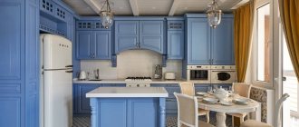
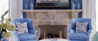
How many different feelings and thoughts are evoked by the term “blue”! Immediately what comes to mind is the endless expanse of the sea, the endless sky in its variety of shades and the image of the planet itself, often called “blue”. Without realizing it, we associate blue with hopes and the fulfillment of desires, since childhood we have become accustomed to trusting both the magical cartoon blue trailer and the blue bird, which has become a symbol of happiness. Undoubtedly, an environment in such colors will evoke a feeling of peace and tranquility. The blue color in the interior of the hallway will perfectly convey the feeling of security and comfort caused by returning to your home and closest people.
Blue color in the interior of the hallway: all shades of blue
In 2020, the already popular color blue was talked about with a vengeance: leading designers at shows in Milan and Paris named this tone the color of the year
. And already at the fashion show, visitors were able to see that the blue color in the hallway interior can include many variations:
- cornflower;
- aquamarine;
- deep cobalt;
- mysterious and subtle lunar and azure;
- bright ultramarine;
- mysterious indigo with a hint of lilac;
- taucine, labradorite, woad and other complex tones.
All these names are united only by belonging to the cold spectrum , although the psychology of blue color more often correlates it with positive emotions, and not with coldness and aloofness.
Blue is the color of contemplation and meditation, relaxation and peace. This color, like the abyss of the sea or the expanse of the sky, makes a closed space wider and deeper. This same color also has a tangible property of absorbing negativity: just spend a few hours in a blue interior, and bad thoughts and a load of vain worries will dissolve.
It seems that only for these qualities can blue be called the most successful color for decorating a hallway? Indeed, the blue color in the interior of the hallway is something that will calm you down after a hard day at work, set you up for relaxation and relationships with household members, and relieve irritability and nervousness. The blue color in the hallway interior will visually enlarge the room
, even if the available square meters are quite modest.
Features of warm and cold palettes in corridor design
It is difficult to overestimate the role of color in the interior. It sets the style and mood and influences the overall perception of the living space. A harmonious combination of shades in the corridor is especially important. The absence of windows, a small area, and a specific layout make the color scheme the central character of the room. It’s not enough to decorate the walls and ceiling in your favorite shades. You also need to choose the color of the cabinet in the hallway, take care of combining other elements of furniture and decor in order to visually expand the space, fill it with light and pleasant contrasts.
The corridor is perceived by many as a utility room, boring and uninteresting. Meanwhile, the functionality of the hallway is much broader than just a place to store outerwear, outdoor accessories and shoes. Competent design turns the corridor into the calling card of the entire house. The standard way to create comfort and harmony in a room is to choose a good color palette for finishing surfaces, combining shades with fittings, furniture and decor. The corridor does not become an exception to the general rules of design. But there are some nuances that need to be taken into account when choosing a color:
- The size and layout of the room directly affect the main shade. For example, in a small hallway you cannot use dark colors. In a narrow and long corridor, horizontal contrasts in the form of stripes should be avoided. In a small room with high ceilings, it is better to decorate the surfaces in warm, soft shades.
- The design of the hallway should be universal in order to become a natural complement to a bright children's room, a discreet living room and a glamorous bedroom. In other words, the palette should correspond to the overall style of the house.
- The corridor is subjected to daily mechanical tests. Moisture and street dust entering the room on shoes, outerwear, and accessories make it difficult to maintain perfect cleanliness. Therefore, it is better to avoid using white, blue, pink or light green colors. On light shades of a cold palette, every speck will be visible from any angle.
Color and stylistic solutions based on blue
Undoubtedly, the color blue is noble, romantic, and strict at the same time. It seems that it is self-sufficient, but designers warn against trying to build a color combination in a blue hallway solely on these shades: too much blue will be too cold. The problem is solved quite simply: a worthy companion is selected for blue, capable of brightening up and complementing the main tone.
What do you need to prepare?
Walls
The walls in the hallway are subject to active wear and tear, so potholes, stains, chips and smudges often appear on them. The work surface can be tidied up by removing old paint or wallpaper (if necessary), using a stiff brush and soap solution (a 3% soda solution is also suitable), and leveling with putties.
If you notice that the walls have become “infected” with fungal mold, then before applying the primer you need to treat the infected areas with special chemicals. means, and then remove the layer of dead fungi. If necessary, the procedure should be repeated.
Stages of preparatory work:
1. Putty the cleaned area. Gypsum putty is usually used for this.
2. Let the putty dry completely and apply a primer.
Putty and deep primer are required! Without them, all surface imperfections will appear under the paint, and the paint itself will lie unevenly, whitish areas will remain or the texture of the paint will not appear.
Dye
Choosing the right paint for a corridor is not an easy task, given the huge range of offers from manufacturers. We will look for “vandal-proof” according to the following parameters:
- budget;
- easy to clean;
- resistant to wear;
- elastic;
- moisture resistant;
- "breathable";
- safe;
- with a high degree of adhesion.
Article on the topic: Types of primers and surface preparation for painting
These parameters are met by paintwork materials that combine the properties of interior and facade paints - enamels, glazes, two-component polyurethane, water-dispersion paints based on acrylic and latex.
Alkyd enamels are good, but you can only work with them with open windows and doors, because... when dry, they release a sharp pungent odor of coloring pigments, which persists for 3-5 days. There is an alkyd with polyurethane without such odors, but its prices are steep.
A washable water “dispersion” is perfect for painting walls in the hallway.
Acrylic styrene paints are also suitable for solving the problem of changing the color in the corridor. The best option in this series is butadiene dispersion for interior work.
All these paints offer many texture options: from matte glossy or shiny varnish to the effect of wet silk or soft velor.
Having finished selecting paint according to its properties, do not forget to stock up on brushes, rollers, a spray gun (according to the application technique), masking tape (for even separation of painted surfaces) and stencils if desired.
Blue and white: lightness and freshness
Supporters of the classics who do not want to experiment can choose a combination of white and blue . This simple and obvious idea, as if whispered by nature itself, provides enormous space for creativity. Marine style, Mediterranean, classic, Provence suggest themselves in this range. White adds airiness to the interior, which is often missing in rooms without windows. At the same time, such a partner will create the prerequisites for linking the interior of the corridor with the furnishings of the rooms it connects: white interior doors will become a kind of universal portal between the styles of different rooms.
Blue and green: a natural duo
Another pair of colors that looks natural, like a tandem dictated by nature itself, is blue and green . The overall impression will be determined by the shade of green. Designers traditionally recommend paying attention to light colors, reminiscent of fresh foliage, or olive shades, hiding the severity of blue. The landscape of the combination will involuntarily set you in a romantic mood, especially in a composition with light accessories and wicker furniture.
However, for supporters of more luxurious interiors, there are ideas in these tones: dark blue in symbiosis with pine or emerald greenery and a subtle gilding motif
- a combination worthy of palace apartments. Gold can be successfully replaced with light bronze, but in this case there should be a little more forged or cast elements of this shade, up to 5% of the wall area.
Blue with brown: freedom and adventurism
The classic combination of the endless sea and a plank deck is the choice of romantics. Blue walls in the hallway will emphasize the natural texture of wood in the best possible way, so naturalness, slightly decorated with varnish, is a priority. Parquet or laminate boards are suitable for the floor, and light walnut, birch and ash species are suitable for furniture. The same recommendations can be given when choosing a set of interior doors: naturalness and a minimum of finishing.
This combination is perfect for a country style interior. For more modern motifs, it is enough to change the shade of brown : coffee, kolkotar, sepia and rusty in combination with pure blue or its shades will look stylish, extraordinary and impressive. You can combine planes in a ratio of 50/50 or with priority in any direction up to 20/80.
Decoration for a small hallway
Small rooms require a particularly careful design approach. What color should I paint the room? It is not recommended to make the walls in such hallways monochromatic. For visual expansion, it is recommended to use horizontal stripes. Vertical lines will correct low ceilings, visually lifting them. The pattern does not always have to be straight lines; a pattern directed horizontally or vertically is sufficient.
The color scheme in a small corridor should not be too dark. It is best to paint in light cinnamon and beige shades with white and off-white trim. An interesting solution would be white and brown striped teeth. A white horizontal stripe on the wall under the ceiling will visually raise it. You can also use mirrors and metal trim pieces to expand the space.
Small rooms are very capricious in terms of design. The emphasis should be on functionality, but at the same time avoiding exaggerated minimalism.
Natural materials look good in a small apartment. Light wood trim will create a warm and cozy atmosphere, and if installed correctly, it will last for many years.
Related article: Decorating a small hallway: selection of materials
Blue with yellow or orange: a ray of sunshine on the sea surface
Blue wallpaper in the hallway can narrow the space: dark shades of sea wave, cyan and cobalt have this property. Alas, such a nuisance is possible, since the spacious room and bright lighting of a finishing materials store do not always make it possible to present the same wallpaper in detail in a small corridor.
The solution to the problem is elementary: the room must be filled with sunlight, or, in the absence of real light, with artificial light. A bright designer chandelier, a decorative border around the perimeter of the ceiling and along the floor plinth, lemon upholstery on the ottoman - and the blue color in the hallway interior no longer seems either gloomy or overly austere.
A combination with orange shades will also look elegant.
: rich blue and subtle orange patterns strongly hint at an oriental-style hallway solution. This idea can be a real find if the space of a small hallway is limited to just a few square meters.
The Arabic style is characterized by lightness and an abundance of lattice elements that will not clutter up the room. The overlap of planes will help to achieve this effect: the blue surface should appear through the intricacy of arabesques. The accent, as it should be in oriental interiors, should be gold.
How to visually change the proportions of a corridor
An effective way to change the proportions of a hallway is vertical stripes. They give the interior elegance and lightness, and also “lengthen” it. This will look good where the ceiling is lowered or the arrangement has a touch of sophistication.
For this reason, vertical lines often emphasize a glamorous, vintage or retro style. In turn, horizontal stripes optically expand the surfaces and increase the depth. When used on a shorter wall, they are the perfect tool for masking imperfections in a narrow room or long hallway.
Small and wide stripes are an extremely decorative element, so it is best to choose them on one, maximum two walls, and reduce the contrast with pastel, harmonizing or monochrome colors. This will prevent the decor from becoming overwhelming while highlighting surfaces and turning them into eye-catching features.
Conclusion
Colors affect more than just mood. In addition to their decorative and psychological function, they also effectively cope with complex surfaces, such as a narrow hallway, a small area, a high or low ceiling.
Choosing the right tone and its application in a certain plane will be a panacea for internal ailments. Light colors will optically enlarge a small corridor, dark colors will add depth, and stripes will expand the wall, lower or raise the ceiling. Using the designers' recommendations, you can enjoy the cozy interiors of small corridors.
Blue with gray: the severity of silver or the dynamics of metallic
The complex and at first glance gloomy combination of achromatic gray and blue does not seem to be the most successful for a hallway. Even if silver plays the role of gray, it is difficult to call such a duet life-affirming. In this case, the blue color in the hallway interior should be diluted by at least a third. At the same time, this combination is perfect for a spacious hallway in a classic or retro style: slight melancholy and relaxation are guaranteed in such walls.
The impression will be enhanced by mother-of-pearl and numerous mirrors , visually multiplying the space. Those who are drawn to the latest in technological progress can choose another technique: metallic on a blue background. Open chrome shelves and mounts for sports equipment will fit perfectly into the interior of the hallway of a modern young couple who promote the motto “Life is movement.”
Feng Shui design of the entrance door to the apartment
The front door is a landmark of the home, which is constantly under the close attention of everyone around. Its main function is to protect housing and residents from various troubles and create home comfort.
But the teaching also defines the front door as the supplier of Qi energy for the home.
Feng Shui guarantees that with its correct location, arrangement and color, all housing will be filled with the energy of success and health, even if it does not strictly adhere to this science.
Where should you never place the front door according to Feng Shui?
The design of the corridor in any color according to Feng Shui should be neutral
Basic Rules:
It is prohibited to place three doorways on one wall, one of which is the entrance. In a multi-level house, the front door should not be located under the bathroom.
It is not recommended to plan doors opposite a window or a toilet with a bathtub. The condition of the door must be constantly clean and repaired.
You may be interested in: Interior design of small hallways: what should it be like?
Choosing a color to paint your front door to maintain Feng Shui harmony
The color of the door directly depends on the area where it is located:
- West - white and brown.
- East – black and green.
- South – red and green.
- North – black and blue.
- Northeast - brown and yellow.
- Southwest – all shades of the yellow palette.
No matter what color or material the door is made of, do not forget that it is a conductor of positive energy, and its appearance significantly affects the implementation of this manipulation.
As Feng Shui masters say, the design of a corridor in any color should be neutral and create a room that will not cover the private rooms for everyone who comes.
It is not recommended to plan the interior in such a way that the owners’ sleeping place or children’s room can be seen from the corridor. To implement this rule, it is worth installing opaque doors and keeping them closed at all times.
Blue and pink: a compromise of contradictions
At first glance, seemingly poorly combined tones actually complement each other effectively and stylishly. A delicate pink top with deep blue along the floor is suitable for rooms with low ceilings; shades of peach with vertical inserts of blue planes will visually expand the walls.
The blue color in the hallway interior will balance out the bright pink
: this solution is relevant for a room in avant-garde styles. Based on this duet, you can create stunning hallways in the Empire or Art Deco style, if you decorate the pink walls with fancy dark blue accessories.
Working with blue in the interior of a hallway is both complex and exciting. Self-sufficient blue can be simple and multifaceted, unobtrusive and actively expressing itself. In a word, he will become the way the master sees him. If, after studying all the options, a blue hallway has transformed from a vague dream into a specific goal, feel free to set about realizing it.
The WESTWING shopping club will support you with advice and pleasant bonuses: club subscribers receive designer accessories and interesting elements for their future dream hallway at a serious discount.
What color is better for the corridor
When deciding what wall color to choose for a hallway or corridor, it is necessary to take into account factors such as the width of the room and lighting. If this is a small and narrow room in which there is only artificial lighting, then the color of the walls should be light, all shades of white, gray, blue and beige will do. When the corridor is too small, you should think about a horizontal pattern on the walls. If the ceiling in the room is too low, horizontal lines on the walls will visually correct this.
