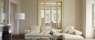
Agnes Rudzite: Riga apartment in the spirit of mid-century modern
Agnes Rudzite project - apartment in the center of Riga. The starting point was the current mid-century modern style, which the designer implemented in bright colors.
On the subject: Agnes Rudzite: weightless interior in the center of Riga
Agnes Rudzite designed an apartment for a young family of jet setters. The owner is engaged in the production of high-end equipment and even personally designed a cabinet for audio and video devices for the living room.
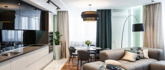
Dining room. Emmemobili table designed by Ferruccio Laviani. Sé' chairs designed by Niki Zupanc. Lighting fixtures, Lee Broom. The floor has parquet laid in French fir-tree.
The apartment is located in a new building on Zaubes Street, occupying half a floor, and the windows offer a magnificent panorama of the center of Riga. On an area of 180 sq. meters there are only five main rooms: living room, kitchen, bedroom, children's room and office. Such generosity of the designers made it possible to create a feeling of spaciousness.
Agnes Rudzite Agnes Rudzite Interiors
nonenonehttps://www.facebook.com/agnesrudziteinteriors/https://www.agnesrudzite.com/
Living room. The media library was made according to the sketch of the owner of the house and finished with olive veneer. Meridiani sofa. Armchairs Cassina and Poltrona Frau. West Elm Chandelier. Floor lamp Delightful. A diamond-shaped pattern made of polyurethane moldings adorns the wall.
Living room. Philipp Selva bookcase. Gubi chair.
The owners know a lot about quality design and gladly took part in the selection of subject content. The interior expertly combines furniture from Italian and Scandinavian brands, German cuisine, Portuguese and English lamps. Stand out are the elegant, feminine chairs designed by Niki Zupanz for the young company Sé, the lamps of today's fashionable Lee Broom, the UFO series table by Ferruccio Laviani for Emmemobili - this brand is known for its sculptural tables.
Cabinet. Gubi chair.
As always, Agnes Rudzite could not do without designer classics. The Lady armchair by Marco Zanuso and Du55 by Gastone Rinaldi, born in the 195s, formed a harmonious ensemble in the living room. Such items emphasize the retro style and at the same time raise the interior to a timeless level. In the bedroom, the Boborelax chaise longue sets the tone. The 1967 model is a cutting-edge monoblock seat created entirely from polyurethane foam by Chini Boeri, one of the world's first female architects. Today she is 94 years old.
Kitchen from the German brand SieMatic. Lee Broom lamp.
For the walls, the designer chose white, which is expected in an interior where there are many worthy design objects. Variety was added by a diamond-shaped pattern of moldings on one of the walls in the living room. If desired, this technique can also be interpreted as a creative version of the classic boiserie.
Black and white graphics always look noble. Chair with armrests Sé.
On the Philipp Selva console, model Victoria, is a black and white bird from the Spanish company Lladro (limited edition).
Despite the abundance of bright colors, the interior looks calm. Shades are balanced, accents are dispersed, white and gray as a background dilute and reconcile strong colors. Velvety upholsteries mute the color and add sensuality to the interior. An indispensable attribute of mid-century style are brass elements. We must pay tribute to the design tact of Agnes Rudzite: brass was used in doses and wisely.
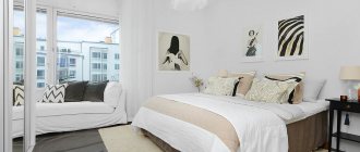
The bedroom walls are decorated with Cole & Son wallpaper. The headboard is custom-made and features American Art Deco motifs. West Elm Nightstands. Artemide sconce. The chandelier fan brings a tropical resort atmosphere.
Bedroom. Chaise lounge Boborelax, design. Chini Boeri, Arflex, model 1967. The Tom Dixon floor lamp in chrome is a rare thing in interiors; pendant models from this brand in brass and copper are more often used. Mirror Magis.
A journalist by first profession, Agnes came to interiors 15 years ago and since then has formed her own recognizable style: she knows how to find a balance between classic and modern, challenge and elegance, between cosmopolitanism and attentive attitude to the context.
Bathroom. The vanity is custom made from marble and metal. The shower stall is tiled with simple but expressive mosaics. There is a board made of moisture-resistant teak on the floor. Faucets Zucchetti.
Range
The iModern online store offers furniture in the mid-century modern style at an attractive price.
It is worth paying attention to the elegant sets of upholstered furniture. A luxurious sofa on thin legs with spectacular patterned upholstery and a pair of ergonomic armchairs will appeal to anyone who loves beauty and comfort. You can also choose a sofa that is sold “solo”. And armchairs complemented by ottomans are an amazingly relaxing solution. What about a set of bedroom furniture that will delight you with comfort and pleasant appearance?
It is worth paying attention to dining groups (including for 2 persons).
Coffee tables and chests of drawers, bedside tables, chairs, poufs, banquettes - details that will make the room even more comfortable and ergonomic.
In addition to furniture, mid-century modern also includes extraordinary mirrors that are used not only for their intended purpose. These are also original decorative elements. They will not be superfluous in the living space.
Apartment of the weekBright two-room apartment with furniture in mid-century style
The repairs dragged on for more than a year: during this time, several teams were replaced for various reasons. The matter was not limited to finishing and infrastructure. The purchased space has changed a lot after renovation: initially it was a classic two-room apartment; as a result of the redevelopment, the wall in the corridor was removed, a passage was made between the bedroom and the kitchen, and a wardrobe was built in the bedroom.
As Sasha says, when choosing the interior concept, mood and general atmosphere of the apartment, she was guided by the popular American manufacturer of furniture and accessories WestElm: “I fell in love with their solutions in the mid-century style. The plus was that the price tag at WestElm was only slightly more expensive than IKEA and they delivered large items to Russia. When we received the album, the renovation was in an active phase, it was time to buy furniture and accessories, but Black Tuesday struck and almost everything we needed to buy became twice as expensive. In addition, they canceled delivery to Russia.” Nevertheless, the owners decided not to deviate from the planned plan: a significant part of the furniture and all accessories (including, for example, dishes) were still purchased from WestElm - through intermediaries.
A separate adventure was the search for a manufacturer of wooden structures for the apartment. All the slats were made at a furniture factory with the help of ]“Hipstastroy”[/anchor], but the shelving unit, wooden elements for the hallway, a dog house, legs in the bathroom, wedding frames were first unsuccessfully ordered by unscrupulous carpenters and only on the second attempt did they get what they wanted you need to contact a small studio that you found on Instagram.
The entrance area, shelving and bedroom are entirely made of wooden slats in the apartment. The designers also used various geometric patterns in the interior: the same tiles were used in the hallway and shower stall, and in the bedroom, kitchen and living room the wallpaper was printed according to a personal design and made in contrasting colors (dark in the kitchen, dark in the bedroom). light).
The owners also asked the designers to somehow incorporate their wedding accessories into the interior - a vest with embroidery in the style of Sailor Jerry tattoos and boots from Vivienne Westwood: they were placed in special frame boxes.
In general, the apartment is dominated by furniture from three main manufacturers: the inevitable IKEA (kitchen, cabinets in the bathroom and living room, bed, picture frames and posters), the already mentioned WestElm (computer desk, chest of drawers and lamp in the bedroom, all accessories, including flower pots, candlesticks , towels, cutting boards, toaster and cutlery) and IDEA (tables in the kitchen and living room, as well as a chest of drawers under the aquarium). The sofa was bought from the Finnish BoConcept.
The owner ordered some things on Etsy (for example, bedspreads from Lithuania), and the Danish rug Rug Solid, woven from pieces of leather, was found on the Monoqi website. On the walls of the apartment there are paintings painted by an artist, a friend of the owner. The owners travel frequently, and some of the items in the apartment were brought back from their trips: for example, a “sugar skull” from Albuquerque and a horse made from recycled tin barrels.
In the kitchen they hung a giant flipchart in the form of a magnetic chalk board: on it the owners place printed photos and postcards from their latest trips and save all the necessary relevant notes.
A star is born
Mid-century was born at a difficult time for society, from the 30s to the 60s of the last century. New moods and hopes for a peaceful future explain the emergence in architecture and interiors of an emphasis on simplicity and comfort, and a desire to combine living space with the environment. Artists and architects sought to ease the tension of structures without losing functionality.
Zoning in the interior: how to enter the comfort zone
As internet wisdom says: before you leave your comfort zone, you must first enter it.
After the end of World War II, there was an acute shortage of expensive natural materials, but new ones, such as plastic and plywood, were already in abundance.
New construction technologies and new materials significantly influenced the creative search and decisions of artists of the middle of the last century. Plastic was attractive due to its own qualities, and not as a substitute for wooden furniture. Amazingly shaped backs and seats of chairs and lamp shades were made from it, while plywood replaced wood and was more convenient for making smooth, rounded shapes.
Mid-century, with an eye to national differences, was well known in the USSR. Mid-Century interiors have been demonstrated in cinema and at international exhibitions, and now nostalgic generations are returning to its canons.
Mid-Century Modern in your home
Space
The main thing in mid-century is space. This style erases boundaries in the interior. If for an apartment as a whole a violation of privacy is unacceptable (we leave doors not only in the bathroom and toilet, but also in the bedroom and children’s room), then in the living room you can implement the main principle by combining it with the dining room and/or kitchen area. Cabinets are superfluous; a few massive shelves or minimalist shelving would be more appropriate. Carpets are acceptable, but bare parquet (or laminate) will not ruin the experience.
Well forgotten old
On international auction sites, online services, antique stores, or at home on the mezzanine, you can find radios, floor lamps and coffee tables that meet the requirements, all of their types referencing the good old “mid-century modern”.
It is not necessary that these be things with American history; Soviet retro from the 50s of the last century is also suitable.
But don't get carried away! In order not to accidentally copy the living room of your grandfather-professor, remember that many modern brands produce furniture that will fit perfectly into the decor. We are interested in: the soft outline of the backs, hard wooden handles. It’s good if you can find chairs with characteristically spaced legs, as if the chair sagged slightly under the weight of the owner.
Other style ingredients include: low coffee tables, a carpet with a geometric contrasting pattern or a strict fractal pattern.
Curtains in the classical sense will weaken the “aquarium” effect; if necessary, they should be replaced with laconic curtains.
Accent walls
For an accent wall, deep olive or “coconut shell color”, fashionable “wasabi”, “pink flamingo”, “bitter lemon” are suitable.
Wallpaper print for an accent wall: stylized floral, geometric shapes (usually: various versions of circles and squares with smoothed corners).
Lighting
One of the signs of the present Mid-century is a variety of lamps. In addition to their main function, they play the role of art objects, which is where you can give free rein to your imagination! When choosing chandeliers and lamps, do not neglect bright plastic and spheres made of thick paper; let the lamps resemble space stations or satellites, flying saucers or exploding stars.
5 ex-trends that it’s time to say “bye”
If you can accurately determine from the interior in what year and in the wake of what fashion trends it was created, then there are a couple of former trends in the space that have already become an eyesore for everyone.
Decor
The walls can be decorated with posters in the pop art style, a clock or a mirror reminiscent of a golden sun; on a coffee table or shelf it is appropriate to place a voluminous ceramic vase, living plants and retro decor: a radio tape recorder, a typewriter, etc.
During your creative search, remember: mid-century modern is always a sense of proportion, good taste and absolute comfort.
#Review #Style Icon #Decor #Inspiration
