» Green » Pistachio color: combination and selection of wardrobe
Pistachio color is a delicate, youthful shade of green that creates soft and contrasting combinations. Tables, selection of clothes. Photo
The pistachio tree is called the “tree of life” for its many beneficial properties, and its fruits are hard-shelled nuts with a delicate light green color – “lucky nuts”. In Persia, pistachios are considered a symbol of wealth. They are valued and grown in Greece, Syria, Iran, Spain, Italy, USA, Turkey and other countries. People conveyed their respect and joy for this delicacy to a color they called “pistachio” - a soft, light, elegant tone of green - subtle and refined, shades of which range from warm to cold menthol, they can be brighter or muted, like the pistachio itself , shimmering in halftones.
Like a delicate green, pistachio is the spring color of growth, multiplication, fertility, prosperity, tranquility and self-confidence. Like a light tone, that is, with a large admixture of white - feminine, immaculate, noble. Pistachio shades have long been included in the decoration palettes of the nobility, both in the wardrobe and in the interior.
Shades of pistachio color. Photo
Like the nut kernel itself, pistachio color has many shades, from clear and bright to medium smoky, from warm to cold.
Medium pistachio is a clean and expressive light green with a spring flavor. It is the most saturated in this range and has a yellow-green base. Light pistachio is a pale shade of pistachio, characterized by lightness, freshness and purity. Along with rich pistachio, it is the most common. Yellow-pistachio - can be classified as dusty light olive. It has a golden color to it. It is distinguished by softness and sophistication. Beige-pistachio - tends to light khaki. Pleasant, natural tone, endowed with deep calm. Green-pistachio is a cool shade that is also present in this wonderful nut. In terms of lightness and saturation, it is equal to warm pistachio. All intermediate tones between warm and cold of the same lightness will also belong to the described range. Dark pistachio - from the pastel range - it is the darkest, but if considered in isolation, it will be closer to medium. The tone is cloudy, natural, soft, it can be classified as light khaki.
Pistachio-colored kitchen: what styles will be harmonious
The versatility and neutral tone of pastel green make it suitable for literally any style. But it will be difficult to implement a ceremonial design with this soft shade, so Empire, Baroque, and Rococo are unlikely to be harmonious in pistachio color. The following styles can be called organic:
- Light green can be used in classic cuisine, but without unnecessary pathos. This is a nice solution for wall decoration. In this case, you can choose plain or striped wallpaper. The optimal solution would be to choose a combination of pistachio with cream, beige, or coffee with milk. It is better to choose a monochromatic set, leaving a different color for the walls. The floor can be wooden or ceramic in a warm terracotta color scheme. In a classic interior, a combination of green and pearl will look interesting. This could be a pattern in the decoration of the walls, wallpaper, or the entire set against a background of pistachio decoration.
The photo shows a classic-style kitchen in pistachio color.
- Japanese kitchen design, like minimalism, is also organic in pistachio color. Since there will be no unnecessary decor here, the shade itself will decorate the interior. Light green harmonizes in such directions with natural wood, the color of coffee with milk, and white and milky tones. The surfaces here are textured and decorative in themselves. Therefore, wallpaper or any other wall decoration should be embossed. What color to choose for furniture and what color to paint the walls is up to your taste.
The photo shows a pistachio interior with a coffee-colored addition.
- Country, and even more Provence, is the best option for decorating a kitchen in pistachio color. It is in this style that pastel green with slight notes of beige and yellow will be most appropriate. It looks like it’s been bleached by the sun, this is exactly how walls, furniture, and textiles should look.
Pistachio color combination
The medium pistachio shade in combination can form romantic pastel pairs, but combinations with bright tones are also available to it.
Let's look at the complex combination of pistachio:
- with pearlescent pink (2) - a light, romantic, pastel combination based on a light thermal contrast. This is a natural contrast that has long attracted our eye; it relaxes and pleases.
- with milk (3) - as with a neutral shade, forming a fresh combination with a predominance of pistachio. Soft, complex white mutes the contrast and acts as a highlight. You can complement the combination with pale sunny, honey-gold, coral.
Color combination: pistachio
How to combine different colors with pistachio? The basic rule would be to keep the purity of the pair in the same range as the soft green color. To enhance the contrast of the pair, choose dark, medium-saturated tones. Combinations with warm shades will be cheerful, while combinations with cold ones will result in more strict palettes. Light neutral shades will add style and consistency. There are 10 palettes with different shades for you.
A combination of pistachio and pink. For soft green, it is preferable to choose warm tones of pink; the lighter they are, the more delicate the range. But you can increase the contrast of the pair with rich fuchsia or hot pink. The palette is made up of royal pink, pink-peach, summer pink, fuchsia, and raspberry.
How to combine pistachio with red? Such a pair is built on additional contrast: bright and unprincipled, however, the fact that pistachio is soft and light, the intrusiveness of the contrast is reduced to pleasant. The darker the red, the higher the light contrast and expressiveness of the couple as a whole. Consider a combination with watermelon, coral red, ruby, bright burgundy, wine.
Color combination: pistachio and orange. Like all shades of green, this color goes well with orange. A combination with a slight resonance in temperature generally tends to a warm palette. The brighter and darker the orange, the more expressive the couple. Combinations with peach, orange-coral, carrot, fiery, red-orange have been compiled for you.
Pistachio combines with yellow for a fresh summer combination. The range can be called pastel, since the shades suitable for it are light, light, sunny, without a red undertone, but you can take cool color options. The palette includes pale yellow, lemon yellow, banana, yellow gold.
Pistachio and warm green combine as colors that belong to the same color scheme. Almost any middle expression of this palette is suitable in pairs, creating a feeling of depth and volume. The rich pistachio itself acts as a highlight. Consider combinations with chartreuse, olive green, swamp, greenery, dark green.
The combination of pistachio and cold green does not form a deep thermal contrast, while still being within the same tone, therefore, as in the previous version, they create volume and a feeling of light and shadow. Such a fresh combination can be either independent or a background for warmer shades. For example, a composition with the color of water, menthol, mint, emerald, malachite.
Pistachio and blue (blue): color combination. This is a refreshing pair with not a deep thermal contrast, but a pronounced light contrast in the case of dark shades of blue. Blue tones form a pastel range: light, gentle, summer. Check out pairs with the color of blue water, sky blue, blue-green, Prussian blue, sapphire.
The combination of pistachio and purple is spectacular and calm. Dark tones with a preponderance of red, such as plum and eggplant, are interesting. They create a slight thermal contrast and bright light, and overall they look harmonious and attractive. For example, consider a tandem with white-lilac, lilac, blackberry, grape, plum.
Color combination: pistachio and brown. Such a pair is natural, since we can easily see it in nature. Brown favorably sets off pistachio, filling the combination with warmth and light contrast. The boundaries of this pair are clear, so they can highlight the shape. The palette consists of beige-brown, yellow-brown, golden chestnut, chocolate, dark chocolate.
Pistachio color goes well with white, beige, gray, black. Although medium pistachio is a soft, natural, not prominent shade, it may well be dominant next to a neutral palette. Almost airy next to white, soft, feminine - with beige, glossy - with gray, expressive - with black. Consider pairings with creamy, papyrus, beige, gray, and wet asphalt.
The magic of mixing paint colors
The color gets its name from the nuts, whose shells are cracked to reveal a pleasant green color. The palette varies from brown-green, slightly withered to a joyful light color. It is worth understanding what shade you need to get in the interior. In any case, certain colors of paint will be required, and the question of how to get a pistachio color will be solved in practice.
The palette ranges from brown-green, slightly withered to a joyful light color!
What is needed for work:
- color sample (interior photo, piece of wallpaper, illustration);
- paints: blue-green, yellow (ochre, terracotta);
- brush; paper;
- palette for mixing paints;
- glass of water.
Secure the sample in the middle of the Whatman paper. Start mixing paints. Gradually adding color, carefully mix until smooth and paint near the sample. By varying the amount of one color or another, color saturation, texture density, strive for a perfect match with the selected sample. Write down the proportions of mixed paints; to paint the walls you need to know the exact dosage of each color . Enjoy the process, because the walls in your house will be painted in your favorite shade. Make several samples from light pastel to dark rich colors.
Related article: What color to paint the ceiling: basic rules, important points
If the speed of getting what you want is more important to you, then visit a hardware store. In the paint and varnish department, you will be offered pigments, mixing them with the base color to create the desired pistachio color for walls or other surfaces. With this approach, you can vary the intensity, density, and compatibility with other shades.
The easiest selection option is to purchase ready-made, graded paint in the required volume. You should choose a shade according to the ral palette. By examining the proposed palette, it is easy to understand what saturation and density of shade you need for your interior, and choose color combinations in the design of the room. Take a closer look at catalogs that contain photos of interiors using the selected palette.
The easiest selection option is to purchase ready-made, graded paint in the required volume!
Light pistachio color and its combination
Light pistachio - feminine, light, very light shade of green with a slight predominance of yellow looks gentle and fresh. This is an ideal tone for a teenage girl: it will emphasize the freshness of the skin, and its combination can enhance the contrast of appearance. In a romantic wardrobe, light pistachio will be more appropriate than in any other. The relaxing effect of the tone can be used in home clothes or underwear, as well as for relaxation. It's just as good for prom.
Combine light pistachio with shrimp, fuchsia, red rose, mango, red-orange, lemon, gold, mint, leaf green, dove, royal blue, lilac-amethyst, blackberry, bronze, latte, wet asphalt.
Application
Let's consider the most popular options for using pistachio color, using the example of bedroom, living room and kitchen interiors.
Kitchen
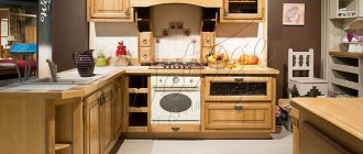
As we said earlier, pistachio fabrics and extra-quality vinyl wallpaper on non-woven backing can be easily used in the kitchen interior. This coloring will help to gain energy and vitality, which will be very useful for the owners of the apartment.
The dimensions of the kitchen, by and large, are not important; pistachio can be successfully used both in a small Khrushchev-era kitchen and in a large area in the kitchen of a private house. Bright accessories will serve as accent elements in such an interior. An apron with a bright, colorful image in red, yellow and orange tones will look great.
Balanced interior of a simple kitchen
Let us note once again that kitchens are a very specific, highly polluted room, so be sure to choose high-quality washable wallpaper. Vinyl wallpaper on a non-woven basis from German companies (Erismann, Rasch, Marburg, AS Creation) are famous for such qualities.
Living room
But for the living room, in terms of wallpaper, there are no such serious restrictions. This room is calmer, and pistachio-colored wallpaper will also fit perfectly here. It is noteworthy that this shade harmonizes perfectly with wooden furniture. The atmosphere is calm and not stressful, perfect for small talk.
White will help us dilute the pistachio color in the living room, as it will add some space. There are always a lot of accessories in the living room interior; they can be selected in appropriate colors.
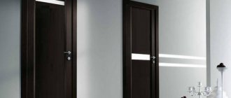
Related article: Do-it-yourself installation of an interior door: step-by-step instructions (video)
High-quality wallpaper with vinyl quality monograms
Special collections of wallpaper for the living room in pistachio colors were released by the German companies Rasch and Marburg.
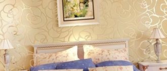
Bedroom
In the interior of the bedroom it is permissible to use diluted pistachio color, since in its normal state it is too bright. It will be supported by pastel shades traditionally used in this room.
You can use any wallpaper: paper, vinyl on a paper or non-woven basis, liquid, paintable. The bedroom is a simple room, without additional criteria. However, it is best to use high-quality wallpaper, and once again we will mention German manufacturers: Erismann Rasch, Marburg, AS Creation.
Using soft colors in the bedroom
It is permissible to use pistachio in the interior of a bedroom in any form: main or secondary, as the main color of the walls or as an additional color on accessories and household items.
Yellow-pistachio color and its combination
Pistachio yellow is a soft, muted tone filled with positive and relaxing properties. It looks good in urban style, leisure wear and everyday wardrobe. Suitable even for an office set of things, but for business meetings it is too friendly: its relaxing atmosphere is not conducive to decision-making, and the image of an open and sympathetic person is more suitable for a family circle. Although the tone leans toward summer, all-season use is possible.
When choosing a yellow-pistachio pair, consider shades such as strawberry, dark pink, dark red, coral orange, copper, mustard, old gold, khaki, malachite, thrush egg color, thunderstorm, purple, red-violet, mahogany, milky, anthracite.
Beige-pistachio color and its combination
Beige-pistachio is a muted, light green with a positive yellow undertone. His desire for a neutral palette makes the tone universal; it also gives an advantage in creating combinations: both rich and muted tones will look chic next to it. However, it is worth remembering that the level of color purity must be consistent. The color is all-season, looks good in both everyday and evening wardrobes. It has a relaxing effect and creates the image of a calm, confident woman.
To combine with beige-pistachio, you can choose sakura, purple-pink, red-terracotta, orange-coral, brick, champagne, old gold, patina, brown-green, steel, dark blue-green, gray-violet, grape, chocolate, light beige, wet asphalt.
Green-pistachio color and its combination
Pistachio green is a fresh, charming shade, characterized by freshness and innocence. The good thing about the tone is that it creates amazing pairs based on warm-cold contrast, which can increase the contrast of appearance, refresh the skin, and highlight the tan. The color is more of a summer color and looks good in a romantic style, home wear, or leisure wardrobe. Will be attractive in an evening look. As a cool shade, it can look strict, so it is also suitable for office style.
Combine pistachio green with cloud pink, coral pink, Chinese red, mango, carrot, fawn, pale gold, kelly, dark green, thrush egg, blue grey, thistle, purple, umber, cream, black.
Dark pistachio color and its combination
Dark pistachio is reminiscent of a light olive tone - subtle, feminine, which is more suitable for mature women. Having a medium saturation, the shade is more suitable for a medium-contrast appearance. It reveals itself wonderfully in a feminine wardrobe, successfully combining with warm, neutral colors, beige, cream, and brown. Suitable for both office and evening wear.
Dark pistachio is combined with peach-pink, amaranth, tomato, golden-copper, red, sand, bright gold, brown-green, malachite, dark turquoise, dark blue, orchids, eggplant, dark chocolate, latte, black.
Pistachio color in clothes
Pistachio color in clothes is a romantic, fresh and soft tone; it can be used for the wardrobe of an adult woman, but still it is more teenage. It is completely unsuitable for creating a serious image, but can serve as an elegant element. The presence of this color in fashion is due to the attitude towards women; if the era sees women as not independent and fragile, homely, then pistachio will definitely appear in the collection.
Who would suit pistachio color in clothes?
When choosing this tone, you must be sure that it suits you, since its pale shades mute the high contrast of appearance. So for the “spring” and “winter” color types, the main choice will be clean, bright colors, such as rich pistachio, light pistachio. A combination of bright and dark colors will help you enhance the contrast. For “summer”, muted shades are suitable, such as light pistachio, yellow-pistachio, beige-pistachio, green-pistachio, dark pistachio. Representatives of the “autumn” color type will also be able to use soft, hazy shades, bypassing bright and clean ones.
Features of pistachio color in the kitchen
This tone is obtained by mixing two colors - yellow and green. The pistachio shade is a little softer than green, and much richer than the olive palette. It is rightfully considered calm and has a positive effect on the human nervous system.
Pistachio color calms and helps to concentrate.
A person, being surrounded by this range, does not get irritated or tired. By giving preference to pistachio color, you can fill the space with freshness, joy and positive energy. This option will be an excellent solution for the kitchen, as it does not suppress or awaken the appetite on a subconscious level.
Classic kitchen pistachio color.
The combination of pistachio color in clothes
The combination of pistachio color in clothes can be divided into two types: pastel and contrasting. Pastels include combinations where two shades differ little in lightness, but differ in tone. The darker and brighter the tone, the more expressive the combination with it.
Black and pistachio color is a bright combination that highlights the borders as much as possible, so the shape and various patterns will be most beneficial in this color scheme. White is often added to this combination.
White and pistachio – an airy, delicate combination, fresh, summery, youthful. A floral print with pink or yellow splashes will go very well with it. You can add contrast while maintaining freshness by using other shades of green.
The gray-pistachio color depends on the lightness of the gray: light grays give the pistachio a feeling of gloss and well-groomedness. Medium and dark grays increase the pair's contrast. If you complement the combination with white, light beige, yellow, as well as gray of different shades, you can achieve a very interesting and sophisticated pair.
Beige and pistachio paired support a warm, summer mood. The lighter the beige, the sunnier the combination. Medium beige enhances the femininity of the couple and brings elegance. To enhance the contrast of the pair, additional shades of green or a floral print are added to the light pair; in addition to green, other shades of beige, possibly white or gray, are added to the middle pair.
Pistachio brown is a contrasting palette that maintains softness. Dark browns can be used as an alternative to black: it just as intensely emphasizes edges and shape, but the contrast is more subdued, warm, and natural. Light, rich brown tones come into mid-contrast and continue the romantic mood of the main color. The first combination option is complemented by not bright white, the second – by shades of green.
Yellow and pistachio combine into a clean, joyful, summer-spring pair. Yellows and pale yellows without an orange undertone are an ideal pair for light yellow-green with any degree of purity, but the similarity must be observed in both shades. You can increase the effectiveness of the pair using brown, darker green and black.
Orange-pistachio is a harmonious, warm, holistic combination that can be delicate, bright or natural. Coral creates a summer mood, especially if the tones are in a floral print. Bright orange requires the support of blue, black, dark green. Pale and muted oranges look natural and pleasant next to an equally hazy green, but next to pure ones, the combination must be complemented with gray and other pale tones.
Red-pistachio is a successful, bright combination that does not hurt the eyes, like the ultimate complementary pair. You can use both medium and bright tones, but, in my opinion, the combination with medium red with a pink undertone looks especially expressive. You can enhance the palette with black, white or brown.
Burgundy color in combination with the main color increases the contrast of the pair, adding severity and elegance. Brown would be very appropriate in this range.
Violet-pistachio can be either subtle or high-contrast. Purple and dark violet highlight the main color favorably, but for balance it is necessary to add white, gray, pink or dark gray-green to the pairs.
Pastel and medium lilac tones create a delicate and feminine flavor. White people can support him.
Pink-pistachio is one of the most pleasant and delicate combinations, especially if they are warm, soft pinks. This relaxing couple only belongs to the romantic style. For balance, beige is often added to it.
Bright fuchsia looks juicy and contrasting next to soft green, without requiring a balancing addition, but you can add elegance to it with the help of beige.
Blue-pistachio is a summer, cool combination, the brightness of which depends on the shade of blue. Soft blue tones: the colors of water or sky form a pastel palette that is relaxing and unobtrusive. It can be enhanced with darker blue or beige, but without going beyond the purity of the main pair. Bright turquoise is a more expressive and active option. A red accent in such a palette can be a nice highlight in contrast.
Blue-pistachio is a bright, cool combination, where the richer the shade of blue, the more catchy and impressive it looks. Gray-blues balance the naivety of soft green, focusing on its natural nature. Instead of bright dark blues can be used as an alternative to black, bringing not only the utmost contrast, but also freshness to the combination.
Pistachio and green , as colors of the same range, the most pleasant and recognizable to the eye, create voluminous, emotional palettes that can be either independent or a background for warm colors. Most often, for variety, basic tones such as white, beige, black, gray-blue are added to such compositions.
VIEW COMBINATIONS WITH SIMILAR SHADES (click on color)
Interior style and pistachio color
The natural warm shade consists of yellow and green tones. The dynamic range has many intensity options - from airy light to almost brown. The universal color sounds original in different design directions.
Living room in pistachio color Source popul.ru
Classical
In the interior of the room, pistachio decoration adds a touch of luxury. In a classic space, color is used in wallpaper, complemented by gold patterns. The tone should accompany, not dominate. If the background of the room is neutral (white, gray, beige), then the shade can be used in:
- textiles;
- furniture upholstery;
- decor.
Minimalism
Pistachio-colored living rooms or kitchens do not look as laconic and restrained as white options. The natural palette will become the backdrop for interior items in a minimalist direction. The natural tone looks light, so there is no need to overload the room with dark details.
Pistachio color of the walls in the kitchen Source www.pinterest.com
High tech
Chrome and plastic elements in the design of the space are combined with shades of pistachio. A single bright accent is performed in a warm palette. Natural colors are used to decorate cabinet fronts, picture frames or furniture upholstery. The tone can be used in ceiling lights and bedside lamps.
Modern design for the bedroom Source www.igre123.com
Eco style
Natural materials and colors are used to decorate the premises. Pistachio fits harmoniously into the space and helps reveal the beauty of neighboring flowers. The tone emphasizes the texture of wood and stone, fabric and iron. A transparent shade on the walls will help visually expand a small room.
Pistachio color in the bedroom interior Source uutvdome.ru
Provence
Pistachio color in the interior of a kitchen, living room or bedroom naturally combines with delicate tones of blue, pink and lavender. The rooms look beautiful with aged white furniture and wicker chairs. Neutral yellow-green in a room visually adds light.
Cozy living room Source physac.me/
Mediterranean
The rustic style prefers bright, rich colors - blue, orange and red. A pistachio background will emphasize the elegance of intense shades and demonstrate the benefits of space. Variants of muted yellow-green are used as patterns on wallpaper and in decor.
Kitchen in dark colors Source kipred.net
Room design option Source www.google.com.ua
Contemporary
The style prefers the spontaneous juxtaposition of objects from different sets, rough surfaces and varnished parts. To decorate walls, designers often use light shades of yellow-green. Rough finishes (stone, wood) look luxurious against the background of delicate natural colors.
Pistachio living room Source dikidaycare.com
If the interior is made in a neutral color, then noticeable accents are needed. Pistachio will help highlight the beauty of the natural texture and become a rich detail in the room. Indoors, the shade can be found in:
- curtains (blinds);
- central chandelier;
- furniture upholstery.
Pistachio curtains for the living room Source oshtorah.ru