Golden rules
An experienced designer knows how to choose a kitchen countertop by color. Specialists always follow new trends and, based on them, create their own interpretation of interior design. There are a great variety of different design options for headsets. To choose the most suitable one, it is necessary to decide at the stage of ordering or purchasing a kitchen how the work surface will be organized. Will it stand out against the background of the furniture, go beyond the set and form a bar counter? The tabletop may be partially located in the living room area, then its color should match the design of the main room.
There are three options for win-win color combinations. The first is that the combination of colors of the kitchen set and the countertop matches, or is built on the principle of analogy with the color of the lower cabinets or upper wall cabinets. The second is that the combination is built in contrast with the furniture. Third, a multi-color tabletop is used. Each option has its own characteristics, so it makes sense to talk about the advantages and disadvantages of each.
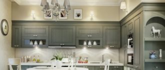
Primary color gray Source kuhnyagid.ru
When the color matches
If you choose a tabletop whose color matches the color of the furniture facades, the work surface will dissolve in space and will not attract attention to itself. This feature of the combination is most suitable for kitchens decorated in a minimalist style. In this case, the decor is faced with the task of hiding the working elements as much as possible and emphasizing the decoration of the walls, focusing on household appliances or the elegant shape of the furniture set.
The photo shows how the white countertop in the kitchen, white furniture, and white accessories form the highest degree of sterility of the interior. It is ideal only for lovers of an extreme form of minimalism. This combination of colors is very popular with perfectionists, those who are obsessed with cleanliness. In such a kitchen there is always impeccable order.
White kitchen with white countertop Source mebelvs.ru
If you add paintings with a bright plot, painted in rich colors, to the white interior, the atmosphere will liven up slightly. Strictness will disappear, freshness will appear, while the impeccable appearance of the furniture content will remain.
A bright kitchen apron will also help eliminate excessive severity. If you pick up dishes, flower pots, and textiles for the window, you will get a very lively space in which a cheerful person will feel good.
Look how impressive the gray countertop looks in the photo in a white kitchen. This is not even a contrast, but a dilution of the dominant with a similar cold shade. This combination emphasizes the monolithic nature of the headset. Therefore, the monumentality of the style does not suffer.
Gray dilutes white Source i.pinimg.com
See also: Popular projects of houses with a kitchen
Everything changes when a fusion of the colors of the work surface and one of the tier of furniture (upper or lower) is used. If the tabletop, apron and upper cabinets are made in light shades, the set does not put pressure and does not visually clutter up the space. The lower dark cabinets come to the fore; they become the dominant feature around which the rest of the decor plays out.
If the color of the lower cabinets, countertop and apron match, a similar combination is also ideal for the kitchen. It doesn’t overload her and perfectly emphasizes the chosen style. Typically, in this situation, the dark color is supported by the identical design of the dining group. Then harmony is maintained, the interior becomes very cozy.
The color of the lower cabinets, countertops and splashback match Source idealkuhnya.ru
When contrast comes to the fore
Such solutions are usually liked by fans of the avant-garde. Here you can experiment in two directions: make the set in a light color, and make the tabletop in a dark color, or vice versa. The most famous contrasting black and white combination. It is considered a classic, which is why it is especially popular. This pairing is best revealed in a kitchen designed in the style of fashionable glamor, French chic or minimalism.
The black color of the tabletop is most suitable for a white set. In this case, it looks gentle, elegant, fresh. Dark inserts give it a strict character. When accessories support the color of the work surface, the design is harmonized. To do this, you can hang black lamps in the room, and decorate the walls with black and white photographs or reproductions.
Choosing black appliances helps achieve an even distribution of dark color in a light kitchen. If you install a black oven under the work surface, a black microwave on the top tier, and a black sink with the same mixer flush with the countertop, the interior will become more graphic.
Black appliances make the interior graphic Source promobonuscodes.com
See also: They specialize in the construction of extensions to existing houses
Change your approach, buy light-colored household appliances, and you will be able to create a single plane of furniture. Then the work surface will cut the kitchen in half, and it will immediately catch your eye. If it is glossy and the facades of the furniture are matte, the effect will be enhanced. A black kitchen apron will create strong depth; a white apron, on the contrary, will emphasize the beauty of a dark plane. Therefore, knowing how to choose the right color for the kitchen countertop, you can create completely different interiors.
A black work surface will require special care. Any crumb on it will be noticeable, any stain, any scratch. Therefore, for the manufacture of countertops, you need to choose materials that are resistant to mechanical damage. It can be natural stone or conglomerate.
If you want to slightly diversify the kitchen and reduce the severity of the black and white design, you can use accessories in yellow, red, pink. They will set a completely different tone. By changing them, you can change your mood.
Bright accessories soften the black and white design Source modernplace.ru
There are different contrasts. Headsets in which the tabletop differs in color from the facades only in shade look beautiful. The furniture itself can be blue, and the work surface dark blue and vice versa. Light and dark shades of brown look good in this combination.
Interiors are harmonious if the color of the working surface matches the tone of the walls. And here there can be a great many variations in execution. The photo shows how this technique works.
The color of the countertop matches the color of the walls
Light work surface
A light countertop is suitable for the interior of a kitchen of any style; it combines equally well with a light or dark kitchen. It is easily soiled and requires careful treatment on the part of the owner.
White color
The most popular and controversial color is white for the work surface. Glossy ideal surfaces are suitable for modern style, hi-tech, minimalism, Scandinavian. Combines with white or contrasting kitchen. A classic matte white stone countertop suits a conservative style.
Beige color
Beige in light shades of ivory, champagne, milky, vanilla, suitable for neutral countertops that act as a background for an apron or set.
The photo shows a white kitchen interior with a vanilla-colored countertop, which does not attract attention, but at the same time separates the upper and lower space.
Sand color
The sand color of the countertop should be selected for a kitchen with wooden facades and warm lighting, as well as for a dark set.
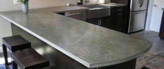
Light gray color
A light gray countertop is suitable for white, gray and dark gray furniture, as well as the color of concrete, which does not highlight the remains of splashes and possible crumbs as much as white.
The photo shows a light gray countertop on the island table and the main work area; the color matches the walls and looks organic with the white set.
Metallic color
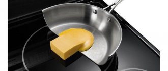
Metallic color or a tabletop made of aluminum/stainless steel in a steel shade is best used when creating a high-tech style. This is a practical choice for kitchens where you cook frequently.
The photo shows a metallic countertop that fits into the blue and white interior of a modern kitchen and resonates with kitchen appliances.
Video description
The video shows options for countertops for small kitchens:
Contrasts are least suitable for small sets. They clearly define the dimensions of the furniture, which visually makes compact furniture even smaller. For small rooms, a combination is suitable in which the desktop and apron blend in color with the fronts of the lower cabinets. If this part is darker and the top part is lighter, the ceilings in the room will seem a little higher.
The color of the countertop for a large white kitchen can be dark (dark blue, dark brown, dark green). This combination is more suitable for rooms decorated in a minimalist, high-tech style. But black and white classics also look very interesting. This is an ideal option for reserved but ambitious people.
Briefly about the main thing
Not everyone knows how to choose a kitchen countertop according to color, or how to make the interior beautiful and harmonious, without hurting the eyes. In order not to make a mistake, you need to act taking into account the effect that you want to achieve when decorating a multifunctional space. It’s easiest to work with contrasts; it’s more difficult to combine three different colors in one set. It will be much easier to solve the problem if you look at photos and videos of the work of professional designers. They are able to inspire, show what will especially appeal to your heart and clearly demonstrate which color of the countertop will suit a white kitchen, which one will suit a red set, or furniture made in soft pastel undertones.
Ratings 0
Selecting the color of the kitchen countertop
Neutral color of kitchen countertops: beige, black, wood, white, gray
For a white kitchen set, a surface of a neutral tone, reminiscent of wood or stone,
. For a light kitchen, give preference to cool shades of stone: gray or black. In the case of disguising it as wood, it is also better to choose light colors. Because dark-colored wood will overwhelm a white kitchen unit, it may lose much of its sophistication.
how to choose a kitchen countertop by color
A kitchen set in beige tones, on the contrary, is best combined with a countertop similar to dark chocolate or wood
— the facades against its background will acquire a creamy hue and become even more appetizing and tender.
It is logical to decorate a kitchen in beige or white tones with an identical or similar color of the countertop. This solution will help preserve the visual weightlessness of the white kitchen, as well as its tenderness and lightness. And it will give the atmosphere a feminine touch.
Using a dark-colored surface, on the contrary, you can make a light kitchen set more brutal. It will highlight the brightness of the facades and bring a spectacular contrast to the kitchen area. For a beige set, as we wrote above, it is optimal to choose a dark wood countertop color, and for a white kitchen it is better to choose a black surface.
Black tabletop for white furniture
is a chic solution with many fans. These pieces of furniture look very stylish and rich.
To determine the color of the countertop for a beige or white kitchen, the following nuance can help: you need to take into account the kitchen apron. If you select all the elements - the countertop, the apron, and the facades - in light colors, then the overall appearance will look blurry, since the objects will merge and lose the clarity of their outlines. If you have chosen a light-colored surface, then create either a contrasting or at least eye-catching apron. In the case of a pre-made light apron, it is better to combine it with a dark tabletop.
It is not recommended to complement a kitchen in black tones with a dark-colored countertop - the set will turn out to be too gloomy for the kitchen area. If you like this combination, choose a light apron. Otherwise everything will look like a blur.
White countertop with black fronts
- one of the best options. The same as the opposite solution - a white set and a dark top.
At the same time, black kitchen furniture can be combined with a surface that imitates the texture of light wood (will add coziness and comfort to a dark room) or natural stone (will add visual value).
Sets with gray facades are complemented with gray, white and black countertops. Tops that imitate marble or other natural stone in achromatic colors look good.
For a set with a wood texture, it is good to choose white, cream and wood countertops. The combination with a black tabletop is acceptable, but it is quite risky. If you are the owner of expensive kitchen furniture made from solid wood, you can complement it with a stone countertop of a suitable color and texture.
The next solution for sets of neutral tones is colored countertops
. The option is certainly not quite familiar, but very effective. White facades will serve as an excellent basis for a colored countertop. A bright tabletop will add contrast and dynamics to a bright environment.
Countertop color for a colored kitchen
Typically, colored sets are combined with tops in neutral tones, for example: wood, beige, white, marble, and sometimes black.
It is necessary to take into account the saturation of the shades of the headset. A cream and brown countertop will go well with “warm” tones of facades (red, yellow, orange, etc.).
With “cold” facades (green, blue, indigo, pink and purple), a gray or “marble” tone top will look good.
The white color of the countertop will be effective in any case. It should be noted that a light top will create a delicate and elegant kitchen, and a dark top will create a brutal one.
Worktop for a two-tone kitchen
Today, kitchens are popular, the design of which consists of two colors: one belongs to the top row, the second to the bottom. What should you combine the tabletop with in this case? If the kitchen furniture combines two neutral tones, the color of the countertop is often close to the upper facades and contrasts with the lower ones.
For example, for a set with a “white top - black bottom” design, a white tabletop is optimal. In this kitchen everything will be calm and harmonious. It’s the same with cream-brown sets.
It doesn’t matter at all that the top is the same tone as the top tier. For the tabletop, you can choose a shade that is midway between the tone of the bottom and top: For example, the color of a light chocolate tabletop will go well with a combination of wenge cabinets and cream hanging cabinets.
They also have the right to life and other options. It is quite possible to choose a tabletop that matches the tone of the lower tier. Here you need to decide which color scheme you like best.
If spectral and neutral tones come together in the kitchen, the top should not dominate. The tabletop should be cream, light marble, white, beige or gray, depending on the color of the facades. In addition, the color of the tabletop can be identical to the lower tier. It would be better if there was no “apron”, it would stand out. Facades rule here!