Combination of orange with other colors in the interior
The warm, rich tone has adopted the properties of red, so it cannot be the only one in the room. When decorating, shades from a bright range must be combined with other colors. Successful combinations do not irritate the psyche; they become an extension of the room.
Tits on a work apron Source ukuhnya.com
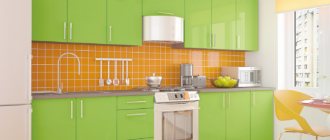
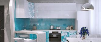
Design option for a small city apartment Source mykitchendesign.ru
Pastel
A neutral shade range visually mutes the richness of orange. Delicate creamy will add a touch of airiness to warm tangerine or pumpkin cuisine. The pastel mint color on the walls looks impressive in combination with the orange panels of the set.
Kitchen in orange Source feedler.life
Those who love an active lifestyle will appreciate rich walls and beige furniture. The combination energizes and makes emotions positive. If the combination is depressing, then instead of bright it is better to use muted options:
- amber;
- apricot;
- ocher.
Green
The best companion for orange in the interior of the room. They combine both delicate tones and bright (acidic) colors. Designers recommend choosing 4 shades from both palettes and decorating the kitchen from the ceiling and walls to textiles on the furniture. One tone is chosen as dominant, and the rest are slightly muted.
Orange with green Source irina_sivtseva.arxip.com
Blue
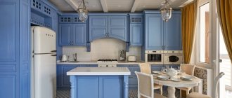
The warm tone can be combined with a refreshing blue option. The soft blue top and pumpkin bottom help to visually expand the space of a small room. The interior looks harmonious with a checkerboard shade of aqua and peach in the background design. Dark azure is combined with juicy orange, and muted carrot with turquoise. In the duet, orange takes on a more saturated sound. Combination with purple is contraindicated.
Combination with blue Source krisha.kz
Red
The bold combination makes the kitchen very cozy. The glossy warm panels of the set echo the scarlet furniture and draperies on the windows. It is better to dilute bright shades with neutral gray, delicate milky or white. An excess of loud elements irritates the psyche, so staying in a room for a long time is dangerous to health. The duet with pink is too catchy and tacky.
Combination with red Source dizainkyhni.com
Shades of orange
The colors of the same palette naturally combine with each other. Rich orange looks luxurious against the backdrop of delicate peach or apricot. Warm amber is combined with ocher and terracotta. Juicy pumpkin will show its beauty with muted caramel or sea buckthorn. Rusty and mahogany are chosen as dark accents in the room.
Light orange kitchen Source stroy-podskazka.ru
Harmonious combinations of orange with other shades
Of course, such a bright and rich color cannot be the only one, so it is combined with other shades. Interestingly, this design rarely uses only two tones - orange is most often accompanied by one neutral and one finishing shade, in which the dishes can also be painted:
- The orange-white duo is usually complemented by metallic gray or black - a typical color for the facades of household appliances. In a small room, such a trio will use a minimum of dark shades, but in spacious rooms, quite large surface areas can be black or metallic. In such a combination, the set is usually made pumpkin, while the apron, often the top of the furniture, the main walls of the kitchen, curtains, dining area - all this remains white. Metallic can become the edging of cabinet furniture, especially in Khrushchev, where it is impossible to use dark accents.
- The black and orange composition also does not perform in a duet. It is diluted with white or shades of beige. With snow-white, the contrast will be more severe, but in combination with a cream-colored finish, the design will seem softer, as in the next photo. Black dishes will be harmonious in such a kitchen.
- An orange kitchen with the addition of blue is a typical solution. It's always warm here, but the shades of the sky and the depths of the sea give the interior a refreshing touch. Even in a Khrushchev-era building you can decorate a room in these colors if you use rich colors in moderation. Here you can use various combinations: blue top and pumpkin bottom, blue bottom and peach top, checkerboard top or bottom, azure pattern on orange facades.
- A duet of green and orange is considered natural. These colors are associated with the colors of grass and fruits, the sun and fields. This combination is diluted with a neutral background, as in the photo below. The dishes in such a kitchen should be bright.
- A combination with natural brown - wood, chocolate, wenge - will be no less harmonious. The richer the orange color in the kitchen, the less dark there should be, especially in a small room. Here wenge can be present in part of the facades or in the dining area.
Orange kitchen set
Bright furniture fronts against white or pastel walls visually enlarge small rooms. Juicy shades of tangerine or pumpkin bring a lot of color and warmth to the interior, making them suitable for a northern location. Proper design will help correct an unsuccessful layout.
Orange decorative elements Source mik-mebel.com
Carrot set Source dizainkyhni.com
Pumpkin color of urban cuisine Source remontkit.ru
Features of orange color in the kitchen interior
Orange color helps to cope with apathy, sadness and brings bright, bright emotions into a person’s life. It also has some features:
- The color is bright, deep, but at the same time the energy of aggressiveness does not emanate from it.
- Combines with many colors.
- Will fit perfectly into any interior.
- Many shades.
- More of a warm tone.
Orange attracts attention and cannot go unnoticed. All tones of this color are beautiful in their own way. And also the advantage of a large number of halftones gives free rein to imagination and a choice of shades for every taste.
Furniture
To create an original design, use a modular set with a glossy orange facade. Models with white or gray doors and orange walls look less bright. Metal fittings and aluminum edges will help to emphasize the beauty of the warm colors.
Orange silver kitchen Source dizainkyhni.com
Transparent chairs made of durable plastic will harmoniously fit into a kitchen in orange tones. If the room is decorated in a classic style, then the interior items are made of natural wood. As an additional accent in the dining area, use a sofa with green upholstery or a carrot refrigerator.
Orange set Source design-homes.ru
The bright island set looks luxurious with matte panels. A dark (black, chocolate or wenge) tabletop is suitable for the pumpkin module, which will give the structure an elegant look. The top of the work area often echoes the table. White, olive and gray tones remain popular base options.
Combination with gray Source redterem.spb.ru/
What shades can you combine orange with in your kitchen interior?
A harmonious combination of shades is almost half the success when creating the interior of any room, including the kitchen. Before you start arranging it, you need to clearly understand the general concept of the room and clearly understand what the result should be.
Orange and white is a classic win-win. This combination of shades will look very stylish and elegant, but at the same time somewhat cold.
The ideal way to decorate the interior is to combine white walls with orange furniture. The kitchen floor can be beige. One orange wall combined with three completely white ones also looks great.
Advice! Since the orange tone belongs to a warm color scheme, it should be combined with the same warm shades that are located next to it in the color palette.
Orange and black - this combination of shades will help make the kitchen exclusive and elegant; it will add sophistication and charm to the room.
However, only these two colors should not be present in the interior. They must be diluted with beige or light shades. For example, paint the walls and ceiling white, install kitchen units in black and orange tones and make the screed floor black.
Orange and beige are a wonderful combination of shades, warm and harmonious. A kitchen in this color scheme will look very cozy.
The beige shade significantly smoothes out the brightness of orange, making it softer and more pleasant. As additional tones when arranging a beige-orange interior, you can use white, brown and yellow.
Orange and gray are a very elegant and almost perfect combination of tones. Orange color combines perfectly with all shades of gray, from the palest to the most saturated and dark. This solution is especially often used when arranging a high-tech kitchen.
Ideal interior option : decorate the walls with gray plaster, install a light gray kitchen set with orange glossy facades. Decorate your kitchen backsplash with mosaics in black, orange and gray tones. Place a table and chairs with metal bases and a bright orange top.
Finishing walls, ceilings and floors
The design depends on the color of the headset. Furniture in a rich tangerine shade looks good against the background of wallpaper (paint) made in muted tones:
- pistachio;
- sandy;
- blue;
- beige;
- white.
Elements of black Source gearbestblog.ru
Details of the set are orange Source kitchenguide.su/
Finishing the walls in a milky tone reduces the aggressiveness of the orange tint. Gray tones bring a cozy, relaxing atmosphere to the interior. The design with ivory-colored plaster looks luxurious and expensive. If the room is small, then the surfaces are covered with light wallpaper with a pattern in the form of thin lines, repeating the color of the furniture.
Terracotta wall color in the kitchen Source sw.unistica.com
Bright apron Source design-homes.ru
The ceiling in the kitchen with orange furniture is made in neutral colors. Classic white looks luxurious with the addition of beige and gray details. If the furniture is glossy, then a matte surface of the top is appropriate (whitewash painting, textured plaster).
Yellow kitchen combined with brown Source obzorkuhni.ru/
The floor emphasizes the intensity of the bright palette. Light wood, ceramics and floor mosaics look harmonious in the kitchen. A bold solution would be black slats against a background of pumpkin facades. The poured version in a juicy tangerine color or the checkerboard tile looks original.
Pumpkin orange Source deco.journaldesfemmes.fr
Curtains
Draperies in a kitchen with an orange set are taken in neutral shades or regular tulle. Classic textiles are a couple of tones lighter or darker than the wall decoration, but not brighter than the furniture. If the room is decorated in orange and green tones, then bamboo blinds (roller blinds) are suitable for the windows. Designers allow the color of the panels to be repeated on roller blinds.
Brown and orange kitchen Source yesmebel.ru
Decor
A kitchen in rich, warm colors should not be left without decoration. Plates, vases and services are placed on the shelves. Paintings, photos depicting vegetables and fruits, or abstractions are hung on the walls. The color of the set is repeated fragmentarily in the decor.
Glossy surfaces Source www.chayapat.com/
Lighting
A room in orange tones must be properly lit, otherwise the beauty of the design will be lost. Spotlights along the perimeter of the ceiling are complemented by a central chandelier. If the room is large, then lighting fixtures will help with zoning. Suspensions are located in the dining room; there are enough spots on the track above the work island.
Tabletop, apron and curtains
The light, cheerful mood that orange creates in the interior can be emphasized with a glass apron with photo printing. In the photos of kitchen interiors you can see exactly what designs are used for photo printing.
The most suitable colors for the countertop are olive, white, gray or black.
Orange kitchens require dim curtains, but they should not “shout out” to the furniture. The most suitable material for them would be light gauze or openwork fabric. It is advisable that the color of the curtains contrasts somewhat with the color of the walls. Along with classic ones, roller blinds can also be used, which can be made to match the furniture.
Combining different shades in an orange interior is a very exciting activity. The design of such kitchens is varied, and you can decide on a specific option by looking at photos of ready-made professional solutions.
Orange walls in the interior
An excess of color in a space puts irritating pressure on the psyche, and in a small room it visually brings objects closer. If the walls are painted in a bright shade, then the remaining details are chosen in neutral ones. In the kitchen, only one wall can be painted in a pumpkin tone, and the interior is decorated in calm colors. The visible surface is finished with painted brick or textured plaster.
Persimmon-colored kitchen Source robdom.ru
Muted orange Source topstroyinfo.ru/
Orange for the kitchen: why exactly it
It's no secret that chromotherapy works wonders, especially the color orange. Therefore, by choosing it for your favorite area of your own home/apartment or kitchen, you will get a lot of advantages. And not a single flaw!
So, orange in the kitchen interior is:
- excellent mood. What else is needed for a large family consisting of several generations?;
- optimism and the desire to move forward despite difficulties. I walked out of the kitchen wearing orange and solved a lot of problems;
- excellent functioning of the digestive and genitourinary systems. Such an effect on the body in a harmonious union with the dietary menu - and you will not recognize chronic ailments;
- stimulation of appetite. This means that in such a kitchen you can feed even the most capricious “unwanted” person;
- powerful energy of movement and drive. And the long winter months, bad weather and bad mood will not be a hindrance to you in achieving your dreams!
Black and orange kitchen
The luxurious combination looks stylish and sophisticated, suitable for people with leadership qualities. It is ideal to use the duet when decorating a room in a high-tech direction. To balance the intensity of orange and black, contrasts are needed in the space. The following details are appropriate in the room:
- white;
- soft coffee;
- metallic.
Glossy surfaces Source www.chayapat.com/
In an orange kitchen with black furniture, light accents are used spot-on. The tabletop and apron are kept in neutral shades. To prevent the room from looking like a closed box, the floor and ceiling should not be decorated in dark colors. Transparent yellow and ivory look harmonious in space.
Combination with black Source findresultsonline.com/
Variations of orange cuisine
What, how and with what can you combine in a bright orange kitchen? What options and combinations can be implemented, adding originality and moving away from banality? We answer with a lot of examples and photographs.
It's not just the kitchen set that can make your kitchen orange. Here are some examples. It is enough to paint the walls the most classic orange and install a white set. Shouldn't this kitchen be called orange? She's very orange.
If you decorate just one wall in orange, you will get almost the same effect. Orange is such a strong color that it simply pushes other colors into the background, taking all the attention to itself.
The same “trick” can be done with the ceiling. Make it bright, and to support it, “fill” a couple of hanging cabinets with the same bright pumpkin shade.
The orange kitchen “apron” will also readily “take on the fire.” He just needs help in the form of a couple of accessories.
Since the topic is about the “apron”, we will continue it. The mosaic “apron” looks good with orange. These can be shades of brown, perfectly complementing the native orange. Or maybe a reflection of the colors of the facade, where there is orange itself, dark brown tones and his majesty black.
If you want more joy, let the mosaic be like this - with white, green, red and yellow.
An “apron” with delicious fresh orange vegetables will help create a joyful mood. Long live peppers and tomatoes!
Although, it seems that nothing could be closer to orange than the orange in honor of which this color got its name. So let him be on the “apron”. Skins with photo printing will help with this.
Would you like oranges on your “apron”? How about depicting them on facades?
Facades, like the “apron”, can support any theme and mood using digital photo printing. For example, a bright orange sunset.
You can get away from photo reality and add an abstract design in the form of autumn leaves or a modest tattoo pattern to the facade.
And here are a few more ways to create an orange mood in your kitchen. It is not necessary to paint the walls or order kitchen units in this color. Add lots of orange details: a dining table with chairs, a chandelier, handles and dishes.
If you have a very spacious kitchen, then you can complement the orange set with several interior elements in the same color. Decorative floor vases, transparent plastic chairs, an orange part of the wall and the same part of the coffee table. The main thing is not to overdo it.
In large rooms, both from a practical and design point of view, a kitchen island often suggests itself. Due to the vast space around, the orange facades of the island and wall cabinets will dominate, but not overwhelm. The larger the room, the more generous in quantity the orange color can be.
Gray-orange kitchen
A discreet, beautiful combination suitable for an interior in a modern style. The coolness of the neutral color cools the intensity of the orange color, so the space does not irritate the psyche. Countertops and ceramics on the floor are kept in gray, while facades of household appliances are used in metallic. In the carrot room, rich graphite, wet asphalt looks luxurious.
Matte facade Source www.domovoi-kashira.ru
White and orange kitchen
Bright walls in the room need to be balanced. Light details give the space volume. White textiles on the windows, table and furniture panels make the room more lively and elegant. The floor tiles or apron in the work area are kept in the form of a neutral orange checkerboard.
Orange apron in the kitchen Source tutorduck.co/
In an orange kitchen, beige or milky furniture is appropriate. In a pumpkin room, furniture facades in a light wood look look luxurious. The more compact the room, the less intensity in the shades of the design. Cream and gray will suit the rich color of the only accent.
Orange tile Source www.pinterest.com
Orange Kitchen Design Basics
You can make almost any element of your kitchen interior orange: cabinets, tables, walls and even the floor.
But you shouldn’t get carried away either: if you ordered orange cabinets, then wallpaper for the walls in this color will no longer be suitable, since everything will merge and “smear.” Here, on the contrary, a play of contrasts must come into play.
The orange color in the interior goes well with the following colors: light green, gray, beige in various shades, black and white. Designers are divided on purple, but you can find photos of this combination on the Internet and view them to make your final choice.
Here are a few recommendations that you can use when developing your kitchen interior design.
- If you decide to make an orange apron, then the furniture fronts should be made in one of the other suitable shades. Black, gray or cream furniture will look very good.
- To make orange facades look brighter, the kitchen apron should be made in white.
- To decorate your kitchen interior, you can use softer shades of orange: peach, salmon, honey or pink-orange. This interior design will be more gentle and calm.
- If you are afraid to overdo it with a bright color, you can use orange in the interior in a targeted manner: order orange-colored chairs or paint part of the walls orange. Just keep in mind that this sunny color immediately attracts attention, so think very carefully about what you would like to visually highlight in the setting.
- Orange allows you to achieve a more harmonious combination of different shades of wood in one composition. If you have wooden furniture and wood-look flooring, then adding orange tones will make the interior more cohesive.
Orange and brown kitchen
Both tones belong to a warm range and combine harmoniously. One accent wall and countertop are decorated in orange, while the rest of the space is kept in brown. An elegant solution suitable for a classic style. If you use dark wood for the panels and flooring, the orange color will look bright.
Bright walls Source slubne-suknie.info
The walls of orange kitchens in eco-interiors are made in a light palette. The design combines sunny shades with the beauty of wood texture. The three-dimensional pattern on wenge panels looks unusual. Natural tones give the room a harmonious sound.
Rich orange backsplash Source www.homedit.com
Chocolate color balances the brightness of orange. The combination brings homely warmth, comfort and energy to the room. Rich orange on the walls is often complemented by deep brown with a glossy sheen. To make the kitchen look natural, use single splashes of gray and beige.
Sand color of walls Source www.baneproject.com/990d916b170f75c1.jsp
Woody tones soften the brightness of the orange on the walls. The dominant color does not overload the room. Wheat and cream will reduce the intensity of orange or carrot. The room looks warm, but without irritating notes.
Apron for an orange kitchen
A properly designed apron area is a memorable element of the interior. It is necessary to avoid visual overload of the space, and correctly combine the part with other objects. The decoration of the site depends on the taste preferences of the owner.
Color
In an orange kitchen, a neutral shade range is used when decorating the apron. In the work area, beige and light peach, coffee and cream are appropriate. Noble gray will help balance the brightness of the main background and give it an aristocratic laconicism. Suitable for decoration:
- blue;
- pistachio;
- emerald.
Glossy corner kitchen Source www.draft-glass.ru
A black apron adds graphics and depth to the decoration of a tangerine kitchen. The glossy area looks expensive and attracts the human eye. Graphite combines harmoniously with orange patterns. A gradient transition from dark to gray will relieve the interior of gloomy notes.
Bright facade Source shefkuhni.kz
Materials
Fiberboards with a laminated surface have a texture reminiscent of natural wood. The beautiful finish in the apron area looks original. The material echoes the laminate flooring or the furniture in the dining room. The warm pattern matches the main decor of the room.
Carrot color on the facade Source www.meb100.ru
Tiles are a popular raw material for cladding the apron area, which comes in many shapes and textures. In the room, both a single-color covering and a bright checkerboard look luxurious. The orange color in the kitchen interior is played up in the form of brickwork. In classical styles, antique mosaics are often used.
Mosaic tiles in the kitchen Source www.chita.ru
A skinali is a kitchen apron made of tempered glass, under which a drawing, photograph or fragile material is hidden. The transparent coating is not visible on the wall, but the matte coating adds richness to the image. In a bright room, it is better to use citrus fruits, water or abstraction with basic shades.
“Fruit” apron for the kitchen Source www.postroil.com/
Other details of the orange kitchen.
Kitchen apron. It is best to use a glass apron with photo printing. The pattern can be anything you like, but it is important that it matches the entire decor. Options for design solutions are presented in the photo.
Tabletop. Let it be neutral in our sunny kitchen - white, gray or olive-colored.
Curtains. Curtains should not compete with the bright furnishings of our kitchen. We suggest using calm, muted colors that can create a slight contrast with the walls.
To sew curtains, it is better to use airy openwork or gauze fabric. Roller blinds can match the color of the furniture set.
Orange is a very bright and energetic color. But don’t be afraid to use it in your interior, because it will help you add a festive touch to your life, and the search for color combinations that are acceptable to you will captivate you for a long time. The offered photographs will help you choose the right solution.
Photo gallery: best options
Bright work apron Source allstroygroup.ru/
Small accents Source topstroyinfo.ru/
Solution for a small apartment Source dizainkyhni.com
Orange in detail Source kuhnov.ru/
Orange chairs Source kuhnov.ru/
Bright lamp Source remontkit.ru
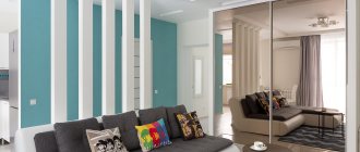
Contrasting combination Source mykitchendesign.ru
Dark wood Source zabavnik.club
Stylish design Source remontkit.ru
Kitchen with island Source interieridizain.ru
Space zoning Source labrys.ru
Bar counter Source topstroyinfo.ru/
Large kitchen Source labrys.ru
Original kitchen equipment Source www.art-designs.ru
Built-in furniture Source almaz-mebel.by
Orange design Source www.pinterest.com
Country style Source countrycorner.ua/
Small corner kitchen Source mebelvs.ru
Modern kitchen Source remontkit.ru
Custom kitchen design with dining room Source kuhni-5.ru